Dark color cheat sheet
Table of Contents
A cheat sheet that tells you what colors to use to support dark mode. This is a guide for those who want to adopt dark mode, but too lazy to figure out which color to use.
TLDR
I encourage you to skim through the content, but if you have no time for that, you can jump right to the sheet.
You can easily support sarunw.com by checking out this sponsor.

Localization Buddy: Easiest way to localize and update App Store metadata.
Who is this guide for?
This guide is for developers who are very excited to adopt the dark mode in their app, but many months pass by, and their app still bright and shiny.
The best time to adopt the dark mode was September 19, 2019. The second best time is now."
– Chinese Proverb
It may seem complicated with all the new system colors Apple introduced. But it is simple than you think. There are only two categories of color you need to consider – background and foreground.
Background Color
iOS defines two sets of background colors—system and grouped—each of which contains primary, secondary, and tertiary variants that help you convey a hierarchy of information. In general, if your foreground content is grouped and separate from background, e.g., grouped table view, use a grouped set of background colors; otherwise, use the system set of background colors.
With both sets of background colors, you generally use the variants to indicate hierarchy in the following ways:
- Primary for the overall view
- Secondary for grouping content or elements within the overall view
- Tertiary for grouping content or elements within secondary elements
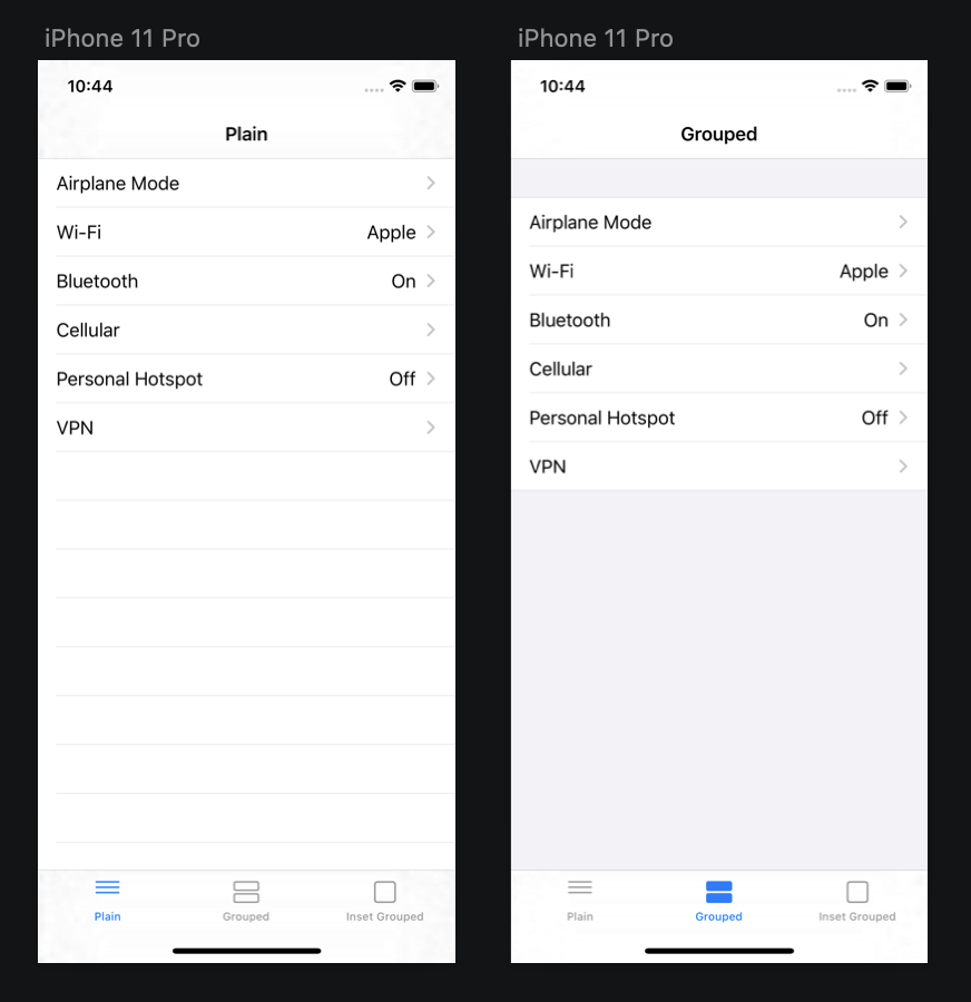
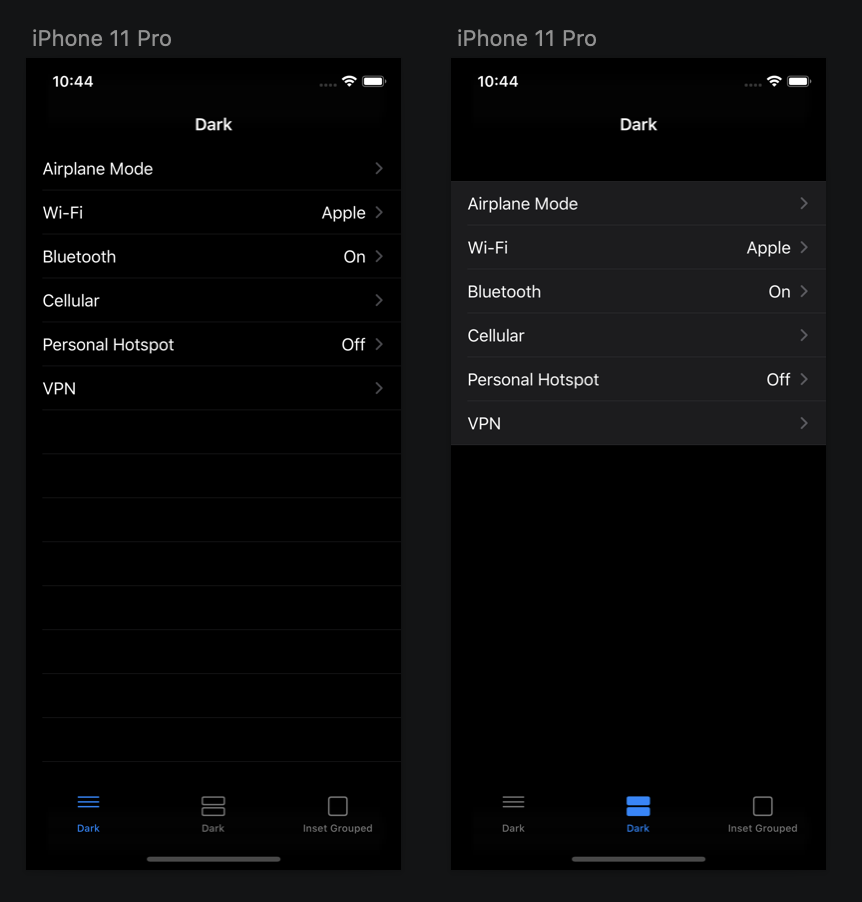
Here are examples of grouped and non-grouped content.

Notice the change in foreground content (table view cell) color in dark mode. In light color style, both foreground contents are white, but in dark mode, white don't always translate to black.

The above examples should be familiar to you. It is a plain style table view and grouped style table view. But the concept of a group doesn't limit to a table view. Any view with the behavior of group content can benefit from system color.
Once you know the type of content, you can start adopting dark mode.
Nongroup - Foreground content and background are on the same plain
If your foreground content and background are on the same plain (Like plain style table view) Use .systemBackground.
Group - Foreground content is grouped and separate from background
If your foreground content isn't on the same plain as background (Like grouped style table view) use .systemGroupedBackground for background view and .secondarySystemGroupedBackground for foreground content (background color for table view cell).
| Name | Light Color | Code | Dark Color | Code |
|---|---|---|---|---|
.systemBackground |
#FFFFFFFF rgba(1.0, 1.0, 1.0, 1.0) |
#000000FF rgba(0.0, 0.0, 0.0, 1.0) |
||
.secondarySystemBackground |
#F2F2F7FF rgba(0.95, 0.95, 0.97, 1.0) |
#1C1C1EFF rgba(0.11, 0.11, 0.12, 1.0) |
||
.tertiarySystemBackground |
#FFFFFFFF rgba(1.0, 1.0, 1.0, 1.0) |
#2C2C2EFF rgba(0.17, 0.17, 0.18, 1.0) |
||
.systemGroupedBackground |
#F2F2F7FF rgba(0.95, 0.95, 0.97, 1.0) |
#000000FF rgba(0.0, 0.0, 0.0, 1.0) |
||
.secondarySystemGroupedBackground |
#FFFFFFFF rgba(1.0, 1.0, 1.0, 1.0) |
#1C1C1EFF rgba(0.11, 0.11, 0.12, 1.0) |
||
.tertiarySystemGroupedBackground |
#F2F2F7FF rgba(0.95, 0.95, 0.97, 1.0) |
#2C2C2EFF rgba(0.17, 0.17, 0.18, 1.0) |
Foreground Content
Once you finished choosing the color for your background, you are halfway done.
For foreground content such as labels and text, it is straightforward, ditch out your fifty shade of gray and use semantically defined system colors.
Label Colors
There are four variants for your label primary, secondary, tertiary, and quaternary. They represent the importance of the content from highest to lowest. The more important, the more contrast for your labels.
| Name | Light Color | Code | Dark Color | Code |
|---|---|---|---|---|
.label |
#000000FF rgba(0.0, 0.0, 0.0, 1.0) |
#FFFFFFFF rgba(1.0, 1.0, 1.0, 1.0) |
||
.secondaryLabel |
#3C3C4399 rgba(0.24, 0.24, 0.26, 0.6) |
#EBEBF599 rgba(0.92, 0.92, 0.96, 0.6) |
||
.tertiaryLabel |
#3C3C434D rgba(0.24, 0.24, 0.26, 0.3) |
#EBEBF54D rgba(0.92, 0.92, 0.96, 0.3) |
||
.quaternaryLabel |
#3C3C432E rgba(0.24, 0.24, 0.26, 0.18) |
#EBEBF52E rgba(0.92, 0.92, 0.96, 0.18) |
Placeholder Colors
If you have placeholder text, use .placeholderText
| Name | Light Color | Code | Dark Color | Code |
|---|---|---|---|---|
.placeholderText |
#3C3C434D rgba(0.24, 0.24, 0.26, 0.3) |
#EBEBF54D rgba(0.92, 0.92, 0.96, 0.3) |
Separator Colors
I think separator is one of the most used UI elements. Apple provided two types of separator .separator and .opaqueSeparator. Pick this based on whether you need it to be transparent or not.
| Name | Light Color | Code | Dark Color | Code |
|---|---|---|---|---|
.separator |
#3C3C434A rgba(0.24, 0.24, 0.26, 0.29) |
#54545899 rgba(0.33, 0.33, 0.35, 0.6) |
||
.opaqueSeparator |
#C6C6C8FF rgba(0.78, 0.78, 0.78, 1.0) |
#38383AFF rgba(0.22, 0.22, 0.23, 1.0) |
Tint Colors
If you have other colors that not represent your brand, I encourage you to use system colors one. Try to find the closest one and replace it with the system one.
| Name | Light Color | Code | Dark Color | Code |
|---|---|---|---|---|
.systemBlue |
#007AFFFF rgba(0.0, 0.48, 1.0, 1.0) |
#0A84FFFF rgba(0.04, 0.52, 1.0, 1.0) |
||
.systemGreen |
#34C759FF rgba(0.2, 0.78, 0.35, 1.0) |
#30D158FF rgba(0.19, 0.82, 0.35, 1.0) |
||
.systemIndigo |
#5856D6FF rgba(0.35, 0.34, 0.84, 1.0) |
#5E5CE6FF rgba(0.37, 0.36, 0.9, 1.0) |
||
.systemOrange |
#FF9500FF rgba(1.0, 0.58, 0.0, 1.0) |
#FF9F0AFF rgba(1.0, 0.62, 0.04, 1.0) |
||
.systemPink |
#FF2D55FF rgba(1.0, 0.18, 0.33, 1.0) |
#FF375FFF rgba(1.0, 0.22, 0.37, 1.0) |
||
.systemPurple |
#AF52DEFF rgba(0.69, 0.32, 0.87, 1.0) |
#BF5AF2FF rgba(0.75, 0.35, 0.95, 1.0) |
||
.systemRed |
#FF3B30FF rgba(1.0, 0.23, 0.19, 1.0) |
#FF453AFF rgba(1.0, 0.27, 0.23, 1.0) |
||
.systemTeal |
#5AC8FAFF rgba(0.35, 0.78, 0.98, 1.0) |
#64D2FFFF rgba(0.39, 0.82, 1.0, 1.0) |
||
.systemYellow |
#FFCC00FF rgba(1.0, 0.8, 0.0, 1.0) |
#FFD60AFF rgba(1.0, 0.84, 0.04, 1.0) |
Gray Colors
Gray colors always drive me crazy. Everyone wants to come up with their shade of gray. If a design system isn't set up properly in the first place, you will end up with a lot of grays. I glad that Apple comes up with these gray colors.
Apple prepared six opaque gray colors. If you have your own shade of gray, you better replace it with Apple provided one. .systemGray6 is the most subtle gray (low contrast), and .systemGray is the most dominant one (high contrast).
| Name | Light Color | Code | Dark Color | Code |
|---|---|---|---|---|
.systemGray |
#8E8E93FF rgba(0.56, 0.56, 0.58, 1.0) |
#8E8E93FF rgba(0.56, 0.56, 0.58, 1.0) |
||
.systemGray2 |
#AEAEB2FF rgba(0.68, 0.68, 0.7, 1.0) |
#636366FF rgba(0.39, 0.39, 0.4, 1.0) |
||
.systemGray3 |
#C7C7CCFF rgba(0.78, 0.78, 0.8, 1.0) |
#48484AFF rgba(0.28, 0.28, 0.29, 1.0) |
||
.systemGray4 |
#D1D1D6FF rgba(0.82, 0.82, 0.84, 1.0) |
#3A3A3CFF rgba(0.23, 0.23, 0.24, 1.0) |
||
.systemGray5 |
#E5E5EAFF rgba(0.9, 0.9, 0.92, 1.0) |
#2C2C2EFF rgba(0.17, 0.17, 0.18, 1.0) |
||
.systemGray6 |
#F2F2F7FF rgba(0.95, 0.95, 0.97, 1.0) |
#1C1C1EFF rgba(0.11, 0.11, 0.12, 1.0) |
Action
Once you know what color do you want for dark style, you have two options – replace and add dark color to your existing color.
I would recommend you replace as much as possible if your light color is close to the system provided one. But if you want to keep your light color and change only dark color, you have two ways to do this.
Color asset
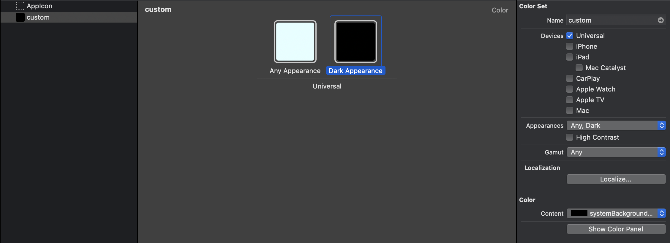
Open the asset catalog. In Attributes inspector under a new Appearances section, select "Any, Dark". Set any appearance to your existing light color and dark appearance to system one.

Programmatically
If you don't (or can't) use the asset catalog, you can create a new color and modify just the dark color.
extension UIColor {
  var customColor: UIColor {
    return UIColor { (trait) -> UIColor in
     switch trait.userInterfaceStyle {
     case .dark:
      return .systemBackground
     default:
      return // your old background color for ligth style
     }
    }
  }
}
Cheat Sheet
| From | To | Note |
|---|---|---|
| Grouped table view background color | .systemGroupedBackground |
|
| Table cell on grouped table view | .secondarySystemGroupedBackground |
|
| Plain table view background color | .systemBackground |
|
| Table cell on plain table view | .systemBackground |
|
| Other background color | .systemBackground |
|
| A text label that contains primary content. | .label |
The most important information, e.g., Email title |
| A text label that contains secondary content. | .secondaryLabel |
The second most important information, e.g., Email body, receiving date of email |
| A text label that contains tertiary content. | .tertiaryLabel |
Less important information. |
| A text label that contains quaternary content. | .quaternaryLabel |
The least important information. |
| Placeholder text in controls or text views. | .placeholderText |
|
| A separator with transparency | .separator |
|
| An opaque separator | .opaqueSeparator |
|
| Blue / Green / Indigo / Orange / Pink / Purple / Red / Teal / Yellow | .systemBlue / .systemGreen / .systemIndigo / .systemOrange / .systemPink / .systemPurple / .systemRed / .systemTeal / .systemYellow |
If you have any color that resemble this, I recommended using the system one. |
| Any gray | .systemGray to .systemGray6 |
If you have any shade of grays, I recommended you remap it to system one where .systemGray is the most contrast and .systemGray6 is the least contrast. |
Conclusion
This article aims to be the simplest starting point for you to adopt the dark mode.
If you have a simple app, this should cover your case. I hope you can quickly embrace dark mode to your app.
You can easily support sarunw.com by checking out this sponsor.

Localization Buddy: Easiest way to localize and update App Store metadata.
Related Resources
- Still not ready for this? Learn how to opt-out and come back later. Adopting iOS Dark Mode
- Things you should know about color when adopting dark mode. Dark color
- List of all available semantically defined system colors https://developer.apple.com/documentation/uikit/uicolor/ui_element_colors
Read more article about iOS, Dark Mode, or see all available topic
Enjoy the read?
If you enjoy this article, you can subscribe to the weekly newsletter.
Every Friday, you'll get a quick recap of all articles and tips posted on this site. No strings attached. Unsubscribe anytime.
Feel free to follow me on Twitter and ask your questions related to this post. Thanks for reading and see you next time.
If you enjoy my writing, please check out my Patreon https://www.patreon.com/sarunw and become my supporter. Sharing the article is also greatly appreciated.
Become a patron Buy me a coffee Tweet ShareCaching dependencies in Github Actions
How to cache Pods, Ruby gem, and Carthage in your iOS project.