How to make a custom button style with UIButton.Configuration in iOS 15
Table of Contents
The final part in the series "What's new in UIKit button". In this last part, we will learn how to create our own button style. It is not as easy as I first thought, but I am quite satisfied with the result.
As we learn in the Button Configuration post, Apple come up with four pre-defined UIButton.Configuration, plain, gray, tinted, and filled.
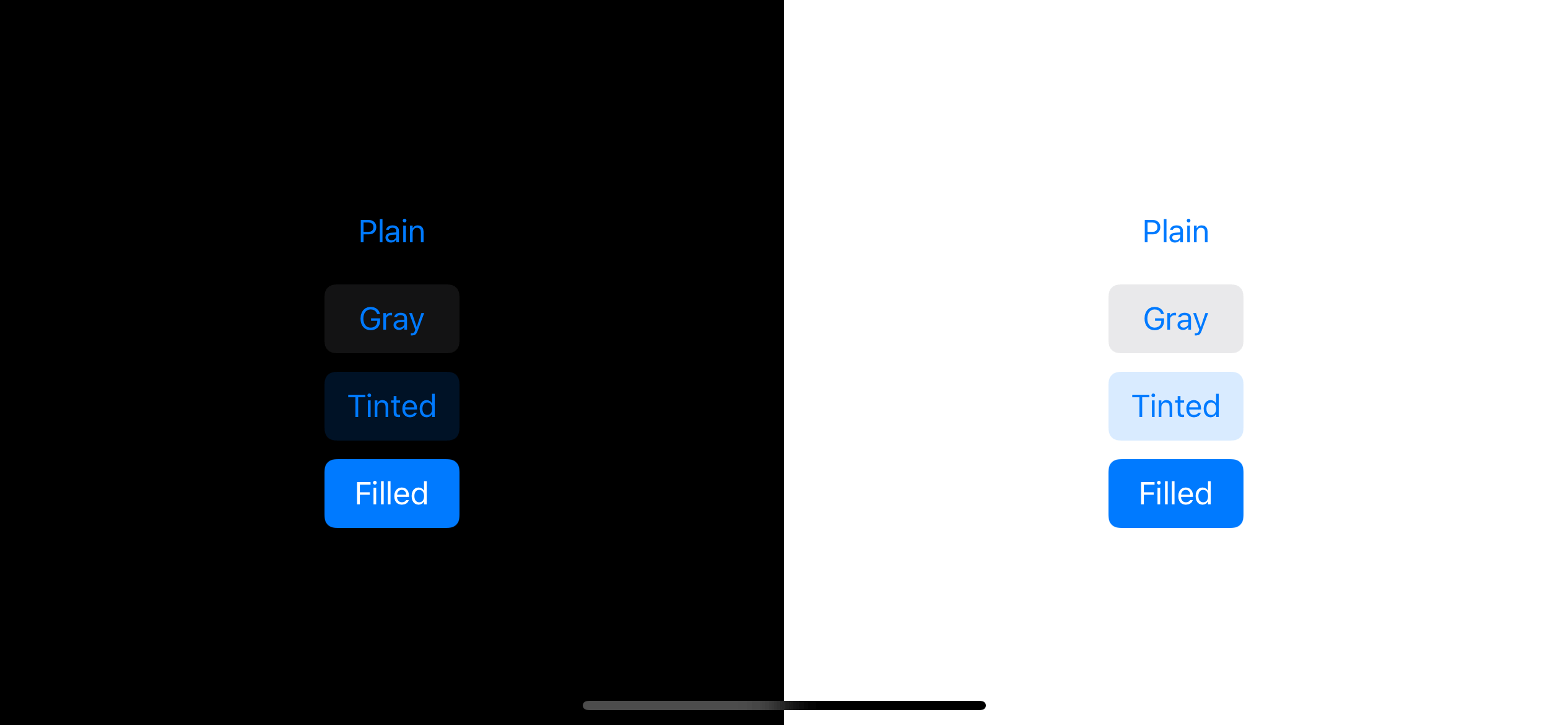
It might look limited, but with a combination of background and foreground color, it should suffice for most of the design you have. But if you or your designers have a specific need that does not match these pre-defined configurations, how would you do it? This is the question we are going to discover in this article.
We will try to create a new custom button style and see what it take to do so. It will be a capsule-shape outline button style, and here is how it look.
How UIButton.Configuration work
The system-defined styles are in the form of static functions.
public static func plain() -> UIButton.ConfigurationSo, I plan to make something like this.
public static func outline() -> UIButton.ConfigurationSince we want to create a new UIButton.Configuration, let's see what is UIButton.Configuration really is. UIButton.Configuration act as a container of a button's contents and appearance.
You can set content like title, subtitle, and image or appearance like baseBackgroundColor and baseForegroundColor. Each button configuration style will combine this information with a button state to produce different behavior for a state.
The brain of button configuration lies in a updated(for button: UIButton) method. This instance method returns a copy of the configuration based on the given button (state).
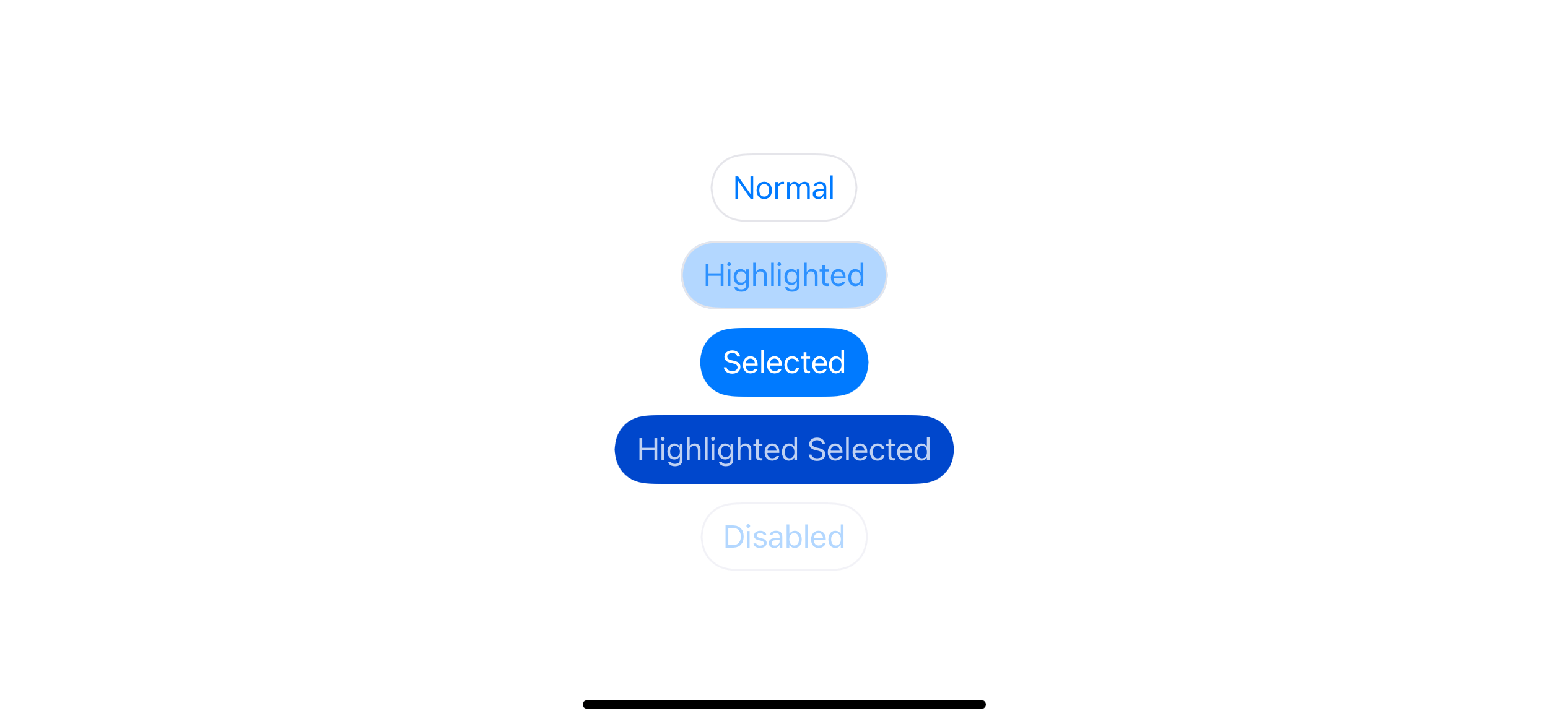
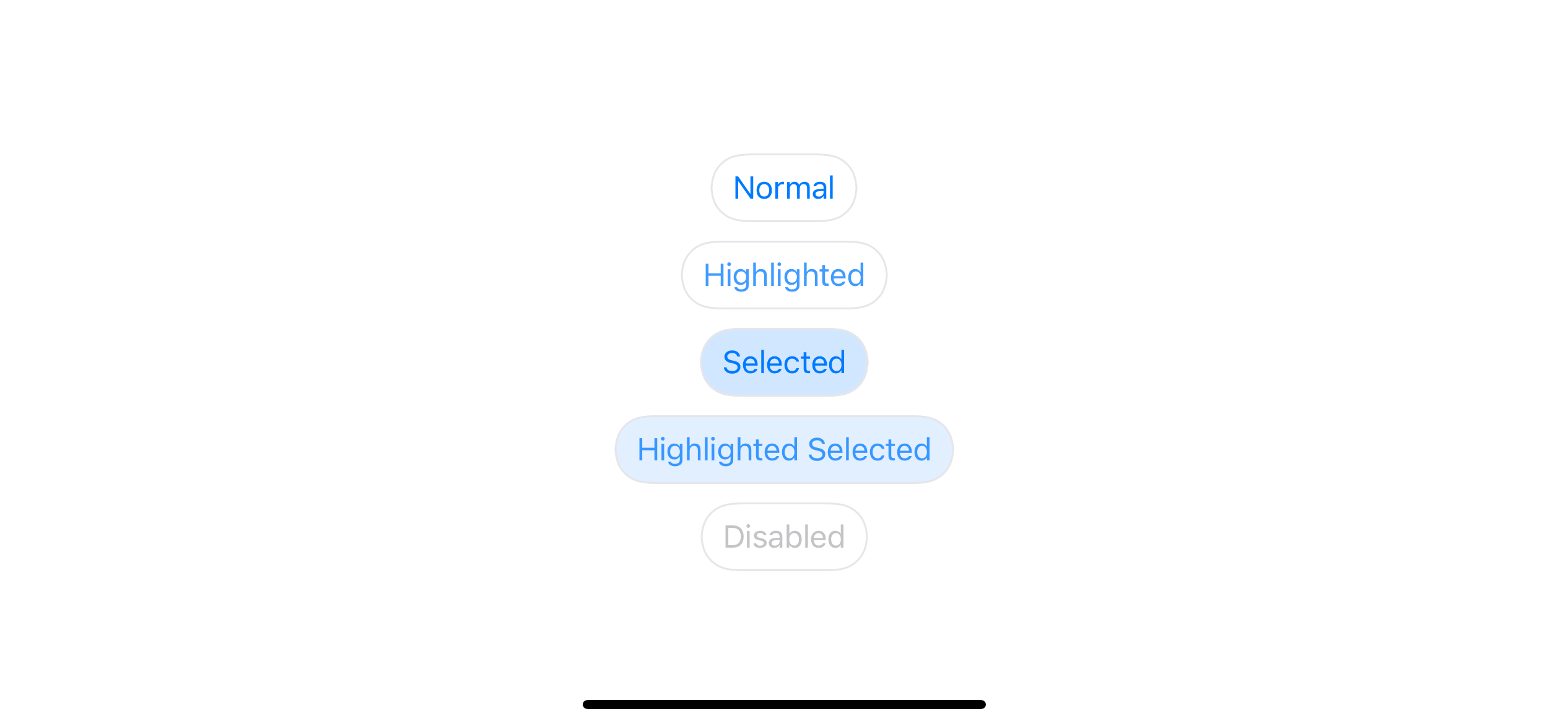
The following example shows that the same configuration can result differently based on a button state.
var configuration = UIButton.Configuration.plain()

configuration.title = "Normal"
let normal = UIButton(configuration: configuration, primaryAction: nil)

configuration.title = "Highlighted"
let highlighted = UIButton(configuration: configuration, primaryAction: nil)
highlighted.isHighlighted = true

configuration.title = "Selected"
let selected = UIButton(configuration: configuration, primaryAction: nil)
selected.isSelected = true

configuration.title = "Highlighted Selected"
let highlightedSelected = UIButton(configuration: configuration, primaryAction: nil)
highlightedSelected.isSelected = true
highlightedSelected.isHighlighted = true

configuration.title = "Disabled"
let disabled = UIButton(configuration: configuration, primaryAction: nil)
disabled.isEnabled = false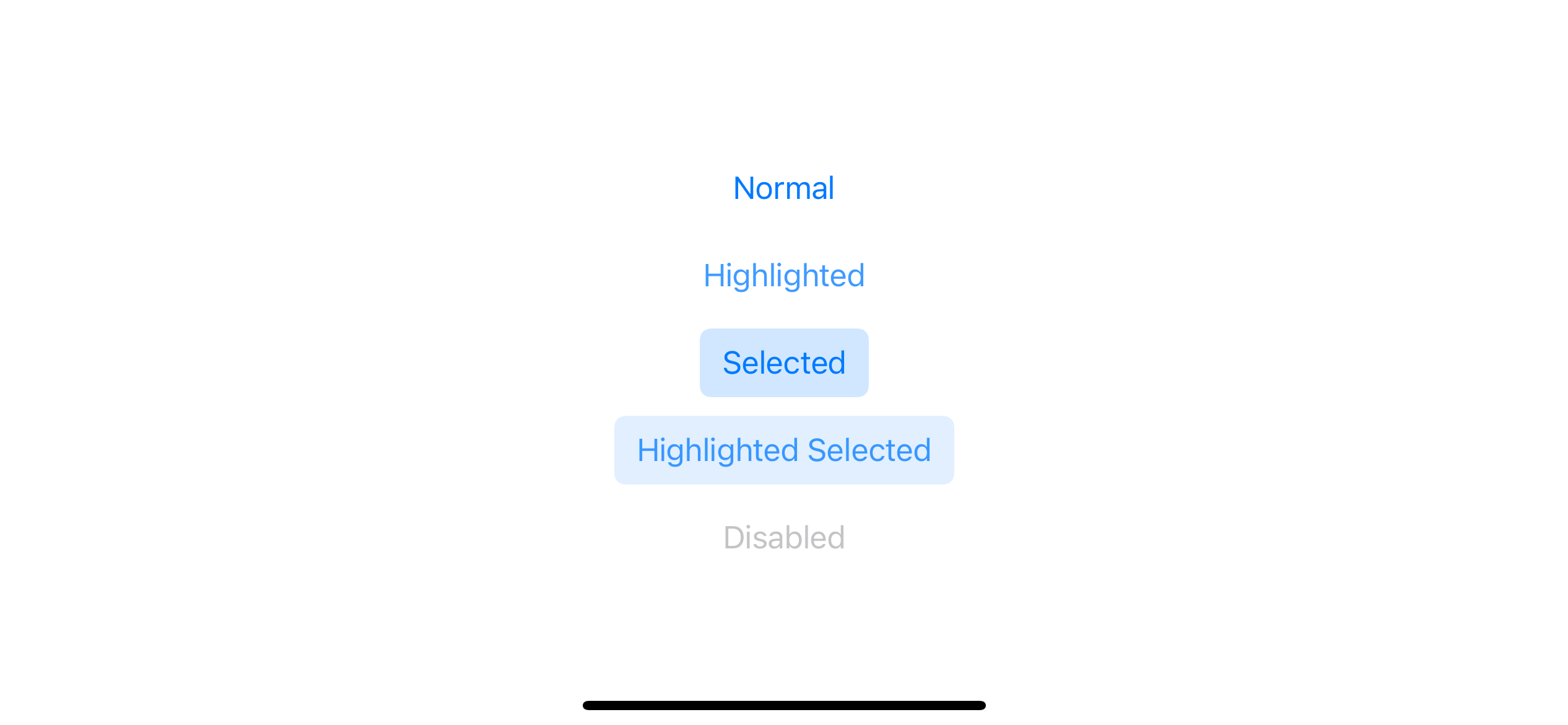
All the magic happens inside this updated(for button: UIButton) method. This method will produce a different configuration for the specified style based on a passing button.
Let's see the conversion again, but this time we directly called the updated(for button: UIButton) and manually passed a button instance.
let configuration = UIButton.Configuration.plain()
let normalButton = UIButton()
let c1 = configuration.updated(for: normalButton)
let b1 = c1.background.backgroundColor
print(b1)
// Optional(UIExtendedGrayColorSpace 0 0)
let selectedButton = UIButton()
selectedButton.isSelected = true
let c2 = configuration.updated(for: selectedButton)
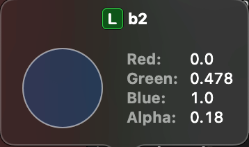
let b2 = c2.background.backgroundColor
print(b2)
// Optional(UIExtendedSRGBColorSpace 0 0.478431 1 0.18)The same configuration produces a style that adapts to a passing button state. In this example, the selected button results in a default blue background color.
Custom UIButton.Configuration
It is tempted to create a new outline button configuration and override this updated method for our new style. Too bad we can't either define a new UIButton.Configuration or override updated(for button: UIButton) method because button configuration is a struct :(
The best we can do is modify an existing configuration, which doesn't work since we can't override the updated(for button: UIButton). Our change can only be static and won't change according to button states.
extension UIButton.Configuration {
    public static func outline() -> UIButton.Configuration {
        var style = UIButton.Configuration.plain()
        var background = UIButton.Configuration.plain().background
        background.cornerRadius = 20
        background.strokeWidth = 1
        background.strokeColor = UIColor.systemGray5
        style.background = background

        return style
    }
}
As you can see, our new button style works across all button states, which is not a behavior we want. Modifying an existing configuration like this only works if you have a style that remains constant regardless of button states.
We want a way to make our button configuration adapt to a button state. But where should we do that?
You can easily support sarunw.com by checking out this sponsor.
AI Grammar: Correct grammar, spell check, check punctuation, and parphrase.
updateConfiguration()
Since we can't create a new button style using button configuration, we should shift our focus to an UIButton. Luckily, UIButton got a new method that I think suits our need, updateConfiguration().
updateConfiguration() will update configuration in response to button state change. I think this is a perfect place for our needs. We can override button configuration, but this time we also get access to a button state since we are inside a UIButton instance method.
The default implementation of this method should look something like this:
override func updateConfiguration() {
    // 1
    let updatedConfiguration = configuration?.updated(for: self)
    // 2
    self.configuration = updatedConfiguration
}
This method trigger when there is a button state change.
1 First, we ask for a new configuration for a new button state using updated(for button: UIButton) method.
2 We then apply this newly updated configuration back to the button's configuration.
As we know where to put our custom logic, let's create our outline button by subclass an UIButton.
Outline button
Here is how our outline button looks like. I create an UIButton subclass, override the updateConfiguration() method, and put styling logic there.
We have quite a big chunk of code in updateConfiguration(), so I will split the implementation detail into two parts for readability.
Part 1:
class OutlineButton: UIButton {
    override func updateConfiguration() {
        guard let configuration = configuration else {
            return
        }

        // 1
        var updatedConfiguration = configuration

        // 2
        var background = UIButton.Configuration.plain().background

        // 3
        background.cornerRadius = 20
        background.strokeWidth = 1

        // 4
        let strokeColor: UIColor
        let foregroundColor: UIColor
        let backgroundColor: UIColor
        let baseColor = updatedConfiguration.baseForegroundColor ?? UIColor.tintColor

        // ....
    }
}
1 First, we get the current button configuration. We need this to get the user's current content, such as title, subtitle, and image. We don't use an updated state method (configuration?.updated(for: self)) here because we want to do the transformation manually.
2 User can pass any button configuration style which might effect a background, so I start with a known state by getting UIBackgroundConfiguration from UIButton.Configuration.plain().
3 Set basic property that apply to all button state.
4 Create a variable to hold properties that change according to state. We will fill these properties in the next chunk of code.
Part 2:
We finish the first preparation phase. The next one is a brain of our button where we try to simulate func updated(for button: UIButton) -> UIButton.Configuration method and produce configuration that adapts to button state.
class OutlineButton: UIButton {
    override func updateConfiguration() {
        // ...

        // 1
        switch self.state {
        case .normal:
            strokeColor = .systemGray5
            foregroundColor = baseColor
            backgroundColor = .clear
        case [.highlighted]:
            strokeColor = .systemGray5
            foregroundColor = baseColor
            backgroundColor = baseColor.withAlphaComponent(0.3)
        case .selected:
            strokeColor = .clear
            foregroundColor = .white
            backgroundColor = baseColor
        case [.selected, .highlighted]:
            strokeColor = .clear
            foregroundColor = .white
            backgroundColor = baseColor.darker()
        case .disabled:
            strokeColor = .systemGray6
            foregroundColor = baseColor.withAlphaComponent(0.3)
            backgroundColor = .clear
        default:
            strokeColor = .systemGray5
            foregroundColor = baseColor
            backgroundColor = .clear
        }

        background.strokeColor = strokeColor
        background.backgroundColor = backgroundColor

        updatedConfiguration.baseForegroundColor = foregroundColor
        updatedConfiguration.background = background

        // 2
        self.configuration = updatedConfiguration
    }
}
1 We switch over button state and set different colors based on that state, then we assign it back to UIButton.Configuration.
2 Don't forget to set the modified version back to the button's configuration to apply the new style.
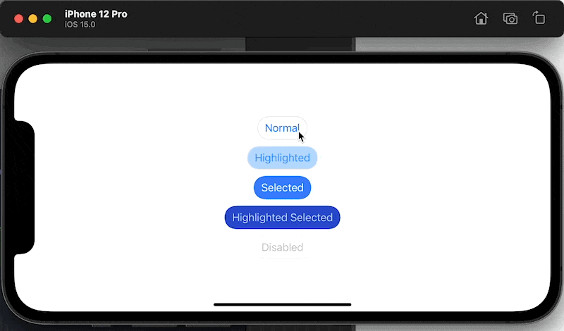
Replace UIButton with OutlineButton and run again.
var configuration = UIButton.Configuration.filled()

configuration.title = "Normal"
let normal = OutlineButton(configuration: configuration, primaryAction: nil)

configuration.title = "Highlighted"
let highlighted = OutlineButton(configuration: configuration, primaryAction: nil)
highlighted.isHighlighted = true

configuration.title = "Selected"
let selected = OutlineButton(configuration: configuration, primaryAction: nil)
selected.isSelected = true

configuration.title = "Highlighted Selected"
let highlightedSelected = OutlineButton(configuration: configuration, primaryAction: nil)
highlightedSelected.isSelected = true
highlightedSelected.isHighlighted = true

configuration.title = "Disabled"
let disabled = OutlineButton(configuration: configuration, primaryAction: nil)
disabled.isEnabled = false
The result is almost perfect.

Caveats
There are two problems in our current implementation.
- The text color of the disabled state is not what I expected. I expected it to be light blue as define here
foregroundColor = baseColor.withAlphaComponent(0.3). - If you run the code, you will find that the selected buttons' appearance isn't working correctly.
Let's tackle the problems one by one.
Button override baseForegroundColor in disabled state
Set title color with updatedConfiguration?.baseForegroundColor = foregroundColor work for every cases but disabled state. I think UIButton does some magic under the hood for a disabled state. Luckily, we can overcome this magic by using attributedTitle. We can set text color for disabled state by setting attributedTitle.
override func updateConfiguration() {
    guard let configuration = configuration else {
        return
    }

    var updatedConfiguration = configuration

    var background = UIButton.Configuration.plain().background
    background.cornerRadius = 20
    background.strokeWidth = 1

    let strokeColor: UIColor
    let foregroundColor: UIColor
    let backgroundColor: UIColor
    let baseColor = updatedConfiguration.baseForegroundColor ?? UIColor.tintColor

    switch self.state {
    case .normal:
        strokeColor = .systemGray5
        foregroundColor = baseColor
        backgroundColor = .clear
    case [.highlighted]:
        strokeColor = .systemGray5
        foregroundColor = baseColor
        backgroundColor = baseColor.withAlphaComponent(0.3)
    case .selected:
        strokeColor = .clear
        foregroundColor = .white
        backgroundColor = baseColor

    case [.selected, .highlighted]:
        strokeColor = .clear
        foregroundColor = .white
        backgroundColor = baseColor.darker()
    case .disabled:
        strokeColor = .systemGray6
        foregroundColor = baseColor.withAlphaComponent(0.3)
        backgroundColor = .clear

        // 1
        var container = AttributeContainer()
        container.foregroundColor = baseColor.withAlphaComponent(0.3)
        let title = updatedConfiguration.title!
        updatedConfiguration.attributedTitle = AttributedString(title, attributes: container)
    default:
        strokeColor = .systemGray5
        foregroundColor = baseColor
        backgroundColor = .clear
    }

    background.strokeColor = strokeColor
    background.backgroundColor = backgroundColor

    updatedConfiguration.baseForegroundColor = foregroundColor
    updatedConfiguration.background = background

    self.configuration = updatedConfiguration
}
1 We assign attributedTitle to button configuration for disabled case.
With this change, we can override text color for the disabled state, and the appearance matches what we want in the first place. We only have one problem left, but a bigger one.
Wrong configuration when a state change
The problem occurs when you tap a selected button. The background color disappears and becomes gray when highlighted instead of blue.
Let's see the problem again.
The cause of the problem comes from the following line.
let baseColor = updatedConfiguration.baseForegroundColor ?? UIColor.tintColorI use baseForegroundColor as a color for the title and background. I assume it won't change over time, and that was a mistake.
Let see the problem in slow-motion.
override func updateConfiguration() {
    guard let configuration = configuration else {
        return
    }

    var updatedConfiguration = configuration

    var background = UIButton.Configuration.plain().background
    background.cornerRadius = 20
    background.strokeWidth = 1

    let strokeColor: UIColor
    let foregroundColor: UIColor
    let backgroundColor: UIColor
    // 1
    let baseColor = updatedConfiguration.baseForegroundColor ?? UIColor.tintColor

    switch self.state {
    case .normal:
        strokeColor = .systemGray5
        foregroundColor = baseColor
        backgroundColor = .clear
    case [.highlighted]:
        strokeColor = .systemGray5
        foregroundColor = baseColor
        backgroundColor = baseColor.withAlphaComponent(0.3)
    case .selected:
        strokeColor = .clear
        // 2
        foregroundColor = .white
        backgroundColor = baseColor

    case [.selected, .highlighted]:
        strokeColor = .clear
        foregroundColor = .white
        // 4
        backgroundColor = baseColor.darker()
    case .disabled:
        strokeColor = .systemGray6
        foregroundColor = baseColor.withAlphaComponent(0.3)
        backgroundColor = .clear

        var container = AttributeContainer()
        container.foregroundColor = baseColor.withAlphaComponent(0.3)
        let title = updatedConfiguration.title!
        updatedConfiguration.attributedTitle = AttributedString(title, attributes: container)
    default:
        strokeColor = .systemGray5
        foregroundColor = baseColor
        backgroundColor = .clear
    }

    background.strokeColor = strokeColor
    background.backgroundColor = backgroundColor

    // 3
    updatedConfiguration.baseForegroundColor = foregroundColor
    updatedConfiguration.background = background

    self.configuration = updatedConfiguration
}
First appear:
1 On the fist run baseForegroundColor is nil, so we use default tint color (blue) as a baseColor.
2 For .selected state we use baseColor as a background (backgroundColor) and set text color (foregroundColor) to .white.
3 We assign foregroundColor (.white) to updatedConfiguration.baseForegroundColor. Right now baseForegroundColor become .white instead of nil.
The first run would result as expected, but after we tap on the selected button, the background turns gray. Let's revisit the flow again.
Gray background in highlighted state:
1 On the second run baseForegroundColor is .white.
4 For [.selected, .highlighted] state we use baseColor.darker() as a background color (backgroundColor). A .darker() of white is gray.
3 We set gray (backgroundColor) as our background color and again, we assign foregroundColor (.white) to updatedConfiguration.baseForegroundColor.
After releasing a finger and the button go back to a selected state, our button turns completely white.
Background become white after lift your finger:
1 On the third run baseForegroundColor is .white.
2 For .selected state we use baseColor (.white) as a background color.
3 We assign foregroundColor (.white) to updatedConfiguration.baseForegroundColor.
As you can see, we rely on baseForegroundColor to dictate our button's color, but we keep changing this value as the button state change.
Solution
To fix the Wrong configuration when state change problem, we must not change the source of truth, baseForegroundColor, since we rely on this value to be the same through the course of change of button state.
If we won't change baseForegroundColor, how can we manipulate background and foreground color? Turn out we can do that with a help of two tranformer .titleTextAttributesTransformer and .backgroundColorTransformer. You can think of transformer as a map function that takes in input and produce a new output without changing the input. This is perfect for what we need.
The change is minimal. Instead of setting backgroundColor and foregroundColor directly, we use transformer methods to get a color we want without touching our source of truth.
override func updateConfiguration() {
    guard let configuration = configuration else {
        return
    }

    var updatedConfiguration = configuration

    var background = UIButton.Configuration.plain().background
    background.cornerRadius = 20
    background.strokeWidth = 1

    let strokeColor: UIColor
    let foregroundColor: UIColor
    let backgroundColor: UIColor
    let baseColor = updatedConfiguration.baseForegroundColor ?? UIColor.tintColor

    switch self.state {
    case .normal:
        strokeColor = .systemGray5
        foregroundColor = baseColor
        backgroundColor = .clear
    case [.highlighted]:
        strokeColor = .systemGray5
        foregroundColor = baseColor
        backgroundColor = baseColor.withAlphaComponent(0.3)
    case .selected:
        strokeColor = .clear
        foregroundColor = .white
        backgroundColor = baseColor

    case [.selected, .highlighted]:
        strokeColor = .clear
        foregroundColor = .white
        backgroundColor = baseColor.darker()
    case .disabled:
        strokeColor = .systemGray6
        foregroundColor = baseColor.withAlphaComponent(0.3)
        backgroundColor = .clear
    default:
        strokeColor = .systemGray5
        foregroundColor = baseColor
        backgroundColor = .clear
    }

    background.strokeColor = strokeColor
    // 1
    // background.backgroundColor = backgroundColor
    background.backgroundColorTransformer = UIConfigurationColorTransformer { color in
        return backgroundColor
    }

    // 2
    // updatedConfiguration.baseForegroundColor = foregroundColor
    updatedConfiguration.titleTextAttributesTransformer = UIConfigurationTextAttributesTransformer { incoming in
        var container = incoming
        container.foregroundColor = foregroundColor

        return container
    }

    updatedConfiguration.background = background

    self.configuration = updatedConfiguration
}
1 Instead of set .backgroundColor which affect the state of the next update, we set .backgroundColorTransformer which return a background color we want instead.
2 The same rule apply to .baseForegroundColor. We don't want to change this and mess up the next update. We apply a new foregroundColor to an AttributeContainer and return it from the transformer. This change also solves our disabled text color problem, so we can remove the fix we made in last section.
With these two changes, everything work as expected. We finally got an outline style button.
You can easily support sarunw.com by checking out this sponsor.
AI Grammar: Correct grammar, spell check, check punctuation, and parphrase.
Conclusion
The implementation in this article is just a basic guideline and contains a lot of rough edges. I only assume a user will only set a title with this outline button, and the way we initialize the button that ignores a specified button style feels weird (We can create a new initializer to make it less weird). But I think you can take it from here and add the functionality you want.
// We ignore the passing configuration style
var configuration = UIButton.Configuration.filled()

configuration.title = "Normal"
let normal = OutlineButton(configuration: configuration, primaryAction: nil)
And this is the end of the "What's new in UIKit button" series. It took me longer than I was expected, and I'm happy I can finally end the series. If you love this kind of long post series, don't forget to Subscribe so you don't miss when the next one is coming. Until next time.
Read more article about iOS 15, UIKit, Button, or see all available topic
Enjoy the read?
If you enjoy this article, you can subscribe to the weekly newsletter.
Every Friday, you'll get a quick recap of all articles and tips posted on this site. No strings attached. Unsubscribe anytime.
Feel free to follow me on Twitter and ask your questions related to this post. Thanks for reading and see you next time.
If you enjoy my writing, please check out my Patreon https://www.patreon.com/sarunw and become my supporter. Sharing the article is also greatly appreciated.
Become a patron Buy me a coffee Tweet ShareHow to set custom CodingKey for the convertFromSnakeCase decoding strategy
The thing you should know before using the convertFromSnakeCase decoding strategy.
7 ways to pass a closure as an argument in Swift
There are many ways we can satisfy a closure argument. Some of them do not even look like closure. Let's learn all of them in this article.