What is Button Role in SwiftUI
Table of Contents
What is ButtonRole in SwiftUI
In iOS 15, SwiftUI got a new struct, ButtonRole, that means to use alongside with a button.
ButtonRole is a value that describes the purpose of a button.
There are two roles you can choose.
destructive: Use this role for a button that deletes user data, or performs an irreversible operation.cancel: A role that indicates a button that cancels an operation.
You can easily support sarunw.com by checking out this sponsor.
AI Grammar: Correct grammar, spell check, check punctuation, and parphrase.
How does ButtonRole affect a button
The system uses the button's role to improve styling and usability based on the context.
From my observation, it can affect a button in two ways.
Appearance
The system usually changes the styling of a destructive button to be more prominent. Since it uses to perform an irreversible operation, it usually styled in red color to convey the sense of danger.
The followings are examples of button roles in different contexts.
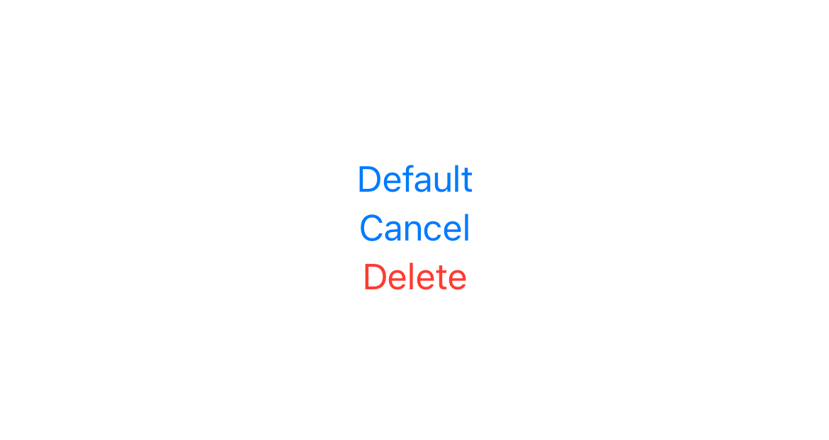
Buttons with no role, cancel role, and destructive role in VStack.
VStack {
    Button("Default", action: {})
    Button("Cancel", role: .cancel, action: {})
    Button("Delete", role: .destructive, action: {})
}
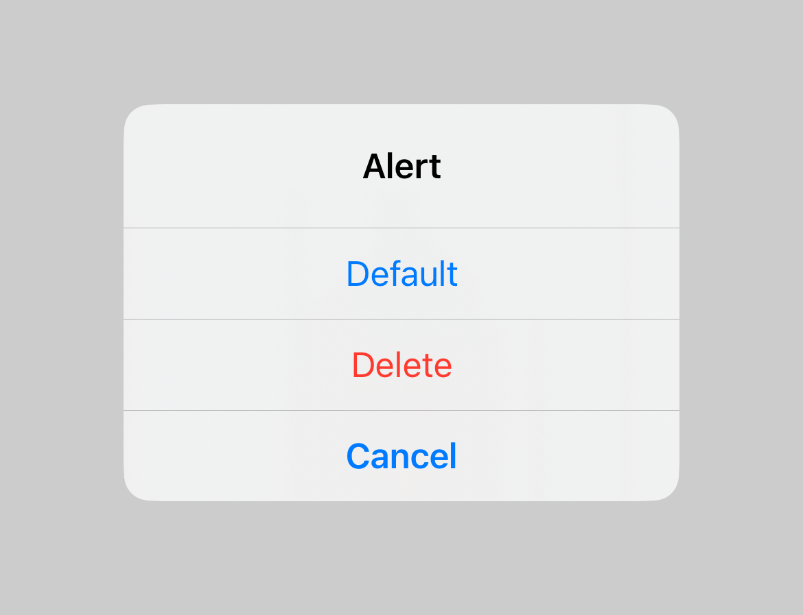
Buttons use as Alert actions.
.alert("Alert", isPresented: $isPresented) {
    Button("Default", action: {})
    Button("Cancel", role: .cancel, action: {})
    Button("Delete", role: .destructive, action: {})
}
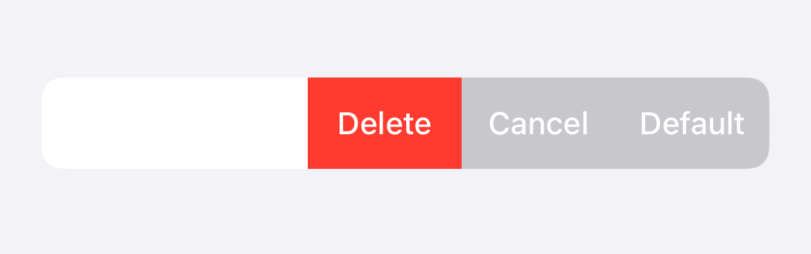
Buttons use as Swipe actions for a List row.
List {
    Text("Item 1")
        .swipeActions {
            Button("Default", action: {})
            Button("Cancel", role: .cancel, action: {})
            Button("Delete", role: .destructive, action: {})
        }
}
Position
In some contexts, the system also uses the button's role to determine the button position.
For example, iOS usually positions the cancel operation at the bottom for Alert and Confirmation Dialog.
Knowing that the button is a cancel button allows the system to adjust its position. This improves consistency and usability.
Alert
.alert("Alert", isPresented: $isPresented) {
    Button("Default", action: {})
    Button("Cancel", role: .cancel, action: {})
    Button("Delete", role: .destructive, action: {})
}
As you can see, in the code, we put the cancel button in the middle. But the system puts it at the bottom when presented as alert actions.
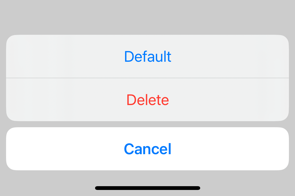
Confirmation Dialog
.confirmationDialog("Confirmation Dialog", isPresented: $isPresented, actions: {
    Button("Default", action: {})
    Button("Cancel", role: .cancel, action: {})
    Button("Delete", role: .destructive, action: {})
})
The same principle holds for .confirmationDialog. The cancel button gets pushed to the bottom of a confirmation dialog.
Read more article about Button, SwiftUI, iOS 15, or see all available topic
Enjoy the read?
If you enjoy this article, you can subscribe to the weekly newsletter.
Every Friday, you'll get a quick recap of all articles and tips posted on this site. No strings attached. Unsubscribe anytime.
Feel free to follow me on Twitter and ask your questions related to this post. Thanks for reading and see you next time.
If you enjoy my writing, please check out my Patreon https://www.patreon.com/sarunw and become my supporter. Sharing the article is also greatly appreciated.
Become a patron Buy me a coffee Tweet ShareHow to declare Multiline String in Swift
If you need a string that spans several lines, Swift has a multiline string literal that you can use.
Swift mod operator (%)
There might be several reasons that cause this error. I will share the solution that works for me.