How to scale margin and padding with @ScaledMetric Property Wrapper
Table of Contents
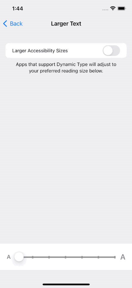
Dynamic Type automatically scales a font size according to Accessibility settings. In iOS 14, we also have a way to scale numeric values like padding and margin.
Difference font sizes required different spaces.
By nature, the larger the font size, the larger the space required around the text.
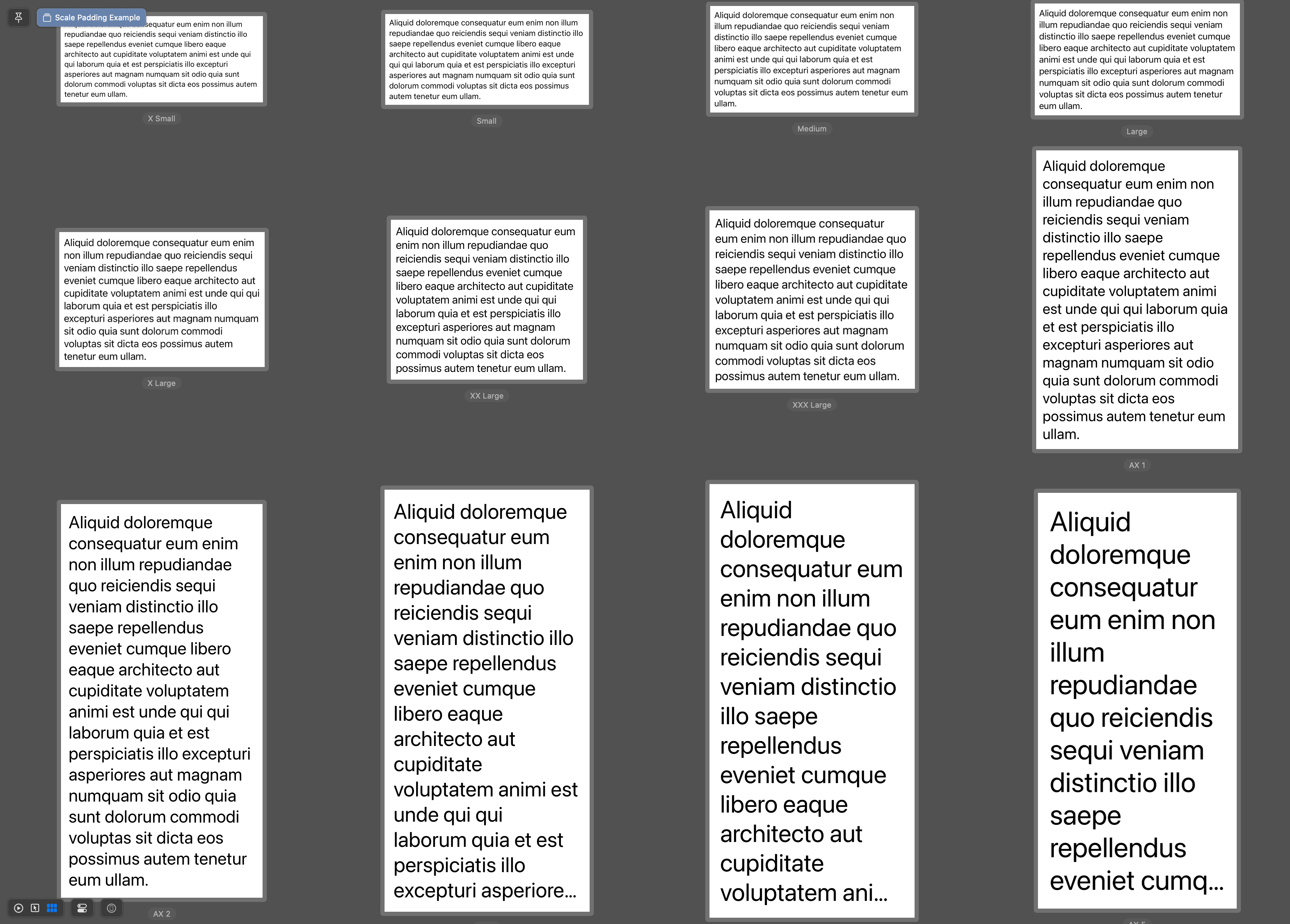
Here is an example of the body text style in different accessibility settings.
struct ScalePaddingExample: View {
    var fixedPadding: CGFloat = 8

    var body: some View {
        VStack {
            Text("Aliquid doloremque consequatur eum enim non illum repudiandae quo reiciendis sequi veniam distinctio illo saepe repellendus eveniet cumque libero eaque architecto aut cupiditate voluptatem animi est unde qui qui laborum quia et est perspiciatis illo excepturi asperiores aut magnam numquam sit odio quia sunt dolorum commodi voluptas sit dicta eos possimus autem tenetur eum ullam.")
                .font(.body)
                .padding(fixedPadding)
        }
    }
}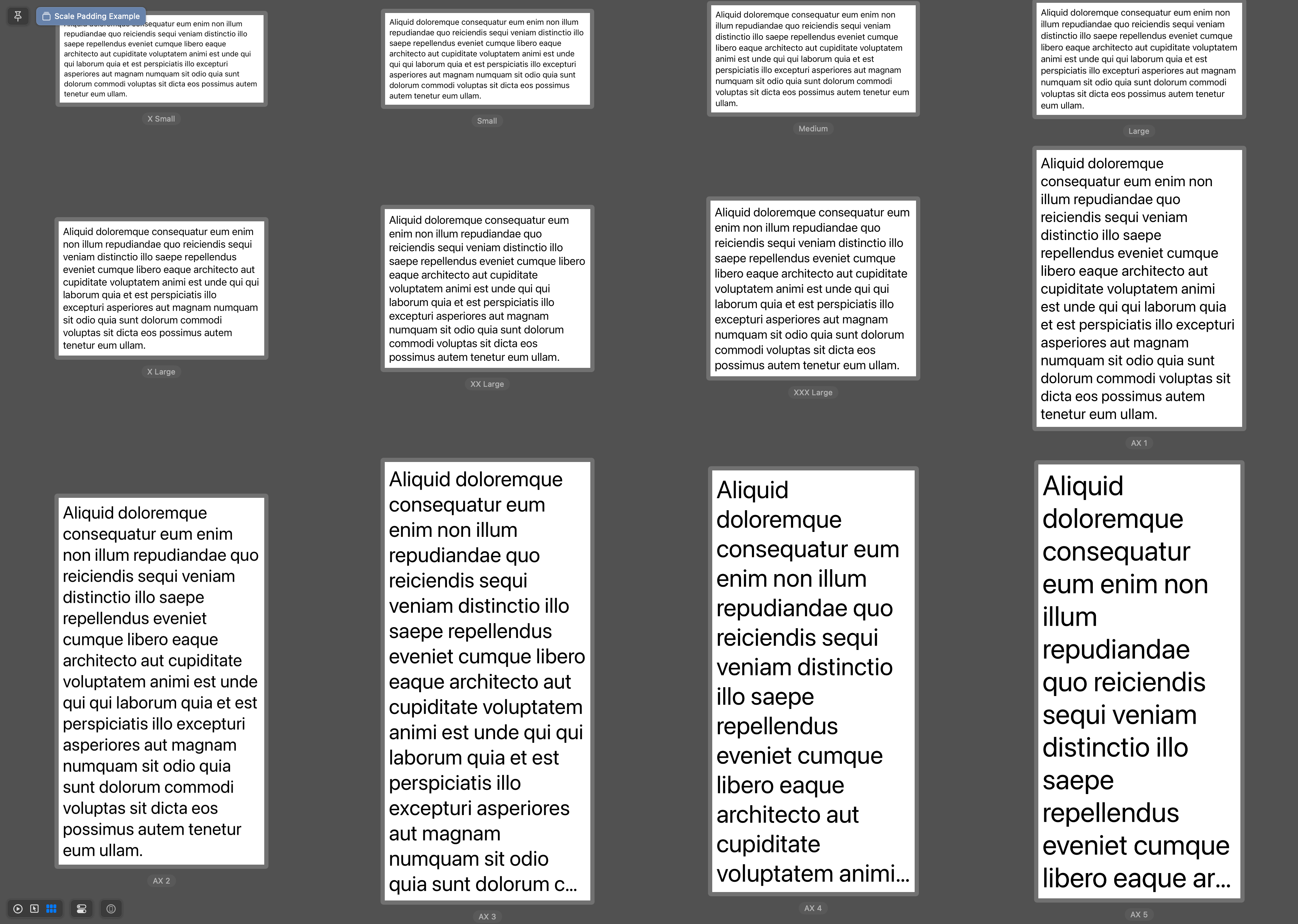
As you can see, when font size scales up, line height also increases to improve readability and visual design.
The same padding seems smaller on a larger text because of the larger line height.
Fixed-size padding gives us a visual of less whitespace around the large text size, which seems uncomfortable.
The way to fix this is to have dynamic size padding.
You can easily support sarunw.com by checking out this sponsor.
Translate your app In 1 click: Simplifies app localization and helps you reach more users.
How to scale padding with Dynamic Type
In iOS 14, SwiftUI introduced the @ScaledMetric property wrapper. It is a property wrapper that scales a numeric value.
@ScaledMetric allows us to have a number that changes its value automatically with accessibility settings.
This is a perfect property wrapper to use with things like margin, padding, or anything around text.
You can specify the text style that you want the value to scale relative to, or you can leave it blank to make it scale to body text style.
@ScaledMetric var defaultScaledPadding: CGFloat = 8
// Equals to
@ScaledMetric(relativeTo: .body) var defaultScaledPadding: CGFloat = 8

@ScaledMetric(relativeTo: .largeTitle) var largeTitlePadding: CGFloat = 8
The following example uses @ScaledMetric to scale the padding value surrounding a text view.
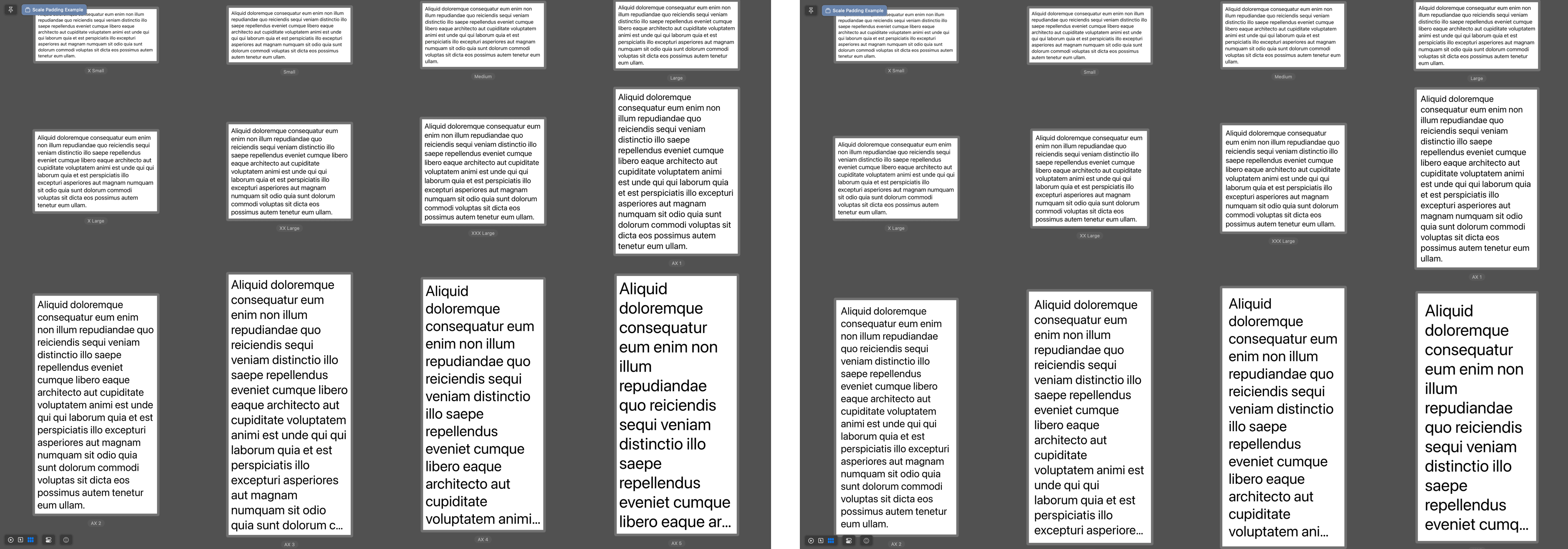
struct ScalePaddingExample: View {
    @ScaledMetric var scaledPadding: CGFloat = 8

    var body: some View {
        VStack {
            Text("Aliquid doloremque consequatur eum enim non illum repudiandae quo reiciendis sequi veniam distinctio illo saepe repellendus eveniet cumque libero eaque architecto aut cupiditate voluptatem animi est unde qui qui laborum quia et est perspiciatis illo excepturi asperiores aut magnam numquam sit odio quia sunt dolorum commodi voluptas sit dicta eos possimus autem tenetur eum ullam.")
                .font(.body)
                .padding(scaledPadding)
        }
    }
}
As padding also scales with the font, we got nice whitespace that looks good on every font size.
Here is the side-by-side comparison.
Read more article about SwiftUI, Font, Property Wrapper, or see all available topic
Enjoy the read?
If you enjoy this article, you can subscribe to the weekly newsletter.
Every Friday, you'll get a quick recap of all articles and tips posted on this site. No strings attached. Unsubscribe anytime.
Feel free to follow me on Twitter and ask your questions related to this post. Thanks for reading and see you next time.
If you enjoy my writing, please check out my Patreon https://www.patreon.com/sarunw and become my supporter. Sharing the article is also greatly appreciated.
Become a patron Buy me a coffee Tweet ShareMissing dSYM download link in App Store Connect
You can no longer download dSYM from the App Store Connect.
Set SwiftUI app theme with AccentColor
An accent color is a simple and unified way to theming your app. This article will teach you how to set a global accent color for your app.