A new way to style UIButton with UIButton.Configuration in iOS 15
Table of Contents
The first part in the series "What's new in UIKit button". An introduction to a new button configuration, a struct that is shaping and styling your button. You no longer need to subclass UIButton ever again with button configuration.
History
Buttons during iOS 7-13
A button is a very important UI element. It is an obvious way for users to interact with our app. Every action has different urgency and importance depend on the context. So, our buttons need to have a different style to reflect that.
Apple adopts a flat design in iOS 7 with a borderless design button. It looks clean and beautiful at that time, but Apple doesn't change it ever since.
It works for most of the standard system UI elements where choices are limited.
But if you have different paths that users can choose from, the simple button style might not enough. As an example, the App Store app uses three different styles of buttons in the app.
It uses a plain button for low priority action, gray background for more important ones, and prominent blue background color for a call to action.
SwiftUI
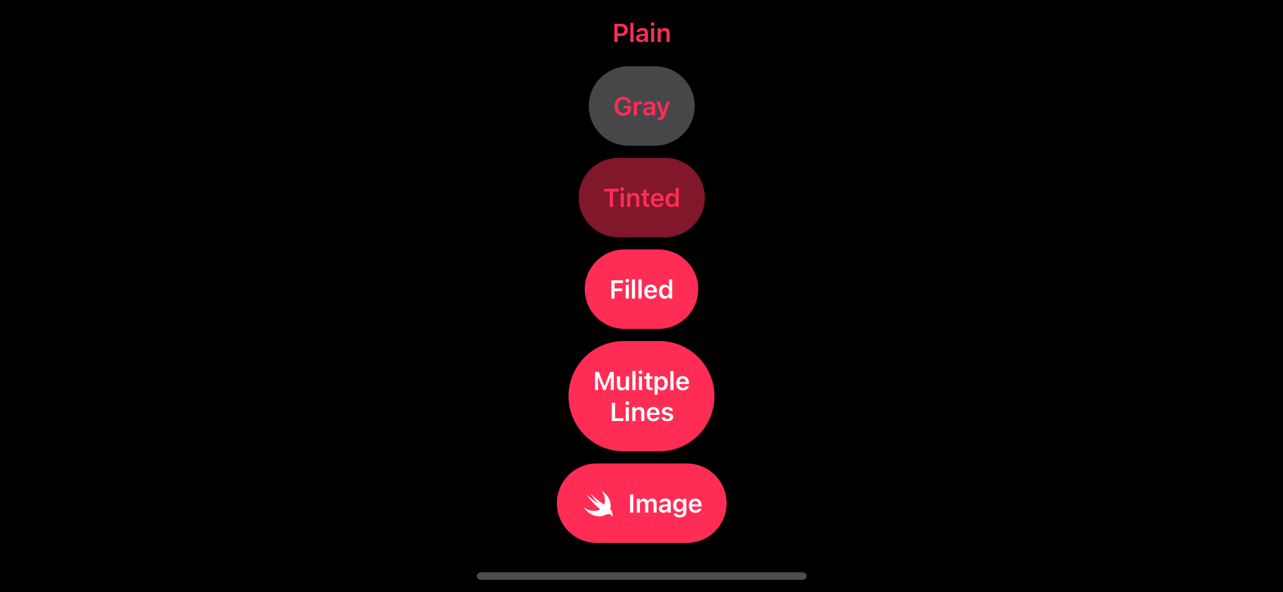
With the introduction of SwiftUI in WWDC 2019, one of the features that I really enjoy is the flexibility to styling a button. You can easily adjust a background color, round color, multiline, and image.
Here is an example how you can style buttons in SwiftUI.
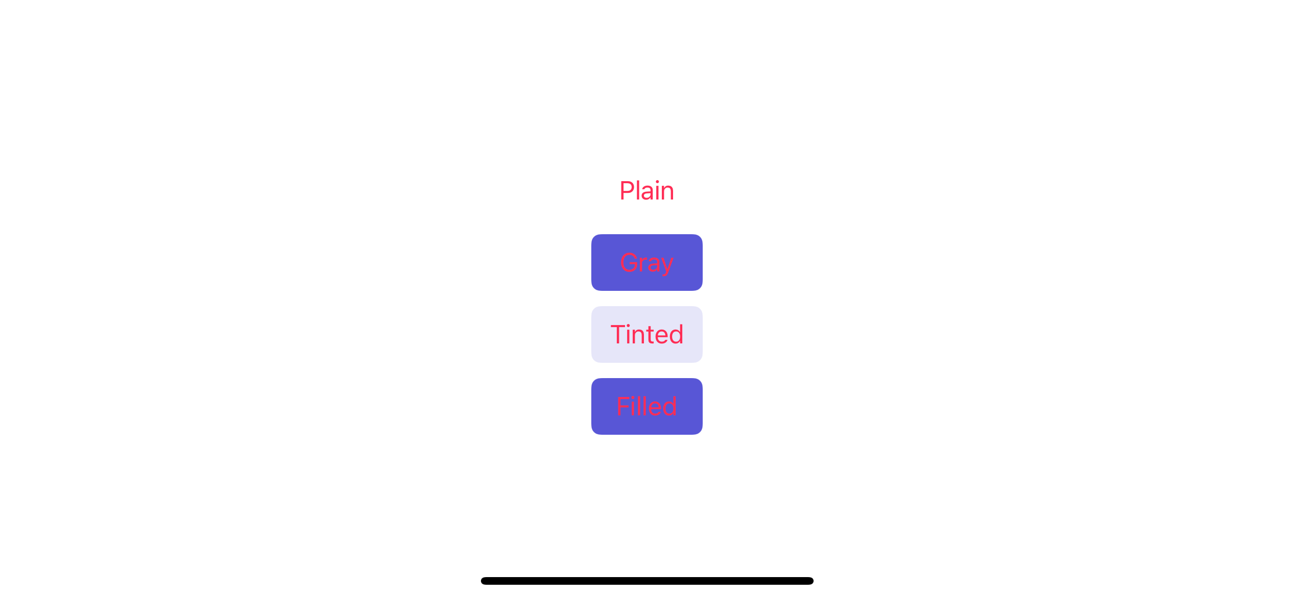
VStack {
    Button(action: {}) {
        Text("Plain")
    }
    Button(action: {}) {
        Text("Gray")
            .padding()
            .background(Color.gray.opacity(0.5))
            .clipShape(Capsule())
    }
    Button(action: {}) {
        Text("Tinted")
            .padding()
            .background(Color.pink.opacity(0.5))
            .clipShape(Capsule())
    }
    Button(action: {}) {
        Text("Filled")
            .padding()
            .background(Color.pink)
            .clipShape(Capsule())
            .foregroundColor(Color.white)
    }
    Button(action: {}) {
        VStack {
            Text("Mulitple")
            Text("Lines")
        }
        .padding()
        .background(Color.pink)
        .clipShape(Capsule())
        .foregroundColor(Color.white)
    }
    Button(action: {}) {
        HStack {
            Image(systemName: "swift")
                .foregroundColor(Color.white)
            Text("Image")
        }
        .padding()
        .background(Color.pink)
        .clipShape(Capsule())
        .foregroundColor(Color.white)
    }
}
Which results in the following buttons.
This seems trivial but very crucial in today's design. Every app needs to have a unique button to reflect its branding. Too bad UIKit lacks most of this support. You have to hack around to customize all of this.
New button style in iOS 15
After all the suffering UIKit goes through, now in iOS 15, I'm pleased that UIButton finally gets some love and having those customizations build right in. A new struct that made this happen is UIButton.Configuration.
You can easily support sarunw.com by checking out this sponsor.
AI Grammar: Correct grammar, spell check, check punctuation, and parphrase.
Overview
UIButton.Configuration is a new struct that specifies the appearance and behavior of a button and its contents. It has many properties that refer to the button appearance and content, e.g., title, titlePadding, image, imagePadding, buttonSize, baseBackgroundColor, background, etc. UIButton will adjust its content and appearance according to configuration values.
You can't initialize this UIButton.Configuration since it doesn't have accessible initializers. Instead, Apple provides us with four static functions to start with.
UIButton.Configuration.plain(): Creates a configuration for a button with a transparent background.UIButton.Configuration.gray(): Creates a configuration for a button with a gray background.UIButton.Configuration.tinted(): Creates a configuration for a button with a tinted background color.UIButton.Configuration.filled(): Creates a configuration for a button with a background filled with the button’s tint color.
Here is an how they look:
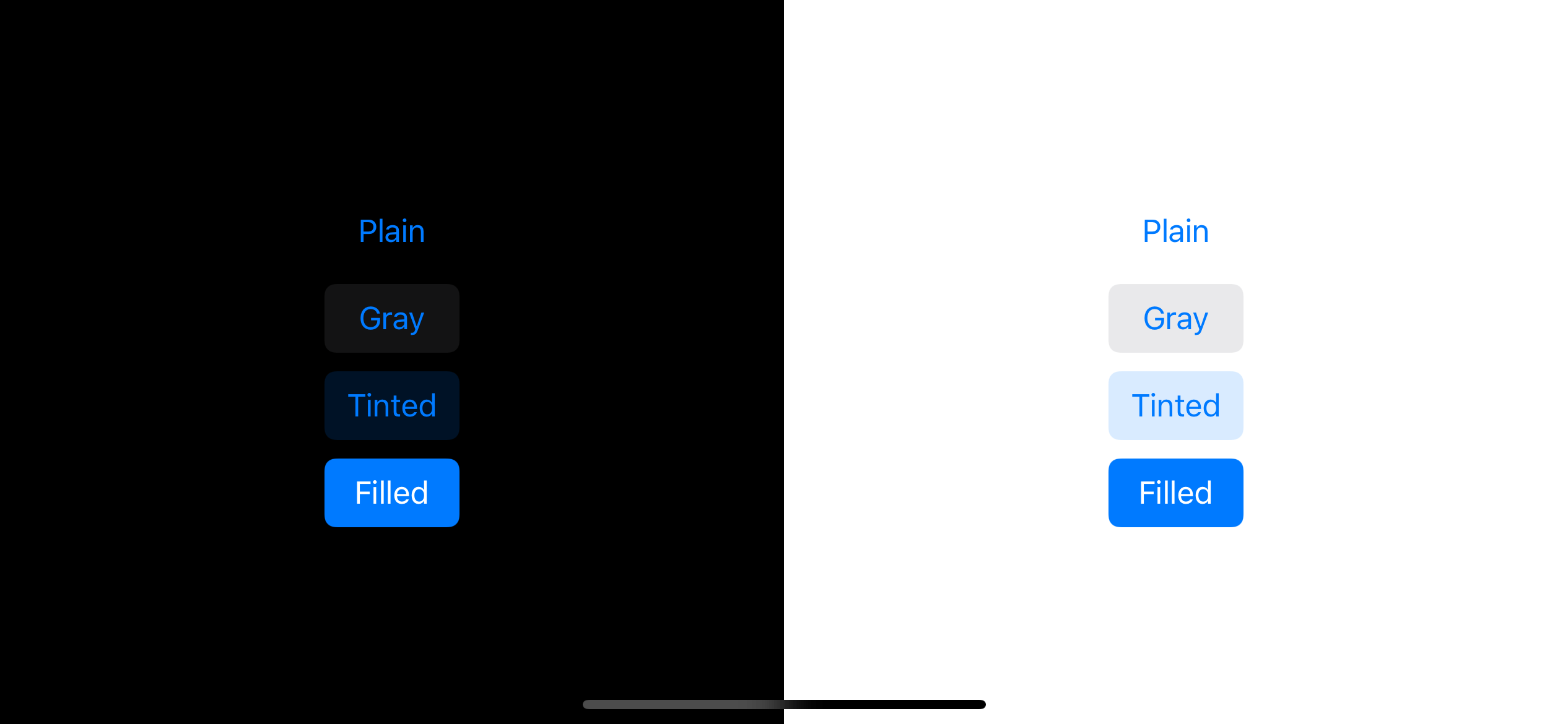
Initialization
As I mentioned earlier, you can't initialize this UIButton.Configuration since it doesn't have accessible initializers. But we got four static factory functions that return us four different styles, plain, gray, tinted, and filled.
To use button configuration, we pass it as an argument in the new initializer.
convenience init(configuration: UIButton.Configuration, primaryAction: UIAction? = nil)Here is an example initializing four button styles.
let plain = UIButton(configuration: .plain(), primaryAction: nil)
plain.setTitle("Plain", for: .normal)

let gray = UIButton(configuration: .gray(), primaryAction: nil)
gray.setTitle("Gray", for: .normal)

let tinted = UIButton(configuration: .tinted(), primaryAction: nil)
tinted.setTitle("Tinted", for: .normal)

let filled = UIButton(configuration: .filled(), primaryAction: nil)
filled.setTitle("Filled", for: .normal)
Customization
You can customize your button by modifying a UIButton.Configuration property. Make sure you modify it before pass it to UIButton since struct is value type.
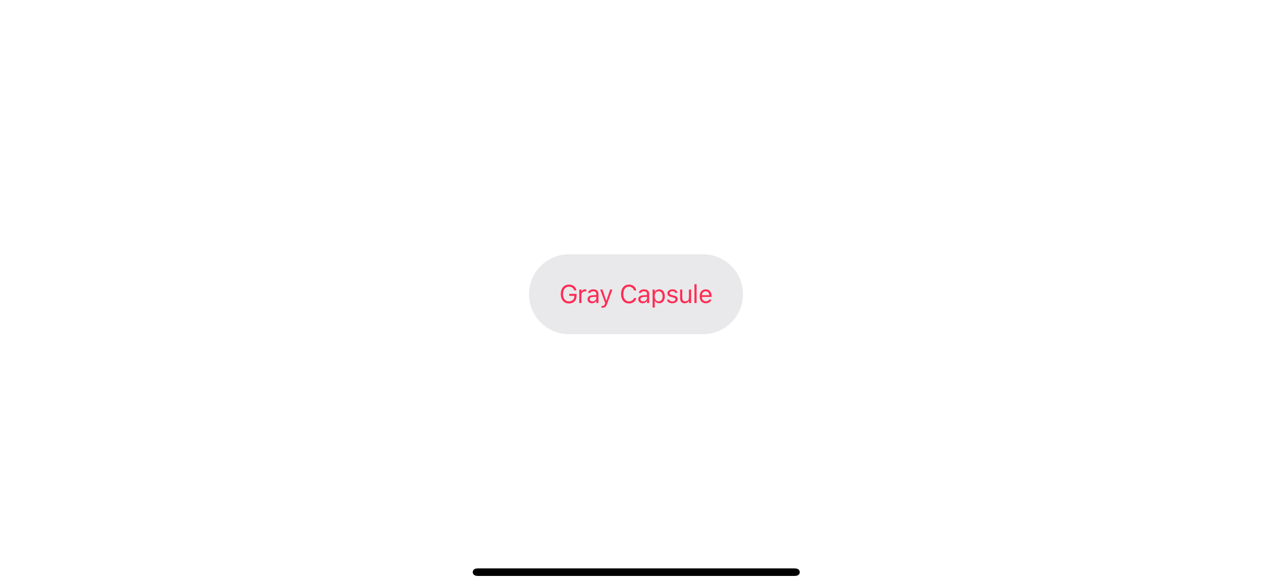
var configuration = UIButton.Configuration.gray() // 1
configuration.cornerStyle = .capsule // 2
configuration.baseForegroundColor = UIColor.systemPink
configuration.buttonSize = .large
configuration.title = "Gray Capsule"

let button = UIButton(configuration: configuration, primaryAction: nil) // 3
<1> Start with the style closest to your design.
<2> Modify any configuration'properites.
<3> Use it in button initializer.
There are many properties you can play with. I will show you some that I find interesting. We can classify them into two groups.
- Content: Property that affect content of a button, e.g., title, image
- Appearance: Property that affect button appearance, e.g., background, title color
Content
Let's start with the essential part of a button, content. We can set title and image in configuration, and we can also add a new piece of content, a subtitle. This is a welcoming change.
Title / Subtitle / Image
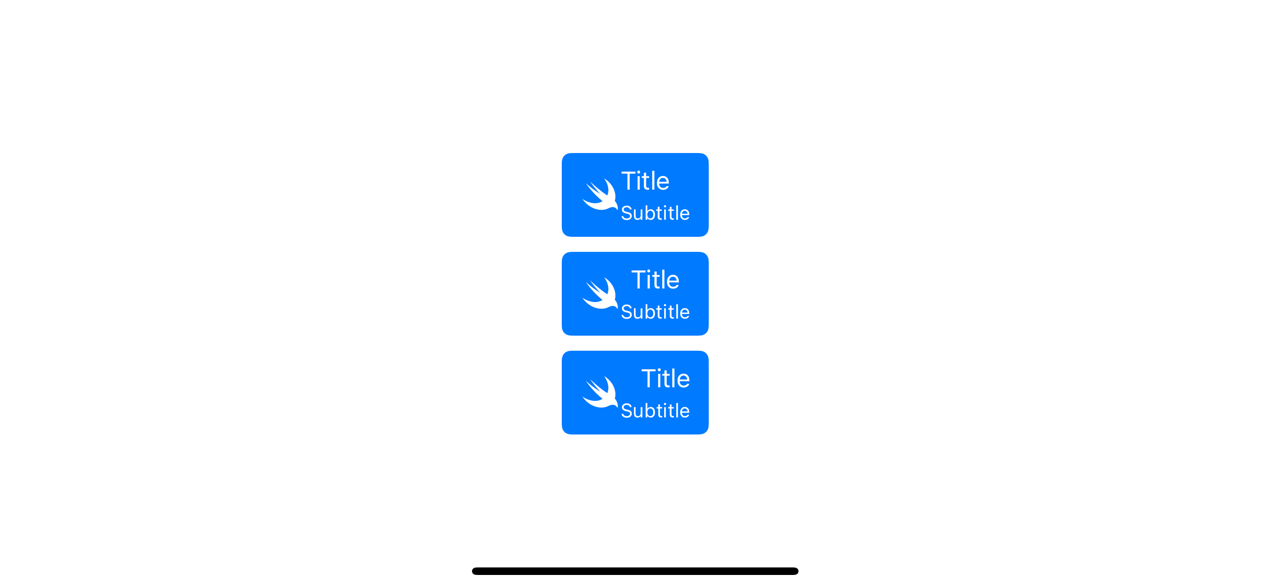
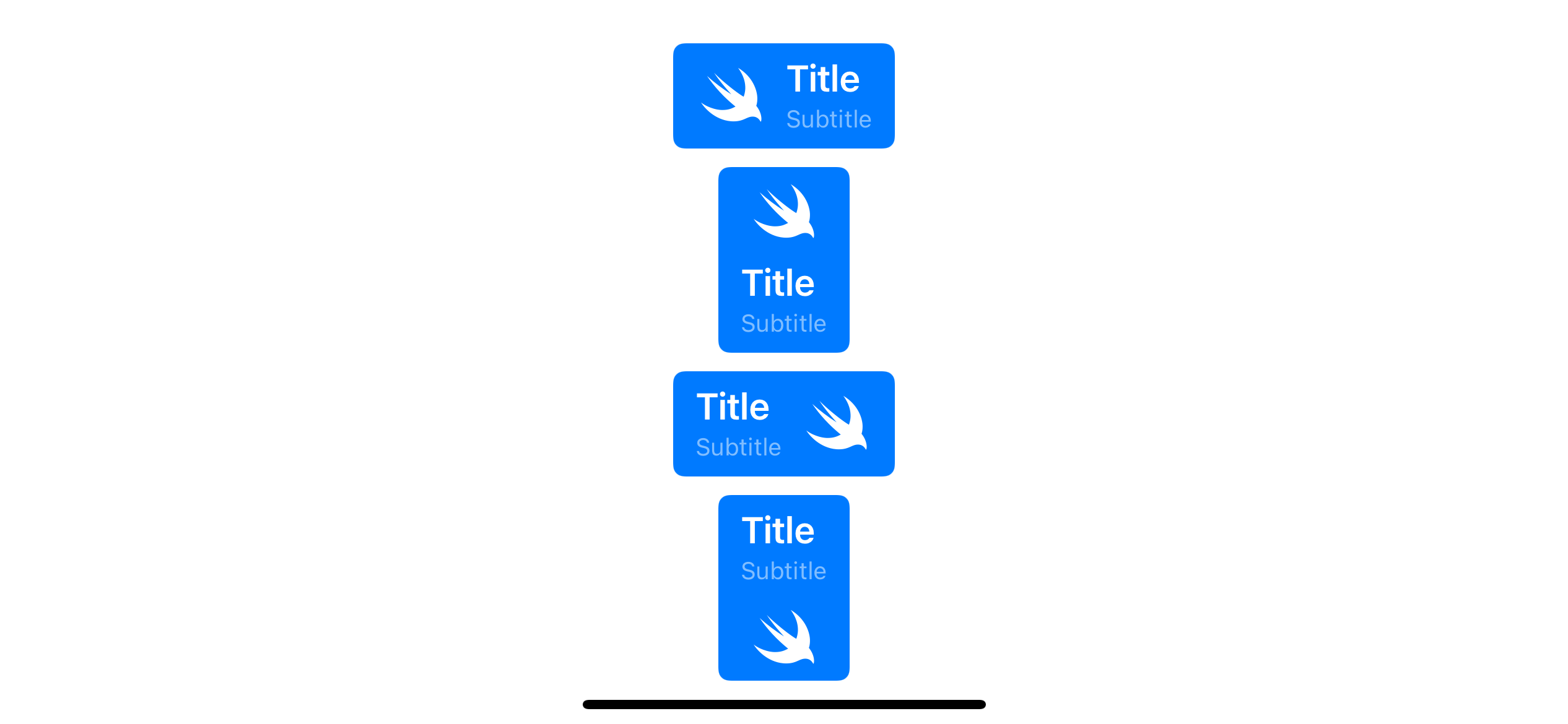
Button configuration has three content, title, subtitle, and image. You should be familiar with the title and image, but in iOS 15, we got a new place to add extra information, subtitle. The subtitle has its place below the title.
An example of button with different title alignment.
var configuration = UIButton.Configuration.filled()
configuration.title = "Title"
configuration.subtitle = "Subtitle"
configuration.image = UIImage(systemName: "swift")

let button = UIButton(configuration: configuration, primaryAction: nil) // 1

configuration.titleAlignment = .center
let button2 = UIButton(configuration: configuration, primaryAction: nil)

configuration.titleAlignment = .trailing
let button3 = UIButton(configuration: configuration, primaryAction: nil)
<1> title and subtitle text alignment defaults to .leading.
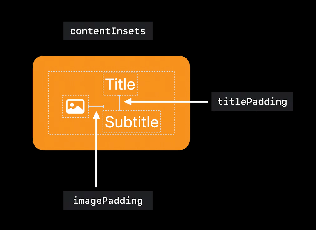
Insets / Padding
Padding and insets control are easier to understand in iOS 15. You have three options to control padding and insets.
titlePadding: The distance between the title and subtitle labels.imagePadding: The distance between the button’s image and text (This is default to zero in the beta, which is quite weird).contentInsets: The distance from the button’s content area to its bounds.
This is a visualization of three properties that affect content spacing.
Here is an example of how you set three paddings.
var configuration = UIButton.Configuration.filled()
configuration.title = "Title"
configuration.subtitle = "Subtitle"
configuration.image = UIImage(systemName: "swift")
configuration.titlePadding = 10
configuration.imagePadding = 10
configuration.contentInsets = NSDirectionalEdgeInsets(top: 2, leading: 20, bottom: 2, trailing: 20)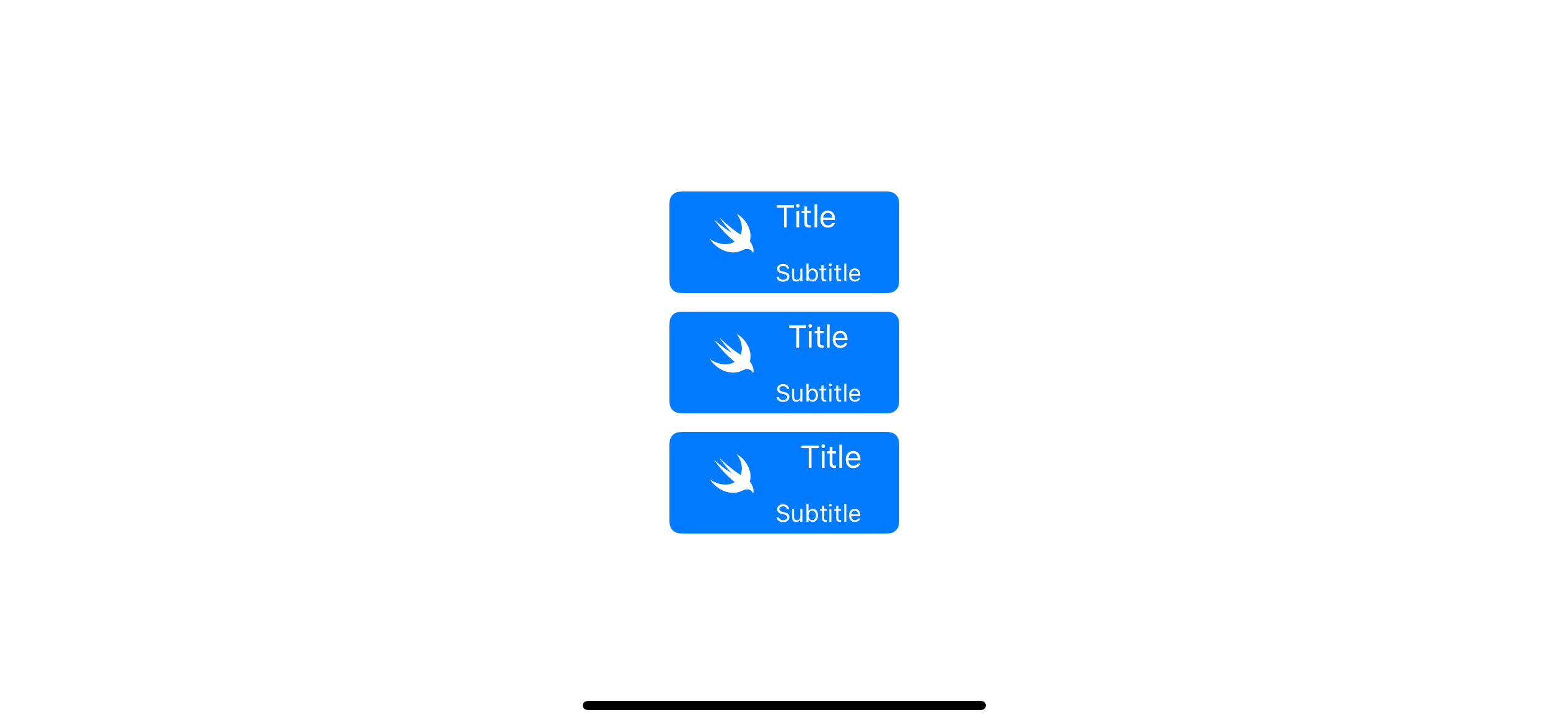
Image placement
Image content also has an imagePlacement property to control which edge the button places the image on.
configuration.imagePlacement = .leading
configuration.imagePlacement = .top
configuration.imagePlacement = .trailing
configuration.imagePlacement = .bottom
More customization
Like the old API, we also can set AttributedString for title and subtitle. For an SF Symbols image, we can use UIImage.SymbolConfiguration to controls its appearance.
Here is an example where we modify these three properties.
var configuration = UIButton.Configuration.filled()

var container = AttributeContainer()
container.font = UIFont.boldSystemFont(ofSize: 20)
// 1
configuration.attributedTitle = AttributedString("Title", attributes: container)

var container2 = AttributeContainer()
container2.foregroundColor = UIColor.white.withAlphaComponent(0.5)
// 2
configuration.attributedSubtitle = AttributedString("Subtitle", attributes: container2)

configuration.image = UIImage(systemName: "swift")
configuration.titleAlignment = .leading
// 3
configuration.preferredSymbolConfigurationForImage = UIImage.SymbolConfiguration(pointSize: 30)
configuration.imagePadding = 10

let button = UIButton(configuration: configuration, primaryAction: nil)

configuration.imagePlacement = .top
let button2 = UIButton(configuration: configuration, primaryAction: nil)

configuration.imagePlacement = .trailing
let button3 = UIButton(configuration: configuration, primaryAction: nil)

configuration.imagePlacement = .bottom
let button4 = UIButton(configuration: configuration, primaryAction: nil)
<1> We declare an AttributeContainer, a new container for attribute keys and values, and create AttributedString with that container.
<2> We do the same for subtitle, but with different attributes.
<3> We adjust our image with UIImage.SymbolConfiguration(pointSize: 30).
And this is what we got.
Appearance
Apart from the content, button configuration also provides a variety of properties to customize the button appearance.
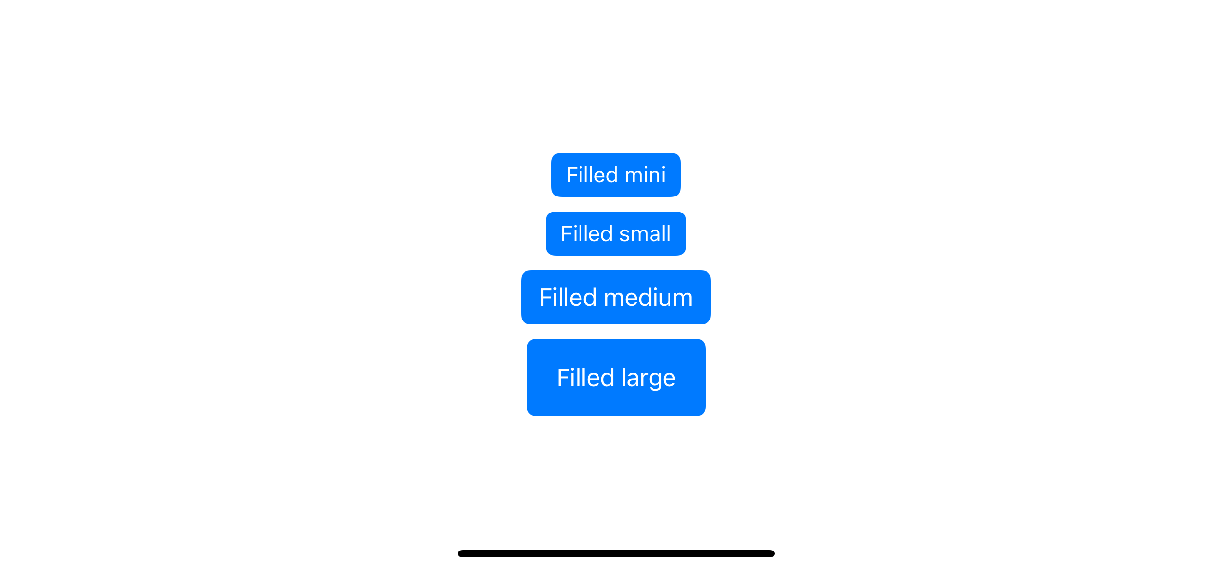
Button Size
We can set a button size from four predefine sizes.
UIButton.Configuration.Size.largeUIButton.Configuration.Size.mediumUIButton.Configuration.Size.smallUIButton.Configuration.Size.mini
configuration.buttonSize = .smallHere are buttons in different sizes.
Round Corner
You have two ways to set a corner radius with configuration.
background.cornerRadius: This is straightforward. You set a radius you want, just like how we do it with.layer.cornerRadius.
configuration.background.cornerRadius = 2cornerStyle: You don't specify an exact floating unit with this property, but rather telling a style / behavior that you want.
Apple offer four static predefine corner radius.
UIButton.Configuration.CornerStyle.capsuleUIButton.Configuration.CornerStyle.largeUIButton.Configuration.CornerStyle.mediumUIButton.Configuration.CornerStyle.small
These four styles will ignore what you define in configuration.background.cornerRadius and use a system-defined corner radius.
configuration.cornerStyle = .small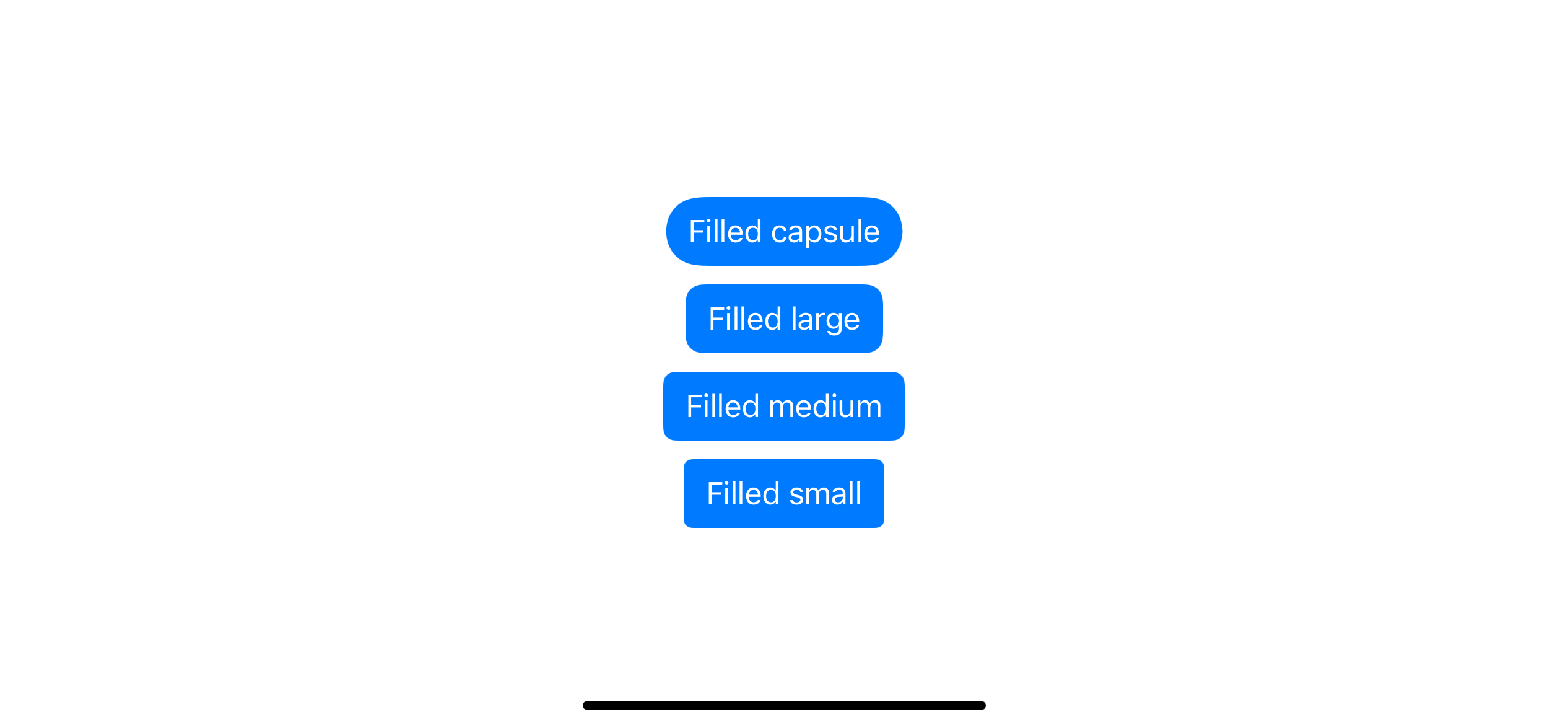
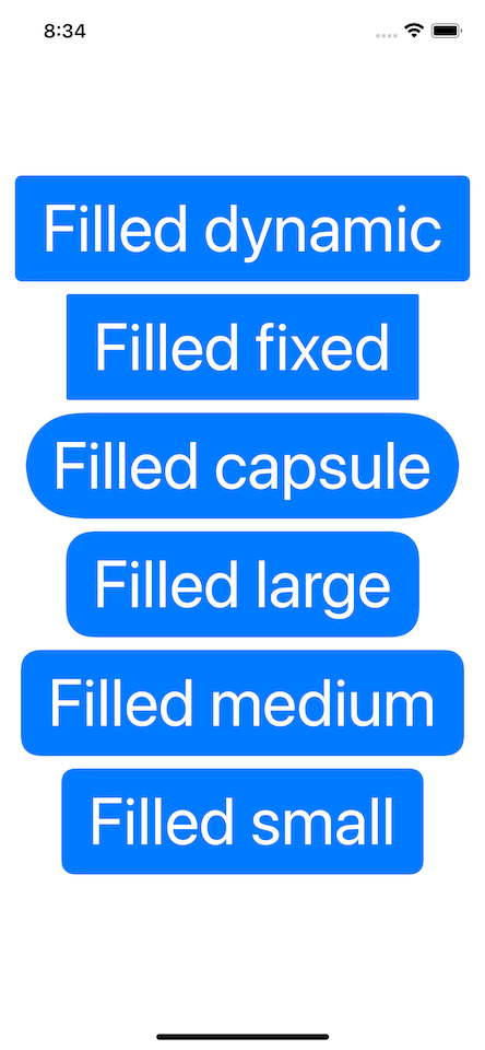
We also have another two dynamic corder radius style.
UIButton.Configuration.CornerStyle.fixed: This will use value inconfiguration.background.cornerRadiuswithout modification.UIButton.Configuration.CornerStyle.dynamic: This will use value inconfiguration.background.cornerRadiusand adjust it to match dynamic type. This is the default corner radius style.
The following showing buttons with configuration.background.cornerRadius = 2. Notice the dynamic style has rounder than the fixed style on XXXL size.
Base Background Color / Base Foreground Color
These two use to set button background color and its content.
var configuration = UIButton.Configuration.filled()
configuration.baseBackgroundColor = UIColor.systemIndigo // 1
configuration.baseForegroundColor = UIColor.systemPink // 2
<1> Set indigo as the base background color of the button.
<2> Set pink as the base foreground color.
The term "base" here means this color might not be the one applying to the button. The button configuration may transform the base color before applying it to background elements. As you can see in the plain and tinted configuration, which got a transparent background and opacity treatment, respectively.
You can easily support sarunw.com by checking out this sponsor.
AI Grammar: Correct grammar, spell check, check punctuation, and parphrase.
Conclusion
As you can see, this new API is really powerful and indeed make our life easier. Finally, we have a way to styling our UIButton as we do with SwiftUI.
This chapter teaches a basic building block of a new button system with a button configuration. But we only scratch its surface, as you might notice that it lacks the ability to adapt to button state changes and external changes func setTitle(_ title: String?, for state: UIControl.State). And I didn't talk about a transformer function that affects baseBackgorundColor and baseForegroundColor yet.
In the next part of the series, we will check out those moving parts, making button styling more dynamic.
Read more article about iOS 15, UIKit, Button, or see all available topic
Enjoy the read?
If you enjoy this article, you can subscribe to the weekly newsletter.
Every Friday, you'll get a quick recap of all articles and tips posted on this site. No strings attached. Unsubscribe anytime.
Feel free to follow me on Twitter and ask your questions related to this post. Thanks for reading and see you next time.
If you enjoy my writing, please check out my Patreon https://www.patreon.com/sarunw and become my supporter. Sharing the article is also greatly appreciated.
Become a patron Buy me a coffee Tweet ShareHow to use a pre-release Swift version in Xcode
Each Xcode version comes with a specific Swift toolchain, but you don't have to wait for a new Xcode version to try the new Swift features. Let's see how we can switch between different Swift toolchains in Xcode.
How to use a pre-release Swift version with command-line tools
Each Xcode version comes with a specific Swift toolchain. If you want to prepare your app for a new feature and make it work with CI, you want to make your tools, e.g., Fastlane and xcodebuild know about the new toolchain. Let's see how we can switch between different Swift toolchains with command-line tools.