Variable Color in SF Symbols 4
Table of Contents
SF Symbols was introduced in WWDC 2019 (iOS 13) as an icon that works with SF Font, i.e., iOS System Font.
It was designed to work side by side with SF Font.
In WWDC 2020, SF Symbols 2 bring a new set of icons and a new multicolor rendering mode to SF Symbols.
WWDC 2021, SF Symbols 3 brings two new rendering modes, Hierarchical and Palette.
This year in WWDC 2022, we got a new Variable Color. A way to change symbols' appearance based on assigned value.
What's Variable Color.
Variable Color is a new feature of SF Symbols that allows you to change the appearance of a symbol based on a percentage value.
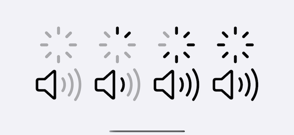
This is beneficial to some symbols that can show a sense of progress, e.g., wifi signal, speaker loudness.
You can easily support sarunw.com by checking out this sponsor.
Offline Transcription: Fast, privacy-focus way to transcribe audio, video, and podcast files. No data leaves your Mac.
How to use Variable Color
We can set the value for symbols with the new initializer, init(systemName:variableValue:).
This new initializer accepts variableValue.
// SwiftUI
Image(systemName: "wifi", variableValue: 0.5)

// UIKit
UIImage(systemName: "wifi", variableValue: 0.5)
Change over time
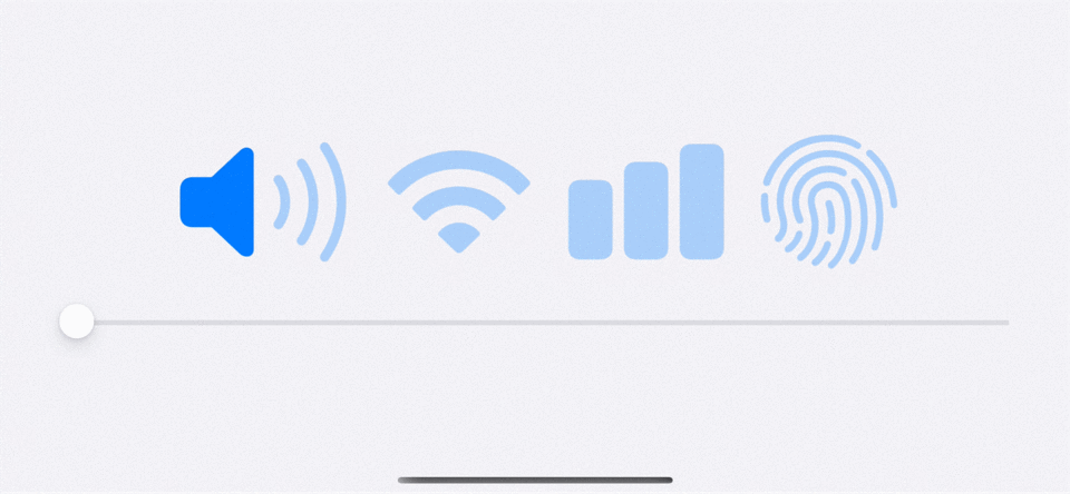
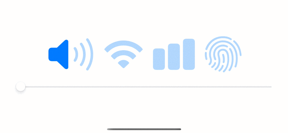
We can change this value over time, and the symbol's appearance would reflect those changes.
We use a slider to control the variable value in the following example.
struct SFSymbolsExample: View {
    // 1
    @State var progress: Double = 0

    var body: some View {
        VStack {
            Grid {
                GridRow {
                    // 3
                    Image(systemName: "speaker.wave.3.fill", variableValue: progress)
                    Image(systemName: "wifi", variableValue: progress)
                    Image(systemName: "chart.bar.fill", variableValue: progress)
                    Image(systemName: "touchid", variableValue: progress)
                }
            }
            // 2
            Slider(value: $progress, in: 0...1)
        }
        .foregroundStyle(.blue)
        .font(.system(size: 100))
    }
}
1 We set a new variable to hold value from 0 to 1.
2 We use a slider to control this value.
3 Then, we use the value to control the appearance of symbols.
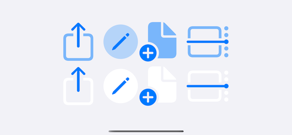
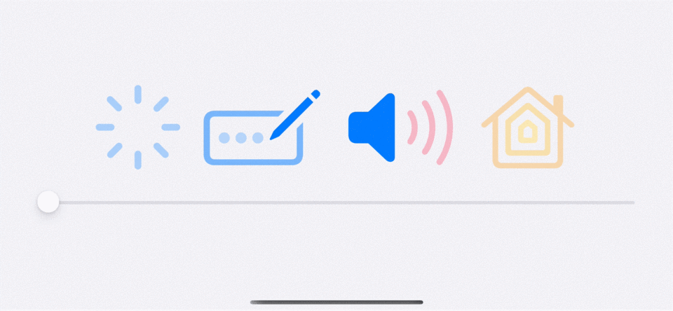
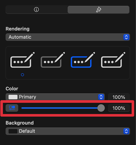
Supported all rendering mode
The part that confuse me at first is the name, Variable Color.
Even though the name contains the word Color, it has nothing to do with color.
Variable color can happen on all rendering modes. The color part that change is to show the progress.
Here is an example of variable color with different rendering mode,
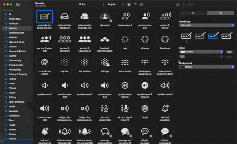
Which symbols support Variable Color
Not all symbols support variable color. The easier way to find out which one supports and test how the change looks is via the new SF Symbols app.
You can browse symbols that support variable color by selecting "Variable" category from the left panel. This will show all symbols that support variable color.
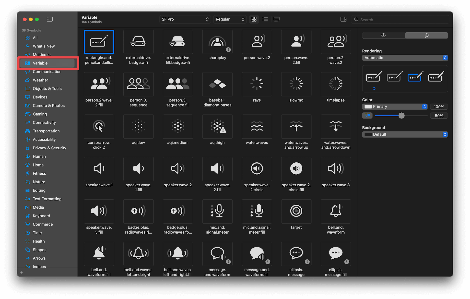
Then you can test out how they react to value change by clicking the "Activate variable color" button, then adjust the slider to see the changes.
You can easily support sarunw.com by checking out this sponsor.
Offline Transcription: Fast, privacy-focus way to transcribe audio, video, and podcast files. No data leaves your Mac.
Conclusion
I think Variable Color is a nice improvement. It allows symbols to communicate more information and visual clue with a very easy and intuitive interface.
The best part is that we don't have to change symbols based on the value manually.
In the past, Apple needs to provide different symbols for each value, and we have to switch them manually.
Here is an example of five battery symbols representing each state of value.
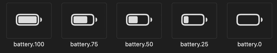
With Variable color, Apple doesn't need to come up with different symbols, and we don't need to manage this ourselves.
Read more article about SwiftUI, SF Symbols, WWDC22, iOS 16, or see all available topic
Enjoy the read?
If you enjoy this article, you can subscribe to the weekly newsletter.
Every Friday, you'll get a quick recap of all articles and tips posted on this site. No strings attached. Unsubscribe anytime.
Feel free to follow me on Twitter and ask your questions related to this post. Thanks for reading and see you next time.
If you enjoy my writing, please check out my Patreon https://www.patreon.com/sarunw and become my supporter. Sharing the article is also greatly appreciated.
Become a patron Buy me a coffee Tweet ShareHide keyboard when scrolling in SwiftUI with scrollDismissesKeyboard
In iOS, we have dedicated built-in ways to dismiss the keyboard in scrollable content. Let's learn how to set that in SwiftUI.
Move the most recent commits to a new branch with git
Sometimes I forget to create a new branch for a new feature and commit changes directly to the develop branch. Let's learn one way to correct this mistake in git.