How to change a navigation bar color in SwiftUI on iOS 16
Table of Contents
In iOS 16, SwiftUI got a way to change the navigation bar color with the new modifier, .toolbarBackground
Basic usage
To change a navigation bar color in SwiftUI, you apply toolbarBackground modifier to the content view of NavigationStack.
toolbarBackground accepts two parameters.
ShapeStyle: The style to display as the background of the bar.ToolbarPlacement: The bars to place the style in. Since we want to change the color for a navigation bar, we will set this to.navigationBar. Leaving this field empty will default to.automatic[1].
In this example, we set the navigation bar background color to pink.
struct ContentView: View {
    var body: some View {
        NavigationStack {
            List {
                Text("Hello, SwiftUI!")
            }
            .navigationTitle("Navigation Title")
            .toolbarBackground(
                // 1
                Color.pink,
                // 2
                for: .navigationBar)
        }
    }
}
1 Color is one of the shape styles, so we can use it as an argument.
2 We set .navigationBar for ToolbarPlacement to apply background color to the navigation bar.
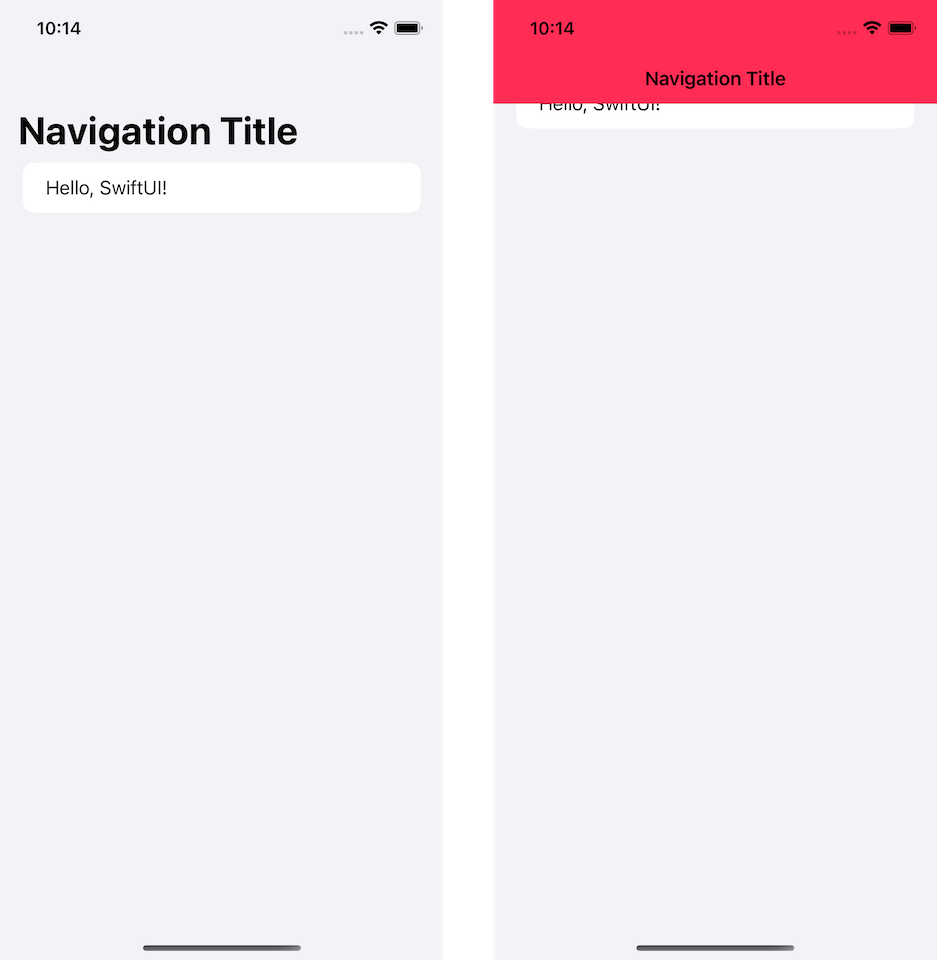
By default, the system background color will show/hide automatically based on the appearance of the content of a navigation view, e.g., List or ScrollView.
As you can see, for the .insetGrouped list style, the background of a navigation bar becomes invisible in an initial state.
Once we move the content up, the navigation bar becomes visible and shows the color that we set (pink).
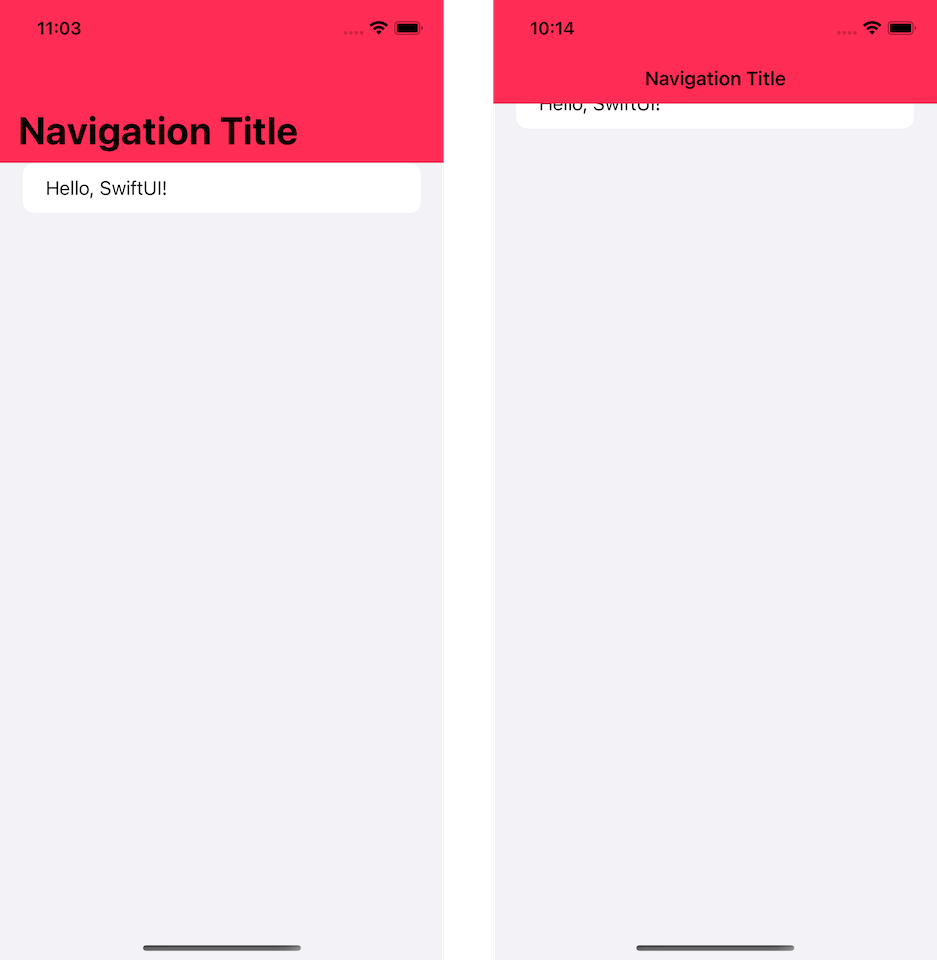
We can override this behavior with another variation of .toolbarBackground, which accepts Visibility parameter.
You can easily support sarunw.com by checking out this sponsor.
Offline Transcription: Fast, privacy-focus way to transcribe audio, video, and podcast files. No data leaves your Mac.
Control background visibility
To control background color visibility, we use another variation of .toolbarBackground modifier, which accepts Visibility instead of ShapeStyle.
Visibility controls the preferred visibility of the bar's background.
In this example, we force navigation bar color to always visible by set Visibility to .visible, .toolbarBackground(.visible, for: .navigationBar).
struct ContentView: View {
    var body: some View {
        NavigationStack {
            List {
                Text("Hello, SwiftUI!")
            }
            .navigationTitle("Navigation Title")
            .toolbarBackground(
                Color.pink,
                for: .navigationBar)
            .toolbarBackground(.visible, for: .navigationBar)
        }
    }
}
With this change, the navigation bar background color will always be present.
Control title and status bar color
By default, a navigation title and status bar color will change according to the device's color scheme.
This might be a problem if you use a custom background color because it might not work well with black and white text.
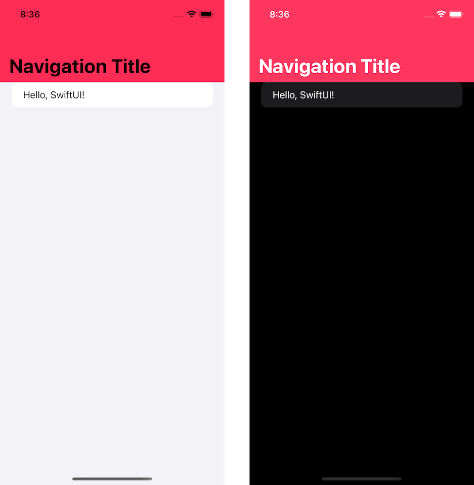
Not all colors work with both black and white color. It makes more sense to set the text color to the one that matched your bar's background color.
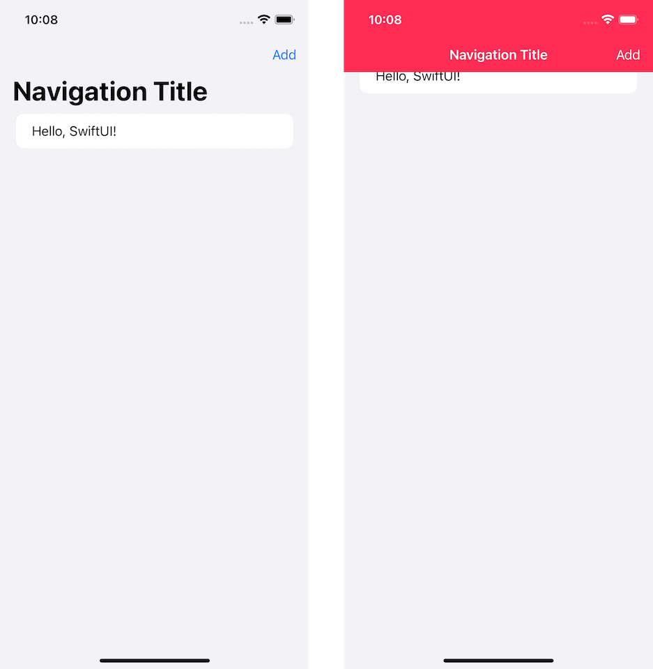
To change color for text in a navigation bar, we use the new modifier, .toolbarColorScheme. We specify the color scheme of the navigation bar's background color in .toolbarColorScheme.
I specified .dark, which turns all text in the navigation bar white in the following example.
struct ContentView: View {
    var body: some View {
        NavigationStack {
            List {
                Text("Hello, SwiftUI!")
            }
            .navigationTitle("Navigation Title")
            .toolbar {
                Button("Add") {}
            }
            .toolbarColorScheme(.dark, for: .navigationBar)
            .toolbarBackground(
                Color.pink,
                for: .navigationBar)
            .toolbarBackground(.visible, for: .navigationBar)
        }
    }
}
Both title, status bar, and button (if you have one) will adapt to this change.
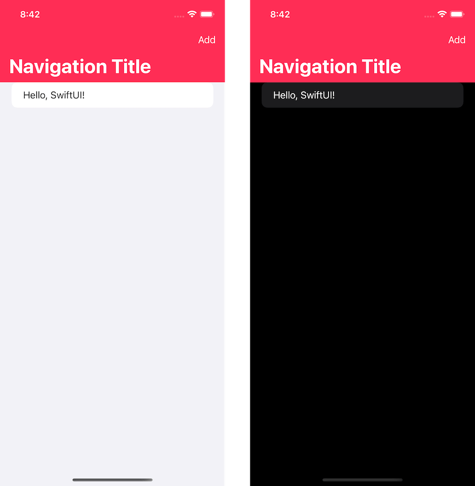
The color scheme will apply only when the background is shown.
So if you don't set .toolbarBackground(.visible, for: .navigationBar), this is the result you will get.
You can easily support sarunw.com by checking out this sponsor.
Offline Transcription: Fast, privacy-focus way to transcribe audio, video, and podcast files. No data leaves your Mac.
Conclusion
A navigation bar is an essential part of iOS apps. It is a part where we usually apply color to match our branding.
This change makes it easier to customize a navigation bar in SwiftUI without returning to UIKit.
The APIs are still limited, but they should cover basic use cases.
Depending on the context, this may refer to the navigation bar of an app on iOS, or watchOS, the tab bar of an app on tvOS, or the window toolbar of an app on macOS https://developer.apple.com/documentation/swiftui/toolbarplacement/automatic. ↩︎
Read more article about SwiftUI, WWDC22, iOS 16, Navigation Bar, or see all available topic
Enjoy the read?
If you enjoy this article, you can subscribe to the weekly newsletter.
Every Friday, you'll get a quick recap of all articles and tips posted on this site. No strings attached. Unsubscribe anytime.
Feel free to follow me on Twitter and ask your questions related to this post. Thanks for reading and see you next time.
If you enjoy my writing, please check out my Patreon https://www.patreon.com/sarunw and become my supporter. Sharing the article is also greatly appreciated.
Become a patron Buy me a coffee Tweet ShareImprove numbers readability with underscores
A tip to prevent error and improve readability when dealing with numbers.
What is the fixedSize modifier in SwiftUI
When you read SwiftUI tutorials, you might stumble on the fixedSize() modifier. Let's see what it is and why we need it.