SwiftUI basic Shape operations
Table of Contents
Most complex custom views can be made by composing many basic shapes together. Today we will learn basic operations that we can do with them. It may seem trivial, but knowing these basics will benefit you in the future.
I will use Rectangle as an example here, but most operations can be applied to other Shapes.
Let's start with default setting.
Rectangle()
A rectangular shape aligned inside the frame of the view containing it. This is the whole space in this case.
.fill
Fill expects ShapeStyle, which is the thing that will be painted (fill) to the shape. It can be gradients (AngularGradient, LinearGradient), or solid colors (Color). In the following example, we will use Color.
Rectangle()
    .fill(Color.pink)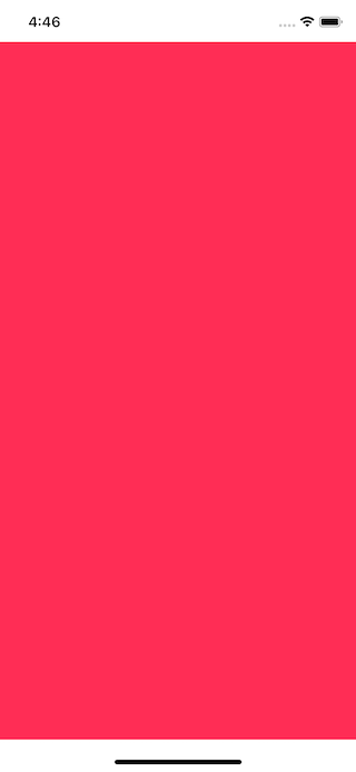
You can easily support sarunw.com by checking out this sponsor.
Offline Transcription: Fast, privacy-focus way to transcribe audio, video, and podcast files. No data leaves your Mac.
.inset
Inset shapes by a specified amount.
Rectangle()
    .inset(by: 10)
    .fill(Color.pink)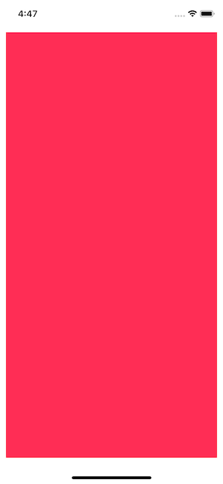
.offset
Offset changes the relative position of this shape using the specified size.
Rectangle()
    .offset(x: 100, y: 100)
    .fill(Color.pink)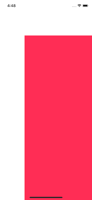
.rotation
Rotates the shape around an anchor point at the angle you specify.
Before testing out the rotation, let change the fill color, so it more obvious when a circle rotates.
Rectangle()
    .fill(LinearGradient(gradient: Gradient(colors: [.pink, .black]), startPoint: .top, endPoint: .bottom))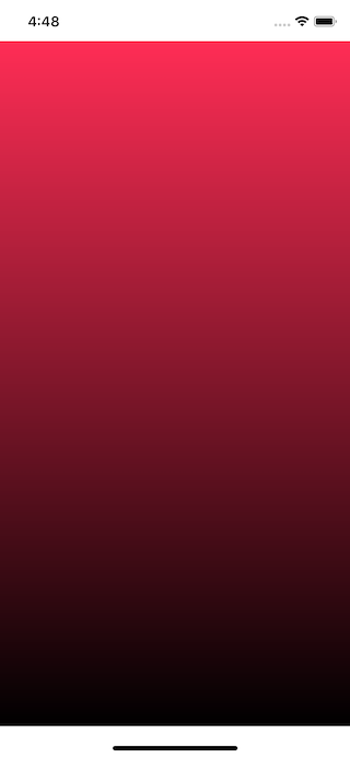
Now we know which is the top, which is the bottom. Let's begin the rotation.
Rectangle()
    .rotation(.degrees(90))
    .fill(LinearGradient(gradient: Gradient(colors: [.pink, .black]), startPoint: .top, endPoint: .bottom))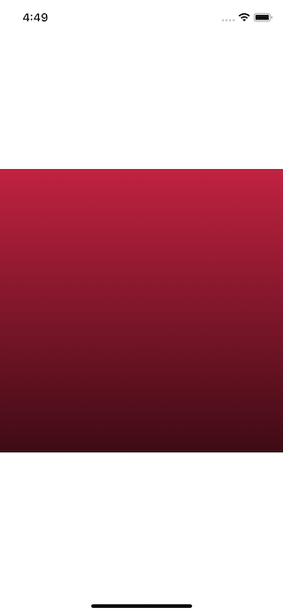
Notice the rotation only affect the shape itself, not the color. The color still rendered based on the original frame. You won't see bright pink and black since it still places at the very top and bottom.
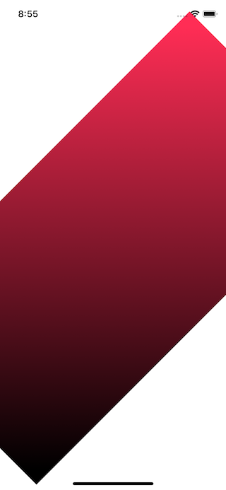
One more example, you can see the gradient isn't rotated and still align vertically, not 45 degrees.
.scale
Scale a shape up (> 1) or down (< 1) based you specify scale factor.
Rectangle()
    .scale(0.5)
    .fill(Color.pink)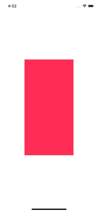
.stroke
Stroke traces the outline of the shape with a color or gradient. There are many variations, but basically, you can set color and stroke style like line width, line cap, line join, miter, and dash.
Simple stroke.
Rectangle()
    .stroke(Color.pink)
    .frame(width: 100, height: 100)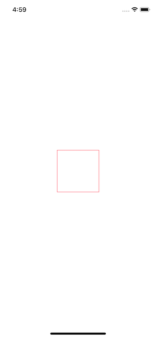
Stroke with adjusted line width.
Rectangle()
    .stroke(Color.pink, lineWidth: 5)
    .frame(width: 100, height: 100)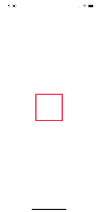
For more sophisticated, you can set it with StrokeStyle.
Rectangle()
    .stroke(Color.pink, style: StrokeStyle(lineWidth: 20, lineCap: .round, lineJoin: .round))
    .frame(width: 100, height: 100)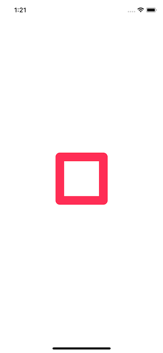
.strokeBorder
The stroke border description is very confusing. Following is the description from Apple, see it by yourself.
Returns a view that is the result of insetting
selfbystyle.lineWidth / 2, stroking the resulting shape withstyle, and then filling withcontent.
In brief, it is another way to draw a stroke. With .stroke, the stroke will be drawn with a view's border as a center of stroke width. With .strokeBorder, the stroke will be drawn within a view's border.
It is easier to see it in action.
Rectangle()
    .stroke(Color.pink, lineWidth: 20)
    .frame(width: 100, height: 100)
    .border(Color.blue)

Rectangle()
    .stroke(Color.pink, lineWidth: 1)
    .frame(width: 100, height: 100)
    .border(Color.blue)


Rectangle()
    .strokeBorder(Color.pink, lineWidth: 20, antialiased: true)
    .frame(width: 100, height: 100)
    .border(Color.blue)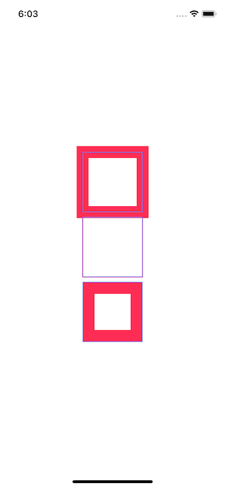
.trim
Trim is a way to draw a fractional amount of a shape based on the startFraction and endFraction.
I set startFraction to 0 to draw it from the very beginning of the path and set endFraction from 0 to 1, so you can see how the trim function work. I find it easier to understand this way.
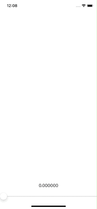
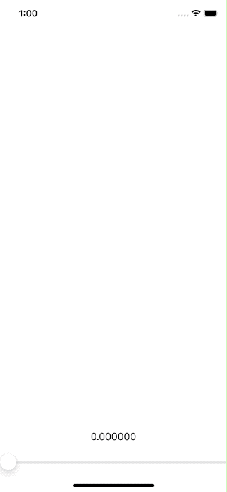
I create a @State variable and Slider to adjust the fraction.
struct ContentView: View {
    @State private var progress: CGFloat = 0

    var body: some View {
        VStack {
            Spacer()
        Rectangle()
            .trim(from: 0, to: progress)
            .stroke(Color.pink)
            .frame(width: 200, height: 200)

            Rectangle()
            .trim(from: 0, to: progress)
            .stroke(Color.pink)
            .frame(width: 200, height: 100)

            Spacer()
            Text("\(progress)")
            Slider(value: $progress)
        }
    }
}
As you can see, the fraction is a portion of the path that gets drawn. When it reaches 1, all paths have been drawn, and the shape complete.
Let's run the same code, but this time we change .stroke to .fill.
struct ContentView: View {
    @State private var progress: CGFloat = 0

    var body: some View {
        VStack {
            Spacer()
        Rectangle()
            .trim(from: 0, to: progress)
            .fill(Color.pink)
            .frame(width: 200, height: 200)

            Rectangle()
            .trim(from: 0, to: progress)
            .fill(Color.pink)
            .frame(width: 200, height: 100)

            Spacer()
            Text("\(progress)")
            Slider(value: $progress)
        }
    }
}
You can notice the first Rectangle, which is square won't have a fill until fraction is more than 0.25 since at 0-0.25 the path is just a straight line, and you can't see the fill on the line.
You can easily support sarunw.com by checking out this sponsor.
Offline Transcription: Fast, privacy-focus way to transcribe audio, video, and podcast files. No data leaves your Mac.
Bonus: Stroke and fill
One of the most common cases when using shapes is changing stroke and fill color. Unfortunately, it isn't as easy as you might think. The following code won't work.
Rectangle()
    .fill(Color.pink)
    .stroke(Color.blue)
That's because of both .fill and .stroke return View, but both of them are instance method of Shape.
To make this happen, we use ZStack or .overlay.
ZStack {
    Rectangle()
        .fill(Color.pink)
        .frame(width: 100, height: 100)
    Rectangle()
        .stroke(Color.blue)
        .frame(width: 100, height: 100)
}Rectangle()
.fill(Color.pink)
.frame(width: 100, height: 100)
.overlay(
Rectangle()
.stroke(Color.blue)
)
Read more article about SwiftUI or see all available topic
Enjoy the read?
If you enjoy this article, you can subscribe to the weekly newsletter.
Every Friday, you'll get a quick recap of all articles and tips posted on this site. No strings attached. Unsubscribe anytime.
Feel free to follow me on Twitter and ask your questions related to this post. Thanks for reading and see you next time.
If you enjoy my writing, please check out my Patreon https://www.patreon.com/sarunw and become my supporter. Sharing the article is also greatly appreciated.
Become a patron Buy me a coffee Tweet ShareGradient in SwiftUI
SwiftUI has built-in ways to apply gradient color to its view. We are going to explore all three types of gradients provided, LinearGradient, RadialGradient, and AngularGradient.