How to add background to your view in SwiftUI
Table of Contents
A background is anything that sits behind your content view. It can be anything such as color, image, or another view. In UIKit, we have to manually create a background view and make sure it sits at the back.
let backgroundImage = UIImageView(image: UIImage(named: "foo"))
view.addSubview(backgroundImage) // 1
// or
view.insertSubview(backgroundImage, at: 0) // 2
<1> Add your background view first to make it sit in the back or <2> Explicitly add them at the button (index 0).
In SwiftUI, you can add a view as a background wtih the background(_:alignment:) view modifier.
In this article, I will go through all of the behaviors of background(_:alignment:) that you should know. In the end, you should be able to add any background to your view comfortably.
background modifier
background(_:alignment:) modifier has a simple interface that accepts a background view as a parameter. I will use color as a background for most of my examples for simplicity.
func background
(_ background: Background, alignment: Alignment = .center) -> some View where Background : View
You can easily support sarunw.com by checking out this sponsor.
Screenshot Studio: Create App Store screenshots in seconds not minutes.
Position
The background modifier will put the background view underneath the view that is modified.
Size
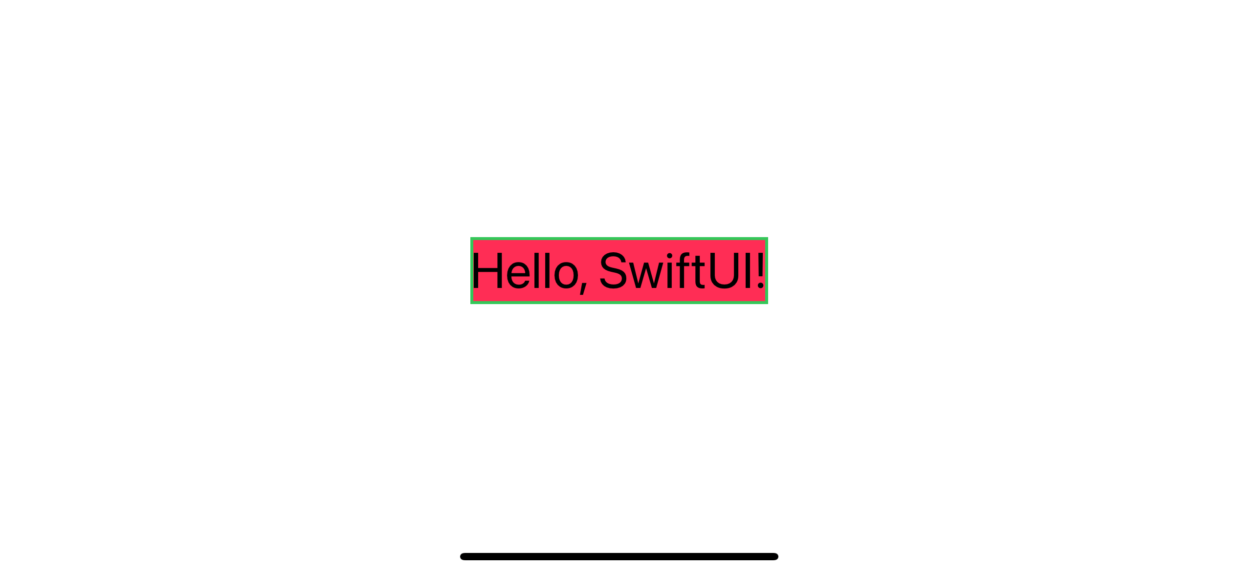
The background view got available space equals the view that got modified.
In this example, we use a color view as a background for our text view. The color view takes up the whole space it offered, which equals the text view frame. I also add a border for you to visualize the frame easily.
struct ContentView: View {
    var body: some View {
        Text("Hello, SwiftUI!")
            .font(.largeTitle)
            .background(
                Color.pink
            )
            .border(Color.green, width: 2)
    }
}
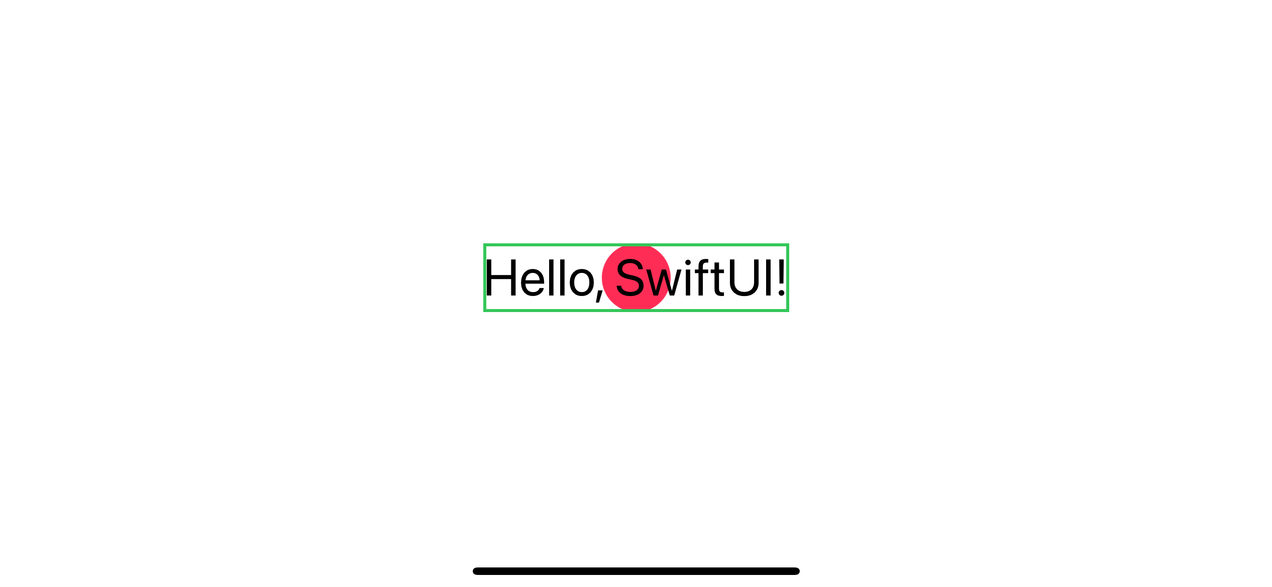
Here is another example, this time, we use Circle as a background.
struct ContentView: View {
    var body: some View {
        Text("Hello, SwiftUI!")
            .font(.largeTitle)
            .background(
                Circle()
                    .fill(Color.pink)
            )
            .border(Color.green, width: 2)
    }
}
Order
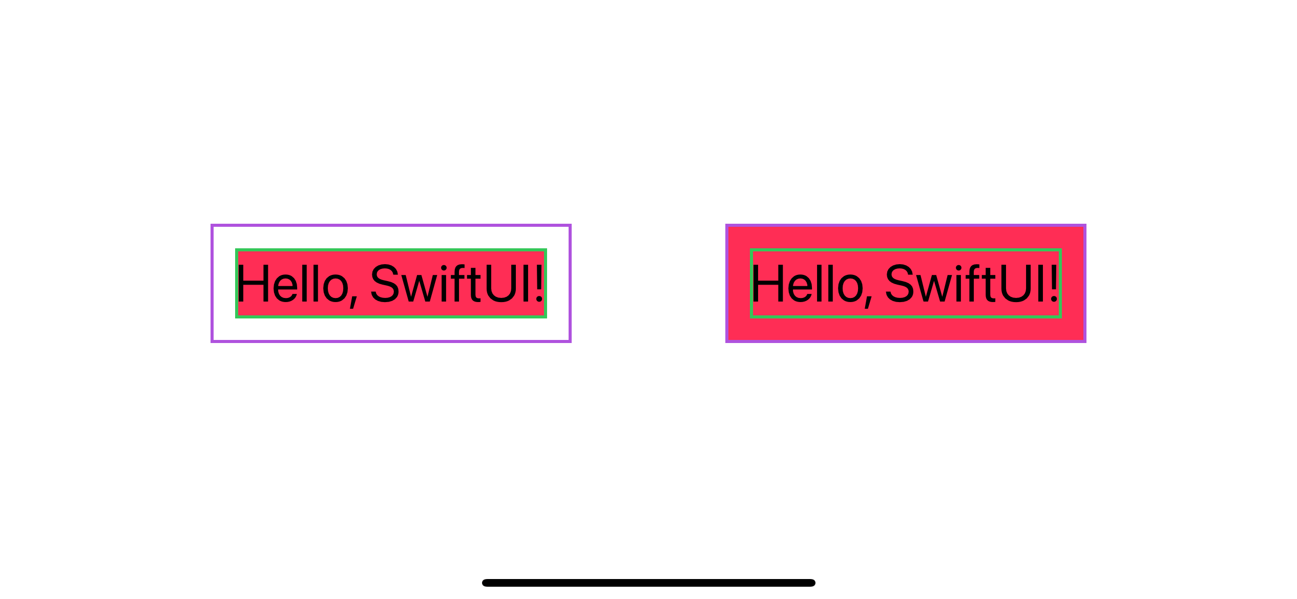
Since the background view's size depends on the view that the background modifier modified, the order really matters.
The following example show you two views. One with a background modifed the text view, and one with a background modified padding view.
struct ContentView: View {
    var body: some View {
        HStack(spacing: 100) {
            Text("Hello, SwiftUI!")
                .font(.largeTitle)
                .background( // 1
                    Color.pink
                )
                .border(Color.green, width: 2)
                .padding()
                .border(Color.purple, width: 2)
            Text("Hello, SwiftUI!")
                .font(.largeTitle)
                .border(Color.green, width: 2)
                .padding()
                .background( // 2
                    Color.pink
                )
                .border(Color.purple, width: 2)
        }
    }
}
<1> .background modified text view.
<2> .background modified padding.
As you can see, two background views get a different space to paint its color.
Safe Areas
By default, SwiftUI sizes and positions views to avoid system-defined safe areas to ensure that system content or the device's edges won’t obstruct your views. This is where things got a little bit tricky. The background view can have a separate ignore safe area behavior from the content view. You can override the safe area avoiding behavior by using the ignoresSafeArea(_:edges:) modifier on the background view.
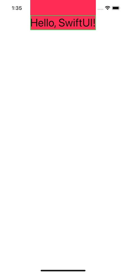
In this example, we have VStack with a spacer that push text view to the very top which layout itself along the safe area. We can make the background view extend beyond the safe area by use ignoresSafeArea on the background view (Color.pink).
struct ContentView: View {
    var body: some View {
        VStack {
            Text("Hello, SwiftUI!")
                .font(.largeTitle)
                .background(
                    Color.pink.ignoresSafeArea() // 1
                )
                .border(Color.green, width: 2)
            Spacer()
        }
    }
}
<1> Use ignoresSafeArea on the background view.
The text view still renders in the safe area, while the background view extends beyond that.
Complex background view
Until this point, we only use a color view as a background, but it can be any view, as I mentioned before.
Image View
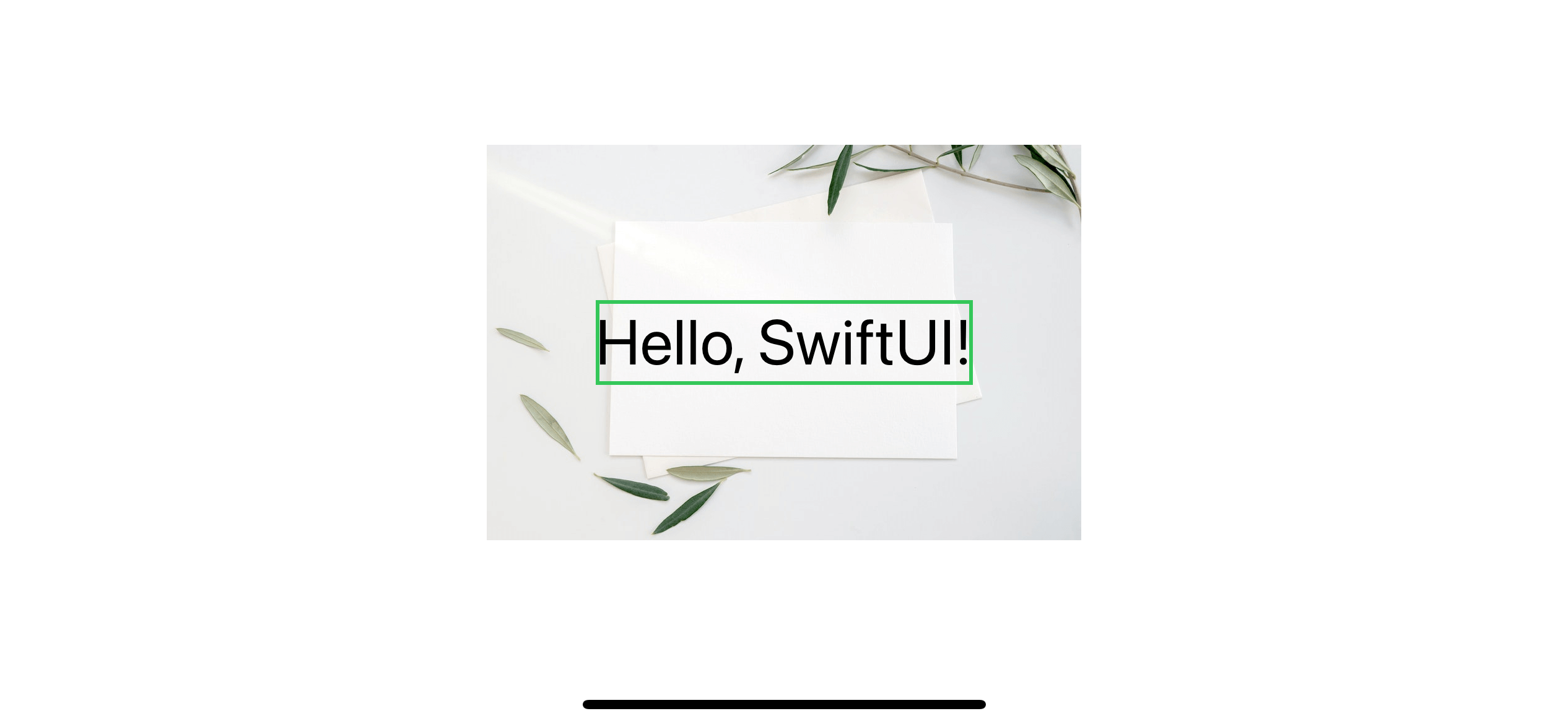
In this example, we use an image view as a background[1].
struct ContentView: View {
    var body: some View {

        Text("Hello, SwiftUI!")
            .font(.largeTitle)
            .border(Color.green, width: 2)
            .background(
                Image("paper")
            )
    }
}
The result might not be the one you expected. Even though the background gets the available space from the modified view, it is up to the view itself to render it content in that space or not. The default behavior of Image is to render the content in its true size.
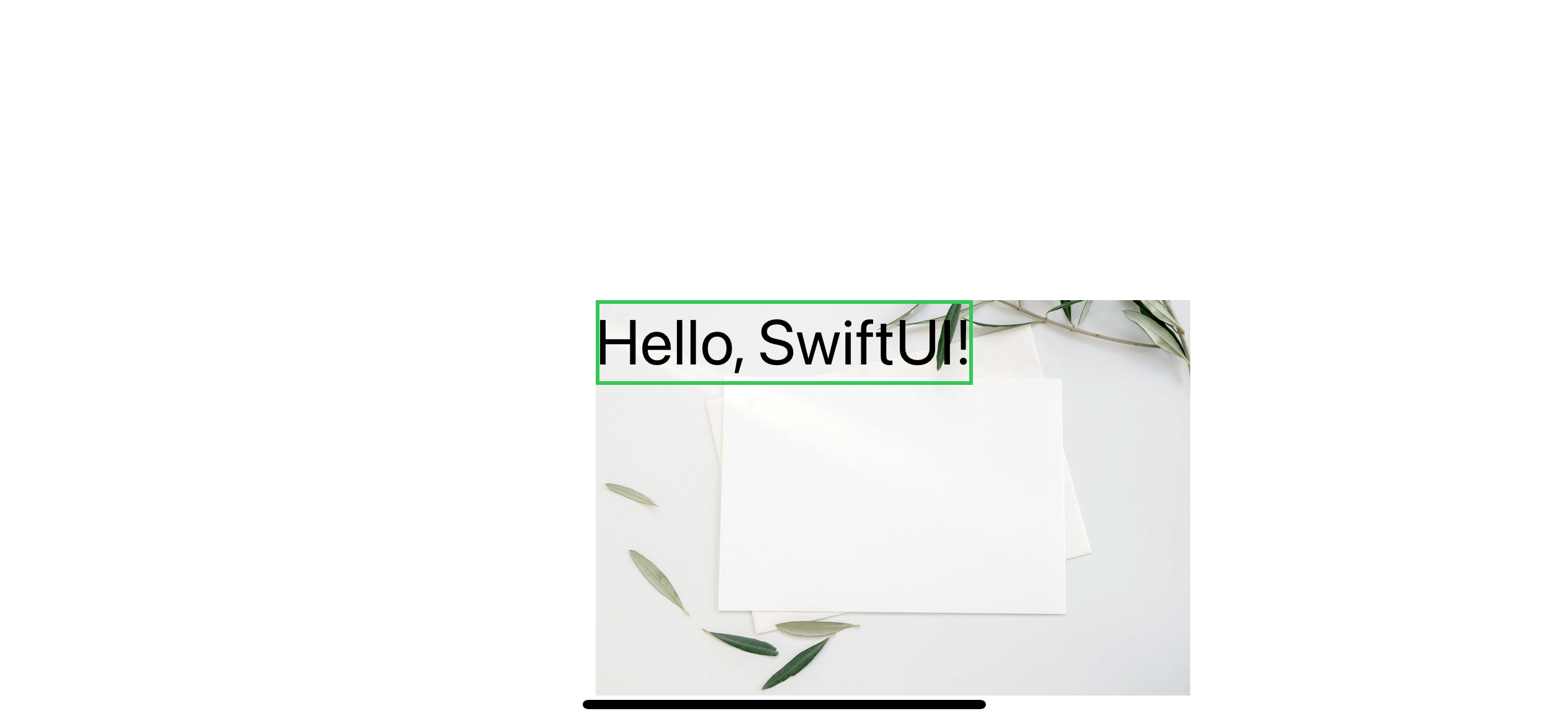
You can use the second parameter of background to align this kind of content—the following example positions the background view to top leading.
ruct ContentView: View {
    var body: some View {

        Text("Hello, SwiftUI!")
            .font(.largeTitle)
            .border(Color.green, width: 2)
            .background(
                Image("paper"),
                alignment: .topLeading
            )
    }
}
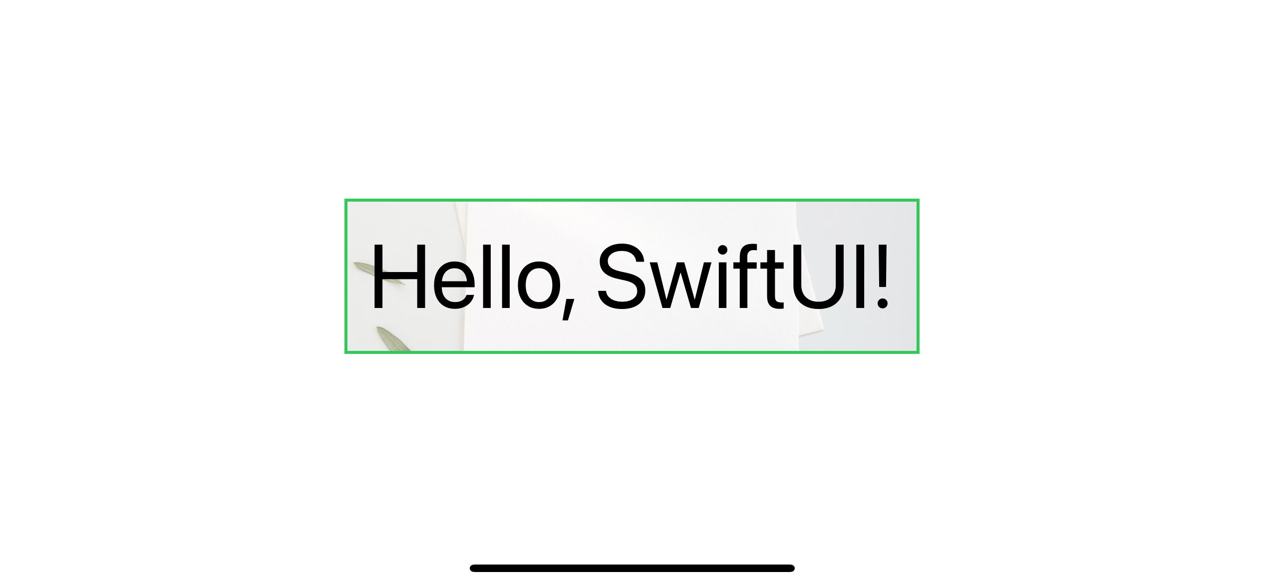
You can scale them or position them just like you do outside the background modifier.
We make our background image view resizeable with aspect fill to the text view.
struct ContentView: View {
    var body: some View {

        Text("Hello, SwiftUI!")
            .font(.system(size: 60))
            .padding()
            .border(Color.green, width: 2)
            .background(
                Image("paper")
                    .resizable()
                    .aspectRatio(contentMode: .fill)
            ).clipped()
    }
}
Custom view
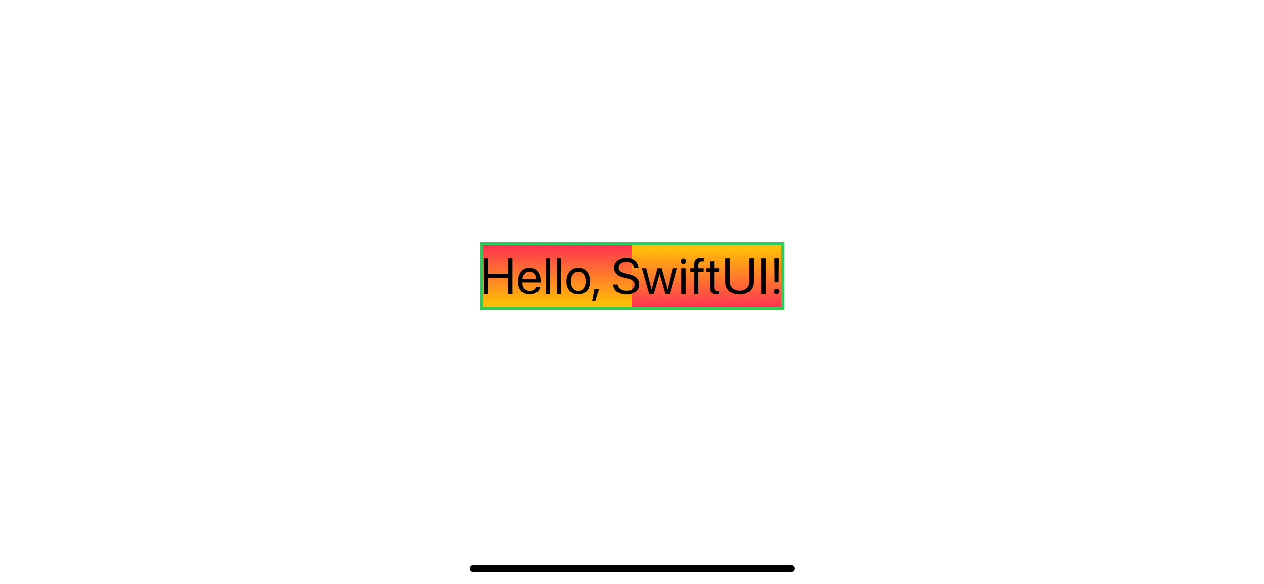
In this example, I create a background view from an HStack view with two gradient views.
let backgroundGradient = LinearGradient(
    gradient: Gradient(colors: [Color.pink, Color.yellow]),
    startPoint: .top, endPoint: .bottom)

let invertBackgroundGradient = LinearGradient(
    gradient: Gradient(colors: [Color.pink, Color.yellow]),
    startPoint: .bottom, endPoint: .top)

struct BackgroundView: View {
    var body: some View {
        HStack(spacing: 0) {
            backgroundGradient
            invertBackgroundGradient
        }
    }
}

struct ContentView: View {
    var body: some View {
        Text("Hello, SwiftUI!")
            .font(.largeTitle)
            .border(Color.green, width: 2)
            .background(
                BackgroundView()
            )
    }
}
You can easily support sarunw.com by checking out this sponsor.

Screenshot Studio: Create App Store screenshots in seconds not minutes.
Conclusion
background is a modifier that puts any view behind the content view, which is how to add a background view in SwiftUI. Typically, you can treat the background view as a normal view with a few different behaviors you already learned in this article.
Photo by Elena Joland on Unsplash. ↩︎
Read more article about SwiftUI, Background, or see all available topic
Enjoy the read?
If you enjoy this article, you can subscribe to the weekly newsletter.
Every Friday, you'll get a quick recap of all articles and tips posted on this site. No strings attached. Unsubscribe anytime.
Feel free to follow me on Twitter and ask your questions related to this post. Thanks for reading and see you next time.
If you enjoy my writing, please check out my Patreon https://www.patreon.com/sarunw and become my supporter. Sharing the article is also greatly appreciated.
Become a patron Buy me a coffee Tweet ShareHow to preview a device in landscape orientation with SwiftUI Previews
SwiftUI doesn't have a built-in way to preview for a device in landscape orientation at the moment, but we can simulate that with a few modifiers.
Replicate 12 UIKit's contentMode options in SwiftUI
In UIKit, we have various ways to control an image's position and behavior in UIImageView with a help contentMode property. In SwiftUI, we only have fit and fill content mode. Let's see how we can replicate the rest.