Divider in SwiftUI - Everything you need to know
Table of Contents
SwiftUI Divider
SwiftUI Divider is a view that is used to separate content. SwiftUI presents this as a thin gray line that can be either horizontal or vertical.
You usually use this when you want to separate related content into a more functional group.
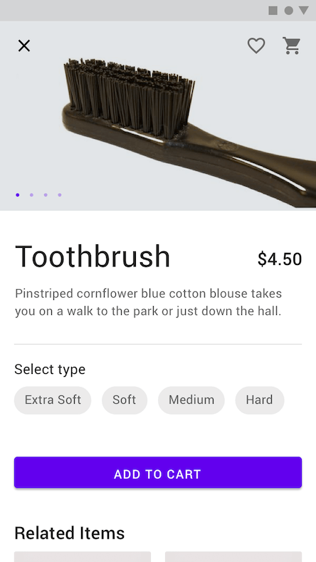
Here is an example of using a divider to separate product detail from type selection.
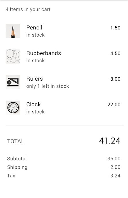
Here is another example where a divider is used to separate cart items and their total pricing details.
SwiftUI Divider is quite limited in options at first glance. But you can customize it with modifiers that SwiftUI provided.
Let's explore its limitation and capability.
You can easily support sarunw.com by checking out this sponsor.

Localization Buddy: Easiest way to localize and update App Store metadata.
SwiftUI Divider Direction
SwiftUI Divider does a great job adapting to the content direction that you want to separate.
When it used in a stack, the divider extends across the minor axis of the stack.
VStack
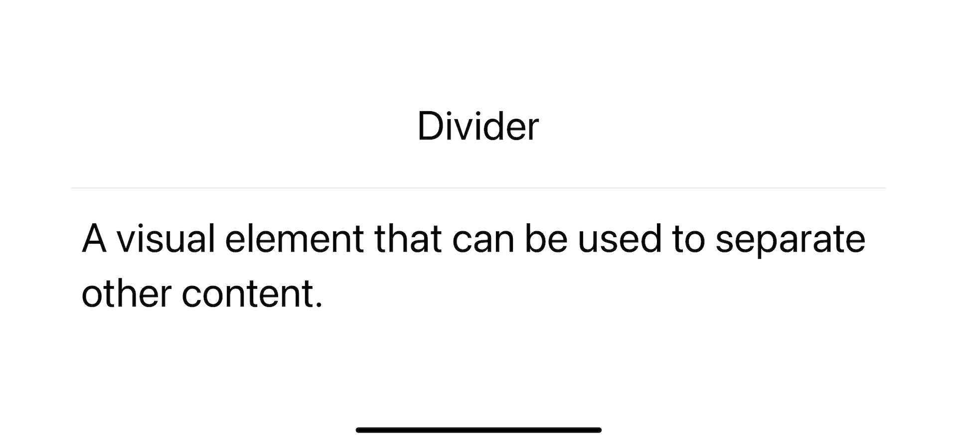
For a vertical stack, a divider extends on the horizontal axis.
struct ContentView: View {
    var body: some View {
        VStack {
            Text("Divider")
            Divider()
            Text("A visual element that can be used to separate other content.")
        }
        .font(.largeTitle)
        .padding()
    }
}
HStack
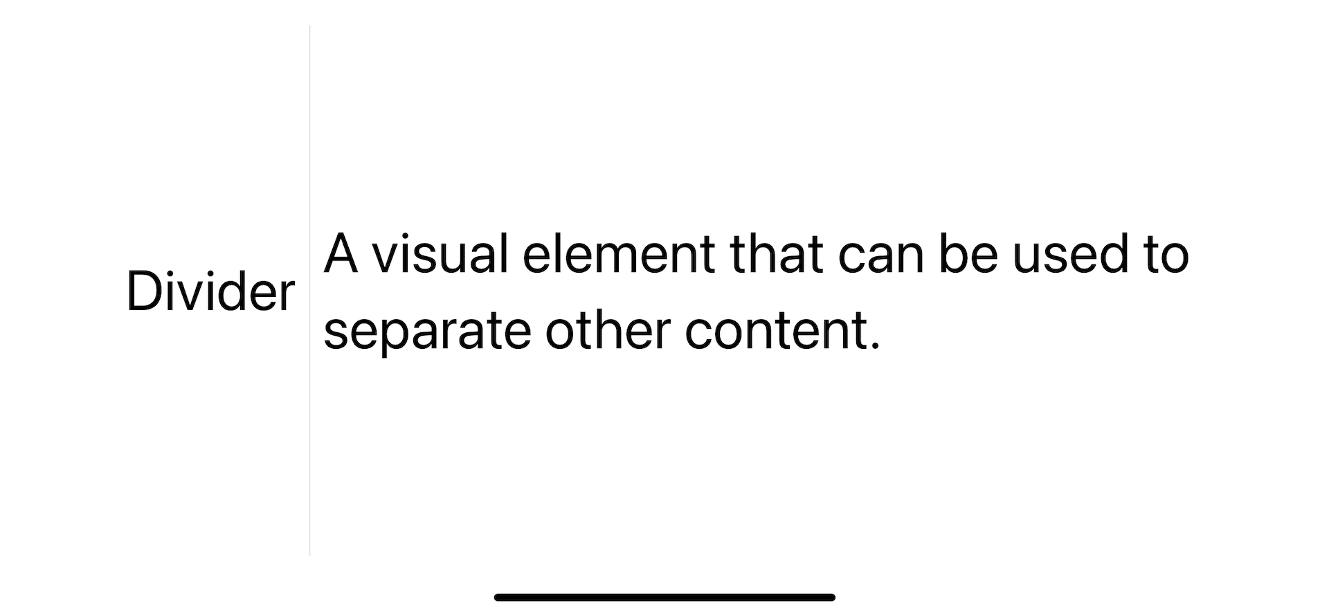
For a horizontal stack, a divider extends on the vertical axis.
struct ContentView: View {
    var body: some View {
        HStack {
            Text("Divider")
            Divider()
            Text("A visual element that can be used to separate other content.")
        }
        .font(.largeTitle)
        .padding()
    }
}
Not in a stack
A divider that uses outside of a stack view will render horizontally.
How to control the Size of SwiftUI Divider
By default, a divider will take up all available space in the direction it extends.
You can control its size using frame(width:height:alignment:) modifier. We set either width or height based on its direction.
Horizontal divider
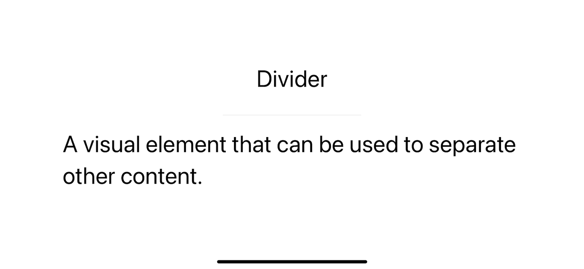
You set frame width to control horizontal divider size.
struct ContentView: View {
    var body: some View {
        VStack {
            Text("Divider")
            Divider()
                .frame(width: 200)
            Text("A visual element that can be used to separate other content.")
        }
        .font(.largeTitle)
        .padding()
    }
}
Vertical divider
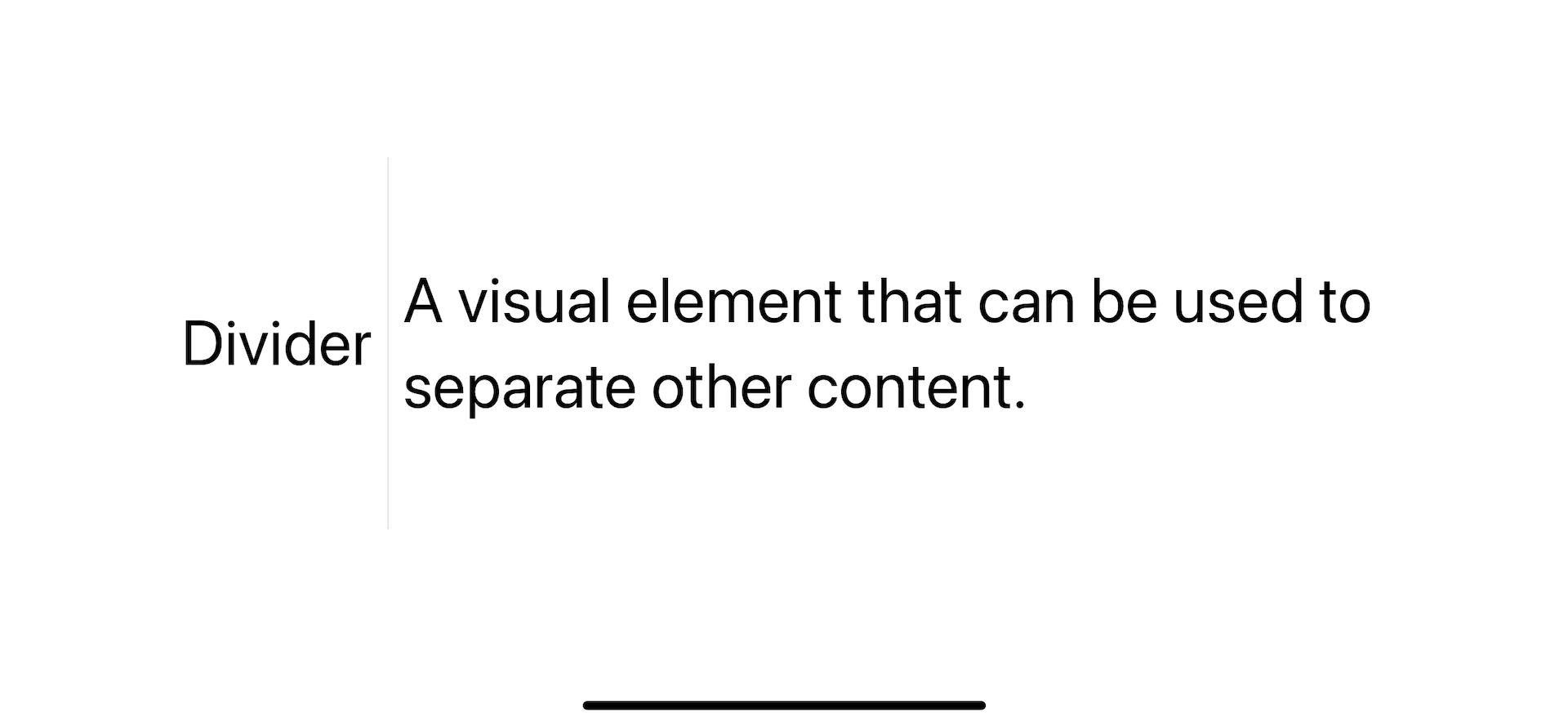
You set frame height to control vertical divider size.
struct ContentView: View {
    var body: some View {
        HStack {
            Text("Divider")
            Divider()
                .frame(height: 200)
            Text("A visual element that can be used to separate other content.")
        }
        .font(.largeTitle)
        .padding()
    }
}
Changing SwiftUI Divider Colors
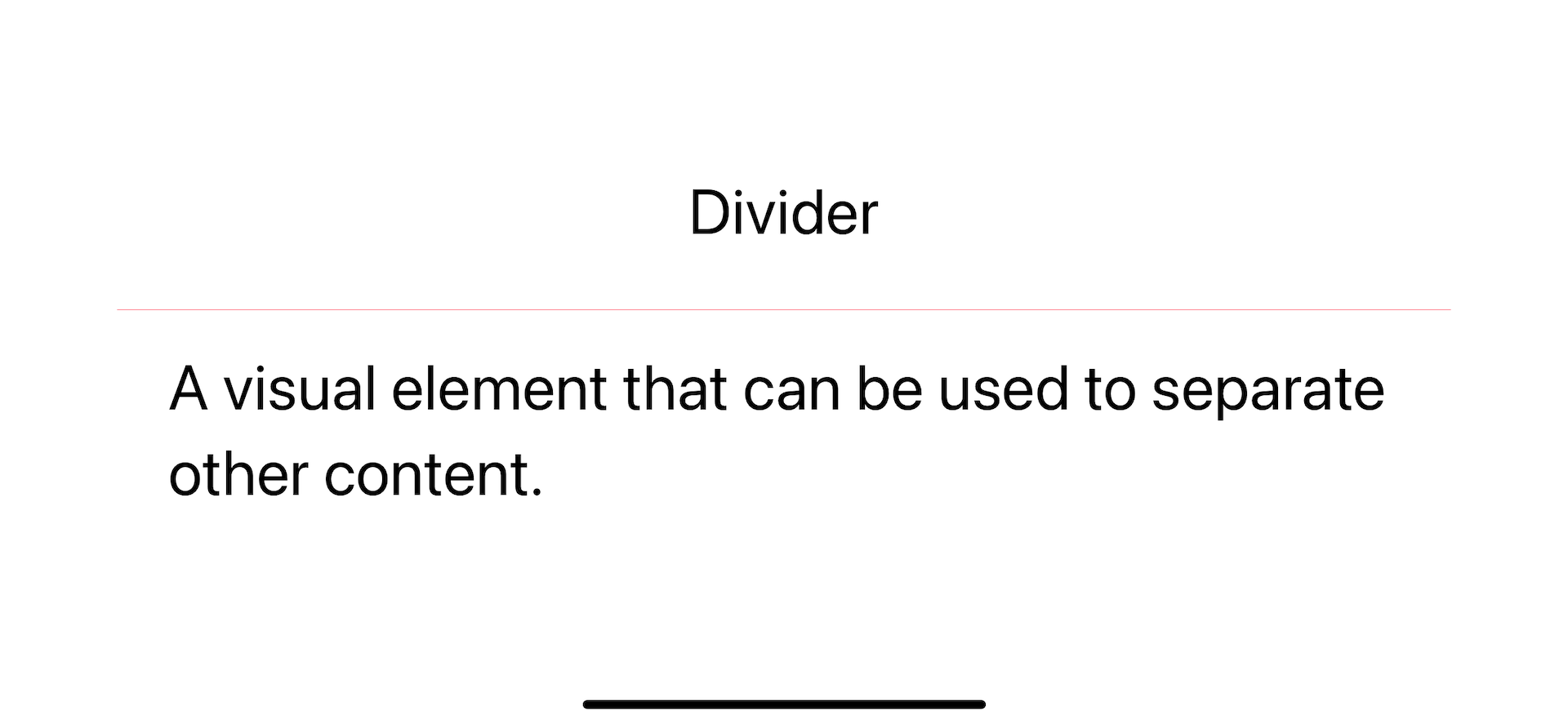
SwiftUI divider has a default color of gray (#C6C6C8).
You can change its color by overlay it with the color you want using .overlay() modifier.
struct ContentView: View {
    var body: some View {
        VStack {
            Text("Divider")
            Divider()
                .overlay(.pink)
            Text("A visual element that can be used to separate other content.")
        }
        .font(.largeTitle)
        .padding()
    }
}
Adjust SwiftUI Divider Thickness
SwiftUI divider has a thickness of 0.33 points, and we don't have a way to modify the thickness directly.
Luckily, we can use a combination of two modifiers to achieve the same result. We will use frame(width:height:alignment:) and .overlay for this task.
To set the thickness of a divider.
- We set frame height/width to the thickness that you want.
- Then, we apply the color to that new frame.
Horizontal divider
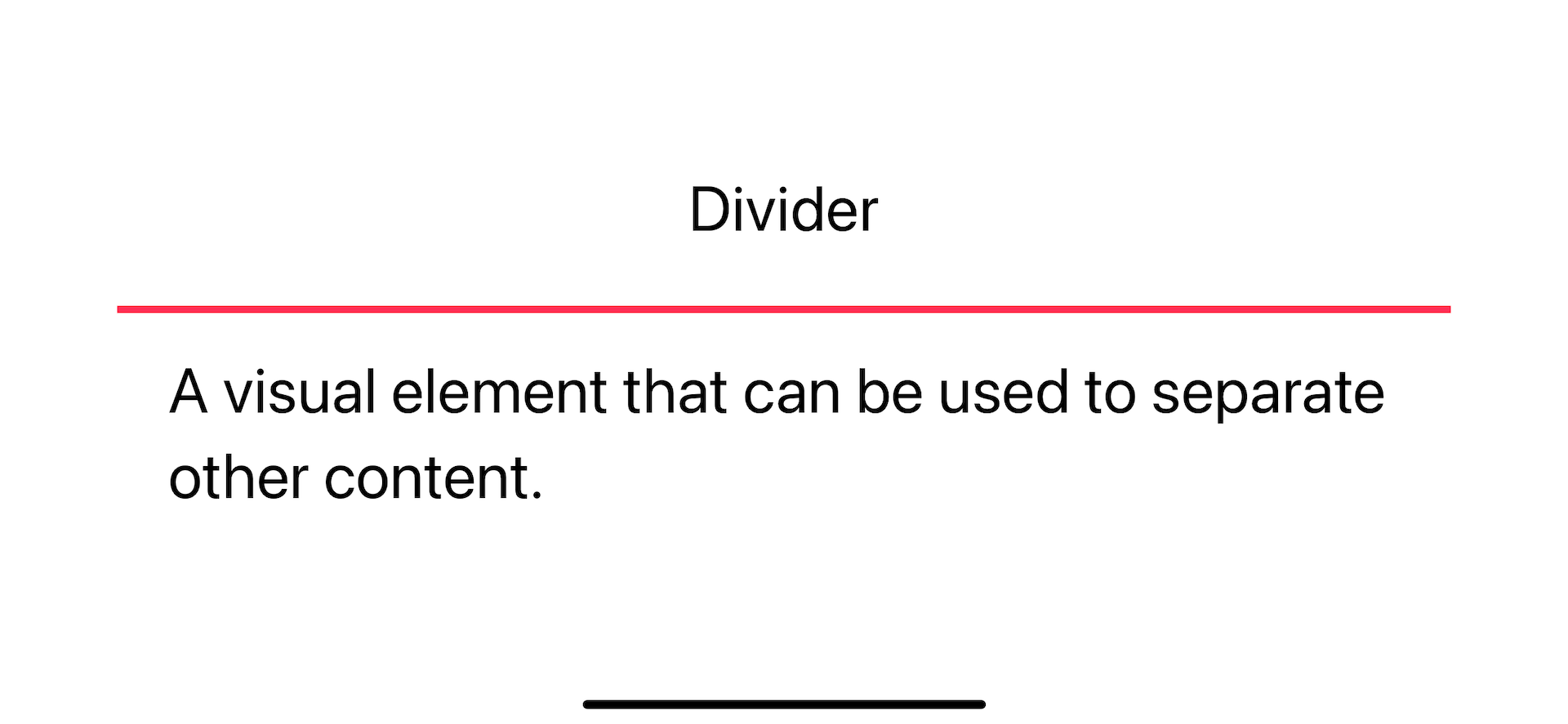
For a horizontal divider, you set the height to the thickness you want.
struct ContentView: View {
    var body: some View {
        VStack {
            Text("Divider")
            Divider()
                .frame(height: 4)
                .overlay(.pink)
            Text("A visual element that can be used to separate other content.")
        }
        .font(.largeTitle)
        .padding()
    }
}
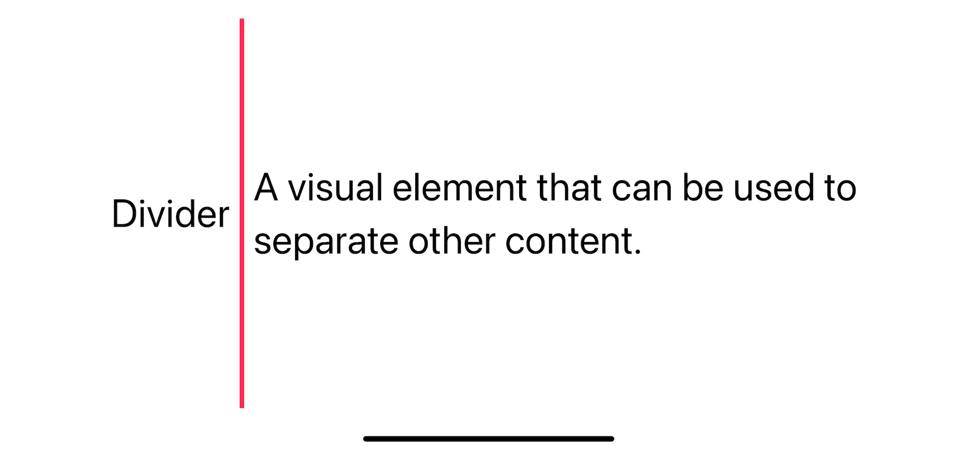
Vertical divider
For a vertical divider, you set the width to the thickness you want.
struct ContentView: View {
    var body: some View {
        HStack {
            Text("Divider")
            Divider()
                .frame(width: 4)
                .overlay(.pink)
            Text("A visual element that can be used to separate other content.")
        }
        .font(.largeTitle)
        .padding()
    }
}
You can easily support sarunw.com by checking out this sponsor.

Localization Buddy: Easiest way to localize and update App Store metadata.
Conclusion
As you can see, SwiftUI Divider is easy to use but quite limited in customizing options. We have to overcome that with the help of other modifiers.
I think the customization you learn in this article should cover most designs that you will encounter.
If you need to customize beyond what we cover today, you might consider creating a custom one.
Read more article about SwiftUI, Divider, or see all available topic
Enjoy the read?
If you enjoy this article, you can subscribe to the weekly newsletter.
Every Friday, you'll get a quick recap of all articles and tips posted on this site. No strings attached. Unsubscribe anytime.
Feel free to follow me on Twitter and ask your questions related to this post. Thanks for reading and see you next time.
If you enjoy my writing, please check out my Patreon https://www.patreon.com/sarunw and become my supporter. Sharing the article is also greatly appreciated.
Become a patron Buy me a coffee Tweet ShareHow to style SwiftUI text Font
Learn how to set font size, design, weight, and color in SwiftUI.
How to add section header and footer to SwiftUI list
We can group related data in a SwiftUI list using Section view. We can also optionally add a header and footer to describe a particular section. Let's learn how to do that.