SwiftUI Button: Basic usage
Table of Contents
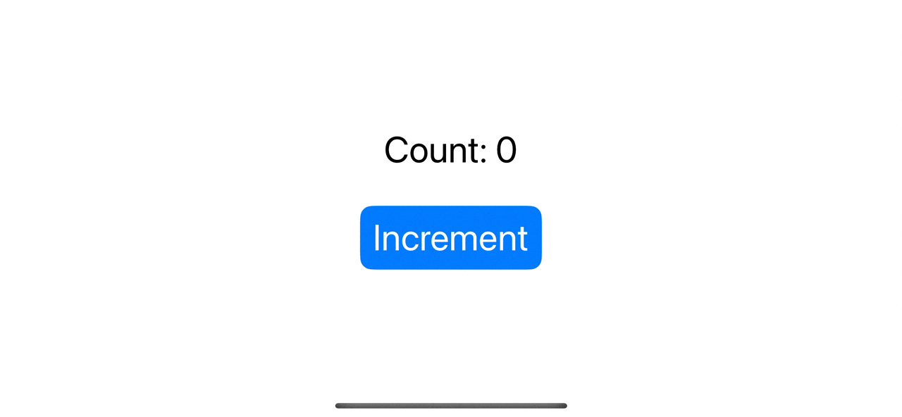
Button is a control that initiates an action when a user clicks or taps.
The following is an example of a button with an action that increases a count value.
In the UIKit era, UIButton is quite strict. You have limited options on how you can customize it.
Button in SwiftUI is a lot easier to use and customize. The interface of the SwiftUI button is simple.
It only needs two things.
How to create SwiftUI Button
Every button in SwiftUI compose of two components.
Action
Action is a method or closure which gets called when a user clicks or taps the button.
An example of a button that uses a closure as an action.
Button("Greeting") {
    print("Hello, World!")
}
An example of a button that uses a method as an action. The method for a button's action must have this signature, () -> Void (Not accepting parameters and not returning anything).
struct ContentView: View {
    var body: some View {
        Button("Greeting", action: greeting)
    }

    func greeting() {
        print("Hello, World!")
    }
}
Label
The label is a view that describes the purpose of a button. It can be text, icon image, or any custom view.
In the following example, we use Text("Greeting") as a label.
Button(action: greeting) {
    Text("Greeting")
}
You might notice that we can use a string to initialize our button in the previous section
A button using text only as a label is very common. That's why Apple has the convenience initializer that takes a string and creates a text view from that text.
These two buttons are identical.
Button("Greeting", action: greeting)

Button(action: greeting) {
    Text("Greeting")
}
The fact that a label can be any view makes SwiftUI Button very powerful. You can create a button any way you can imagine without constraint.
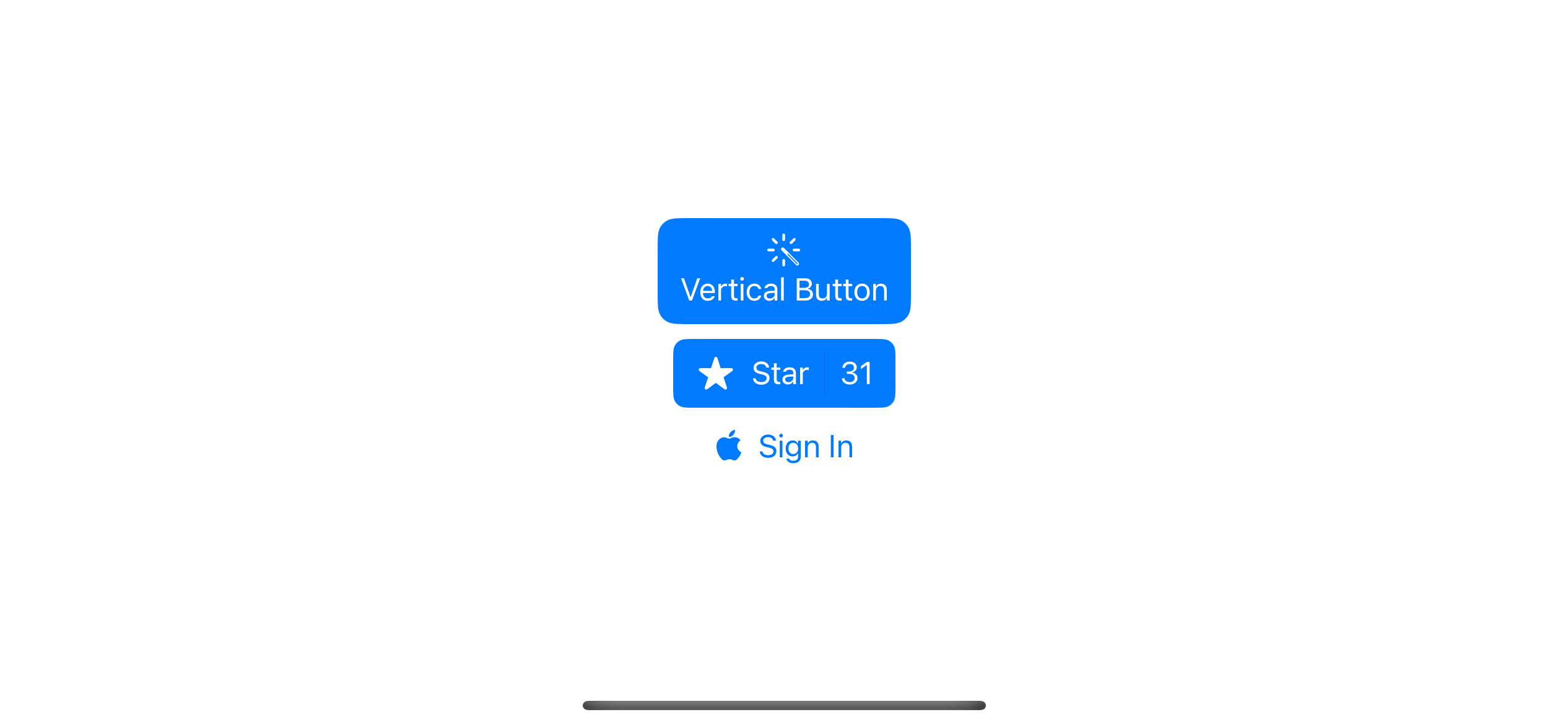
The following is an example where I create three buttons from a different view.
struct ContentView: View {
    var body: some View {
        VStack {
            // 1
            Button {

            } label: {
                VStack {
                    Image(systemName: "wand.and.rays.inverse")
                    Text("Vertical Button")
                }
            }
            .buttonStyle(.borderedProminent)

            // 2
            Button {

            } label: {
                HStack {
                    Image(systemName: "star.fill")
                    Text("Star")
                    Divider()
                    Text("31")
                }
                .fixedSize()
            }
            .buttonStyle(.borderedProminent)

            // 3
            Button {

            } label: {
                Label("Sign In", systemImage: "applelogo")
            }
        }
    }
}
1 Using VStack to create a button with an image and text which align vertically.
2 Using A HStack to create a button with an image and multiple texts.
3 A button with a simple Label view.
You can easily support sarunw.com by checking out this sponsor.
Offline Transcription: Fast, privacy-focus way to transcribe audio, video, and podcast files. No data leaves your Mac.
Button Styles
As you can see, it is very easy to customize a button in SwiftUI. But the best part is, you don't even need to do it if you don't want to.
SwiftUI got many built-in styles for you to use. We can select a button style using buttonStyle(_:) modifier.
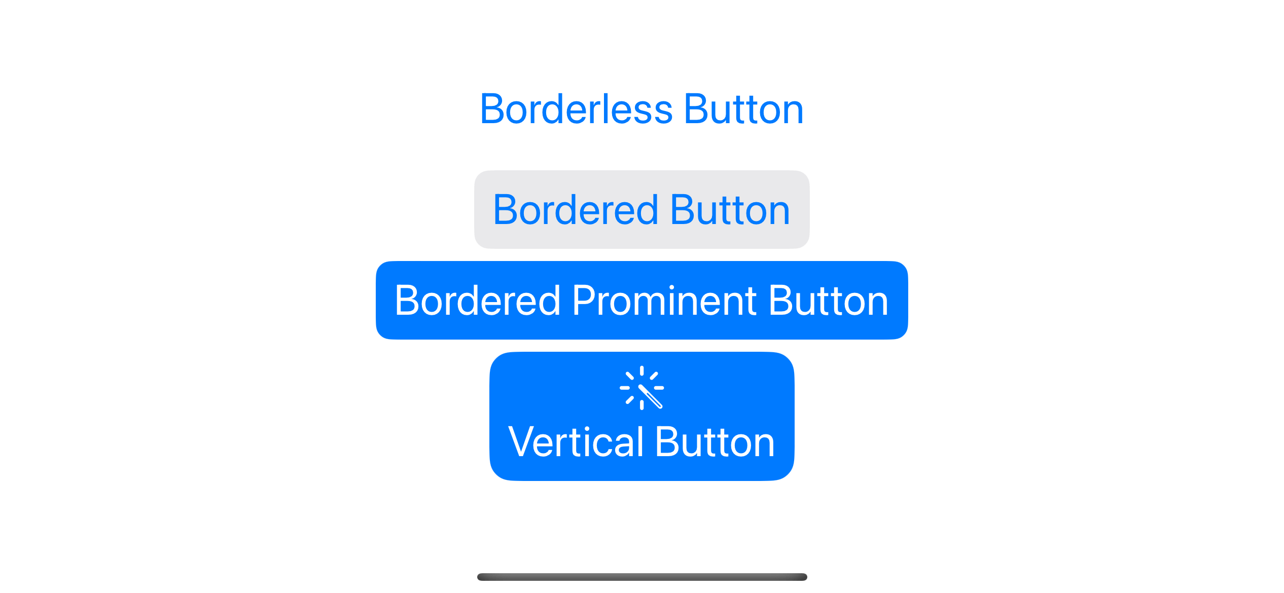
Button styles can vary based on the platforms. For iOS, we have five options.
Automatic
If we don't specify any button style. SwiftUI will use the .automatic button style.
The .automatic button style varies by platform. That means using .automatic on macOSand iOS might not yield the same result.
For iOS, the default button style (.automatic) is .borderless.
It is easier to visualize these styles than to describe them. Let's see the other four styles in iOS.
Borderless
Button("Borderless Button") {

}.buttonStyle(.borderless)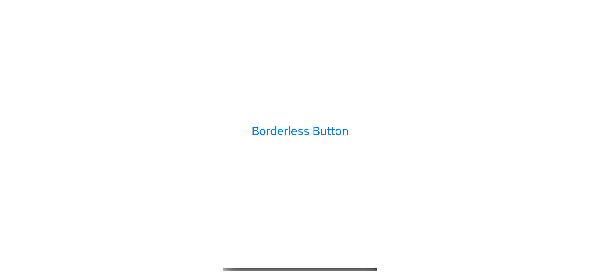
Plain
Button("Plain Button") {

}.buttonStyle(.plain)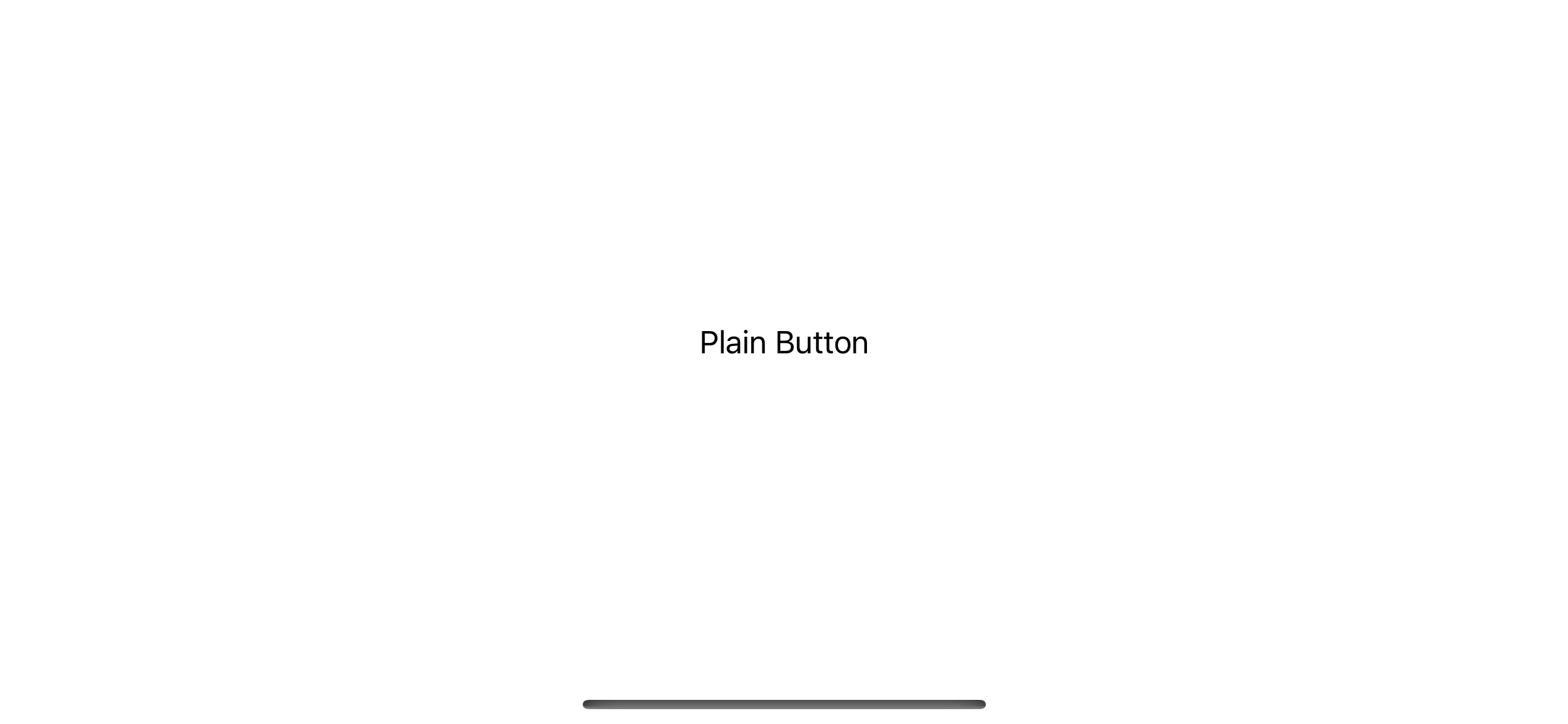
Bordered
Button("Bordered Button") {

}.buttonStyle(.bordered)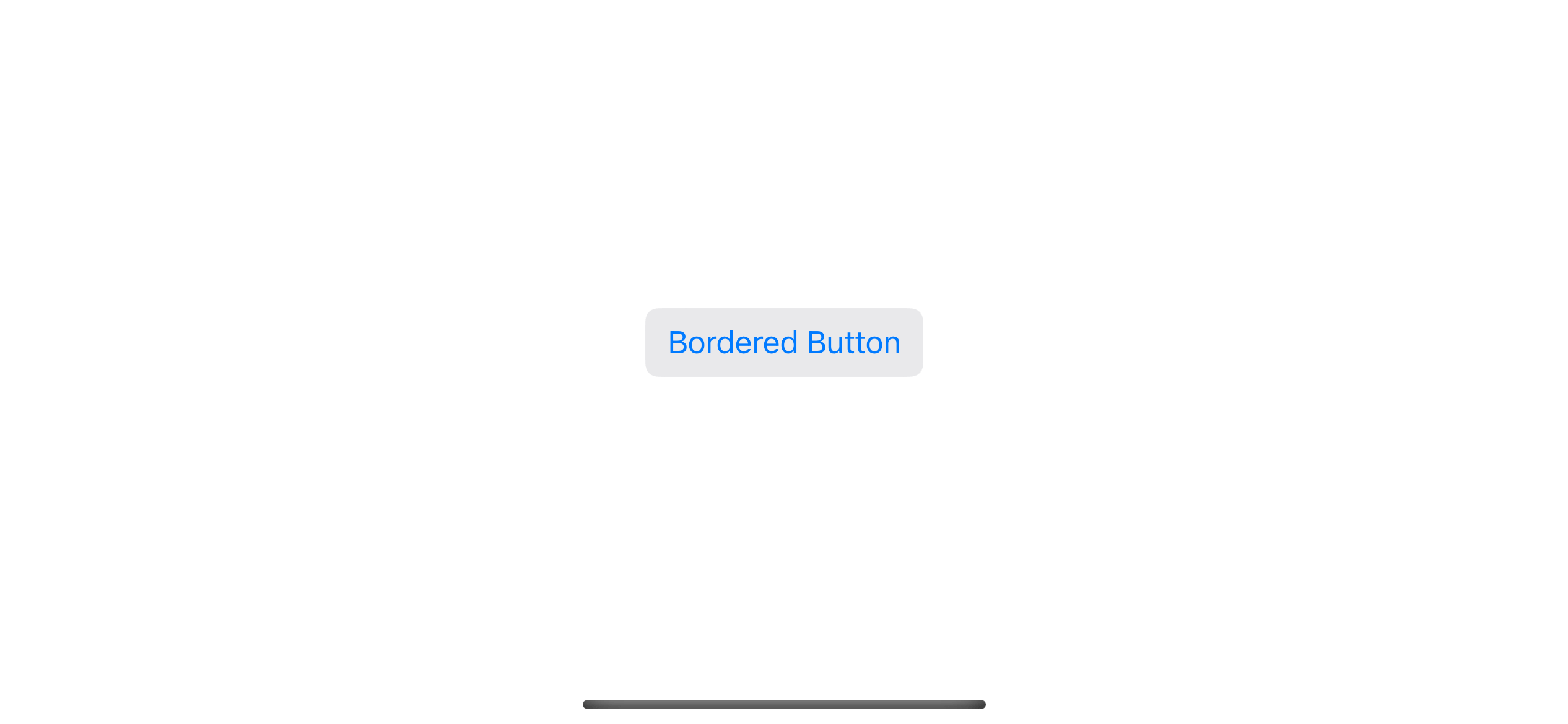
Bordered Prominent
Button("Bordered Prominent Button") {

}.buttonStyle(.borderedProminent)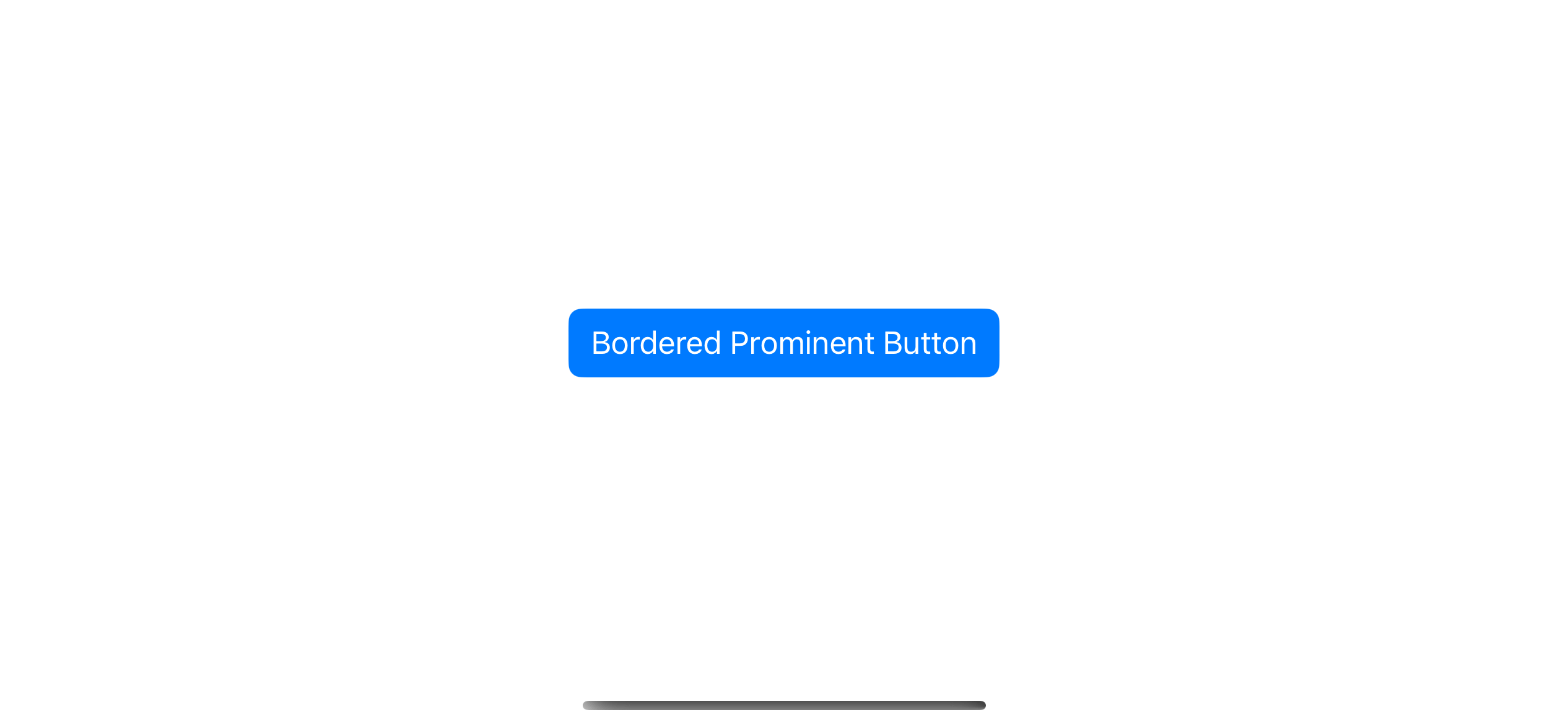
Read more article about SwiftUI, Button, or see all available topic
Enjoy the read?
If you enjoy this article, you can subscribe to the weekly newsletter.
Every Friday, you'll get a quick recap of all articles and tips posted on this site. No strings attached. Unsubscribe anytime.
Feel free to follow me on Twitter and ask your questions related to this post. Thanks for reading and see you next time.
If you enjoy my writing, please check out my Patreon https://www.patreon.com/sarunw and become my supporter. Sharing the article is also greatly appreciated.
Become a patron Buy me a coffee Tweet ShareHow to make equal height subviews in HStack
Learn how to make all subviews in HStack have an equal height.
Multiple rows Selection in SwiftUI List
Learn how to allow multiple row selection in SwiftUI List.