SwiftUI's Toggle Customization
Table of Contents
I love how the SwiftUI use style object as a way to allow its view customization. In the previous post, I show you how to customize a Button with ButtonStyle. Today we are goin to do the same, but to Toggle component.
Most steps are the same as what we did with Button. Here is what we are planning to do.
Do it without style
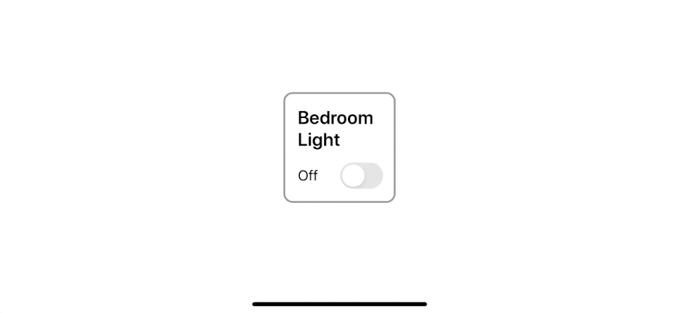
The easiest way to create a style is trying to do it without style first. And this is how I do it.
struct ContentView: View {
    @State private var isOn = false

    var body: some View {
        VStack(alignment: .leading) { // <1>
            Text("Bedroom Light").font(.system(size: 22, weight: .semibold)).lineLimit(2) // <2>
            HStack { // <3>
                if self.isOn { // <4>
                    Text("On")
                } else {
                    Text("Off")
                }
                Spacer()
                Toggle("", isOn: $isOn) // <5>
            }
        }
        .frame(width: 100) // <6>
        .padding()
        .overlay(
            RoundedRectangle(cornerRadius: 10)
                .stroke(self.isOn ? Color.green: Color.gray, lineWidth: 2) // <7>
        )
    }
}
<1> We use vertical stack with a leading aligment as our container.
<2> We create a new Text to use as our Toggle label.
<3> We have a nested horizontal stack to hold an on/off label <4> and a Toggle view <5>.
<4> On/Off label showing based on isOn state variable.
<5> Toggle without a label.
<6> We fix frame size to 100.
<7> A round border with a color change according to isOn state variable.
Run the code and this what we got.
After we got a working Toggle, we can wrap that under a ToggleStyle.
You can easily support sarunw.com by checking out this sponsor.
Screenshot Studio: Create App Store screenshots in seconds not minutes.
Do it with style
You can create a custom Toggle style the same way with Button style. By create a new struct that conforming to the ToggleStyle protocol. ToggleStyle protocol expect us to implement one function, func makeBody(configuration: ToggleStyleConfiguration) -> Self.Body where ToggleStyleConfiguration contains the content of the Toggle (label), and boolean indicates the on/off state of the toggle (isOn). The function creates a View representing the body of a Toggle.
The implementation is quite straightforward, we copy most of the code from our previous example, but this time we use a on/off and text from ToggleStyleConfiguration.
struct VerticalToggleStyle: ToggleStyle {
    func makeBody(configuration: Configuration) -> some View {
        return VStack(alignment: .leading) {
            configuration.label // <1>
                .font(.system(size: 22, weight: .semibold)).lineLimit(2)
            HStack {
                if configuration.isOn { // <2>
                    Text("On")
                } else {
                    Text("Off")
                }
                Spacer()
                Toggle(configuration).labelsHidden() // <3>
            }
        }
        .frame(width: 100)
        .padding()
        .overlay(
            RoundedRectangle(cornerRadius: 10)
                .stroke(configuration.isOn ? Color.green: Color.gray, lineWidth: 2) // <4>
        )
    }
}
<1> We use label that passing along with a toggle instead of our Text.
<2> We use isOn state from configuration object instead of our isOn state variable.
<3> We use .labelsHidden() to hide a Toggle lable.
<4> Again, we use isOn from configuration instead of our own.
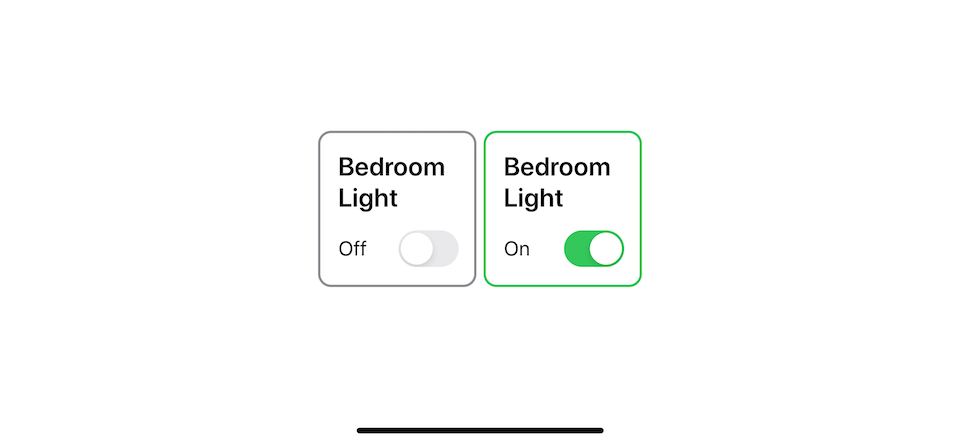
With this minimum change, we can apply the style to any Toggle with the following method.
struct ContentView: View {
    @State private var isOn = false

    var body: some View {
        Toggle("Bedroom Light", isOn: $isOn)
            .toggleStyle(VerticalToggleStyle())
    }
}
Conclusion
SwiftUI makes it very easy to customize a button style. The ButtonStyle protocol works similarly to the ViewModifier protocol, except it's specialized for buttons.
You can see that we can use the same code and make it more structural and reusable with a little effort just by knowing the framework feature. I still have more to learn about this new framework. Subscribe or Follow me on Twitter to get more posts like this. Sharing this with your friends is greatly appreciated.
You can easily support sarunw.com by checking out this sponsor.
Screenshot Studio: Create App Store screenshots in seconds not minutes.
Related Resources
Read more article about SwiftUI, ToggleStyle, or see all available topic
Enjoy the read?
If you enjoy this article, you can subscribe to the weekly newsletter.
Every Friday, you'll get a quick recap of all articles and tips posted on this site. No strings attached. Unsubscribe anytime.
Feel free to follow me on Twitter and ask your questions related to this post. Thanks for reading and see you next time.
If you enjoy my writing, please check out my Patreon https://www.patreon.com/sarunw and become my supporter. Sharing the article is also greatly appreciated.
Become a patron Buy me a coffee Tweet ShareEasy way to detect a retain cycle in a view controller
A view controller is one component where memory leak usually takes place since it holds many pieces together. One of the easiest ways to detect them is to see if a view controller is not being deallocated. Let's see how Xcode breakpoint can help you find a leak.
Add custom SwiftUI view to View Library with LibraryContentProvider
A new way to create a reusable view.