Animate SF Symbols with symbolEffect
Table of Contents
In iOS 17, you can animate SF Symbols with the new modifier, symbolEffect.
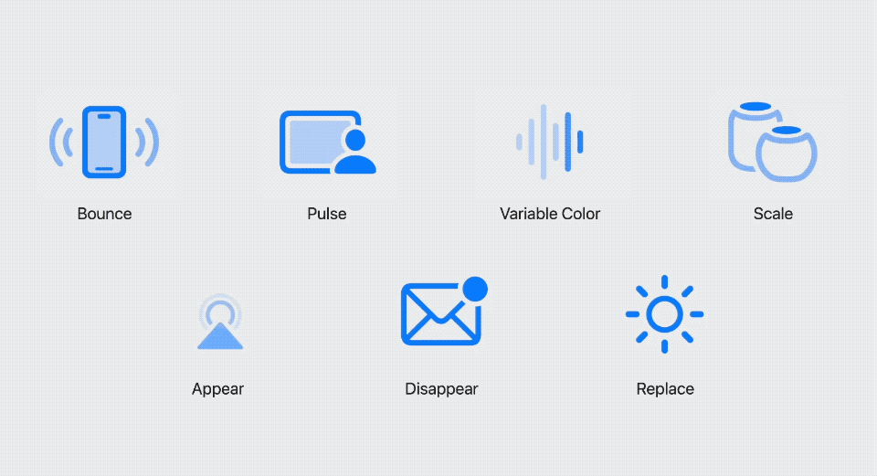
There are six built-in animations for you to choose from:
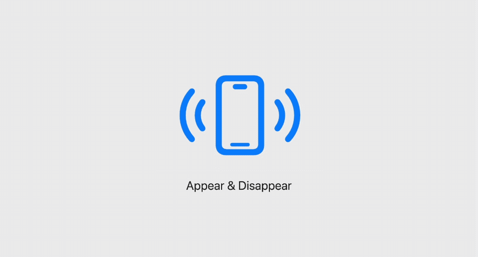
- Appear/Disappear
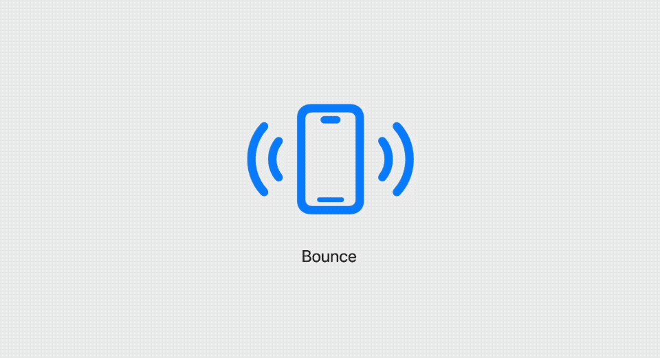
- Bounce
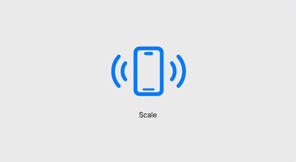
- Scale
- Variable Color
- Pulse
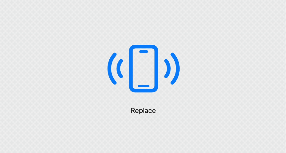
- Replace
Behaviors of Symbol Effect
These six animations can be categorized based on behaviors.
There are four behaviors.
- Discrete Behavior (
DiscreteSymbolEffect). - Indefinite Behavior (
IndefiniteSymbolEffect). - Transition Behavior (
TransitionSymbolEffect). - Content Transition Behavior (
ContentTransitionSymbolEffect).
Understanding these behaviors is crucial to animate symbols because it dictates how you apply the animation.
Discrete
An effect with discrete behavior plays a one-off animation. The effect of an animation is applied only for a brief moment.
The effects that fall into this category are:
- Bounce
- Variable Color
- Pulse
- Appear/Disappear (I will explain this in Animate Appear and Disappear)
Indefinite
An effect with indefinite behavior keeps its animated state indefinitely until the effect is removed.
The effects that fall into this category are:
- Scale
- Variable Color
- Pulse
Transition
Transition behavior animates a symbol in and out of view (Show and Hide).
The effects that fall into this category are:
- Appear
- Disappear
Content Transition
Content transition behavior animates from one symbol to another.
The effect that fall into this category is:
- Replace
You can easily support sarunw.com by checking out this sponsor.
AI Paraphrase:Are you tired of staring at your screen, struggling to rephrase sentences, or trying to find the perfect words for your text?
How to animate SF Symbols
How to animate a symbol is based on the type of behavior of the effect that you want to apply.
Now that we have learned all four behaviors, we are ready to animate them.
Animate Discrete behavior
A discrete effect plays briefly, then returns to its original form.
This is the perfect effect to apply in response to certain events. When an event trigger, the animation will play.
The event trigger can be any Equatable value. Once this value changes, the animation will play.
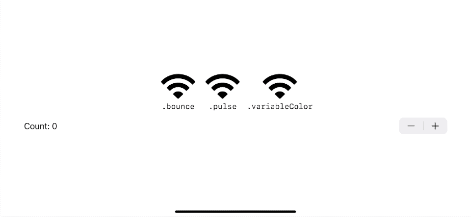
In this example, we play a bounce, pulse, and variable color animation every time the count value change.
struct Symbols: View {
    // 1
    @State var count: Int = 0

    var body: some View {
        VStack {
            HStack {
                VStack {
                    // 2
                    Image(systemName: "wifi")
                        .symbolEffect(.bounce, value: count)
                    Text(".bounce")
                        .font(.subheadline.monospaced())
                }

                VStack {
                    Image(systemName: "wifi")
                        .symbolEffect(.pulse, value: count)
                    Text(".pulse")
                        .font(.subheadline.monospaced())
                }

                VStack {
                    Image(systemName: "wifi")
                        .symbolEffect(.variableColor, value: count)
                    Text(".variableColor")
                        .font(.subheadline.monospaced())
                }
            }
            .font(.system(size: 60))
            // 3
            Stepper("Count: \(count)", value: $count, in: 0...100)
        }
    }
}
1 We use an integer as an event trigger.
2 The bounce effect listens to the count value change event.
3 I use Stepper to change the count value and trigger the event.
As a result, each effect plays once every time the value is changed.
The duration of the animation varies based on the effect.
Animate Indefinite behavior
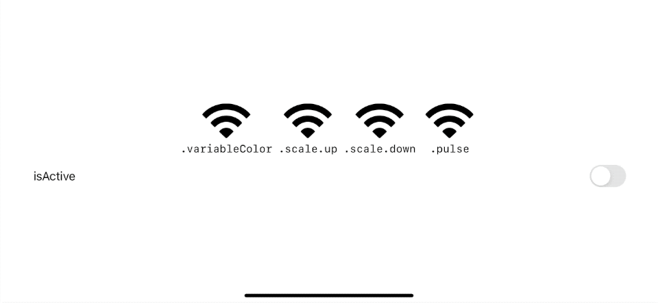
An indefinite effect continually plays until it is disabled or removed.
To enable and disable the effect, we control it with a Bool value.
- When the
isActiveistrue, the animation will continue to play. - When the
isActiveisfalse, the animation stops and returns to its original form.
struct Symbols: View {
    // 1
    @State var isActive = false

    var body: some View {
        VStack {
            HStack {
                VStack {
                    // 2
                    Image(systemName: "wifi")
                        .symbolEffect(.variableColor, isActive: isActive)
                    Text(".variableColor")
                        .font(.subheadline.monospaced())
                }

                VStack {
                    Image(systemName: "wifi")
                        .symbolEffect(.scale.up, isActive: isActive)
                    Text(".scale.up")
                        .font(.subheadline.monospaced())
                }

                VStack {
                    Image(systemName: "wifi")
                        .symbolEffect(.scale.down, isActive: isActive)
                    Text(".scale.down")
                        .font(.subheadline.monospaced())
                }

                VStack {
                    Image(systemName: "wifi")
                        .symbolEffect(.pulse, isActive: isActive)
                    Text(".pulse")
                        .font(.subheadline.monospaced())
                }
            }
            .font(.system(size: 60))
            // 3
            Toggle("isActive", isOn: $isActive)
        }
    }
}
1 We use a boolean to control indefinite effects.
2 Each effect is added or removed based on the isActive boolean value.
3 I use Toggle to control the isActive value in this example.
Indefinite effects are either played in a loop (variable color and pulse) or statically modified (scale) a symbol until it is removed by setting isActive to false.
If you want to play the effect indefinitely, you can just pass a constant true value or pass no argument since the default value for this is true.
Image(systemName: "wifi")
    .symbolEffect(.variableColor)

Image(systemName: "wifi")
    .symbolEffect(.variableColor, isActive: true)
Animate Appear and Disappear
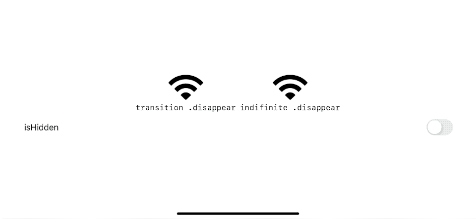
There are two ways to apply Appear and Disappear effects based on the behavior.
- Discrete behavior: Using discrete behavior to show/hide a symbol will keep the layout the same.
- Transition behavior: Showing and hiding a symbol using transition truly removes the symbol from the view hierarchy. As a result, the layout will change.
To use Appear/Disappear with Transition behavior, we specified it in the transition modifier, .transition(.symbolEffect(.disappear)).
struct Symbols: View {
    @State var isHidden = false

    var body: some View {
        VStack {
            HStack {
                // Transition Behavior
                VStack {
                    if !isHidden {
                        Image(systemName: "wifi")
                            .transition(.symbolEffect(.disappear))
                    }
                    Text("transition .disappear")
                        .font(.subheadline.monospaced())
                }
                // Discrete Behavior
                VStack {
                    Image(systemName: "wifi")
                        .symbolEffect(.disappear, isActive: isHidden)
                    Text("indifinite .disappear")
                        .font(.subheadline.monospaced())
                }
            }
            .font(.system(size: 60))
            Toggle("isHidden", isOn: $isHidden)
        }
    }
}
For Transition behavior using .transition(.symbolEffect(.disappear)), you have to manually hide/show the view using the if condition, just like a normal SwiftUI transition.
A transition behavior causes the layout shift, while a discrete behavior keeps the same layout.
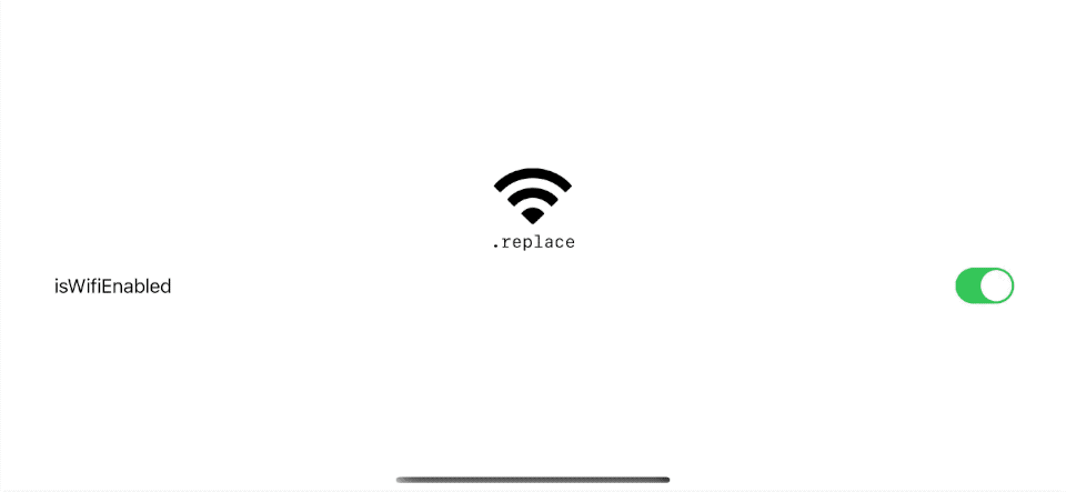
Animate Replace
The Replace effect animates between two different symbol images.
The way we apply the replace effect is via the contentTransition modifier.
struct Symbols: View {
    @State var isWifiEnabled = true

    var body: some View {
        VStack {
            VStack {
                // 1
                Image(systemName: isWifiEnabled ? "wifi": "wifi.slash")
                    .contentTransition(.symbolEffect(.replace))
                Text(".replace")
                    .font(.subheadline.monospaced())
            }
            .font(.system(size: 60))
            Toggle("isWifiEnabled", isOn: $isWifiEnabled)
        }
    }
}
1 We use the isWifiEnabled condition to control the symbols we want to show. Then we apply .contentTransition(.symbolEffect(.replace)) to apply the effect.
Read more article about SF Symbols, SF Symbols 5, WWDC23, or see all available topic
Enjoy the read?
If you enjoy this article, you can subscribe to the weekly newsletter.
Every Friday, you'll get a quick recap of all articles and tips posted on this site. No strings attached. Unsubscribe anytime.
Feel free to follow me on Twitter and ask your questions related to this post. Thanks for reading and see you next time.
If you enjoy my writing, please check out my Patreon https://www.patreon.com/sarunw and become my supporter. Sharing the article is also greatly appreciated.
Become a patron Buy me a coffee Tweet ShareAccess Images and Colors with Enum in Xcode 15
Xcode 15 can automatically create Swift symbols for your resources without any third party. Let's learn how to do it.
SwiftUI Plain Button Style cannot tap on an Empty space
The plain button style has behavior and appearance different from the other styles. Let's learn how this affects a tappable area.