SwiftUI Plain Button Style cannot tap on an Empty space
Table of Contents
The plain button style has behavior and appearance different from the other styles. Let's learn how this affects a tappable area.
A button default behavior
By default, a tap area of a SwiftUI button is everything inside a button label.
This includes a space, padding, an image, and text.
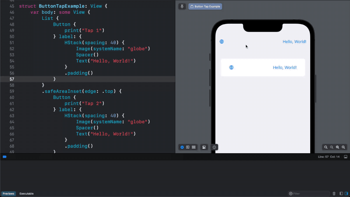
Here is an example where we use HStack as a button's label.
Button {
    print("Tap")
} label: {
    HStack(spacing: 40) {
        Image(systemName: "globe")
        Spacer()
        Text("Hello, World!")
    }
    .padding()
}
We can tap anywhere within the HStack to trigger the button action.
You can easily support sarunw.com by checking out this sponsor.
Localization Buddy: Easiest way to localize and update App Store metadata.
Problem using Plain button style
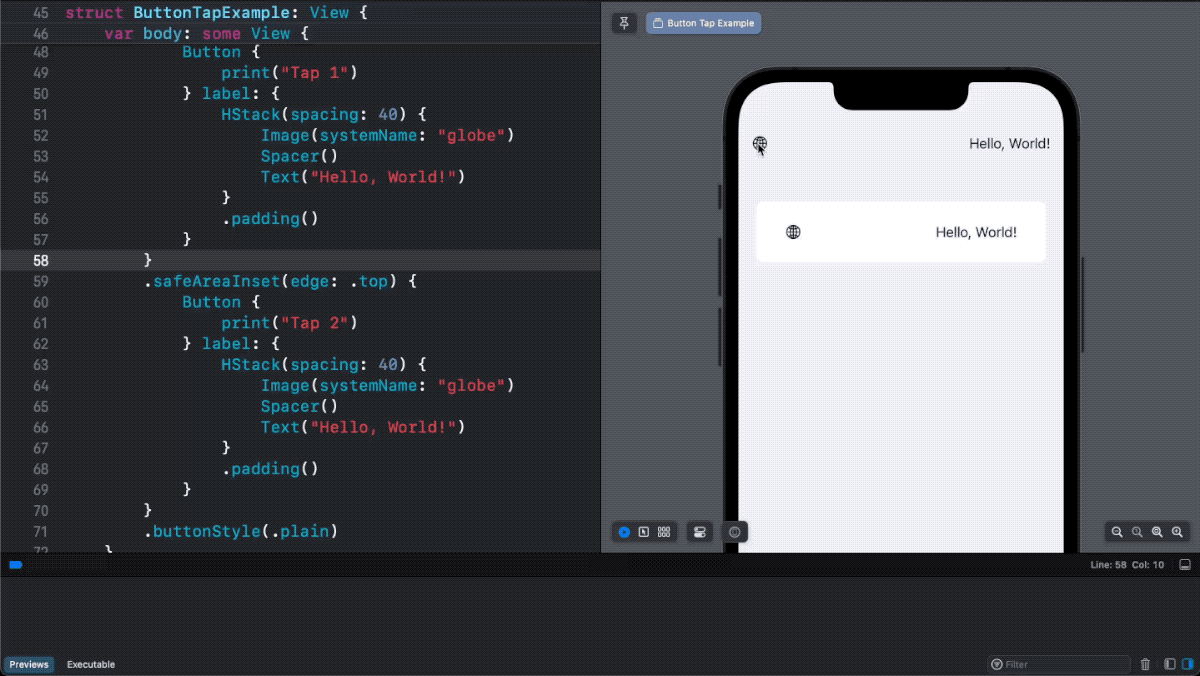
The problem arises when you apply a plain button style .buttonStyle(.plain).
PlainButtonStyle is a button style that doesn't decorate its content.
As a result, your button would be rendered with no tint color, just like plain text.
Here is an example of the default button style vs. the plain button style.
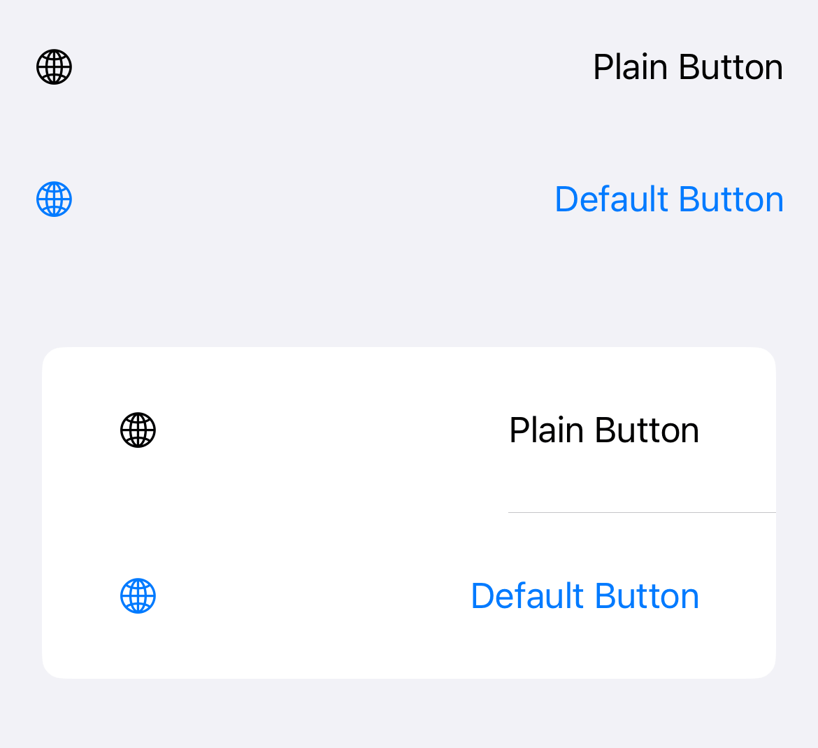
Apart from appearance, there is another significant behavior difference.
A tappable area of a plain button style doesn't include an empty space. Only the button's content, like text or image, can respond to user interaction.
So, tapping on an empty space in a plain button style won't trigger an action.
You can easily support sarunw.com by checking out this sponsor.
Localization Buddy: Easiest way to localize and update App Store metadata.
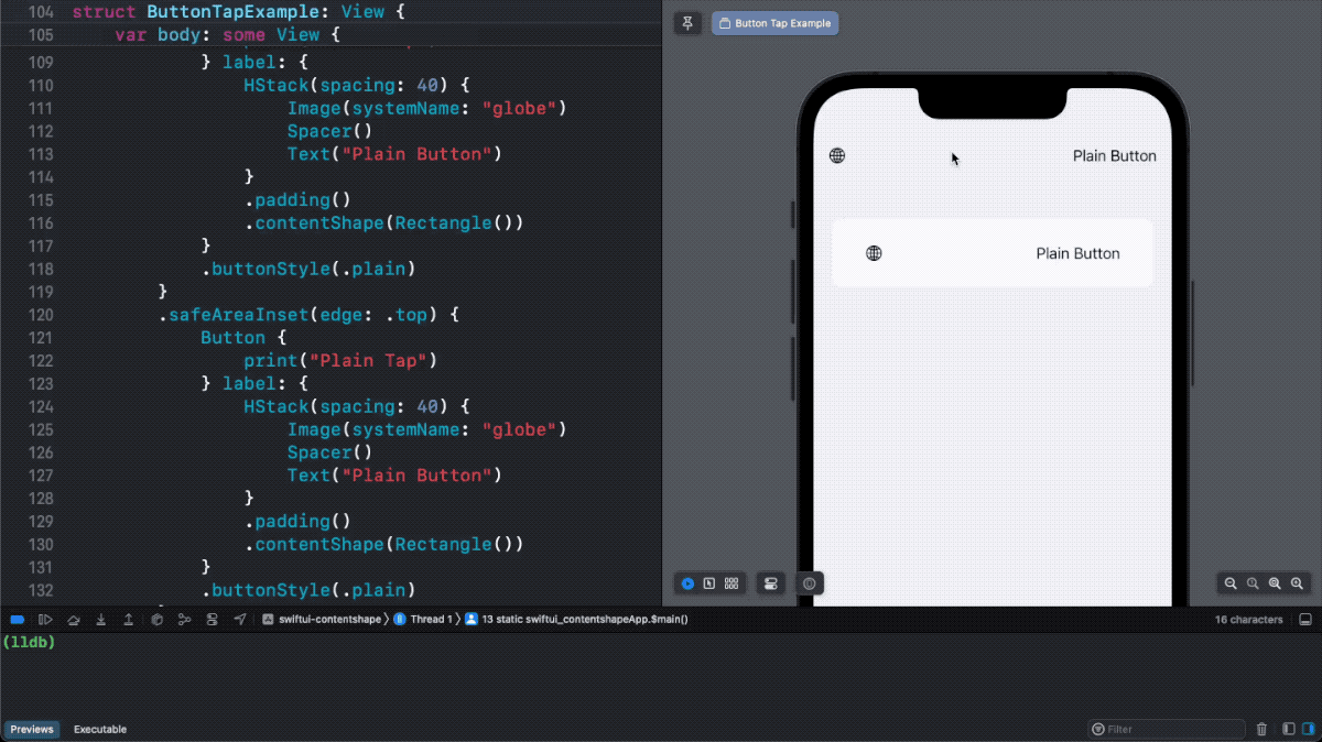
How to make a Space in Plain Button Style tappable
To make the whole area of a plain button tappable, we need to explicitly define a new tappable area.
We can do that with the help of contentShape() modifier.
The contentShape() modifier lets you define the new shape for the tappable area.
In this example, we use a rectangle shape as a new hit testing area.
Button {
    print("Plain Tap")
} label: {
    HStack(spacing: 40) {
        Image(systemName: "globe")
        Spacer()
        Text("Plain Button")
    }
    .padding()
    .contentShape(Rectangle())
}
.buttonStyle(.plain)
By specifying a tap area as a rectangle shape, .contentShape(Rectangle()), we make the whole button area, including a space, tappable.
Read more article about SwiftUI, Button, or see all available topic
Enjoy the read?
If you enjoy this article, you can subscribe to the weekly newsletter.
Every Friday, you'll get a quick recap of all articles and tips posted on this site. No strings attached. Unsubscribe anytime.
Feel free to follow me on Twitter and ask your questions related to this post. Thanks for reading and see you next time.
If you enjoy my writing, please check out my Patreon https://www.patreon.com/sarunw and become my supporter. Sharing the article is also greatly appreciated.
Become a patron Buy me a coffee Tweet ShareAnimate SF Symbols with symbolEffect
In iOS 17, you can animate SF Symbols with the new modifier. Let's learn how to do it.
Built-in symbol animations in UIKit controls
In iOS 17, we can enable symbols animation in UIKit controls using the new property. Let's learn how to do it.