Dark color
Things you should know about color when adopting dark mode.
Table of Contents
Before we begin, I encourage you to visit my previous article Adopting ios Dark Mode to get a basic idea of what is dark mode and tools Apple bring with it.
Adopting dark mode is all about setting a new set of colors.
For most apps, adopting dark mode is a process of replacing your static color to a dynamic one.
Let's say your app has a white background, and you want to adopt dark mode. You open up Asset Catalog, create a new color set, and put white and black colors for each appearance. You might end up with something like this.
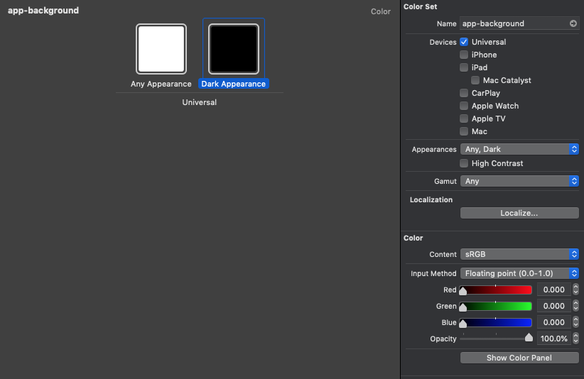
Which translate into something like this.
UIColor { (trait) -> UIColor in
  switch trait.userInterfaceStyle {
  case .light:
    return .white
  default:
    return .black
  }
}
Run it and everything looking good, but actually, it is not. This should be a straight forward process, but there are a few things you should know when replacing your colors.
Dark mode is not just a light and a dark color
If you try to present a modal with the color we just created, you will see something like this.

It looks beautiful in the light, but let's try that in the dark.

As you can see, the drop shadow that the system applies to differentiate the floating visual can't convey the same message in the dark.
There are no shadows in the darkness
How is the system color solving this? If you are running the same code using systemBackgroundColor instead of .black. This is what you will get.
UIColor { (trait) -> UIColor in
  switch trait.userInterfaceStyle {
  case .light:
    return .white
  default:
    return .systemBackgroundColor
  }
}
The presented view become gray to make it possible to distinguish between a presenting and presented view.
It turns out that system color doesn't just take light and dark into consideration. It also considers the elevation level.
You can easily support sarunw.com by checking out this sponsor.
AI Grammar: Correct grammar, spell check, check punctuation, and parphrase.
Elevation Level
From what I remembered, Apple first mentioned the depth[1] in their human interface guideline when they introduced iOS11 with flat design. In iOS13, they brought that concept to the trait collection[2].
Levels create a visual separation between different parts of your UI. Window content typically appears at the UIUserInterfaceLevel.base level. When you want parts of your UI to stand out from the underlying background, assign the UIUserInterfaceLevel.elevated level to them. For example, the system assigns the UIUserInterfaceLevel.elevated level to alerts and popovers.
– Apple Documentation[2:1]
UIUserInterfaceLevel got two cases right now, base and elevated. Modal presentation pass elevated in a trait collection to a presented view controller. UIUserInterfaceLevel is what the system color uses to determine whether it presents as modal in dark mode or not and adapt the color accordingly.
I can't find a way to do this in Asset Catalog, but in code, it would look something like this.
let customBackgroundColor = UIColor { (trait) -> UIColor in
 switch (trait.userInterfaceStyle, trait.userInterfaceLevel) {
 case (.dark, .elevated):
  // Color for dark, elevated
  return .gray
 case (.dark, _):
  // Color for dark, non-elevated
  return .black
 case (_, .elevated):
  // Color for non-dark, elevated
  return .white
 case (_, _):
  // Color for non-dark, non-elevated
  return .white
 }
}
The elevation level is just one aspect of dynamic color. I use it as an example to give you a hint of how deep this can go. More aspects needed to be considered, e.g., contrast, font size, font-weight[3]. We won't go into detail in this article.
As you can see, .systemBackgroundColor do all the hard work for us to making sure everything looks great in both light and dark mode.
Rule of thumb
Here is my rule of thumb when adopting dark mode.
Use system colors if possible
As you can see, the system color you see isn't just two colors, light and dark, pack into one. There is more to it than meets the eyes. By using system colors, you get all those benefits without sacrificed anything. So have a look at the color Apple provided and try to use it as much as possible. If you have a color that slightly different from system color, it always worth using the system one.
If there is no obvious mapping, override the only trait you need
You started with system color and modified just the trait you need. Let's say you have your custom background color in your app and want to support dark mode. I would do something like this.
let backgroundColor = UIColor { (trait) -> UIColor in
  switch trait.userInterfaceStyle {
  case .light:
    // Your custom background color
    return .fancyColor
  default:
    return .systemBackground
  }
}
Make sure your color look good in light and dark
If you can't convince a designer, pm, or yourself to use system color, make sure you visit Human Interface Guidelines - Dark Mode and Color and Contrast.
Conclusion
Apple makes the process of creating custom dynamic colors effortless and pleasant, but don't let the easiness lure you into doing so.
As you can see, there are a lot of things to consider when introducing a new color to your app. Create a custom one mean you are giving up all the benefit and works Apple done for you in system colors.
If you don't have a large design team dedicated to this, my suggestion would be to stick with system one.
You can easily support sarunw.com by checking out this sponsor.
AI Grammar: Correct grammar, spell check, check punctuation, and parphrase.
Related Resources
- Adopting ios Dark Mode
- Human Interface Guidelines - Color
- Human Interface Guidelines - Dark Mode
- Human Interface Guidelines - Color and Contrast
Depth. Distinct visual layers and realistic motion convey hierarchy, impart vitality, and facilitate understanding. Touch and discoverability heighten delight and enable access to functionality and additional content without losing context. Transitions provide a sense of depth as you navigate through content. https://developer.apple.com/design/human-interface-guidelines/ios/overview/themes/ ↩︎
https://developer.apple.com/documentation/uikit/uitraitcollection/3238085-userinterfacelevel ↩︎ ↩︎
https://developer.apple.com/design/human-interface-guidelines/accessibility/overview/color-and-contrast/ ↩︎
Read more article about iOS, Dark Mode, or see all available topic
Enjoy the read?
If you enjoy this article, you can subscribe to the weekly newsletter.
Every Friday, you'll get a quick recap of all articles and tips posted on this site. No strings attached. Unsubscribe anytime.
Feel free to follow me on Twitter and ask your questions related to this post. Thanks for reading and see you next time.
If you enjoy my writing, please check out my Patreon https://www.patreon.com/sarunw and become my supporter. Sharing the article is also greatly appreciated.
Become a patron Buy me a coffee Tweet ShareTake a screenshot and record a video in iOS Simulator
Learn how to do all of this without any external tools.