How to create Neumorphic design in SwiftUI
Table of Contents
Recently, there is a new design trend in a design community called Neumorphism.
If you remembered pre-iOS 7 UI, you probably know the term Skeuomorphism.
Skeuomorphism is a term most often used in graphical user interface design to describe interface objects that mimic their real-world counterparts in how they appear and/or how the user can interact with them.
Apple brings this style in the early day of iOS to make everyone can quickly adopt their brand new touch screen phone. By making every UI element look like real-world counterparts, it gives everyone a clue on how to interact with the new system. And it looks like it works, everyone can pick up the iOS interface in no time.
All the system icons also design in a way that mimics real-world objects.
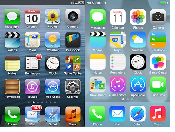
Apple decided to drop this design out in iOS 7. Since everyone knows how to interact with the system now, there is no point to mimic the real-world object[1] and came to the era of flat design.
Neumorphism is a modern take on Skeuomorphism in 2020, it mimics real-world objects, but design it in a minimal and subtle way.
The following are the Dribble sample shots of this style https://dribbble.com/search/skeuomorph and a popular shot https://dribbble.com/shots/8297803-Skeuomorph-Mobile-Banking-Continuation
Enough for a brief introduction. Love it or hate it, I will show you how to this in SwiftUI (I personally hate it).
Two Drop Shadow
There are many variations of Neumorphism, but all of them are a combination of different shadow effects. The one I am going to teach you is the simplest form.
The following example is a Dribble shot I found; we are going to implement the one on the left.
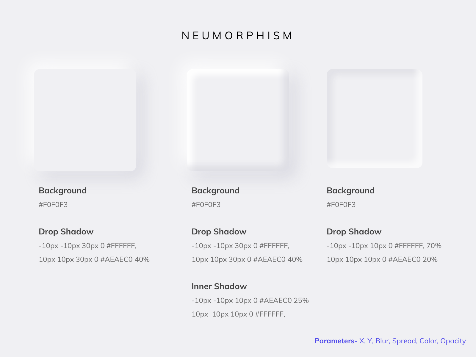
Just like old-skeuomorphism time, we can accomplish this neumorphic design with two drop shadows, one for light and one for shadow, each at opposite ends of an element.
Let's see how to build a button with this design trend.
.shadow()
SwiftUI has a view modifier to apply shadow to a view, and luckily it can easily stack. So we can have two shadows, one for light effect and one for shadow with two lines of code.
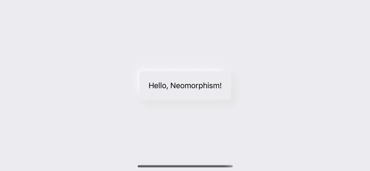
.shadow(color: .dropShadow, radius: 15, x: 10, y: 10)
.shadow(color: .dropLight, radius: 15, x: -10, y: -10)
Neumorphism light source is coming from the top left of the screen (I don't know why, but everyone seems to make it this way). So our shadow offset is (10, 10) and light offset is (-10, -10).
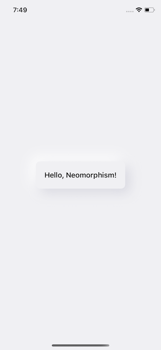
That's probably all you need to do for this simple variation.
struct NeumorphicView: View {
var body: some View {
VStack {
Button("Hello, Neumorphism!", action: {
}).padding(20)
.background(
RoundedRectangle(cornerRadius: 10)
.fill(Color.neuBackground)
)
.shadow(color: .dropShadow, radius: 15, x: 10, y: 10)
.shadow(color: .dropLight, radius: 15, x: -10, y: -10)
.foregroundColor(.primary)
}
}
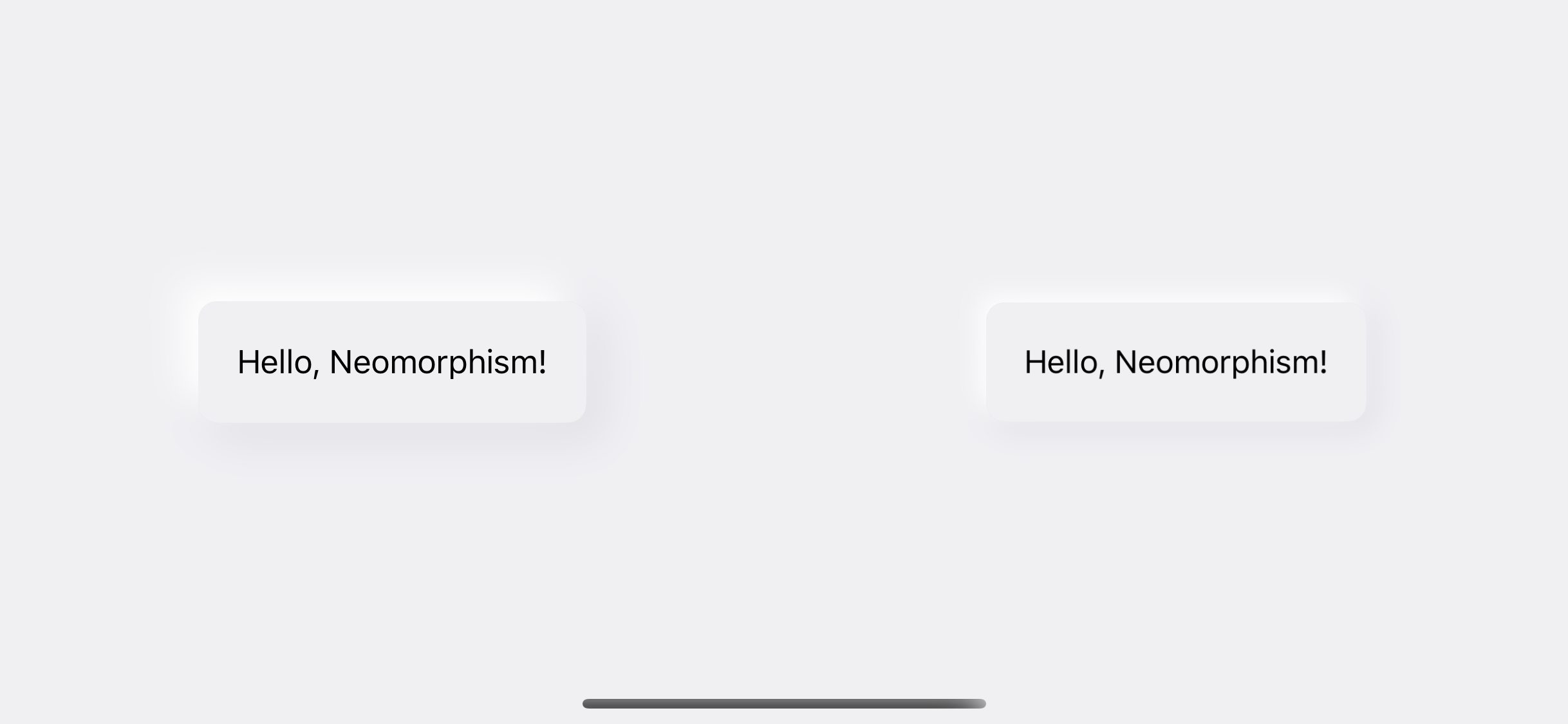
}The above code would result in something like this:
You can easily support sarunw.com by checking out this sponsor.
Offline Transcription: Fast, privacy-focus way to transcribe audio, video, and podcast files. No data leaves your Mac.
Color sensitive
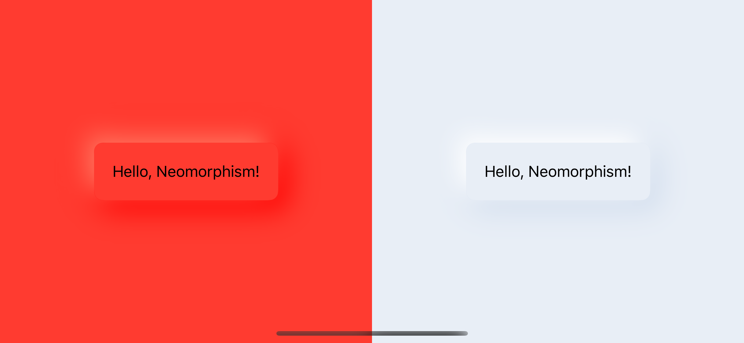
Neumorphism is quite sensitive to color; it won't look good on black and white background. Make sure you set background to non-white for maximum light and shadow effect.
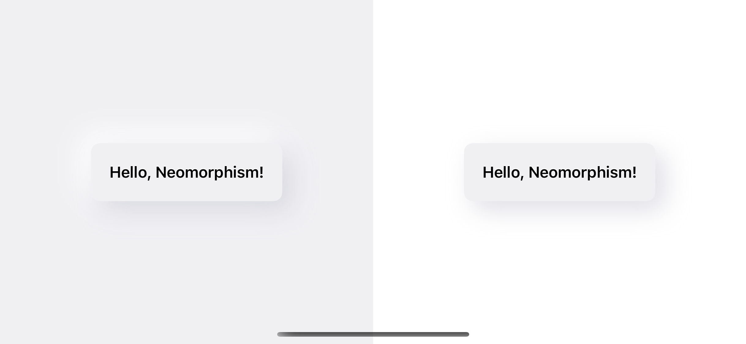
In the above example, I set background color the same color as the button.
struct ContentView: View {
    var body: some View {
        NeumorphicView()
            .frame(maxWidth: .infinity,
            maxHeight: .infinity)
            .background(Color.neuBackground)
            .edgesIgnoringSafeArea(.all)
    }
}
The thing gets worse on a colorful background.
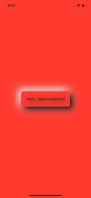
To make a generic neumorphic view, instead of hard code shadow and lighting color like my above example, we need to make a shadow effect apply beautifully regardless of a button or background color. We can do that with .blendMode.
Blend mode
Blend mode is a way to compositing the view with overlapping views. In our case, we want to blend shadow and lighting to underlying views.
First, we change the color of shadow to .white and .black. I find it easier to use with blend mode. Next, we apply blendMode to those shadows. What blend mode to use is trial and error for me, I just rotate through the options and see what fit, in this case, .overlay do the trick.
struct NeumorphicView: View {
    var bgColor: Color

    var body: some View {
        VStack {
            Button("Hello, Neumorphism!", action: {

            }).padding(20)
                .background(
                    ZStack {
                        RoundedRectangle(cornerRadius: 10, style: .continuous)
                            .shadow(color: .white, radius: 15, x: -10, y: -10)
                            .shadow(color: .black, radius: 15, x: 10, y: 10)
                            .blendMode(.overlay)
                        RoundedRectangle(cornerRadius: 10, style: .continuous)
                            .fill(bgColor)
                    }
            )
            .foregroundColor(.primary)
        }
    }
}
We move .shadow into .background because apply .blendMode will apply to all child views. We want to keep our button color intact and not effect by blend mode. We also create another RoundedRectangle to use as a button background color.
This new view work pretty well on color background.
Animation
Now, we have a beautiful neumorphic button, but it still a static button. Taping on it would do nothing. That's not a spirit of skeuomorphism. Let's make it move when we tap it.
Pressed state
Before we implement it, let's decided on our pressed state.
We could use the one on the right of the following example, but I don't think that's how this type of button looks when it is pressed.
Let's look at the real-world examples of these buttons. I'm not an expert on button or design, but what I think is the most resemble to this neumorphic design is Japanese toilet buttons. If you have been to Japan, you know what I'm talking about. If you haven't, here are some examples.
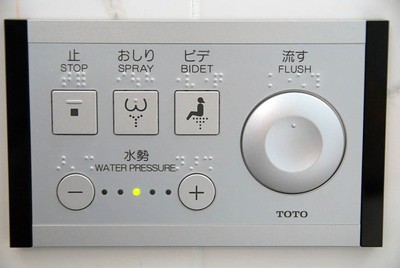
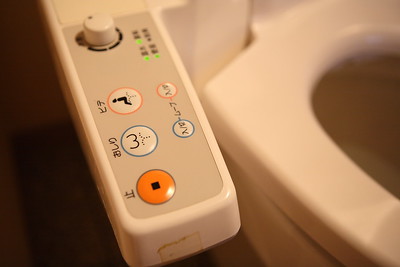
When you push these buttons, it doesn't go all the way down. It just moves down a bit. To achieve this, we just shrink down the button and reduce the shadow radius to mimic that the button is pushed down.
Implementation
We got everything in place, let's do the coding part.
First, we add a new @State to keep track of the button state.
@State private var isPressed: Bool = falseThen, use isPressed to control the value of shadow radius and position.
.shadow(color: .white, radius: self.isPressed ? 7: 10, x: self.isPressed ? -5: -10, y: self.isPressed ? -5: -10)
.shadow(color: .black, radius: self.isPressed ? 7: 10, x: self.isPressed ? 5: 10, y: self.isPressed ? 5: 10)
Scale button a bit to mimic that it is pushing down.
.scaleEffect(self.isPressed ? 0.98: 1)Lastly, make all of this animate with spring animation.
.animation(.spring())The following is the final result:
struct NeumorphicView: View {
    var bgColor: Color
    @State private var isPressed: Bool = false

    var body: some View {
        VStack {
            Button("Hello, Neumorphism!", action: {
                self.isPressed.toggle()
            }).padding(20)
                .background(
                    ZStack {
                        RoundedRectangle(cornerRadius: 10, style: .continuous)
                            .shadow(color: .white, radius: self.isPressed ? 7: 10, x: self.isPressed ? -5: -10, y: self.isPressed ? -5: -10)
                            .shadow(color: .black, radius: self.isPressed ? 7: 10, x: self.isPressed ? 5: 10, y: self.isPressed ? 5: 10)
                            .blendMode(.overlay)
                        RoundedRectangle(cornerRadius: 10, style: .continuous)
                            .fill(bgColor)
                    }
            )
                .scaleEffect(self.isPressed ? 0.98: 1)
                .foregroundColor(.primary)
                .animation(.spring())
        }
    }
}
Here is the animation showing how the final result looks like.
Conclusion
I can see why this neumorphism got all the hype recently, people getting bored with flat and come back to good old skeuomorphism with a new variation. Personally, I don't like it. I can't see myself using all the apps that look like this, but with the right amount of it in some specific places might put joy in your app. When the time comes, make sure you know how it is done.
In this article, I focus on the aesthetic aspect of the button. In the next article, I will write about the right way to implement this kind of styling with ButtonStyle. Subscribe to my newsletter or follow me on Twitter so you don't miss it.
You can easily support sarunw.com by checking out this sponsor.
Offline Transcription: Fast, privacy-focus way to transcribe audio, video, and podcast files. No data leaves your Mac.
Related Resources
- SwiftUI's ViewModifier
- SwiftUI basic Shape operations
- shadow(color:radius:x:y:)
- BlendMode
- SwiftUI ButtonStyle
Actually, skeuomorphism still used in the Apple interface system, but it becomes more and more seamless. One example is all the gestures Apple keeps adding all these years. Those gestures mimic our way of interacting with a real-world object. It backed by the concept of weight and force of the real object. There is a really nice WWDC 2018 session about this Designing Fluid Interfaces. ↩︎
Read more article about SwiftUI, Tutorial, Neumorphism, or see all available topic
Enjoy the read?
If you enjoy this article, you can subscribe to the weekly newsletter.
Every Friday, you'll get a quick recap of all articles and tips posted on this site. No strings attached. Unsubscribe anytime.
Feel free to follow me on Twitter and ask your questions related to this post. Thanks for reading and see you next time.
If you enjoy my writing, please check out my Patreon https://www.patreon.com/sarunw and become my supporter. Sharing the article is also greatly appreciated.
Become a patron Buy me a coffee Tweet ShareHow to remove Cocoapods from your project
Swift Package Manager is getting better every day. It is a matter of time before everyone supports it. When the time comes, make sure you know how to say goodbye to this old friend.
Class-only Protocols: class or AnyObject
If you are still declaring class-only protocols by inheriting them from class, you might need to revise your knowledge.