How to make a custom button style supports leading dot syntax in SwiftUI
Table of Contents
Before Swift 5.5
Before Swift 5.5 (Xcode 13), when we set a button style, we have to use a full name of a concrete type that conforms to PrimitiveButtonStyle or ButtonStyle such as PlainButtonStyle.
Button("Sign In", action: {})
    .buttonStyle(PlainButtonStyle())
The downsides of this approach are poor discoverability and verbosity. It would be better if we could use a leading dot syntax as we do with Color.
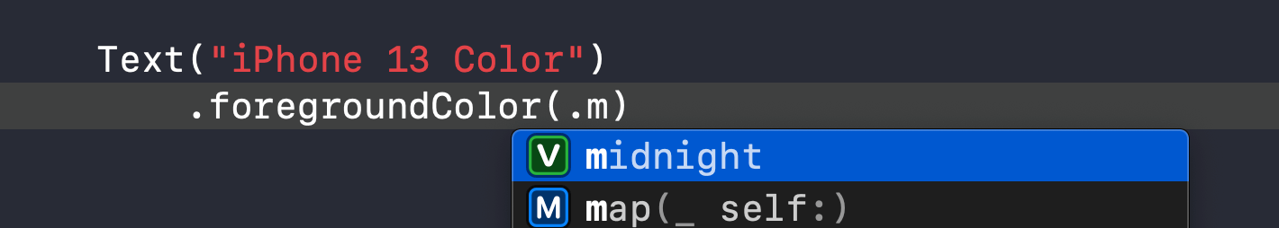
With Color, we could use leading dot syntax to explore all available colors declared as static members.
extension Color {
    static let midnight: Color = ...
    static let starlight: Color = ...
}
This is a Swift feature called static member lookup. As you can see, it works wonderfully on concrete types. It can infer the base type from context, which allows leading dot syntax with autocomplete.
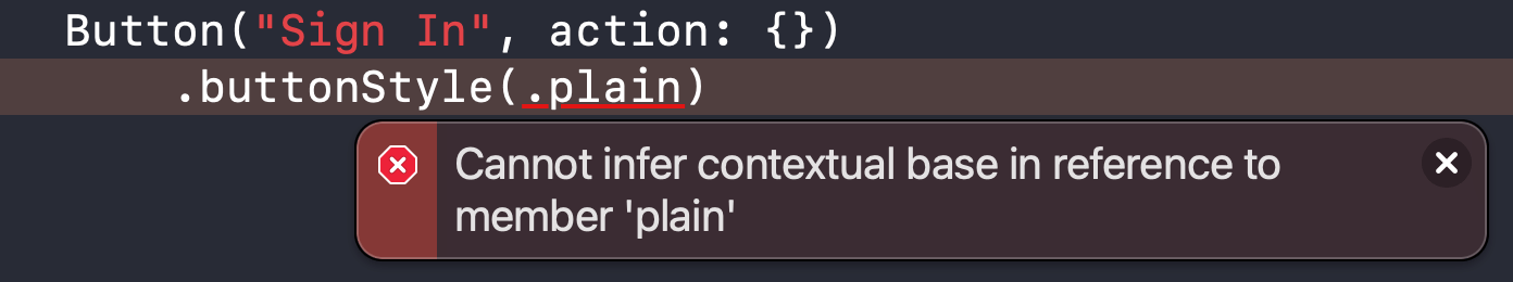
It won't work if you try to create a similar extension on a PrimitiveButtonStyle protocol.
extension PrimitiveButtonStyle where Self == PlainButtonStyle {
    public static var plain: PlainButtonStyle {
        PlainButtonStyle()
    }
}

// This won't work
Button("Sign In", action: {})
    .buttonStyle(.plain)
Swift static member lookup is not supported for members of protocols in generic functions, so there is no way to use leading dot syntax at a generic call site.
You can easily support sarunw.com by checking out this sponsor.
Screenshot Studio: Create App Store screenshots in seconds not minutes.
Static Member Lookup in Generic Contexts
Swift 5.5 extends static member lookup capability to cover generic contexts. And that's what we are trying to do in the previous section.
With this Swift feature (Swift 5.5, Xcode 13), we can use leading dot syntax for generic types.
Button("Sign In", action: {})
    .buttonStyle(.plain)
Most SwiftUI use a protocol as a way to style most of its view. And use a generic function to apply that style. That means all views get benefits of this new capability, not just a button style, but we will only focus on a button style in this article.
Toggle and ToggleStyle also getting benefit from this.
Toggle("Wi-Fi", isOn: $isWiFiEnabled)
    .toggleStyle(SwitchToggleStyle())
// To
Toggle("Wi-Fi", isOn: $isWiFiEnabled)
    .toggleStyle(.switch)
Make a custom button style support leading dot syntax
If you have a custom button style, you can also support this leading dot syntax by creating an extension of PrimitiveButtonStyle or ButtonStyle (depending on what your button style conforms to).
First, let's create a simple button style as an example. You can read more on how to create a custom button style in detail in SwiftUI ButtonStyle.
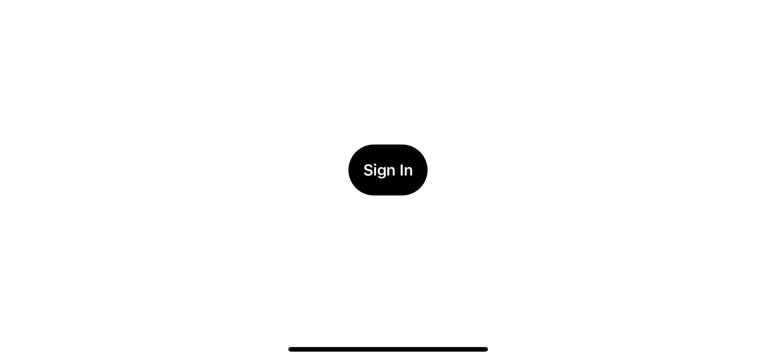
struct CapsuleButtonStyle: ButtonStyle {
    func makeBody(configuration: Configuration) -> some View {
        configuration.label
            .padding()
            .font(.body.bold())
            .foregroundColor(.white)
            .background(
                Capsule()
                    .fill(Color.black)
            )
    }
}

Button("Sign In", action: {})
    .buttonStyle(CapsuleButtonStyle())
It is a simple capsule-style button with a black background.
Solution
To make a custom button style that supports leading dot syntax, we need to do the following:
- Create an extension of a protocol that you want to support leading dot syntax. It is the one that your concreate type conforms to. In this case, it is a
ButtonStyle. - Has
Selfbound to a concrete type that will be used as a type of your static member. In this case, it is our newly created button style,CapsuleButtonStyle. - Declare static members that return a button style we want.
It might sound complicated, but it is not. Here is how an extension for our CapsuleButtonStyle looks like.
extension ButtonStyle where Self == CapsuleButtonStyle {
    static var capsule: Self {
        return .init()
    }
}
1 We create an extension of ButtonStyle with a Self bound to a CapsuleButtonStyle (2).
3 We create a static member that returns our style. Self equals to CapsuleButtonStyle and .init() means CapsuleButtonStyle().
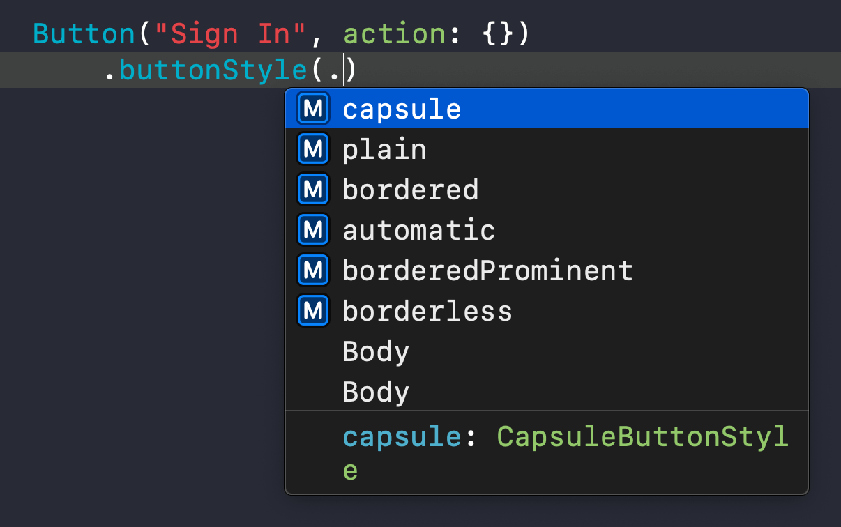
With this extension in place, we can use our custom button style with leading dot syntax, .buttonStyle(.capsule).
Button("Sign In", action: {})
    .buttonStyle(.capsule)
And our custom button style also shows up in code completion along with system-defined ones, which greatly improves discoverability.
You can easily support sarunw.com by checking out this sponsor.
Screenshot Studio: Create App Store screenshots in seconds not minutes.
Conclusion
This Swift feature can be easily overlooked, but it is a nice addition that improves many existing APIs and code discoverability.
As mentioned earlier, this change isn't exclusive to a button style. I think you can leverage this feature to other places in your code as well. I encourage you to check this out at SE-0299: Extending Static Member Lookup in Generic Contexts.
Read more article about SwiftUI, Swift, ButtonStyle, or see all available topic
Enjoy the read?
If you enjoy this article, you can subscribe to the weekly newsletter.
Every Friday, you'll get a quick recap of all articles and tips posted on this site. No strings attached. Unsubscribe anytime.
Feel free to follow me on Twitter and ask your questions related to this post. Thanks for reading and see you next time.
If you enjoy my writing, please check out my Patreon https://www.patreon.com/sarunw and become my supporter. Sharing the article is also greatly appreciated.
Become a patron Buy me a coffee Tweet ShareWhat is a KeyPath in Swift
By learning about the key path, you open up yourself to an opportunity to improve your existing API or even create a new one that you don't aware you can do it.
How to make a SwiftUI view to fill its container width and height
We can use a frame modifier to make a view appear to be full width and height, but the result might not be what you expected.