SwiftUI ButtonStyle
Table of Contents
In the previous post about How to create Neumorphic design in SwiftUI I described how you could customize an appearance of a button, but as you can see it is a bit verbose and hard to reuse. If you want to apply neumorphic design everywhere, it won't be possible.
My first thought to tackle this problem is an old friend ViewModifier. I wrote about view modifier in the previous post SwiftUI's ViewModifier and recommended you to check it out.
ViewModifier
To make a neumorphic button style out of view modifier, we just simply copy all modifiers that we use to make our neumorphic design and put it in a newly create ViewModifier. The code is pretty much the same from How to create Neumorphic design in SwiftUI. I just create a ViewModifier out of it.
struct Neumorphic: ViewModifier {
    var bgColor: Color
    @Binding var isPressed: Bool

    func body(content: Content) -> some View {
        content
            .padding(20)
            .background(
                ZStack {
                    RoundedRectangle(cornerRadius: 10, style: .continuous)
                        .shadow(color: .white, radius: self.isPressed ? 7: 10, x: self.isPressed ? -5: -15, y: self.isPressed ? -5: -15)
                        .shadow(color: .black, radius: self.isPressed ? 7: 10, x: self.isPressed ? 5: 15, y: self.isPressed ? 5: 15)
                        .blendMode(.overlay)
                    RoundedRectangle(cornerRadius: 10, style: .continuous)
                        .fill(bgColor)
                }
            )
            .scaleEffect(self.isPressed ? 0.95: 1)
            .foregroundColor(.primary)
            .animation(.spring())
    }
}

extension View {
    func neumorphic(isPressed: Binding<Bool>, bgColor: Color) -> some View {
        self.modifier(Neumorphic(bgColor: bgColor, isPressed: isPressed))
    }
}
And we use this by applying this to the content of a button.
struct ContentView: View {
    @State private var isPressed: Bool = false

    var body: some View {
        Button(action: {
            self.isPressed.toggle()
        }, label: {
            VStack {
                Text("Hello")
            }.neumorphic(isPressed: $isPressed, bgColor: .neuBackground)
        }).frame(maxWidth: .infinity,
                 maxHeight: .infinity)
            .background(Color.neuBackground)
            .edgesIgnoringSafeArea(.all)
    }
}
As you can see, it is easier to reuse, but still not the best way to do it. First, it is quite annoying that we have to keep track of a pressed state. Second, we apply the style to the content of the button instead of the button itself. It should have a better way to do it. Luckily, SwiftUI has. A button has a modifier that accepts a ButtonStyle.
You can easily support sarunw.com by checking out this sponsor.
Offline Transcription: Fast, privacy-focus way to transcribe audio, video, and podcast files. No data leaves your Mac.
ButtonStyle
ButtonStyle is a proper way to style our buttons. Apple also defines some for us.
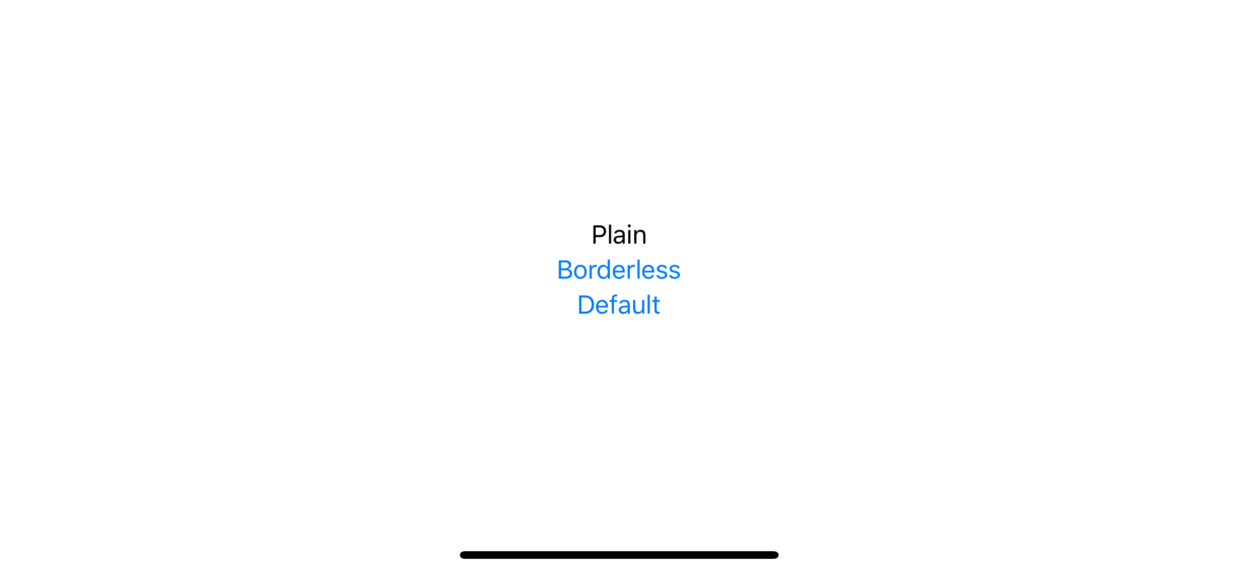
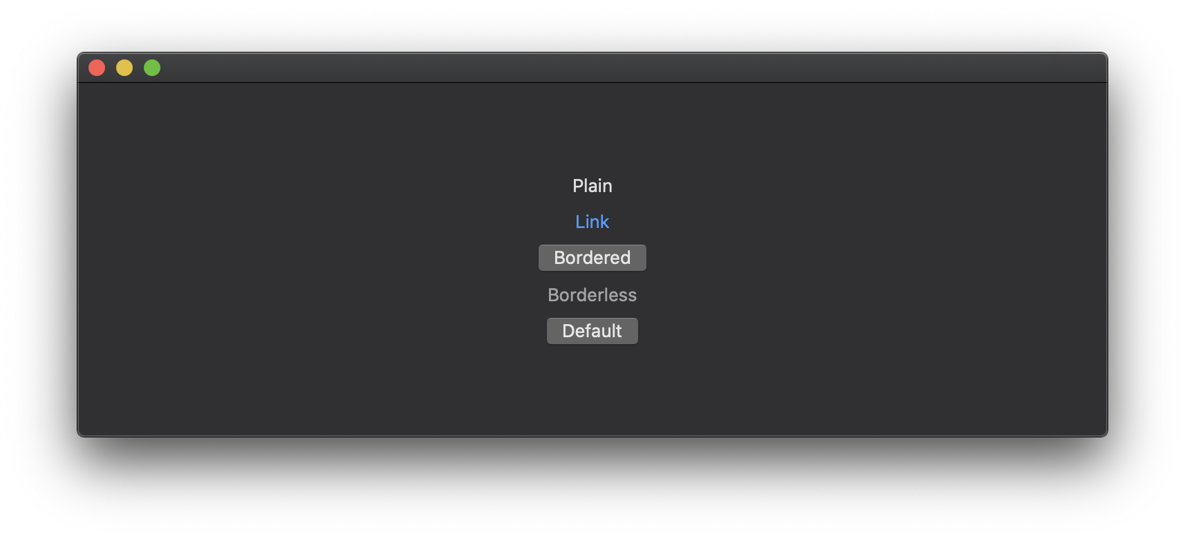
struct ContentView: View {
    var body: some View {
        VStack {
            Button("Plain", action: {
            }).buttonStyle(PlainButtonStyle())

            Button("Borderless", action: {
            }).buttonStyle(BorderlessButtonStyle())

            Button("Default", action: {
            }).buttonStyle(DefaultButtonStyle())
        }
    }
}
For iOS, we have only two styles. PlainButtonStyle that does not style or decorate its content while idle. It will show content in black and more subtle fading effects when click compares to BorderlessButtonStyle.
For macOS, we have more options, PlainButtonStyle, LinkButtonStyle, BorderedButtonStyle, and BorderlessButtonStyle.
How to create a custom button style?
You can create a custom style by create a new struct that conforming to the ButtonStyle protocol. ButtonStyle protocol expect us to implement one function, func makeBody(configuration: Self.Configuration) -> Self.Body.
The function creates a View representing the body of a Button. You will get ButtonStyleConfiguration as a parameter, which contains the content of the button (label), and boolean indicates that the button is currently being pressed down by the user (isPressed).
The implementation is quite straightforward, we copy most of the code from our previous example, but this time we don't have to keep isPressed state as it is provided by ButtonStyleConfiguration.
struct NeumorphicButtonStyle: ButtonStyle {
    var bgColor: Color

    func makeBody(configuration: Self.Configuration) -> some View {
        configuration.label
            .padding(20)
            .background(
                ZStack {
                    RoundedRectangle(cornerRadius: 10, style: .continuous)
                        .shadow(color: .white, radius: configuration.isPressed ? 7: 10, x: configuration.isPressed ? -5: -15, y: configuration.isPressed ? -5: -15)
                        .shadow(color: .black, radius: configuration.isPressed ? 7: 10, x: configuration.isPressed ? 5: 15, y: configuration.isPressed ? 5: 15)
                        .blendMode(.overlay)
                    RoundedRectangle(cornerRadius: 10, style: .continuous)
                        .fill(bgColor)
                }
        )
            .scaleEffect(configuration.isPressed ? 0.95: 1)
            .foregroundColor(.primary)
            .animation(.spring())
    }
}
You can use a custom style the same way as using the system style.
Button("Neumorphic", action: {

}).buttonStyle(NeumorphicButtonStyle(bgColor: .neuBackground))
Conclusion
SwiftUI makes it very easy to customize a button style. The ButtonStyle protocol works similarly to the ViewModifier protocol, except it's specialized for buttons.
You can see that we can use the same code and make it more structural and reusable with a little effort just by knowing the framework feature. I still have more to learn about this new framework. Subscribe or Follow me on Twitter to get more posts like this. Sharing this with your friends is greatly appreciated.
You can easily support sarunw.com by checking out this sponsor.
Offline Transcription: Fast, privacy-focus way to transcribe audio, video, and podcast files. No data leaves your Mac.
Related Resources
Read more article about SwiftUI, ButtonStyle, Neumorphism, or see all available topic
Enjoy the read?
If you enjoy this article, you can subscribe to the weekly newsletter.
Every Friday, you'll get a quick recap of all articles and tips posted on this site. No strings attached. Unsubscribe anytime.
Feel free to follow me on Twitter and ask your questions related to this post. Thanks for reading and see you next time.
If you enjoy my writing, please check out my Patreon https://www.patreon.com/sarunw and become my supporter. Sharing the article is also greatly appreciated.
Become a patron Buy me a coffee Tweet ShareSF Symbols: What is it, and how to use?
Introduction of SF Symbols, learn the basics, and how to use them.
tintColor
Introduce you to one of an essential part of iOS theming. What is tintColor and its benefit.