Create Button with Rounded Corner Border in SwiftUI
Table of Contents
The default button style in iOS is borderless, which is just colorized text.
For some action, you might want to make a button stand out by adding a border to it.
There are many ways to create a button with a border in SwiftUI. In this article, I will show you two styles of bordered buttons.
We will learn how to create a button in both styles.
Filled Bordered Button
There are two ways to create a rounded bordered button in SwiftUI based on the minimum iOS version you supported.
- Button Styles (iOS 15)
- Custom Button label
Button Styles
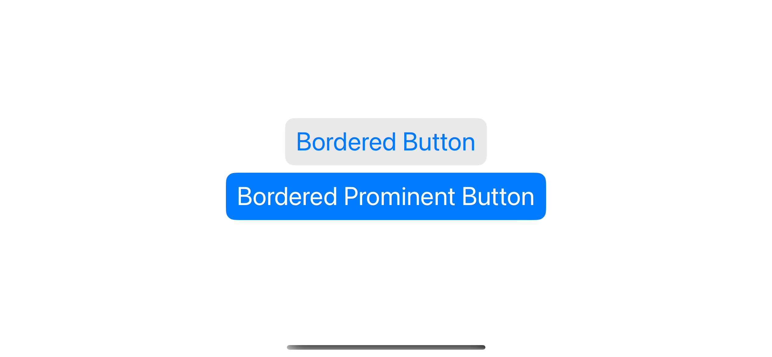
In iOS 15, we got two new button styles with a rounded bordered appearance, bordered and borderedProminent.
This is the easiest way to have a rounded corner bordered button style. You just specify either .bordered or .borderedProminent in a .buttonStyle modifier.
VStack {
    Button("Bordered Button") {

    }
    .buttonStyle(.bordered)

    Button("Bordered Prominent Button") {

    }
    .buttonStyle(.borderedProminent)
}
.font(.title)
Here is the result of both button styles.
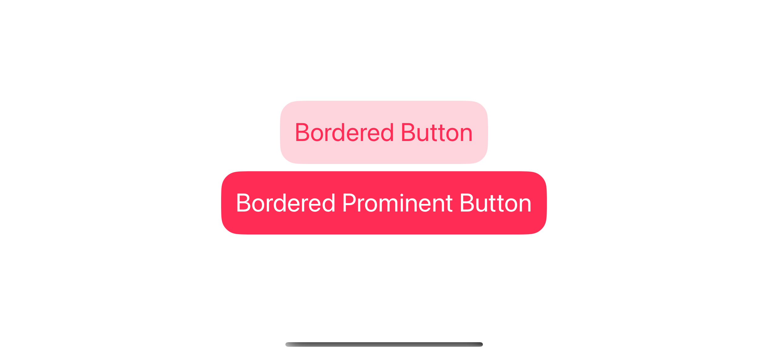
You can also change the color with the tint modifier.
VStack {
    Button("Bordered Button") {

    }
    .buttonStyle(.bordered)
    .tint(.pink)

    Button("Bordered Prominent Button") {

    }
    .buttonStyle(.borderedProminent)
    .tint(.pink)
}
.font(.title)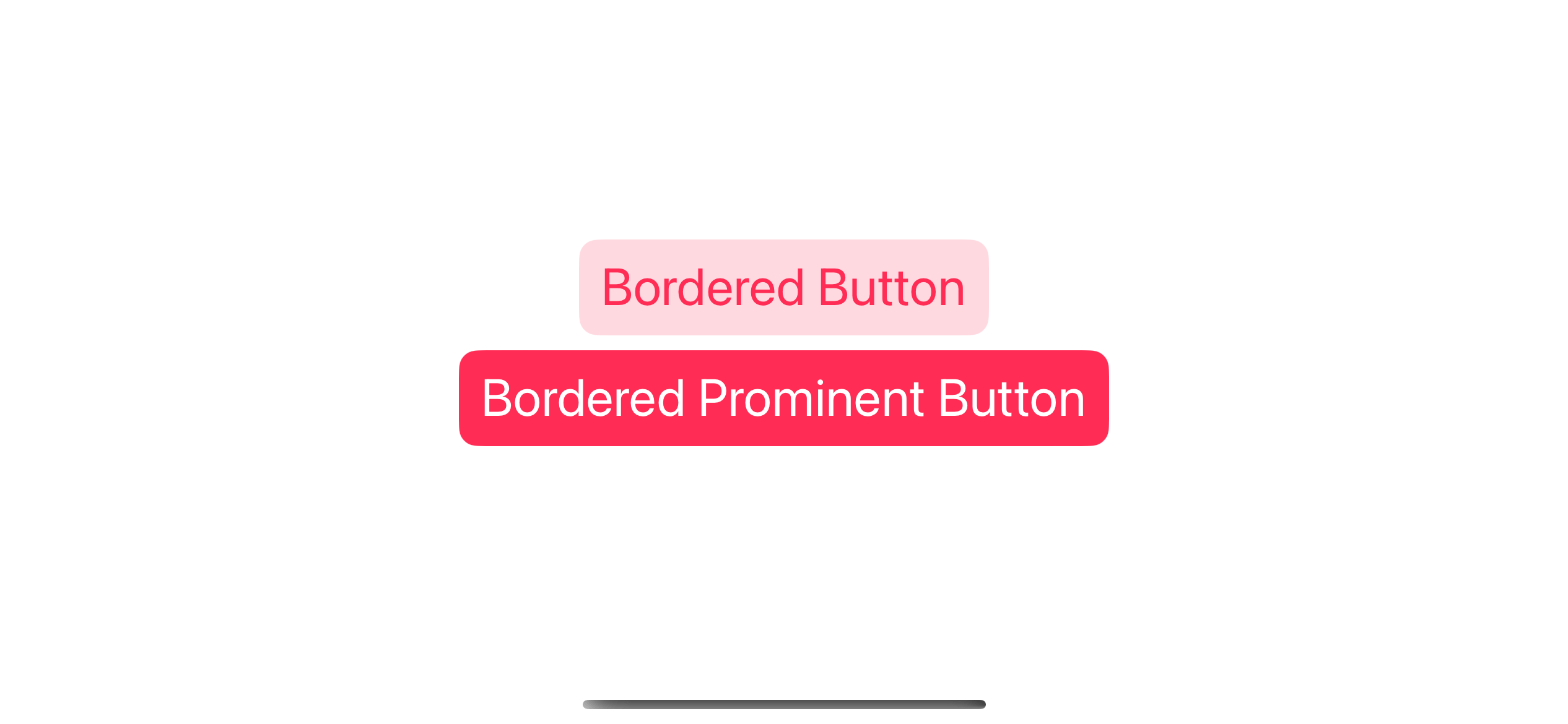
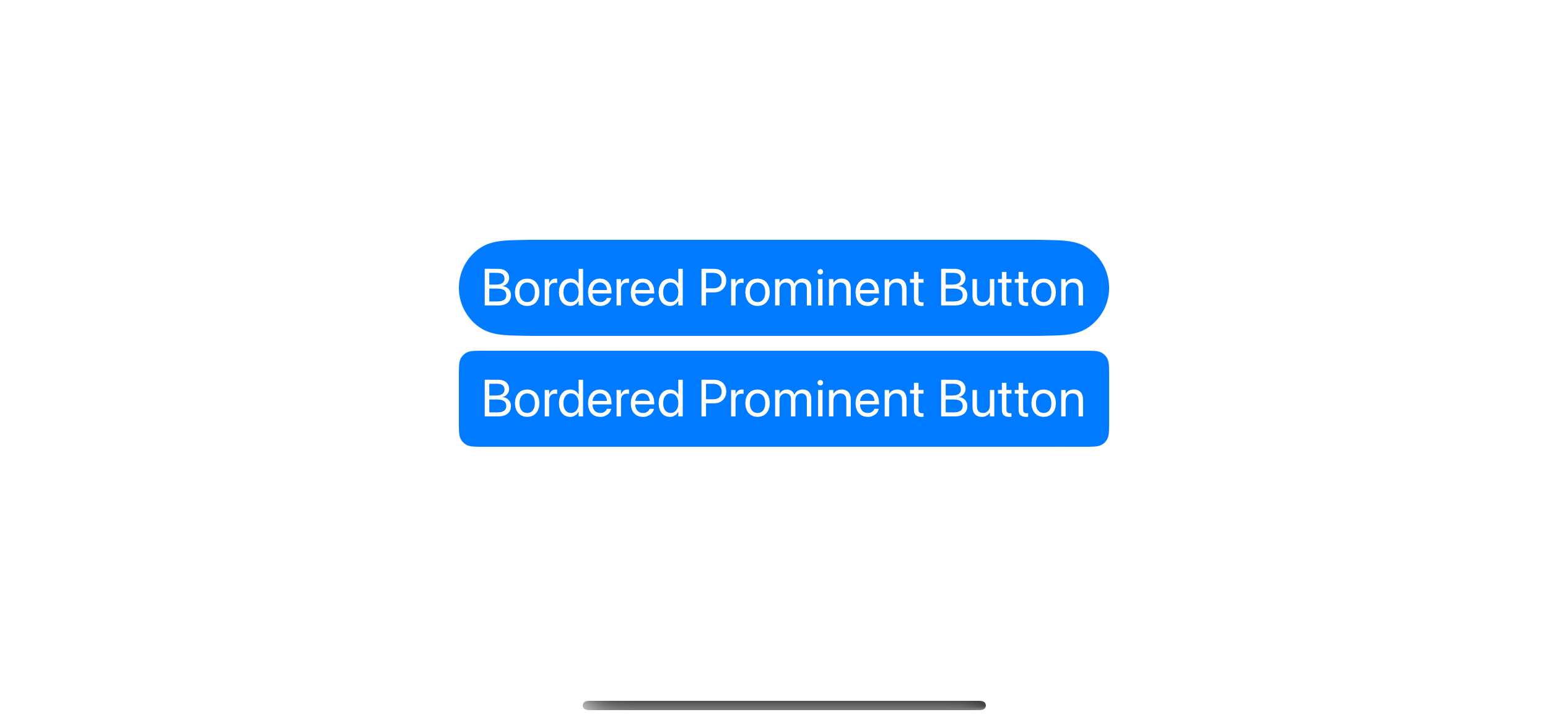
You can adjust the corner radius of a button with .bordered or .borderedProminent styles using .buttonBorderShape.
VStack {
    Button("Bordered Prominent Button") {

    }
    .buttonStyle(.borderedProminent)
    .buttonBorderShape(.capsule)

    Button("Bordered Prominent Button") {

    }
    .buttonStyle(.borderedProminent)
    .buttonBorderShape(.roundedRectangle(radius: 8))
}
.font(.title)
In this example, we use a capsule shape that produces the roundest radius possible and a roundedRectangle with a radius of 8.
Custom Button label
If you need to support a version earlier than iOS 15 or want greater control over how things look, you can create a custom style for your button.
In this example, I replicate bordered and bordered prominent styles with my own implementation.
VStack {
    Button {

    } label: {
        Text("Bordered Button")
            .padding()
            // 1
            .foregroundColor(.pink)
            // 2
            .background(
                RoundedRectangle(
                    cornerRadius: 20,
                    style: .continuous
                )
                .fill(.pink.opacity(0.2))
            )
    }


    Button {

    } label: {
        Text("Bordered Prominent Button")
            .padding()
            .foregroundColor(.white)
            .background(
                RoundedRectangle(
                    cornerRadius: 20,
                    style: .continuous
                )
                .fill(.pink)
            )
    }
}
.font(.title)
1 We use the foregroundColor to set the text color.
2 We use the background modifier to set a background for a button. We use a rounded rectangle as a background to simulate a bordered button.
You can easily support sarunw.com by checking out this sponsor.
Screenshot Studio: Create App Store screenshots in seconds not minutes.
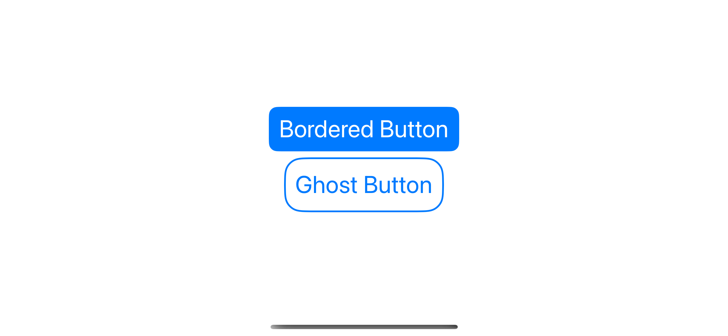
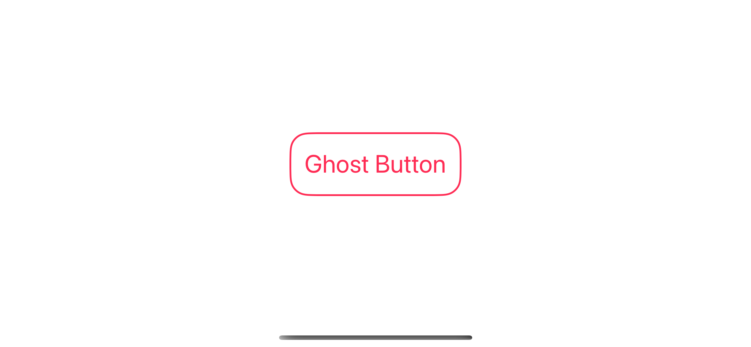
Transparent Bordered Button
There is no built-in style for a rounded bordered button with a transparent fill color. You have to create this with a combination of modifiers.
We use the same technique as bordered with filled color, but instead of applying .fill to RoundedRectangle, we use .stroke instead.
Button {

} label: {
    Text("Ghost Button")
        .padding()
        .foregroundColor(.pink)
        .background(
            RoundedRectangle(
                cornerRadius: 20,
                style: .continuous
            )
            .stroke(.pink, lineWidth: 2)
        )
}
You can control the border color and thickness by specifying them in the .stroke modifier.
Create a Button Style
You can create a new button style from the previous example as follow.
struct GhostButtonStyle: ButtonStyle {
    func makeBody(configuration: Configuration) -> some View {
        configuration.label
            .padding()
            .foregroundStyle(.tint)
            .background(
                RoundedRectangle(
                    cornerRadius: 20,
                    style: .continuous
                )
                .stroke(.tint, lineWidth: 2)
            )
    }
}

extension ButtonStyle where Self == GhostButtonStyle {
    static var ghost: Self {
        return .init()
    }
}
And then use it like this.
VStack {
    Button("Ghost Button") {

    }
    .buttonStyle(.ghost)

    Button("Ghost Button") {

    }
    .buttonStyle(.ghost)
    .tint(.pink)

    Button("Ghost Button") {

    }
    .buttonStyle(.ghost)
    .tint(.mint)
}
.font(.title)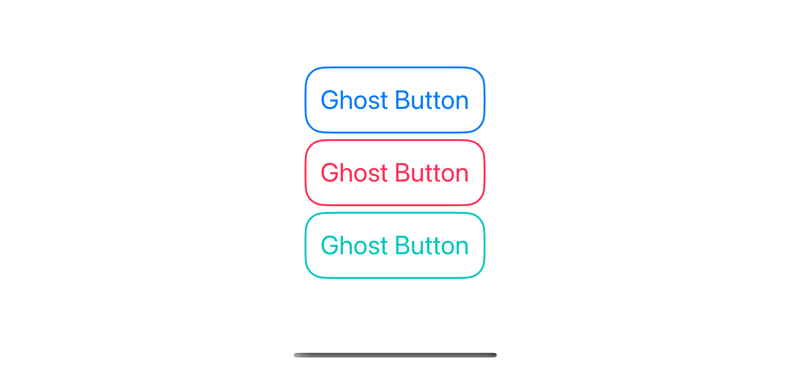
Read more article about SwiftUI, Button, or see all available topic
Enjoy the read?
If you enjoy this article, you can subscribe to the weekly newsletter.
Every Friday, you'll get a quick recap of all articles and tips posted on this site. No strings attached. Unsubscribe anytime.
Feel free to follow me on Twitter and ask your questions related to this post. Thanks for reading and see you next time.
If you enjoy my writing, please check out my Patreon https://www.patreon.com/sarunw and become my supporter. Sharing the article is also greatly appreciated.
Become a patron Buy me a coffee Tweet ShareHow to get Root view controller in Swift
In this article, I will show you a quick and dirty way to get a root view controller in an iOS app.
How to break multiple nested loops in Swift
Learn how to break out of the outer loop from the inner loop.