How to present an alert in SwiftUI in iOS 13/14
Table of Contents
We can show alerts to the user in SwiftUI with an alert() modifier. There are two ways to control the presentation with this modifier:
isPresented, a binding to a boolean value that determines whether to present the alert.Identifiable, a binding to a source of truth for the alert. If the item is non-nil, the alert will be presented.
These presentations expected the same content, Alert. So, let's start with that first.
Alert
Alert is a representation of an alert presentation. You can set an alert title, message, and up to two actions. We will explore how to set each one case by case.
Title Only
This is the simplest form where you specify only a title.
Alert(
    title: Text("Title")
)
The result might not be what you expected. SwiftUI automatically adds a default button with the title "OK" for you. This behavior makes sure that your users always have a way to dismiss the alert.

Title and Message
You can supply an optional message which will show under the title as an alert body.
Alert(
    title: Text("Title"),
    message: Text("Message")
)
Again, SwiftUI adds a default button with the "OK" since we don't specify any actions.

You can easily support sarunw.com by checking out this sponsor.

Offline Transcription: Fast, privacy-focus way to transcribe audio, video, and podcast files. No data leaves your Mac.
Alert Button
Alert also has an option for us to provide a custom action button. In our previous example, we leave this empty, and SwiftUI adds a default "OK" button for us, suffice for a simple case.
For a more sophisticated one, we might want to customize this with a custom handler and text. We can do that by providing an Alert.Button.
We have three button styles.
- Default:
static func `default`(Text, action: (() -> Void)?) - Cancel:
- With text
static func cancel(Text, action: (() -> Void)?) -> Alert.Button - Without text
static func cancel((() -> Void)?) -> Alert.Button
SwiftUI will provide a cancel label for us if we use this form.
- With text
- Destructive:
static func destructive(Text, action: (() -> Void)?)
These styles dictate the appearance (color) and position of the button in an alert. The following are some behavior, but Apple can change this in the future update, so don't rely much on this behavior. The point is to use button style to reflect your intention.
- Default: Show normally.
- Destructive: Show in red text.
- Cancel: Show in bold and always on the left (This varies based on localization).
Now that we know how to structure our alert buttons, let's see how to use them. We have two options here, an alert with one button and two buttons.
Alert with one button
You provide an alert button to a dismissButton parameter to replace the default "OK" button. You can specify a closure to execute when the user taps the button.
Alert(
    title: Text("Title"),
    message: Text("Message"),
    dismissButton: .default(Text("Okay"), action: {

    })
)
The default "OK" button will be gone once you specify any alert button.

Alert with two buttons
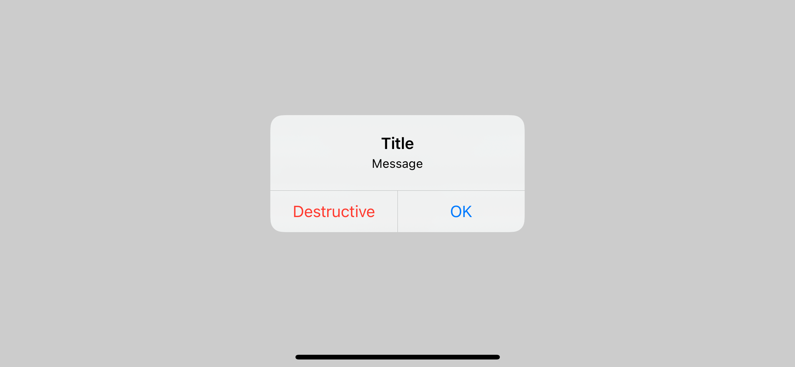
If you want two actions in your alert, you must pass two buttons as arguments—one to primaryButton and another to secondaryButton.
Alert(
    title: Text("Title"),
    message: Text("Message"),
    primaryButton: .destructive(Text("Destructive"), action: {

    }),
    secondaryButton: .default(Text("OK"), action: {

    })
)
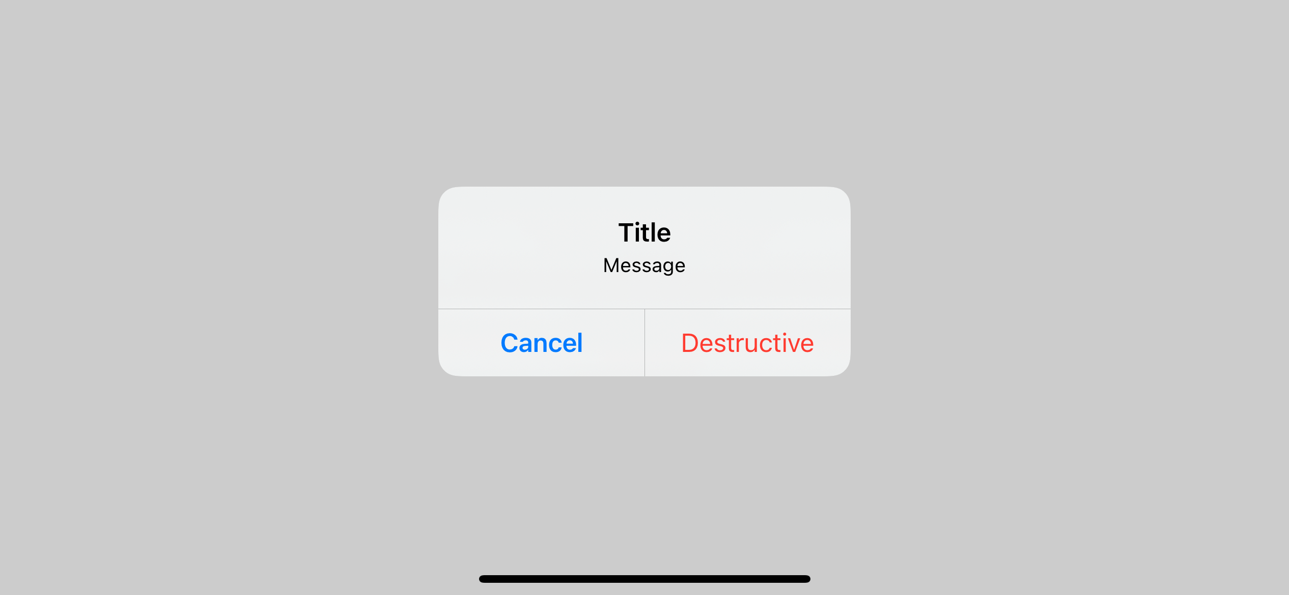
Normally the primaryButton will show on the left and secondaryButton on the right. But as we learn about button style and its behavior in the last section, the cancel button style will always take the left position even when it is set to secondaryButton.
Alert(
    title: Text("Title"),
    message: Text("Message"),
    primaryButton: .destructive(Text("Destructive"), action: {

    }),
    secondaryButton: .cancel(Text("Cancel"), action: { // 1

    })
)
1 Cancel style button render on the left of the alert even when it is set as a secondary button.

You can easily support sarunw.com by checking out this sponsor.

Offline Transcription: Fast, privacy-focus way to transcribe audio, video, and podcast files. No data leaves your Mac.
How to present an alert
We have two ways to present an alert:
isPresented.Identifiable.
Let's start with the simplest form first, isPresented.
isPresented
Alert uses a boolean value to determine whether to present or not. We bind a boolean value to the isPresented binding. Set the isPresented value to true will present the alert. When the user presses any action button, the system dismisses the alert and sets isPresented back to false.
struct ContentView: View {
    // 1
    @State private var presentAlert = false

    var body: some View {
        VStack {
            // 2
            Text(presentAlert ? "Presenting": "Dismissed")
            Button("Alert") {
                // 3
                presentAlert = true
            }
            Spacer()
        }
        .alert(isPresented: $presentAlert) { // 4
            Alert(
                title: Text("Title"),
                message: Text("Message")
            )
        }.padding()
    }
}
1 We declare a @State variable that will use to bind with isPresented binding. We set this to true when we want to show an alert.
3 When the user clicks the button, we set presentAlert to true, which will present the alert bound to this value (4).
2 Once the user tap "OK", the alert will dismiss and set the value bound to isPresented back to false.

Identifiable
Present an alert with isPresented is easy to use, which suits a general static alert. If you have an alert that can present dynamic value, you might want to use the second form of presentation that expected object that conforms Identifiable protocol.
The concept is similar to the first method, but instead of binding an alert with a boolean, we bind it to any Identifiable item. If the item is non-nil, The system will present an alert. The system also passes the item to the content closure. We use the passing content to populate the fields of an alert. When the user presses any action button, the system dismisses an alert and sets the item back to nil.
// 1
struct ErrorInfo: Identifiable {
    var id: Int
    let title: String
    let description: String
}

struct ContentView: View {
    // 2
    @State private var error: ErrorInfo?

    var body: some View {
        VStack {
            // 3
            Text(error?.description ?? "nil")
            // 4
            Button("Error 1") {
                error = ErrorInfo(id: 1, title: "Title 1", description: "Message 1")
            }
            Button("Error 2") {
                error = ErrorInfo(id: 2, title: "Title 2", description: "Message 2")
            }
            Button("Error 3") {
                error = ErrorInfo(id: 3, title: "Title 3", description: "Message 3")
            }
            Spacer()
        }
        .alert(item: $error, content: { error in // 5
            Alert(
                title: Text(error.title),
                message: Text(error.description)
            )
        })
        .padding()
    }
}
1 An item that will populate our alert content.
2 A @State variable use to trigger alert presentation.
4 Each button set an error with a different error title and description. Set error to non-nil will trigger an alert bound to this item (5).
3 When the user presses any action button, the system sets the item back to nil.
Read more article about SwiftUI, Alert, or see all available topic
Enjoy the read?
If you enjoy this article, you can subscribe to the weekly newsletter.
Every Friday, you'll get a quick recap of all articles and tips posted on this site. No strings attached. Unsubscribe anytime.
Feel free to follow me on Twitter and ask your questions related to this post. Thanks for reading and see you next time.
If you enjoy my writing, please check out my Patreon https://www.patreon.com/sarunw and become my supporter. Sharing the article is also greatly appreciated.
Become a patron Buy me a coffee Tweet ShareHow to show multiple alerts on the same view in SwiftUI
If you have ever worked with an app with multiple alerts, please beware that the system can present only the latest or outermost one. Let's see how we can mitigate this.