4 Picker styles in SwiftUI Form
Table of Contents
Picker is a control for selecting value from a list of options.
When using Picker inside a Form, the picker style change automatically based on the platform and version.
In this article, we will explore all possible picker styles, so you can choose the one that suits your needs.
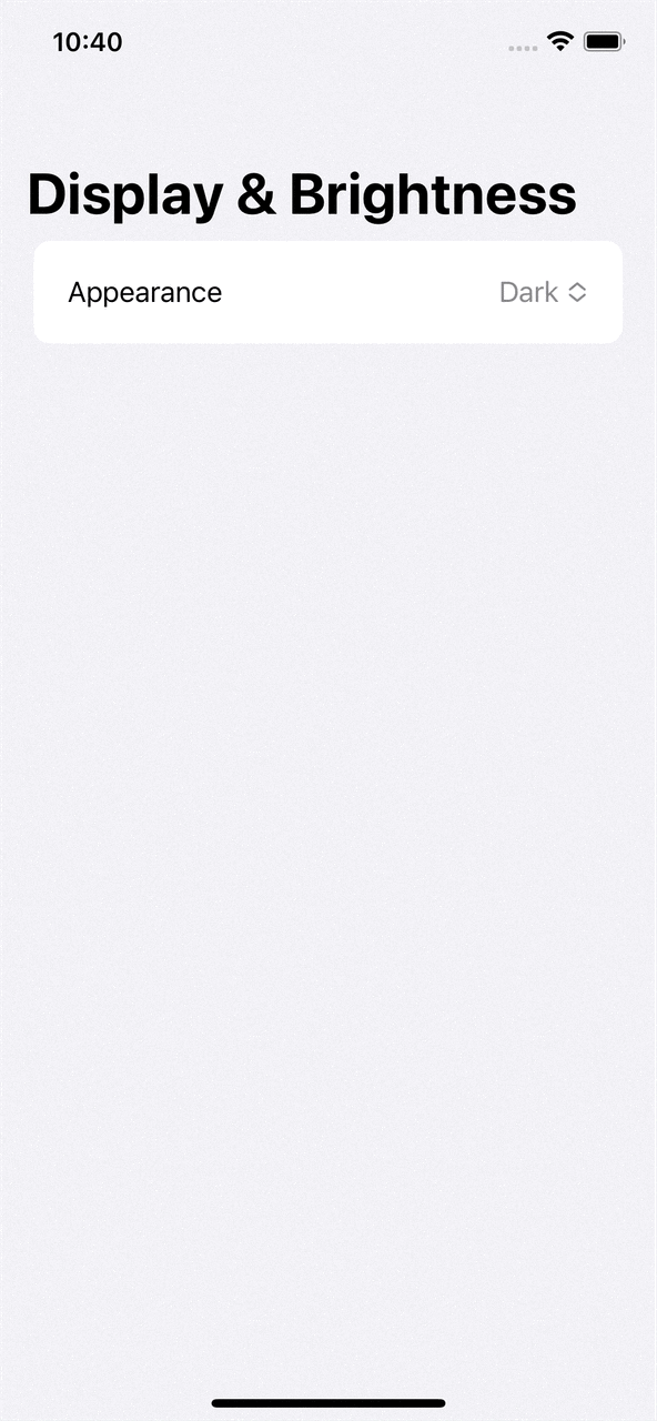
Default picker style
If you don't specify a picker style, SwiftUI will choose one based on the platform and the version.
In iOS 16, picker will use menu style.
The menu style will show the options as a pop-up menu when a user taps the picker.
struct ContentView: View {
    @State private var selectedTheme = "Dark"
    let themes = ["Dark", "Light", "Automatic"]

    var body: some View {
        NavigationStack {
            Form {
                Section {
                    Picker("Appearance", selection: $selectedTheme) {
                        ForEach(themes, id: \.self) {
                            Text($0)
                        }
                    }
                }
            }
            .navigationTitle("Display & Brightness")
        }
    }
}
You can easily support sarunw.com by checking out this sponsor.
AI Paraphrase:Are you tired of staring at your screen, struggling to rephrase sentences, or trying to find the perfect words for your text?
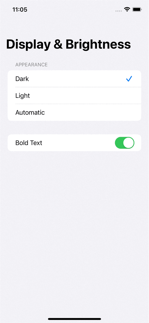
Navigation Link Picker Style
If you have a long list of options and want to put an option selection to another view, you can do that by applying navigationLink picker style.
This is the style you see in the Apple Settings app.
struct ContentView: View {
    @State private var selectedTheme = "Dark"
    let themes = ["Dark", "Light", "Automatic"]

    var body: some View {
        NavigationStack {
            Form {
                Picker("Appearance", selection: $selectedTheme) {
                    ForEach(themes, id: \.self) {
                        Text($0)
                    }
                }
                .pickerStyle(.navigationLink)
            }
            .navigationTitle("Display & Brightness")
        }
    }
}
A picker will act like a navigation link that pushes users to another view with a list of options.

Inline Picker Style
If you have only a few options, inline style might be a good choice.
It places each option inline with other controls in the form. You can select an option with just one tap with this style.
struct ContentView: View {
    @State private var selectedTheme = "Dark"
    let themes = ["Dark", "Light", "Automatic"]

    var body: some View {
        NavigationStack {
            Form {
                Picker("Appearance", selection: $selectedTheme) {
                    ForEach(themes, id: \.self) {
                        Text($0)
                    }
                }
                .pickerStyle(.inline)
                Toggle("Bold Text", isOn: .constant(true))
            }
            .navigationTitle("Display & Brightness")
        }
    }
}
I also add a Toggle control to demonstrate how the picker layout itself with other controls.
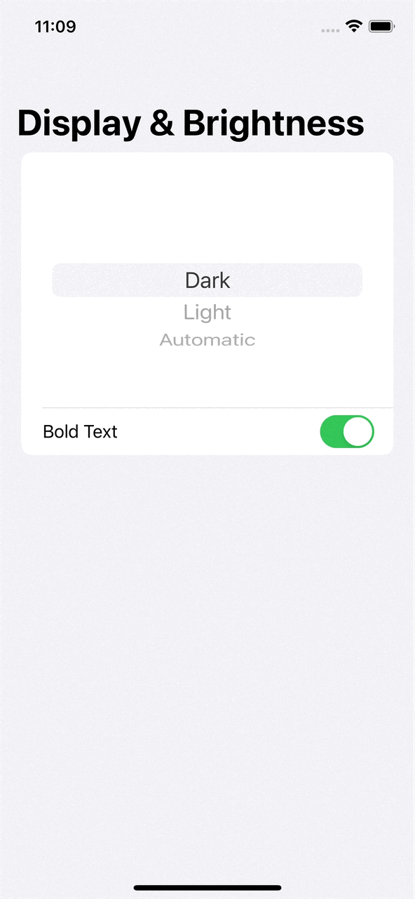
Wheel Picker Style
Wheel picker style will present the options in a scrollable wheel.
This style also places options inline with other controls in the form, but by a wheel-like appearance.
Here are some behaviors of the wheel.
- It got a fixed height regardless of the options.
- Only a limited number of options are visible.
struct ContentView: View {
    @State private var selectedTheme = "Dark"
    let themes = ["Dark", "Light", "Automatic"]

    var body: some View {
        NavigationStack {
            Form {
                Picker("Appearance", selection: $selectedTheme) {
                    ForEach(themes, id: \.self) {
                        Text($0)
                    }
                }
                .pickerStyle(.wheel)
                Toggle("Bold Text", isOn: .constant(true))
            }
            .navigationTitle("Display & Brightness")
        }
    }
}
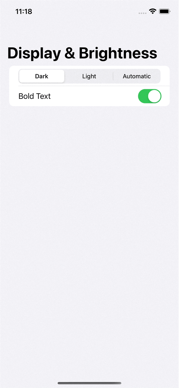
Segmented Picker Style
The last style is segmented, where each option is presented in a tab-like style.
struct ContentView: View {
    @State private var selectedTheme = "Dark"
    let themes = ["Dark", "Light", "Automatic"]

    var body: some View {
        NavigationStack {
            Form {
                Picker("Appearance", selection: $selectedTheme) {
                    ForEach(themes, id: \.self) {
                        Text($0)
                    }
                }
                .pickerStyle(.segmented)
                Toggle("Bold Text", isOn: .constant(true))
            }
            .navigationTitle("Display & Brightness")
        }
    }
}
All options are aligned horizontally on the same row, so it is only suited for a picker with only a few options.
You can easily support sarunw.com by checking out this sponsor.
AI Paraphrase:Are you tired of staring at your screen, struggling to rephrase sentences, or trying to find the perfect words for your text?
Conclusion
Even though the title says picker styles in SwiftUI Form, you can use these styles wherever you want.
The only difference is the appearance might not be the same since SwiftUI Form apply a custom styling to its child view.
Read more article about SwiftUI, Picker, Form, or see all available topic
Enjoy the read?
If you enjoy this article, you can subscribe to the weekly newsletter.
Every Friday, you'll get a quick recap of all articles and tips posted on this site. No strings attached. Unsubscribe anytime.
Feel free to follow me on Twitter and ask your questions related to this post. Thanks for reading and see you next time.
If you enjoy my writing, please check out my Patreon https://www.patreon.com/sarunw and become my supporter. Sharing the article is also greatly appreciated.
Become a patron Buy me a coffee Tweet ShareWhat's new in Xcode 14.3 and iOS 16.4
In this article, we will quickly go through some of the new features in Xcode 14.3 and iOS 16.4 that I find interesting.
How to fix "No exact matches in call to initializer" error in Swift
This error can happen in many places. Based on the message, it might not be obvious what is causing it and how to solve it. Let's learn how to fix it.