CollectionView in SwiftUI with LazyVGrid and LazyHGrid
Table of Contents
What are LazyVGrid and LazyHGrid
LazyVGrid and LazyHGrid are a container view that arranges child views in a grid structure.
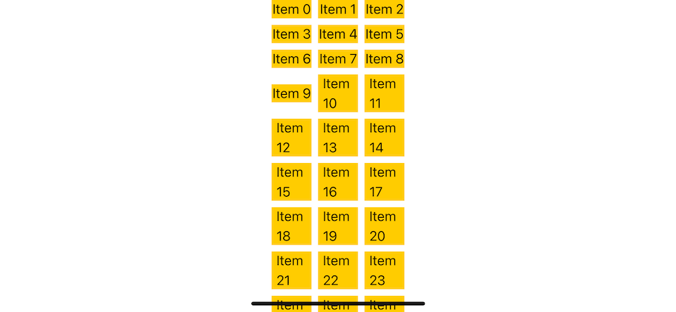
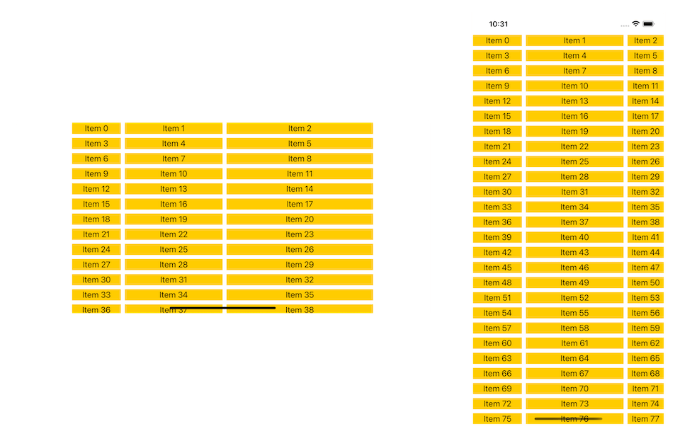
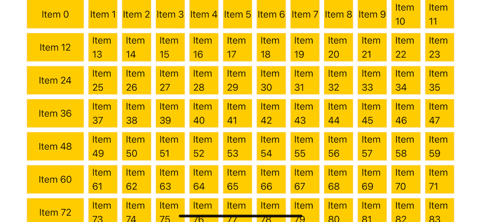
Here is an example of LazyVGrid with three columns.
You can easily support sarunw.com by checking out this sponsor.
AI Paraphrase:Are you tired of staring at your screen, struggling to rephrase sentences, or trying to find the perfect words for your text?
The difference between LazyHGrid and LazyVGrid
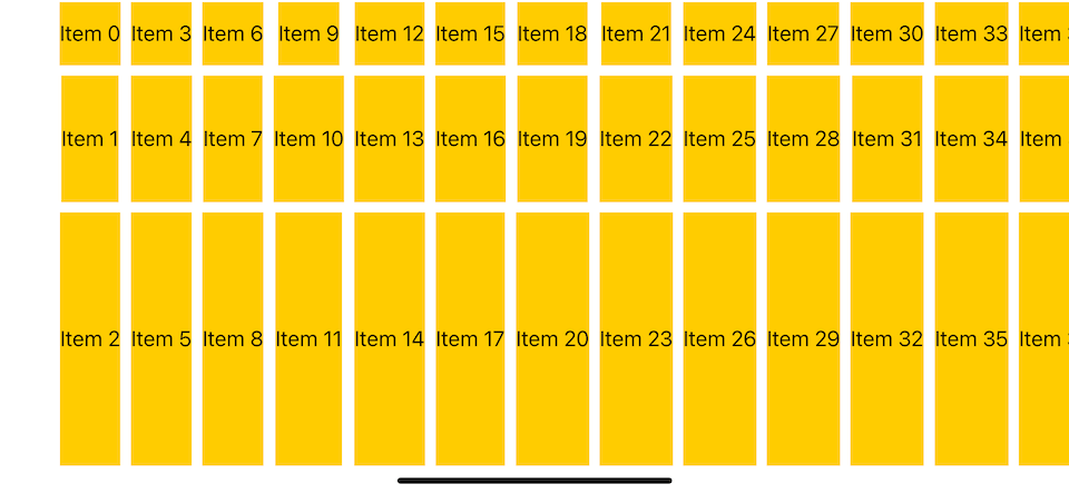
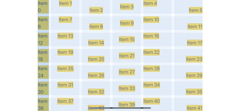
The only different between LazyVGrid and LazyHGrid is the direction.
LazyVGrid will arrange its child views in Vertical direction (Unlimited number of rows).
- It will arrange its child from left to right to matches the number of columns you specified.
- After that, it will arrange its child in the next row.
- This will arrange each item in Z-pattern (You can see this from the item index).
Here is an example of LazyVGrid with three columns.

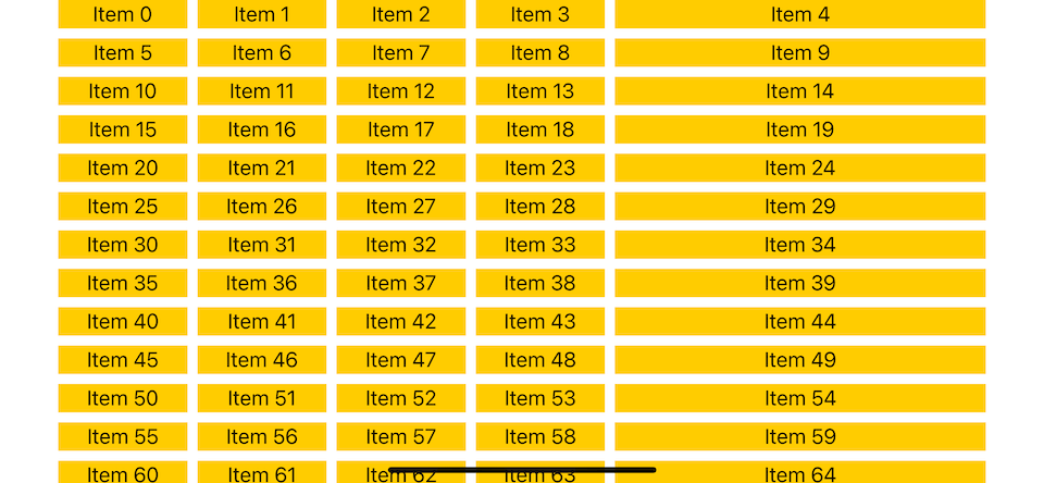
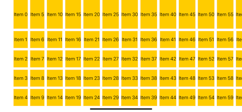
LazyHGrid will arrange its child views in Horizontal direction (Unlimited number of columns).
- It will arrange its child from top to bottom to matches the number of rows you specified.
- After that, it will arrange its child in the next column.
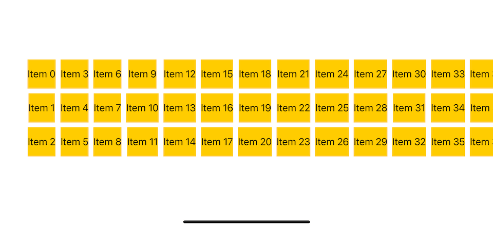
- This will arrange each item in W-pattern (You can see this from the item index).
Here is an example of LazyHGrid with three rows.
The Essential of Grid Layout in SwiftUI
There are three required steps to create a grid layout.
- Choose
LazyHGridorLazyVGridbased on the direction you want. - Define a number of rows or columns based on the grid you use. We will learn how to do that with GridItem.
- Put a grid view in
ScrollView. The responsibility of a grid view is to arrange its child views in a grid structure, not to make it scrollable. If you want to make it scrollable, we need to put them inScrollView.
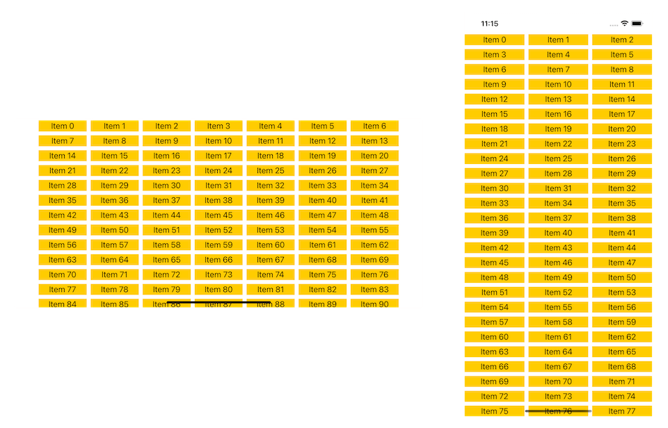
Again, here is an example of LazyVGrid with three columns.
struct ContentView: View {
    // 1
    let columns = [
        GridItem(.fixed(50)),
        GridItem(.fixed(50)),
        GridItem(.fixed(50))
    ]

    var body: some View {
        // 2
        ScrollView {
            // 3
            LazyVGrid(columns: columns) {
                ForEach(0..<100) { i in
                    Text("Item \(i)")
                        .frame(maxWidth: .infinity, maxHeight: .infinity)
                        .background(.yellow)
                }

            }
        }
    }
}
1 Define a number of columns with GridItem.
2 Put a grid view inside a scroll view to make it scrollable.
3 Specified columns as a argument for LazyVGrid.
That's all you need to do to create a grid layout in SwiftUI.
The area where you might spend the most time is defining the size and spacing of each item.
SwiftUI lets us define the characteristics of each item through a GridItem structure.
GridItem
GridItem is a structure used to define a layout of each grid item. We can specify size, alignment, and spacing.
We already see this in previous examples where we define three columns with a fixed size of width 50 (.fixed(50)).
let columns = [
    GridItem(.fixed(50)),
    GridItem(.fixed(50)),
    GridItem(.fixed(50))
]
Let's go through each attribute one by one.
Spacing
spacing define spacing to the next item.
Here is an example of a five-column grid where the spacing between each item in a column is 0, 10, 20, and 30, respectively.
let columns = [
    GridItem(.fixed(50), spacing: 0),
    GridItem(.fixed(50), spacing: 10),
    GridItem(.fixed(50), spacing: 20),
    GridItem(.fixed(50), spacing: 30),
    GridItem(.fixed(50), spacing: 40)
]
Size
We can define width of a column item in LazyVGrid and height of a row item in LazyHGrid using three predefine Size enum.
- Fixed-size (
.fixed). - Flexible size (
.flexible). - Adaptive size (
.adaptive).
Fixed size
Fixed-size is the most straightforward size to understand. We specified the exact size we wanted for the grid item.
Here is an example of a three-column vertical grid view with a column width of 50, 100, and 200, respectively.
let columns = [
    GridItem(.fixed(50)),
    GridItem(.fixed(100)),
    GridItem(.fixed(200))
]
For LazyHGrid, the same grid item will control grid item's height.
let rows = [
    GridItem(.fixed(50)),
    GridItem(.fixed(100)),
    GridItem(.fixed(200))
]
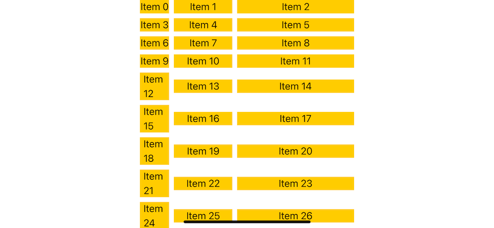
Flexible size
Flexible size is like fixed size, but instead of defining a fixed point size, you define a range of size you want by providing two arguments, minimum and maximum.
By default, the minimum size is 10, and the maximum size is .infinity.
Here is an example of a three-column vertical grid in landscape and portrait.
let columns = [
    GridItem(.flexible(minimum: 10, maximum: 100)),
    GridItem(.flexible(minimum: 200, maximum: 200)),
    GridItem(.flexible(minimum: 10, maximum: 300))
]
In a landscape, there is plenty of space, so each grid item takes as much space they want (100, 200, 300).
In a portrait, where the space is limited, the first item takes 100 points, and the second takes 200 points, leaving only around 70 points for the last item.
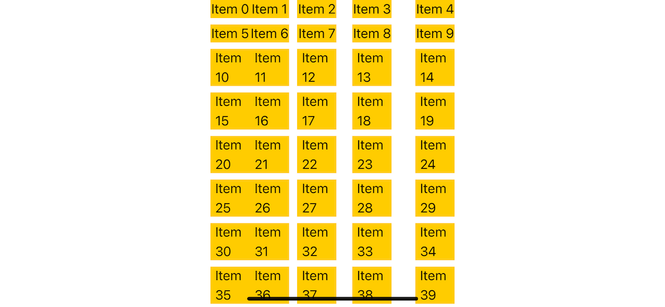
Adaptive size
Adaptive size allows you to have one or more items for each GridItem as long as it can be satisfied the specified minimum and maximum size.
Adaptive size insert as many items of the minimum size as possiblebut lets them increase to the maximum size.
This is suitable in a responsive environment where number of rows/columns should be adapted to screen size.
We declare only one grid item here, but we can have many items here as long as they satisfy a minimum and maximum size.
let columns = [
    GridItem(.adaptive(minimum: 100, maximum: 150)),
]
In this example, each item has a width of 100 points in landscape and 124 in portrait.
Adaptive size has the same complexity as flexible size. I suggest you have only one adaptive size grid item or mix it with fixed size, but not flexible size (Unless you know what you are doing).
Mixing adaptive and fixed item could produce interesting layout.
let columns = [
    GridItem(.adaptive(minimum: 100, maximum: 150)),
    GridItem(.fixed(300))
]
Alignment
By default, each item will center align within a row/column. We can change this with the alignment property.
struct ContentView: View {
    let columns = [
        GridItem(.fixed(40)),
        GridItem(.fixed(100), alignment: .top),
        GridItem(.fixed(100), alignment: .bottom),
        GridItem(.fixed(100), alignment: .center),
        GridItem(.fixed(100), alignment: .topLeading),
        GridItem(.fixed(100), alignment: .bottomTrailing),
    ]


    var body: some View {
        ScrollView {
            LazyVGrid(columns: columns) {
                ForEach(0..<100) { i in
                    Text("Item \(i)")
                        .background(.yellow)
                }

            }
        }
    }
}
Here is the result. I created a blue grid for visual guides only. It doesn't belong in the app.
Using LazyVGrid to Create Vertical Grids
Once you know about GridItem, you can use it to define columns for LazyVGrid to create a vertical grid.
Here is an example of a vertical grid.
struct ContentView: View {
    // 1
    let columns = [
        GridItem(.fixed(100)),
        GridItem(.adaptive(minimum: 50))
    ]

    var body: some View {
        // 2
        ScrollView {
            // 3
            LazyVGrid(columns: columns) {
                ForEach(0..<100) { i in
                    Text("Item \(i)")
                        .frame(maxWidth: .infinity, minHeight: 50)
                        .background(.yellow)
                }

            }
        }
    }
}
1 Define how the grid item look like with GridItem.
2 Put a grid view inside a scroll view to make it scrollable.
3 Specified GridItem as an argument for LazyVGrid.
You can easily support sarunw.com by checking out this sponsor.
AI Paraphrase:Are you tired of staring at your screen, struggling to rephrase sentences, or trying to find the perfect words for your text?
Using LazyHGrid to Create Horizontal Grids
If you want to make a horizontal grid, you need to change three things.
- Change
LazyVGridtoLazyHGrid. - Change the scrolling axis of
ScrollViewto.horizontal. - Change item appearance to match the new direction (control height instead of width).
Here is an example of a horizontal grid.
struct ContentView: View {
    let rows = [
        GridItem(.fixed(100)),
        GridItem(.adaptive(minimum: 50))
    ]

    var body: some View {
        // 1
        ScrollView(.horizontal) {
            // 2
            LazyHGrid(rows: rows) {
                ForEach(0..<100) { i in
                    Text("Item \(i)")
                        // 3
                        .frame(minWidth: 50, maxHeight: .infinity)
                        .background(.yellow)
                }

            }
        }
    }
}
1 Change scrolling axis.
2 Change LazyVGrid to LazyHGrid.
3 Change item frame to match new layout.
Read more article about SwiftUI, Grid, or see all available topic
Enjoy the read?
If you enjoy this article, you can subscribe to the weekly newsletter.
Every Friday, you'll get a quick recap of all articles and tips posted on this site. No strings attached. Unsubscribe anytime.
Feel free to follow me on Twitter and ask your questions related to this post. Thanks for reading and see you next time.
If you enjoy my writing, please check out my Patreon https://www.patreon.com/sarunw and become my supporter. Sharing the article is also greatly appreciated.
Become a patron Buy me a coffee Tweet ShareDart initializing formal parameters
Dart has a special syntax for a constructor to initialize all instance variables. It is convenient but also confusing for a newcomer. Let's learn what it is and how to use it.
How to change SwiftUI list row background color
Learn a dedicated modifier to change a list row background color in SwiftUI.