SwiftUI Grid
Table of Contents
iOS 16 add a new Grid view to SwiftUI.
At first glance, an introduction of a Grid view while we already have a LazyVGrid and LazyHGrid seem like a duplicate in function.
But, unlike its lazy counterpart, a Grid view focus on constructing a simple layout which isn't possible or hard to do with VStack and HStack.
A Grid view arranges child views in rows and columns. This table-like structure makes a layout that is hard to do in vertical and horizontal stacks become easier.
How to use SwiftUI Grid
To use Grid, you populate a grid with GridRow structures.
Each GridRow child views represent each cell/column in a grid view.
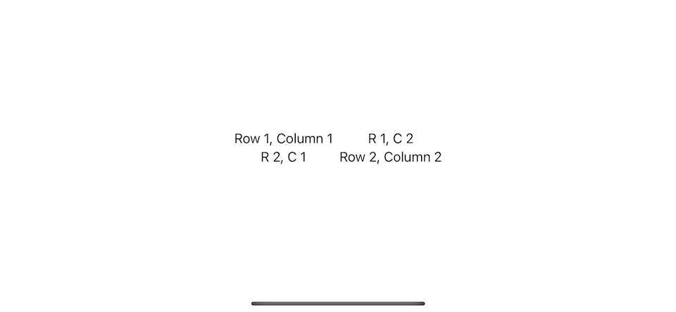
In the following example we created a 2x2 grid (two rows and two columns).
struct GridDemo: View {
    var body: some View {
        Grid() {
            GridRow {
                Text("Row 1, Column 1")
                Text("R 1, C 2")
            }
            GridRow {
                Text("R 2, C 1")
                Text("Row 2, Column 2")
            }
        }
    }
}
You can easily support sarunw.com by checking out this sponsor.
Offline Transcription: Fast, privacy-focus way to transcribe audio, video, and podcast files. No data leaves your Mac.
What is the difference between Grid and nested VStack and HStack
It might look like you can achieve this layout using HStack and VStack, but that is not the case.
Here is an example that we try to replicate Grid with HStack and VStack.
struct GridDemo: View {
    var body: some View {
        VStack {
            HStack {
                Text("Row 1, Column 1")
                Text("R 1, C 2")
            }
            HStack {
                Text("R 2, C 1")
                Text("Row 2, Column 2")
            }
        }
    }
}
Here is the result.

The big different between Grid and HStack/VStack is that each cell/column of HStack isn't related to other rows.
A horizontal stack layout its child without considering other rows while a grid handles row and column creation as a single operation.
As a result, each column in a grid will take the same space across the row.
Grid width and Grid height
Grid width and height grow according to its child view.
- The grid sets the width of all the cells in a column to match the needs of the column's widest cell.
- The gird sets the height of the entire row to match the tallest cell in that particular row.
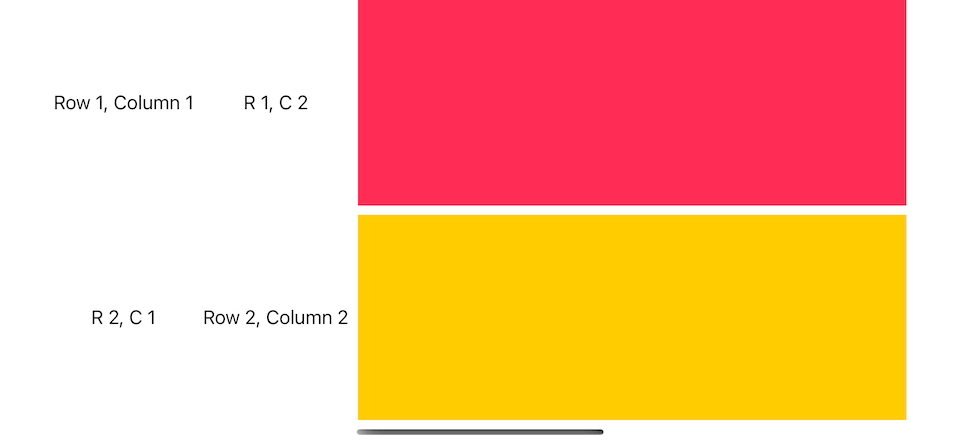
In this example, we put a Color view in the last column. A color view takes as much space as its parent offers.
A grid view also expands as its cell grows.
struct GridDemo: View {
    var body: some View {
        Grid() {
            GridRow {
                Text("Row 1, Column 1")
                Text("R 1, C 2")
                Color.pink
            }
            GridRow {
                Text("R 2, C 1")
                Text("Row 2, Column 2")
                Color.yellow
            }
        }
    }
}
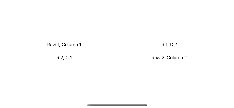
Child view without GridRow
If you provide a view without a GridRow as an element in the grid's content, it will expand across the grid column.
For example, you can add a Divider between the rows.
struct GridDemo: View {
    var body: some View {
        Grid() {
            GridRow {
                Text("Row 1, Column 1")
                Text("R 1, C 2")
            }
            Divider()
            GridRow {
                Text("R 2, C 1")
                Text("Row 2, Column 2")
            }
        }
    }
}
Just like a color view, a divider takes as much horizontal space as its parent offers.
This makes the whole grid wider, which might not be the result you want.
You might want a divider as a decorator and not interfere with the width of the data.
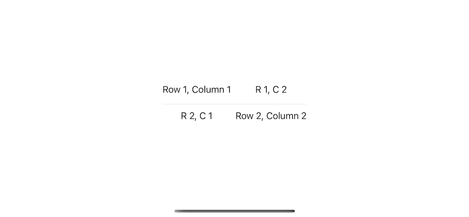
To prevent a flexible view from taking more space than the other cells, add the gridCellUnsizedAxes(_:) view modifier to the view.
This will constrain a divider width to match the size of a grid, which is only enough to cover text views.
struct GridDemo: View {
    var body: some View {
        Grid() {
            GridRow {
                Text("Row 1, Column 1")
                Text("R 1, C 2")
            }
            Divider()
                .gridCellUnsizedAxes(.horizontal)
            GridRow {
                Text("R 2, C 1")
                Text("Row 2, Column 2")
            }
        }
    }
}
Column Count
Each view in a GridRow represents a column.
If each row has a different number of columns, the grid's columns count will follow the largest number of columns.
The grid adds empty cells to the trailing edge of rows that have fewer columns.
The example below creates three rows with different column counts.
// 1
struct ColorSquare: View {
    let color: Color

    var body: some View {
        color
        .frame(width: 50, height: 50)
    }
}

struct GridDemo: View {
    var body: some View {
        Grid {
            GridRow {
                ForEach(0..<3) { _ in
                    ColorSquare(color: .pink)
                }
            }
            GridRow {
                ForEach(0..<1) { _ in
                    ColorSquare(color: .yellow)
                }
            }
            GridRow {
                ForEach(0..<5) { _ in
                    ColorSquare(color: .mint)
                }
            }
        }
    }
}
1 I create a ColorSquare view to represent each cell.
A number of columns follow the largest number of columns in that grid. If any row has fewer columns, empty cells will be added.

Blank Cell
By default, if the number of columns is different, the grid adds empty cells to the trailing edge of rows that have fewer columns.
You can control a position of an empty cell by explicit add Color.clear.gridCellUnsizedAxes([.horizontal, .vertical]) in a place where you want to insert an empty cell.
struct GridDemo: View {
    var body: some View {
        Grid {
            GridRow {
                Color.clear
                    .gridCellUnsizedAxes([.horizontal, .vertical])
                ForEach(0..<3) { _ in
                    ColorSquare(color: .pink)
                }
            }
            GridRow {
                ColorSquare(color: .yellow)
                Color.clear
                    .gridCellUnsizedAxes([.horizontal, .vertical])
                ColorSquare(color: .yellow)
                Color.clear
                    .gridCellUnsizedAxes([.horizontal, .vertical])
                ColorSquare(color: .yellow)
            }
            GridRow {
                ForEach(0..<5) { _ in
                    ColorSquare(color: .mint)
                }
            }
        }
    }
}
Merge Cell
If you want a view to occupy more than one column space, you can specify the number of rows that a cell wants to span into to the gridCellColumns(_:) view modifier.
struct GridDemo: View {
    var body: some View {
        Grid {
            GridRow {
                ForEach(0..<3) { _ in
                    ColorSquare(color: .pink)
                }
                // 1
                ColorSquare(color: .pink)
                    .gridCellColumns(2)
            }
            GridRow {
                // 2
                ColorSquare(color: .yellow)
                    .gridCellColumns(4)
                ColorSquare(color: .yellow)
            }
            GridRow {
                ForEach(0..<5) { _ in
                    ColorSquare(color: .mint)
                }
            }
        }
    }
}
1 The last column of the first row spans two columns. You won't see the size change since the ColorSquare has a fixed size, but you can see a shift in position. The cell now center align between column four and five.
2 The same rule applies here. The ColorSquare center aligns between the first four columns of the second row.

You can easily support sarunw.com by checking out this sponsor.
Offline Transcription: Fast, privacy-focus way to transcribe audio, video, and podcast files. No data leaves your Mac.
Cell Spacing and Alignment
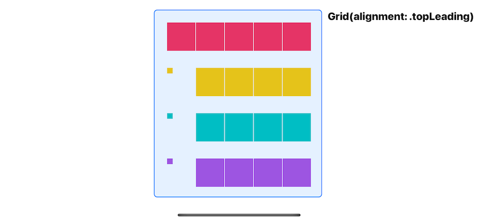
We can control the spacing between cells in both the horizontal and vertical dimensions and set a default alignment for the content in all the grid cells when you initialize the grid using the init(alignment:horizontalSpacing:verticalSpacing:content:) initializer.
In the following example:
- We set horizontal space to 1
- Vertical space to 30
- And default alignment to
.topLeading. Since column and row sizes are determined by the tallest and widest cell, you will see an effect of the alignment on a smaller view.
// 1
struct SmallColorSquare: View {
    let color: Color

    var body: some View {
        color
        .frame(width: 10, height: 10)
    }
}

struct GridDemo: View {
    var body: some View {
        Grid(alignment: .topLeading,
             horizontalSpacing: 1,
             verticalSpacing: 30) {
            GridRow {
                ForEach(0..<5) { _ in
                    ColorSquare(color: .pink)
                }
            }
            GridRow {
                SmallColorSquare(color: .yellow)
                ForEach(0..<4) { _ in
                    ColorSquare(color: .yellow)
                }
            }
            GridRow {
                SmallColorSquare(color: .mint)
                ForEach(0..<4) { _ in
                    ColorSquare(color: .mint)
                }
            }
            GridRow {
                SmallColorSquare(color: .purple)
                ForEach(0..<4) { _ in
                    ColorSquare(color: .purple)
                }
            }
        }
    }
}
1 We introduce SmallColorSquare to show how a default alignment work.
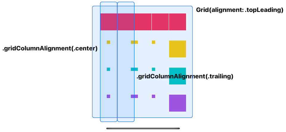
Override a whole column alignment
To override the default horizontal alignment for specific grid column, you use gridColumnAlignment view modifier on any view of that particular column.
In this example, the default alignment is .topLeading.
struct GridDemo: View {
    var body: some View {
        Grid(alignment: .topLeading,
             horizontalSpacing: 1,
             verticalSpacing: 30) {
            GridRow {
                ForEach(0..<5) { _ in
                    ColorSquare(color: .pink)
                }
            }
            GridRow {
                // 1
                SmallColorSquare(color: .yellow)
                    .gridColumnAlignment(.center)
                SmallColorSquare(color: .yellow)
                SmallColorSquare(color: .yellow)
                SmallColorSquare(color: .yellow)
                ColorSquare(color: .yellow)
            }
            GridRow {
                SmallColorSquare(color: .mint)
                // 2
                SmallColorSquare(color: .mint)
                    .gridColumnAlignment(.trailing)
                SmallColorSquare(color: .mint)
                SmallColorSquare(color: .mint)
                ColorSquare(color: .mint)

            }
            GridRow {
                SmallColorSquare(color: .purple)
                SmallColorSquare(color: .purple)
                SmallColorSquare(color: .purple)
                SmallColorSquare(color: .purple)
                ColorSquare(color: .purple)

            }
        }
    }
}
1 We override the column alignment of the first column. Even though we apply this only on the first row, all cells in the same column get the same effect.
2 We override column alignment of the second column to .trailing.
You can override horizontal alignment, but the vertical alignment still follows the one you define in initializer, which is .top from .topLeading.
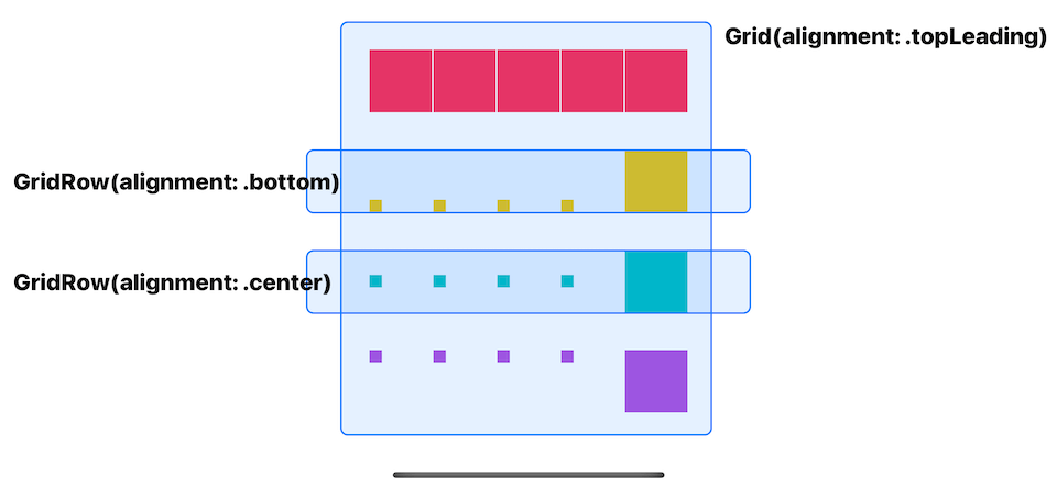
Override Row alignment
To override the default vertical alignment for specific grid row, you specify that when you initialize GridRow using init(alignment:content:) initializer.
struct GridDemo: View {
    var body: some View {
        Grid(alignment: .topLeading,
             horizontalSpacing: 1,
             verticalSpacing: 30) {
            GridRow {
                ForEach(0..<5) { _ in
                    ColorSquare(color: .pink)
                }
            }
            GridRow(alignment: .bottom) {
                SmallColorSquare(color: .yellow)
                SmallColorSquare(color: .yellow)
                SmallColorSquare(color: .yellow)
                SmallColorSquare(color: .yellow)
                ColorSquare(color: .yellow)
            }
            GridRow(alignment: .center) {
                SmallColorSquare(color: .mint)
                SmallColorSquare(color: .mint)
                SmallColorSquare(color: .mint)
                SmallColorSquare(color: .mint)
                ColorSquare(color: .mint)

            }
            GridRow {
                SmallColorSquare(color: .purple)
                SmallColorSquare(color: .purple)
                SmallColorSquare(color: .purple)
                SmallColorSquare(color: .purple)
                ColorSquare(color: .purple)

            }
        }
    }
}
You can override vertical alignment, but the horizontal alignment still follows the one you define in initializer, which is .leading from .topLeading.
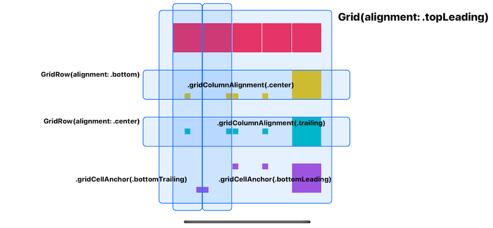
Override speicifc cell alignment
You can override both vertical and horizontal alignment of a specific cell with the gridCellAnchor(_:) view modifier.
In this example we override the first and second column of the last row.
struct GridDemo: View {
    var body: some View {
        Grid(alignment: .topLeading,
             horizontalSpacing: 1,
             verticalSpacing: 30) {
            GridRow {
                ForEach(0..<5) { _ in
                    ColorSquare(color: .pink)
                }
            }
            GridRow(alignment: .bottom) {
                SmallColorSquare(color: .yellow)
                    .gridColumnAlignment(.center)
                SmallColorSquare(color: .yellow)
                SmallColorSquare(color: .yellow)
                SmallColorSquare(color: .yellow)
                ColorSquare(color: .yellow)
            }
        GridRow(alignment: .center) {
                SmallColorSquare(color: .mint)
                SmallColorSquare(color: .mint)
                    .gridColumnAlignment(.trailing)
                SmallColorSquare(color: .mint)
                SmallColorSquare(color: .mint)
                ColorSquare(color: .mint)

            }
            GridRow {
                SmallColorSquare(color: .purple)
                    .gridCellAnchor(.bottomTrailing)
                SmallColorSquare(color: .purple)
                    .gridCellAnchor(.bottomLeading)
                SmallColorSquare(color: .purple)
                SmallColorSquare(color: .purple)
                ColorSquare(color: .purple)

            }
        }
    }
}
Read more article about SwiftUI, Grid, WWDC22, or see all available topic
Enjoy the read?
If you enjoy this article, you can subscribe to the weekly newsletter.
Every Friday, you'll get a quick recap of all articles and tips posted on this site. No strings attached. Unsubscribe anytime.
Feel free to follow me on Twitter and ask your questions related to this post. Thanks for reading and see you next time.
If you enjoy my writing, please check out my Patreon https://www.patreon.com/sarunw and become my supporter. Sharing the article is also greatly appreciated.
Become a patron Buy me a coffee Tweet ShareHow to initialize variables in constructor body in Dart
Initialize instance variable is not as straightforward as you think. Let's learn how to do it.
Create a mac menu bar app in SwiftUI with MenuBarExtra
In iOS 16, we can create a mac menu bar app without a need for AppKit. Let's learn how to do that.