SwiftUI Gauge
Table of Contents
What is SwiftUI Gauge
Gauge is a new SwiftUI view introduced in iOS 16 (SwiftUI 4). It is a view that shows a value within a range.
In the real world, a gauge is an instrument or device for measuring the magnitude, amount, or contents of something.
Here is an example of various gauges in a car[1].

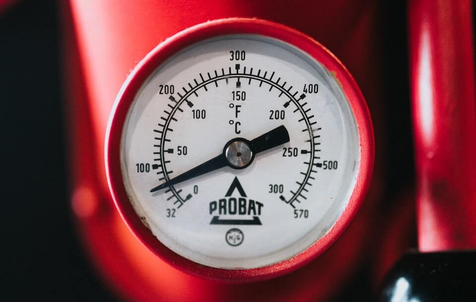
Some gauge can start from non-zero value (Negative values also possible), e.g., a temperature gauge showing both temperatures in Celcius and Fahrenheit.
This is what SwiftUI Gauge is all about: a view that shows a value within a range.
You can easily support sarunw.com by checking out this sponsor.
Screenshot Studio: Create App Store screenshots in seconds not minutes.
Getting Started
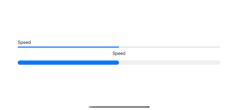
You can think of a Gauge view as a combination of ProgressView and a Slider.
It can present a value within a range like a ProgressView.
But it can have a range outside 0 and 1 and a label like a Slider.
Its simplest form is very similar to ProgressView.
struct GaugeExample: View {
    @State private var speed = 0.5

    var body: some View {
        VStack {
            ProgressView(value: speed) {
                Text("Speed")
            }
            Gauge(value: speed) {
                Text("Speed")
            }
        }
        .padding()
    }
}
We can also provide a custom range other than 0...1 and labels describing what a gauge tries to measure. This is quite similar to a Slider.
struct GaugeExample: View {
    @State private var speed = 50.0

    var body: some View {
        VStack {
            Slider(value: $speed, in: 0...250) {
                Text("Speed")
            } minimumValueLabel: {
                Text("0")
            } maximumValueLabel: {
                Text("250")
            }

            Gauge(value: speed, in: 0...250) {
                Text("Speed")
            } currentValueLabel: {
                Text(Int(speed), format: .number)
            } minimumValueLabel: {
                Text("0")
            } maximumValueLabel: {
                Text("250")
            }
        }
        .padding()
    }
}
Guage view has more labels than a slider, but it is used for presenting value, not to control, so there is no knob control like a slider view.
Guage Styles
The major difference between a gauge view and a progress view or slider view is the style.
SwiftUI Gauge has many styles which you can choose based on an available space and needs.
Here are all the available styles of SwiftUI Gauge view in iOS.
All the styles need different spaces and have different appearances, but it share the same underlying data.
Data
Guage view can accept up to six parameters.
- Current value (
value): The value to show in the gauge. - Value range (
bounds): The range of the valid values. Defaults to 0...1. - Gauge label (
label): A view that describes the purpose of the gauge. - Current value label (
currentValueLabel): A view that describes the current value of the gauge. - Minimum value label (
minimumValueLabel): A view that describes the lower bounds of the gauge. - Maximum value label (
maximumValueLabel): A view that describes the upper bounds of the gauge.
Gauge(value: current, in: minValue...maxValue) {
      Text("What is this gauge")
    } currentValueLabel: {
      Text("\(Int(current))")
    } minimumValueLabel: {
      Text("\(Int(minValue))")
    } maximumValueLabel: {
      Text("\(Int(maxValue))")
}SwiftUI Gauge Customization
We can customize two aspects of a gauge view.
I will use the following code as a base for our customization.
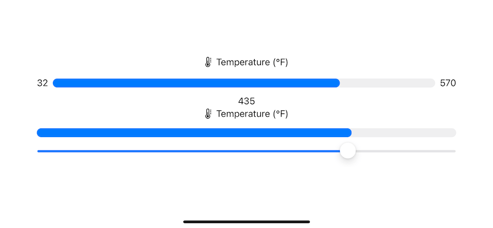
This is a gauge to show a temperature in Fahrenheit.
struct GaugeExample: View {
    @State private var fahrenheit = 32.0

    private let minValue = 32.0
    private let maxValue = 570.0

    let gradient = Gradient(colors: [.green, .orange, .pink])

    var body: some View {
        VStack {
            // 1
            Gauge(value: fahrenheit, in: minValue...maxValue) {
                Label("Temperature (°F)", systemImage: "thermometer.medium")
            } currentValueLabel: {
                Text(Int(fahrenheit), format: .number)
            } minimumValueLabel: {
                Text("32")
            } maximumValueLabel: {
                Text("570")
            }
            // 2
            Gauge(value: fahrenheit, in: minValue...maxValue) {
                Label("Temperature (°F)", systemImage: "thermometer.medium")
            }
            // 3
            Slider(value: $fahrenheit, in: minValue...maxValue)
        }
        .padding()
    }
}
1 The first gauge view shows how a gauge view looks with all the labels.
2 The second one shows a gauge view in the minimal form.
3 I add a slider to control gauge views' value.
This is what the default gauge view looks like for iOS.
Now, we have everything set up. Let's explore all available gauge styles in iOS.
GaugeStyle
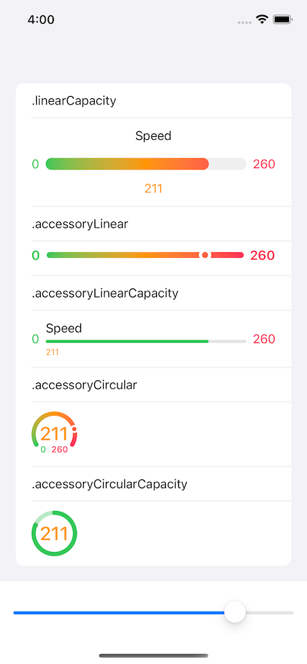
There are five styles of a gauge view that we can use in iOS.
linearCapacity: displays a gauge as a progress bar style.accessoryLinearCapacity: the same style aslinearCapacity, but more compact.accessoryLinear: a gauge style that displays a bar with a point marker to indicate the gauge's current.accessoryCircular: displays an open ring with a point marker to indicate the gauge's current value.accessoryCircularCapacity: displays a closed ring that's partially filled in to indicate the gauge’s current value.
We can control a guage style by using .gaugeStyle(_:) view modifier.
struct GaugeExample: View {
    @State private var fahrenheit = 32.0

    private let minValue = 32.0
    private let maxValue = 570.0

    let gradient = Gradient(colors: [.green, .orange, .pink])

    var body: some View {
        VStack {
            Gauge(value: fahrenheit, in: minValue...maxValue) {
                Label("Temperature (°F)", systemImage: "thermometer.medium")
            } currentValueLabel: {
                Text(Int(fahrenheit), format: .number)
            } minimumValueLabel: {
                Text("32")
            } maximumValueLabel: {
                Text("570")
            }
            Gauge(value: fahrenheit, in: minValue...maxValue) {
                Label("Temperature (°F)", systemImage: "thermometer.medium")
            }
            Slider(value: $fahrenheit, in: minValue...maxValue)
        }
        .gaugeStyle(.linearCapacity)
        .padding()
    }
}
It is to understand this with an example. So the following are examples of five gauge styles.
linearCapacity
linearCapacity will display a gauge as a progress bar style.
.gaugeStyle(.linearCapacity)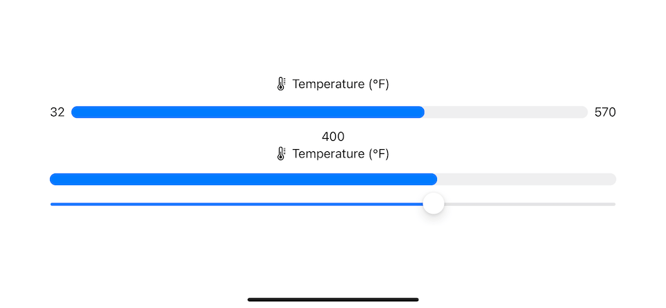
accessoryLinearCapacity
accessoryLinearCapacity also displays a gauge as a progress bar style, but with a more compact form.
.gaugeStyle(.accessoryLinearCapacity)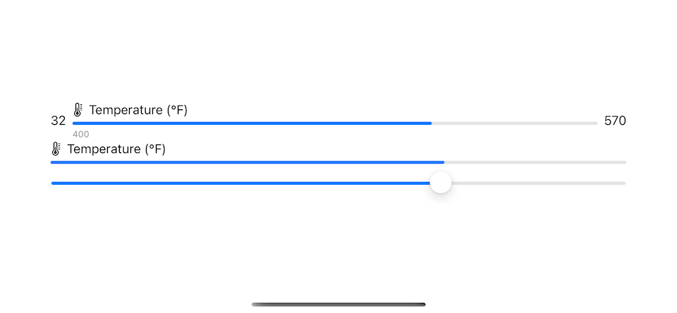
accessoryLinear
accessoryLinear will display a bar with a point marker to indicate the gauge's current value.
.gaugeStyle(.accessoryLinear)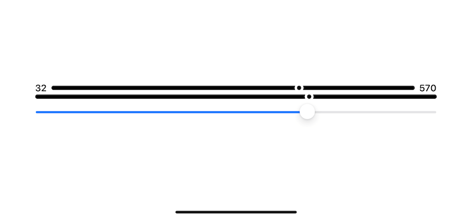
accessoryCircular
accessoryCircular will display an open ring with a point marker to indicate the gauge's current value.
.gaugeStyle(.accessoryCircular)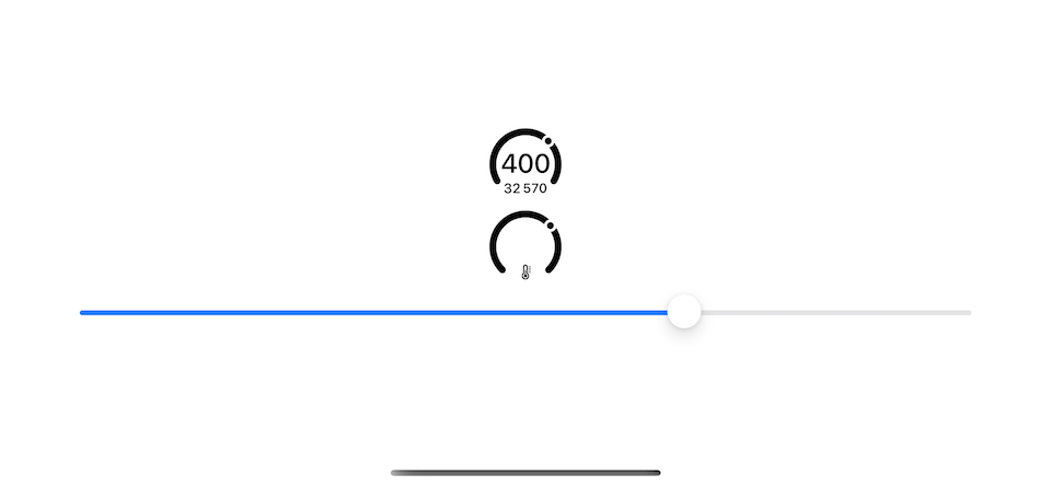
accessoryCircularCapacity
accessoryCircularCapacity will display a closed ring that's partially filled in to indicate the gauge’s current value.
.gaugeStyle(.accessoryCircularCapacity)
You can easily support sarunw.com by checking out this sponsor.
Screenshot Studio: Create App Store screenshots in seconds not minutes.
Color
We can apply color to a different part of a gauge view.
- For a labels, we can set color with a
.foregroundColormodifier. - For a gauge indicator, we set the color with a
.tintmodifier.
Here is an example of gauge views with customized labels and bar colors.
struct GaugeExample: View {
    @State private var fahrenheit = 400.0

    private let minValue = 32.0
    private let maxValue = 570.0

    let gradient = Gradient(colors: [.blue, .green, .pink])

    var body: some View {
        VStack {
            Gauge(value: fahrenheit, in: minValue...maxValue) {
                Label("Temperature (°F)", systemImage: "thermometer.medium")
            } currentValueLabel: {
                Text(Int(fahrenheit), format: .number)
                    .foregroundColor(.green)
            } minimumValueLabel: {
                Text("32")
                    .foregroundColor(.blue)
            } maximumValueLabel: {
                Text("570")
                    .foregroundColor(.pink)
            }
            .tint(gradient)

            Gauge(value: fahrenheit, in: minValue...maxValue) {
                Label("Temperature (°F)", systemImage: "thermometer.medium")
            }
            .tint(.pink)

            Slider(value: $fahrenheit, in: minValue...maxValue)
        }
        .gaugeStyle(.accessoryCircular)
        .padding()
    }
}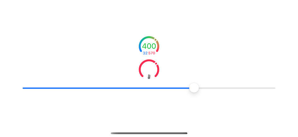
Photo by Erik Mclean and Daniela Paola Alchapar on Unsplash ↩︎
Read more article about SwiftUI, Gauge, iOS 16, WWDC22, or see all available topic
Enjoy the read?
If you enjoy this article, you can subscribe to the weekly newsletter.
Every Friday, you'll get a quick recap of all articles and tips posted on this site. No strings attached. Unsubscribe anytime.
Feel free to follow me on Twitter and ask your questions related to this post. Thanks for reading and see you next time.
If you enjoy my writing, please check out my Patreon https://www.patreon.com/sarunw and become my supporter. Sharing the article is also greatly appreciated.
Become a patron Buy me a coffee Tweet ShareHow to save enum with associated value in UserDefaults using Swift
Let's learn how to read/write enum with associated value to UserDefaults.
How to capitalize the first letter in Swift
Learn how to uppercase to only the first letter of a word and sentence.