How to change a back button color in Flutter
Table of Contents
There are many ways to change the back button color in Flutter. We will go through some of them (if not all, I'm also new to Flutter, there might be more).
Globally
If you want to change the back button color for your whole app, theme should be your go-to option. Theme designed to share colors and font styles throughout an app.
Theme
To set theme values for descendant app bar widgets, you assign ThemeData to the theme in MaterialApp.
void main() {
  runApp(MaterialApp(
    theme: ThemeData(
      appBarTheme: AppBarTheme(
        iconTheme: IconThemeData(color: Colors.pink), // 1
      ),
      // 2
      // iconTheme: IconThemeData(color: Colors.pink),
    ),
    home: MyApp(),
    debugShowCheckedModeBanner: false,
  ));
}
<1> To set a back button color, we need to set iconTheme data under appBarTheme.
<2> Beware that ThemeData also has the iconTheme key at the root level, which will affect Icon in a body, not the app bar.
Example
Here is an example set icon color using a theme.
void main() {
runApp(MaterialApp(
theme: ThemeData(
appBarTheme: AppBarTheme(
iconTheme: IconThemeData(color: Colors.pink), // 1
),
iconTheme: IconThemeData(color: Colors.green), // 2
),
home: MyApp(),
debugShowCheckedModeBanner: false,
));
}
class MyApp extends StatelessWidget {
Widget build(BuildContext context) {
return Scaffold(
appBar: AppBar(
title: Text(
'Flutter Demo',
),
),
body: Center(
child: Column(
mainAxisAlignment: MainAxisAlignment.center,
children: [
IconButton(onPressed: () {}, icon: Icon(Icons.ac_unit)), // 3
ElevatedButton(
child: Text('IconThemeData from parent AppBarTheme'),
onPressed: () {
Navigator.push(
context,
MaterialPageRoute(builder: (context) => SecondRoute()), // 4
);
},
),
],
),
),
);
}
}
class SecondRoute extends StatelessWidget {
Widget build(BuildContext context) {
return Scaffold(
appBar: AppBar(
title: Text("Second Route"),
),
body: Center(
child: ElevatedButton(
onPressed: () {
Navigator.pop(context);
},
child: Text('Go back!'),
),
),
);
}
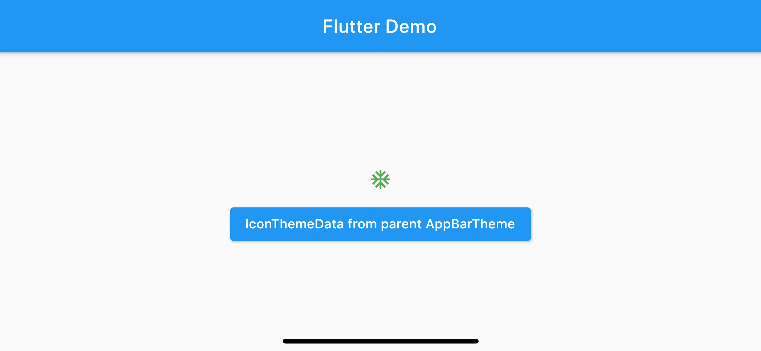
}IconThemeData at root level of ThemeData <2> will apply to icon in a body, IconButton(onPressed: () {}, icon: Icon(Icons.ac_unit)) <3>, resulting in green icon.
theme: ThemeData(
  ...
  iconTheme: IconThemeData(color: Colors.green), // 2
),
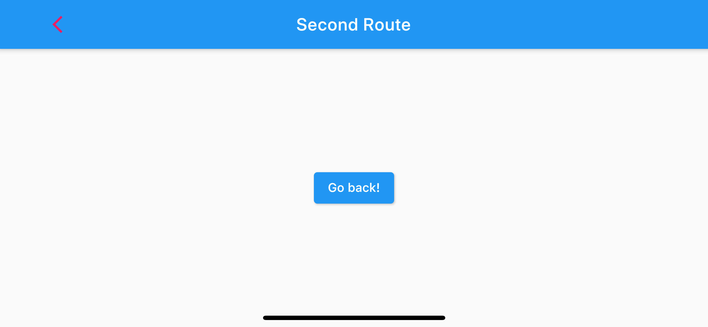
Navigate to SecondRoute <4> and you will see back button got a pink color from iconTheme under appBarTheme <1>.
theme: ThemeData(
  appBarTheme: AppBarTheme(
    iconTheme: IconThemeData(color: Colors.pink), // 1
  ),
  ...
),
Notice that we don't need to specify anything theme information in SecondRoute.

Not all app bar is created equal. There would be a time when you need different back button colors for specific pages, such as when you have a transparent app bar's background that might need a different back button color.
You can easily support sarunw.com by checking out this sponsor.

AI Grammar: Correct grammar, spell check, check punctuation, and parphrase.
Local
There is more way to customize the back button color for a specific page.
Theme
You can override themes for some part of an application by wrap a section of the app in a Theme widget.
There are two ways to approach this: creating a unique ThemeData, or extending the parent theme.
Creating unique ThemeData
If you don’t want to inherit any application colors or font styles, create a new ThemeData() instance and pass that to the Theme widget.
class SecondRoute extends StatelessWidget {
Widget build(BuildContext context) {
return Theme( // 1
data: ThemeData(
appBarTheme: AppBarTheme(
iconTheme: IconThemeData(color: Colors.amber),
),
),
child: Scaffold(
appBar: AppBar(
title: Text("Second Route"),
),
body: ...
),
);
}
}<1> Wrap widget in a Theme widget with a new ThemData assigned to data.

Extending the parent theme
Most of the time, you might want to preserve other stylings from the parent theme. So, extend the parent theme might make more sense. You can do that by using the copyWith() method.
class SecondRoute extends StatelessWidget {
Widget build(BuildContext context) {
return Theme(
data: Theme.of(context).copyWith( // 1
appBarTheme: Theme.of(context) // 2
.appBarTheme
.copyWith(iconTheme: IconThemeData(color: Colors.amber)),
),
child: Scaffold(
appBar: AppBar(
title: Text("Second Route"),
),
body: ...
),
);
}
}<1> We use the Theme.of(context) method to looks up the widget tree and return the nearest Theme in the tree. And copyWith() to override specific values.
<2> We want to override only iconTheme inside appBarTheme, so we use Theme.of(context).appBarTheme.copyWith() to preserve other parent's appBarTheme values and override just iconTheme.
The result would be the same as Creating unique ThemeData in this example, but if you have defined more than just iconTheme in your ThemeData. This method would preserve those values.
BackButton
Override theme data might be overkill if all you want is to change the back button color. In this case, you can create a new BackButton widget with customizing color and assign it to the app bar's leading.
class SecondRoute extends StatelessWidget {
Widget build(BuildContext context) {
return Scaffold(
appBar: AppBar(
title: Text("Second Route"),
leading: BackButton( // 1
color: Colors.purple,
),
actions: [IconButton(onPressed: () {}, icon: Icon(Icons.ac_unit))], // 2
),
body: ...
);
}
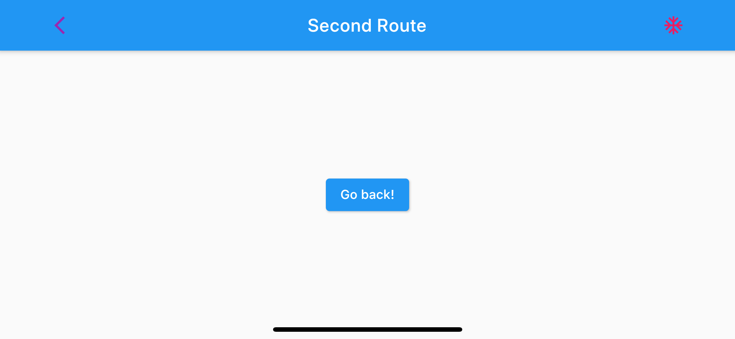
}<1> BackButton will look and behave like a default back button with an option for you to override color and onPressed. In this case, we override its color to Colors.purple.
<2> I add IconButton as an action to show that other icons in the app bar still get the same theme effect.

As you can see, you can have a back button color that different from other app bar actions using this method.
IconButton
BackButton is just an IconButton with a "back" icon appropriate for the current TargetPlatform. So, if you want to have a fancy icon, you can just use IconButton with an action of Navigator.maybePop.
class SecondRoute extends StatelessWidget {
Widget build(BuildContext context) {
return Scaffold(
appBar: AppBar(
title: Text("Second Route"),
leading: IconButton( // 1
icon: Icon(Icons.backspace_outlined),
color: Colors.orange,
onPressed: () {
Navigator.of(context).maybePop();
},
),
),
body: ...
);
}
}<1> Use IconButton as a back button with a custom icon and color.
This method is basically the same as using BackButton, but with a way for you to change the icon.
Read more article about Flutter, Back Button, or see all available topic
Enjoy the read?
If you enjoy this article, you can subscribe to the weekly newsletter.
Every Friday, you'll get a quick recap of all articles and tips posted on this site. No strings attached. Unsubscribe anytime.
Feel free to follow me on Twitter and ask your questions related to this post. Thanks for reading and see you next time.
If you enjoy my writing, please check out my Patreon https://www.patreon.com/sarunw and become my supporter. Sharing the article is also greatly appreciated.
Become a patron Buy me a coffee Tweet ShareHow to make AppBar/Navigation Bar transparent in Flutter
Learn how to make a transparent app bar in Flutter.
How to change status bar text color in Flutter
Learn different ways to change status bar text color in Flutter.