How to make a simple bevel effect using inner shadows in SwiftUI
Table of Contents
We can make a simple bevel effect using two inner shadows. SwiftUI has a built-in way to add a drop shadow with the .shadow modifier. But if you want to add an inner shadow effect, you need to be a bit creative.
Inner shadow is an effect that can simulate many real-world objects by combining one or more inner shadows and adjust their parameters, e.g., position and blur radius. I will show you the simple bevel effect where the inner shadows have zero blur radius. This will produce a retro-style look and feel.
I will show you two examples of how I apply a bevel effect to rectangular and circular shapes. You will see what modifiers you need for each case.
Bevel effect
The beveled edge is an edge of a structure that is not perpendicular to the faces of the piece. As a result, it will have an edge that got highlight and one with darker.
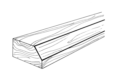
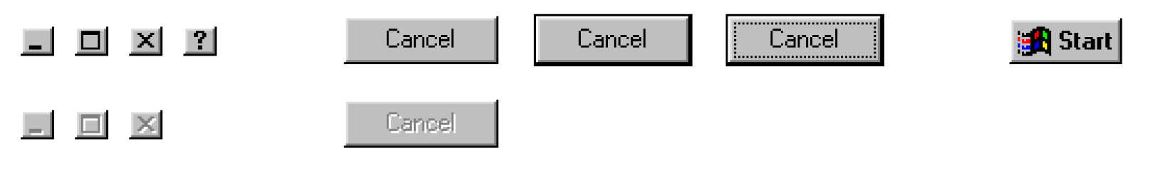
Some use this technique on actionable UI to make it stand out from the rest. You might have seen this in an operating system UI or retro game since it can easily build. The highlight and shadow edge can be build from a single solid line.
To create a bevel effect, we need two non-blur inner shadows. One as a highlighted edge, the other as a shadowed edge. Here is a design I created in the Sketch app to show you the result we want.
You can easily support sarunw.com by checking out this sponsor.
Translate your app In 1 click: Simplifies app localization and helps you reach more users.
Rectangle
Our first example will create a text field with a bevel effect. We need two inner shadows laying out in opposite directions—one for a highlighted edge and one for a darker edge.
overlay and stroke
To create an inner shadow, I will use an overlay and stroke modifiers. There might be other ways, but I think this is the easiest.
struct ContentView: View {
    var body: some View {
        Rectangle()
            .fill(Color.pink)
            .frame(width: 200, height: 200) // 1
            .overlay(
                Rectangle() // 2
                    .stroke(Color.black, lineWidth: 20) // 3
            )
            .border(Color.blue) // 4
    }
}
<1> A pink rectangle of size 200x200. This is an object that we want to apply a bevel effect on.
<2> Create an overlay over the object.
<3> We create an overlay of a rectangle with a stroke with a width of 20.
<4> A border for debugging purposes.
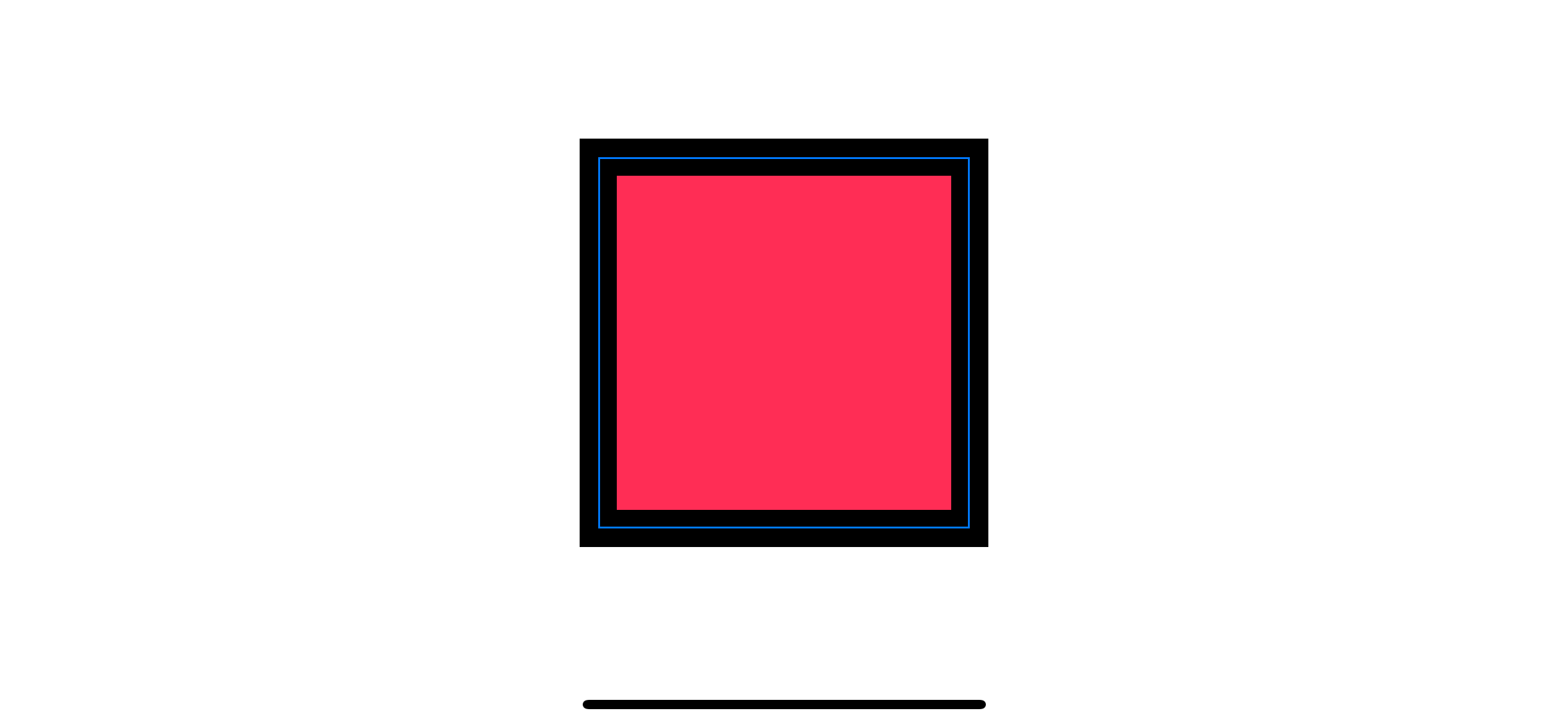
As you can see, a stroke is drawn along the center of the rectangular path splitting the stroke width into an equals width of 10. This stroke will use as a shadow and highlight edges. We want just two edges (top and left) for shadow edges. So, we will move right and bottom edges away with the .offset modifier.
offset
We move our rectangular overlay stroke with an offset modifier to move the bottom and right edges out of the parent frame.
struct ContentView: View {
    var body: some View {
        Rectangle()
            .fill(Color.pink)
            .frame(width: 200, height: 200)
            .overlay(
                Rectangle()
                    .stroke(Color.black, lineWidth: 20)
                    .offset(x: 10.0, y: 10.0) // 1
            )
            .border(Color.blue)

    }
}
<1> Offset to the bottom right by 10 points.
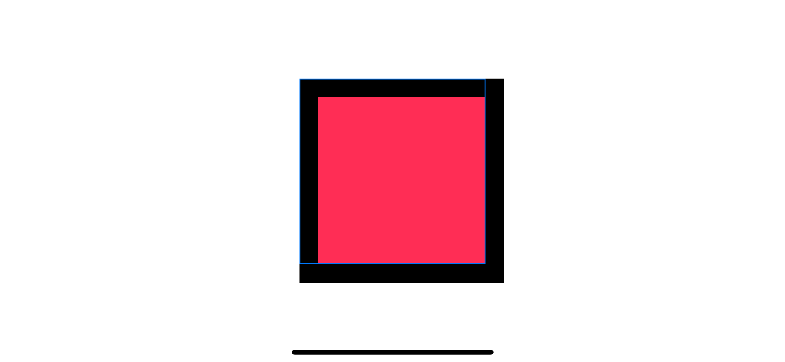
Moving the stroke ten points to the right and ten points to the bottom make the bottom and trailing edges move out of the parent frame. At this point, the overflow edges still render as normal. The only thing left is to clip that out with the .clipped modifier.
clipped
clipped will clip the view to its bounding rectangular frame.
struct ContentView: View {
    var body: some View {
        Rectangle()
            .fill(Color.pink)
            .frame(width: 200, height: 200)
            .overlay(
                Rectangle()
                    .stroke(Color.black, lineWidth: 20)
                    .offset(x: 10.0, y: 10.0)
                    .clipped() // 1
            )
            .border(Color.blue)

    }
}
<1> Clipped stroke to the parent frame.
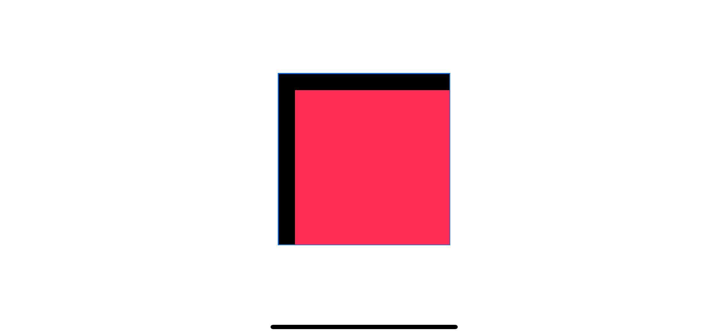
Now we got an inner shadow to represent a shadow edge of a beveled structure. We need another shadow for the highlight edge. We can copy most of the code over to create the highlight edges.
Second Inner Shadow
We can create a second inner shadow using the same technique. The only difference is we put it in the opposite direction by invert x and y offset.
struct ContentView: View {
    var body: some View {
        Rectangle()
            .fill(Color.pink)
            .frame(width: 200, height: 200)
            .overlay(
                Rectangle()
                    .stroke(Color.black, lineWidth: 20)
                    .offset(x: 10.0, y: 10.0)
                    .clipped()
            )
            .overlay(
                Rectangle()
                    .stroke(Color.gray, lineWidth: 20)
                    .offset(x: -10.0, y: -10.0) // 1
                    .clipped()
            )
            .border(Color.blue)
    }
}
<1> Invert x and y offset by using negative values.
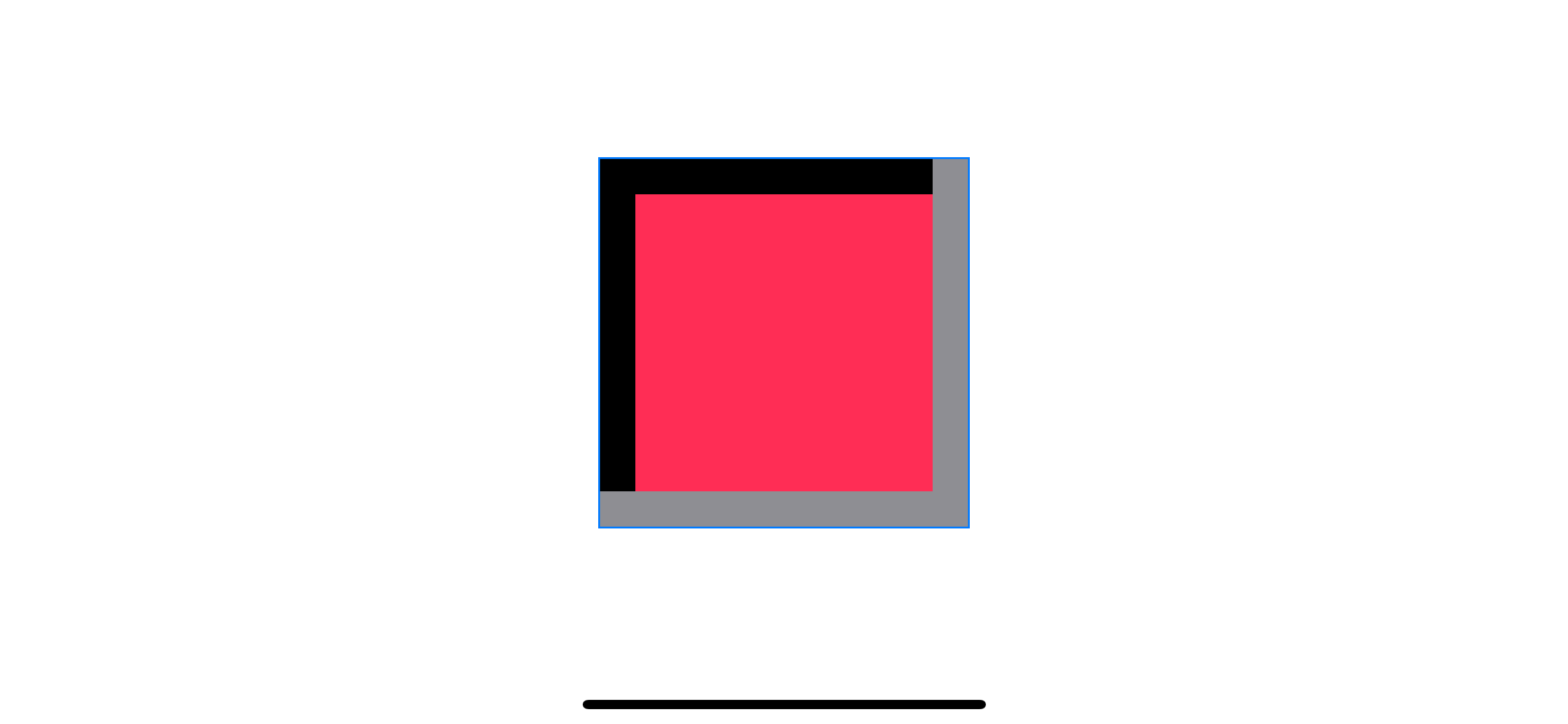
This might not look like a working effect, but it is. Since this effect composes of very simple components, the quality of the result depends heavily on the size (of object and shadow) and color choices.
Demo
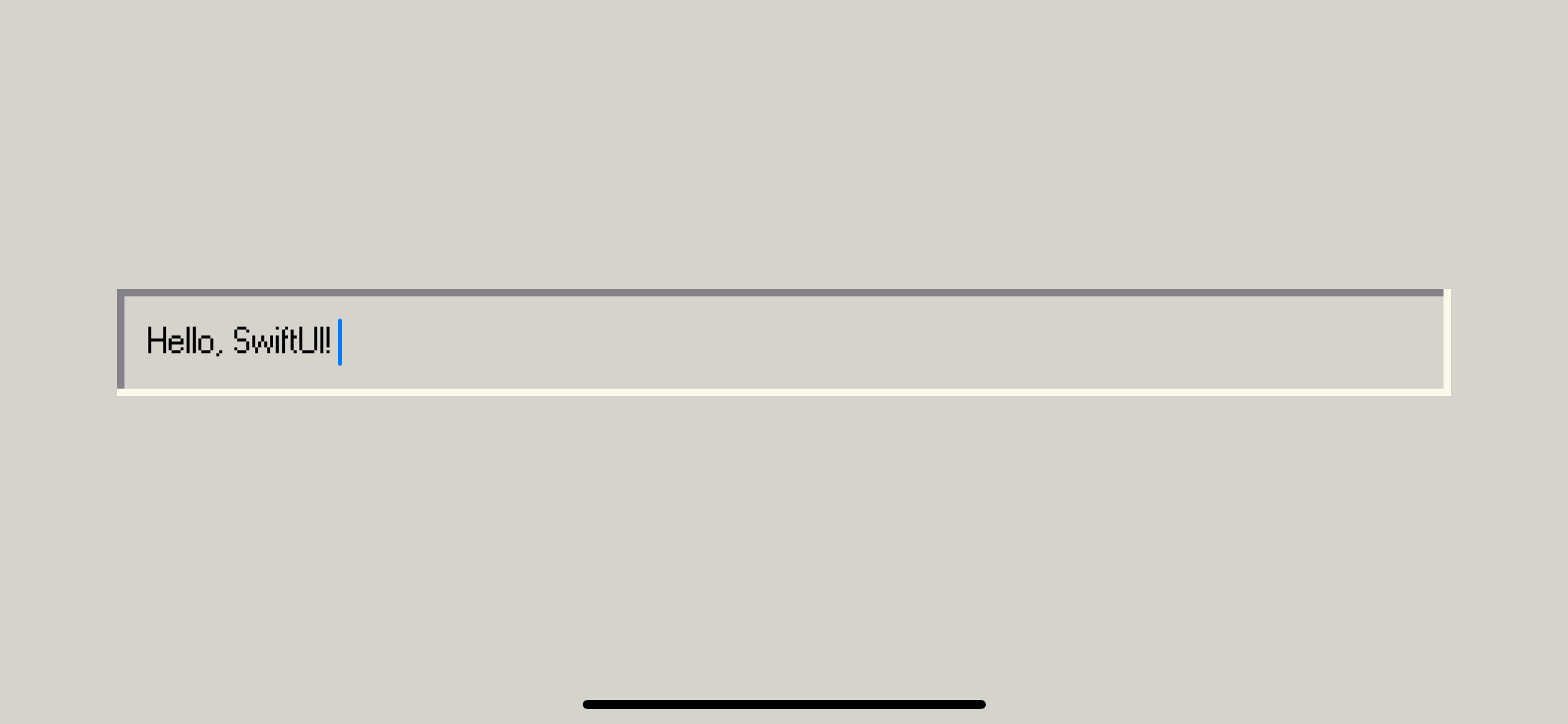
Here is the example of a text field replicated Windows 98 theme using the above technique.
struct ContentView: View {
    @State var input: String = "Hello, SwiftUI!"

    var body: some View {
        ZStack {
            Color("BackgroundColor").edgesIgnoringSafeArea(.all)
            TextField("Title", text: $input)
                .font(.custom("Windows", size: 20))
                .padding()
                .overlay(
                    Rectangle()
                        .stroke(Color("ShadowColor"), lineWidth: 4)
                        .offset(x: 2, y: 2)
                        .clipped()
                )
                .overlay(
                    Rectangle()
                        .stroke(Color("HighlightColor"), lineWidth: 4)
                        .offset(x: -2, y: -2)
                        .clipped()
                )
                .padding()
        }

    }
}
As you can see, I use the same technique with a custom font and appropriate shadow width to yield a pleasant result.
Circle
Let's see another example. This time, I will try to apply the bevel effect on a Circle view.
I start by replacing Rectangle with Circle.
struct ContentView: View {
    var body: some View {
        Circle() // 1
            .fill(Color.pink)
            .frame(width: 200, height: 200)
            .overlay(
                Circle() // 2
                    .stroke(Color.black, lineWidth: 20)
                    .offset(x: 10.0, y: 10.0)
                    .clipped()
            )
            .overlay(
                Circle()
                    .stroke(Color.gray, lineWidth: 20)
                    .offset(x: -10.0, y: -10.0)
                    .clipped()
            )
            .border(Color.blue)
    }
}
<1>, <2> Replace Rectangle with Circle shape.
Since the .clipped modifier clips our shadow to the parent rectangular frame, we need to find another way to make a circular clipping shape.
clipShape
clipShape sets a clipping shape for the view. It accepts Shape as an argument which is perfect for our case.
We replace .clipped with .clipShape(Circle()) to make sure our shadows get clipped to the circle's shape.
struct ContentView: View {
    var body: some View {
        Circle()
            .fill(Color.pink)
            .frame(width: 200, height: 200)
            .overlay(
                Circle()
                    .stroke(Color.black, lineWidth: 20)
                    .offset(x: 10.0, y: 10.0)
                    .clipShape(Circle()) // 1
            )
            .overlay(
                Circle()
                    .stroke(Color.gray, lineWidth: 20)
                    .offset(x: -10.0, y: -10.0)
                    .clipShape(Circle())
            )
            .border(Color.blue)
    }
}
<1> Replace .clipped with .clipShape(Circle())
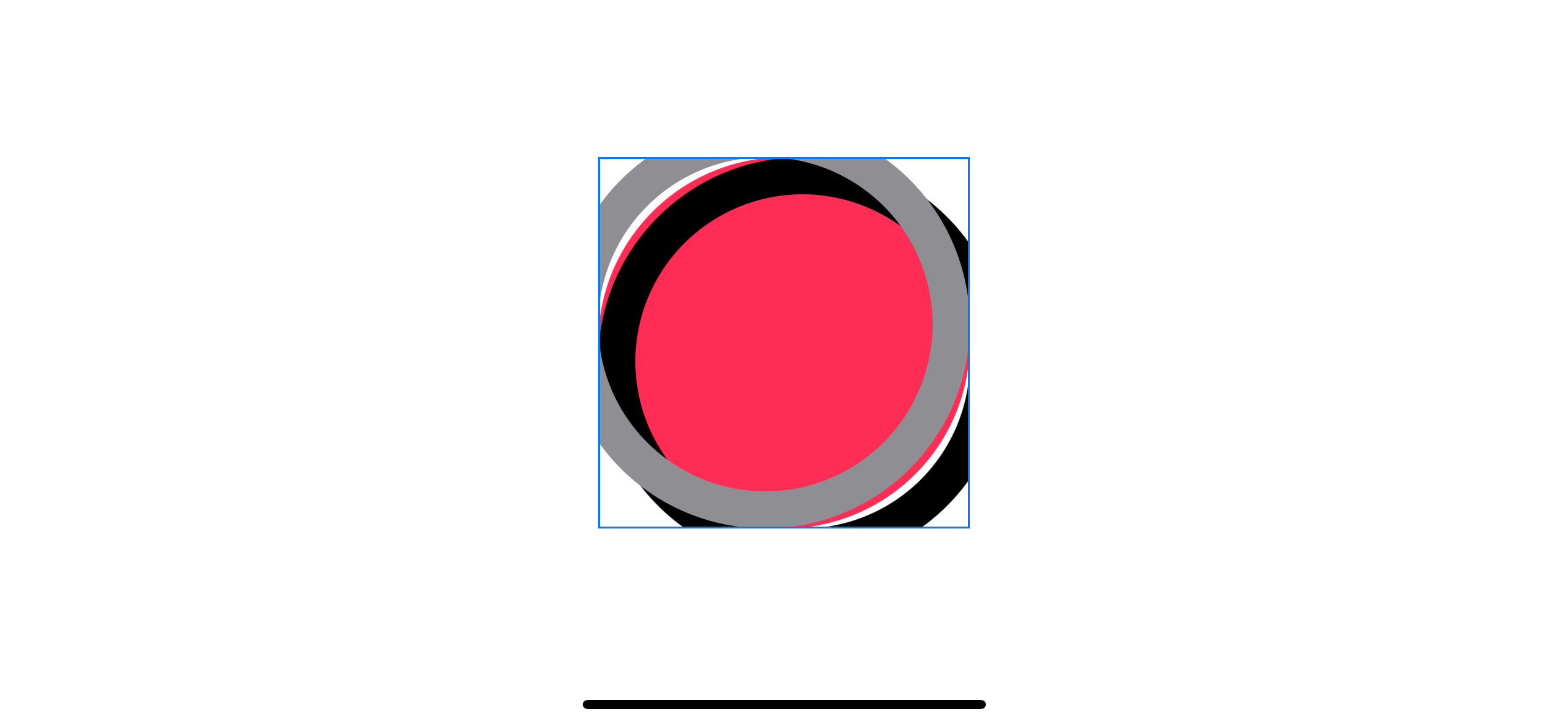
A bevel effect on circle shape with a circle clip shape.
Our shadows now get clipped into a circular shape, but we still have another issue, the shadow does not perfectly align with its parent, revealing pink color on both sides.
Offset
As you might see, we can't use the same offset as our rectangular shape. The shadow curve is not aligned with the parent circle. I know there will be a mathematical formula somewhere to calculate the perfect offset, but I won't cover it here. For this example, I will just reduce the offset until it fits.
I play around until I find the best possible alignment.
struct ContentView: View {
    var body: some View {
        Circle()
            .fill(Color.pink)
            .frame(width: 200, height: 200)
            .overlay(
                Circle()
                    .stroke(Color.black, lineWidth: 20)
                    .offset(x: 7, y: 7)
                    .clipShape(Circle())
            )
            .overlay(
                Circle()
                    .stroke(Color.gray, lineWidth: 20)
                    .offset(x: -7, y: -7)
                    .clipShape(Circle())
            )
    }
}
With our current constraint, we can't produce anything better than this.
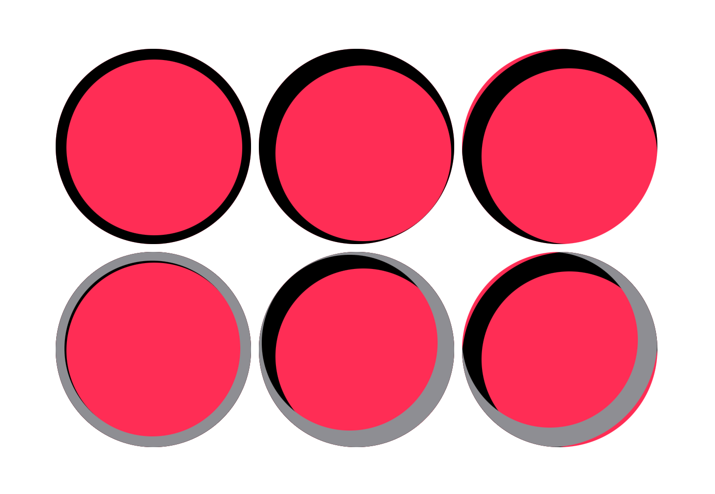
- Small offset will lead to overlap of two shadows (Left: x and y offset equals 1)
- Too much offset will lead to a visible gap between shadows and parent (Right: x and y offset equals 10)
- You can still see an overlap of shadow and highlight even with the right amount of offset (Middle: x and y offset equals 7)
To solve this, we need to adjust the size of our shadow.
Adjust shadow size
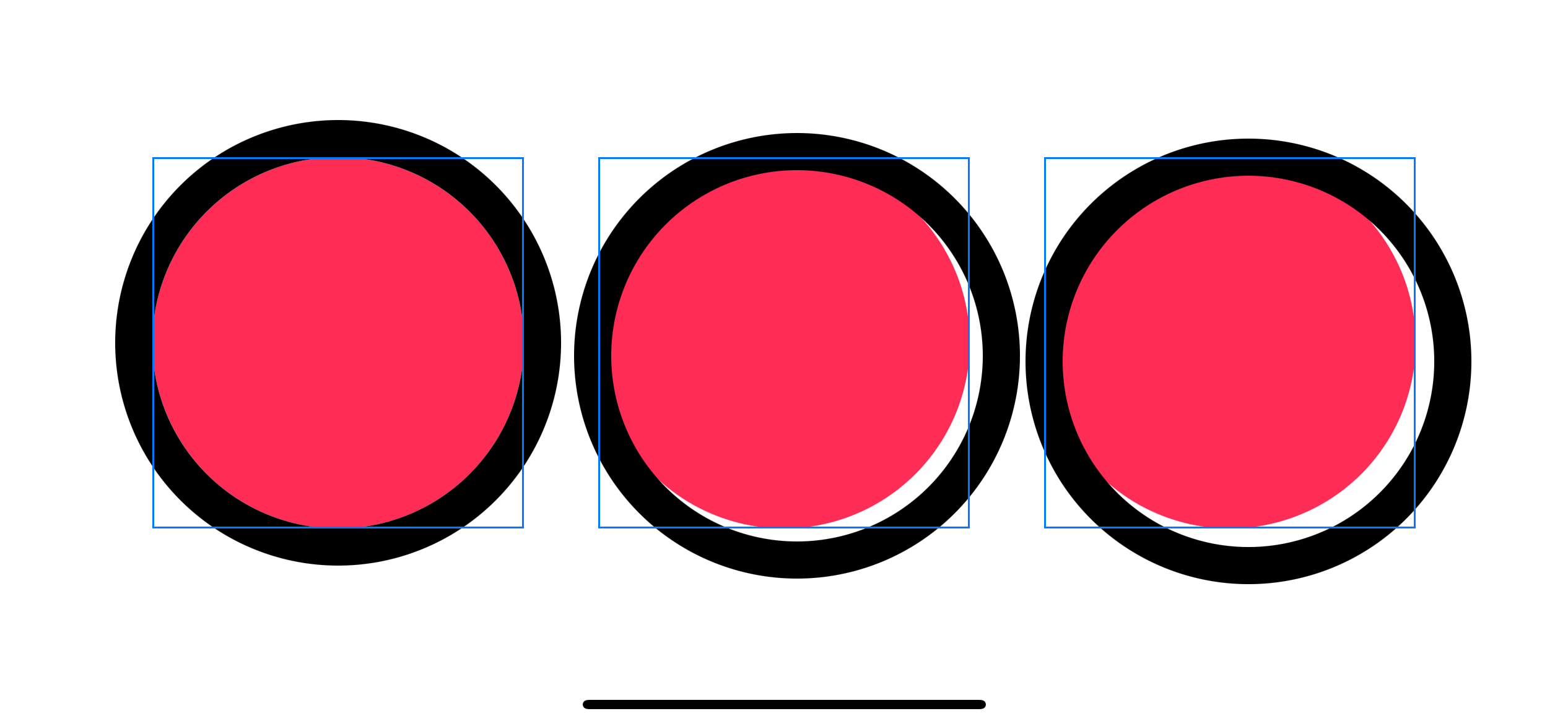
Increase the shadow size create more room for us to place our shadow. The shadow in the following example has a size of 220 with an offset of 0, 7, 10, respectively.
struct ContentView: View {
    var body: some View {
        HStack(spacing: 40) {
            Circle()
                .fill(Color.pink)
                .frame(width: 200, height: 200)
                .overlay(
                    Circle()
                        .stroke(Color.black, lineWidth: 20)
                        .frame(width: 220, height: 220)
                        .offset(x: 0, y: 0)
                )
                .border(Color.blue)
            Circle()
                .fill(Color.pink)
                .frame(width: 200, height: 200)
                .overlay(
                    Circle()
                        .stroke(Color.black, lineWidth: 20)
                        .frame(width: 220, height: 220)
                        .offset(x: 7, y: 7)
                )
                .border(Color.blue)

            Circle()
                .fill(Color.pink)
                .border(Color.blue)
                .frame(width: 200, height: 200)
                .overlay(
                    Circle()
                        .stroke(Color.black, lineWidth: 20)
                        .frame(width: 220, height: 220)
                        .offset(x: 10, y: 10)
                ).border(Color.blue)
        }
    }
}
Let's try to use this new size for our example.
struct ContentView: View {
    var body: some View {
        Circle()
            .fill(Color.pink)
            .frame(width: 200, height: 200)
            .overlay(
                Circle()
                    .stroke(Color.black, lineWidth: 20)
                    .frame(width: 220, height: 220) // 1
                    .offset(x: 7, y: 7)
                    .clipShape(Circle())
            )
            .overlay(
                Circle()
                    .stroke(Color.gray, lineWidth: 20)
                    .frame(width: 220, height: 220)
                    .offset(x: -7, y: -7)
                    .clipShape(Circle())
            )
            .border(Color.blue)
    }
}
<1> Increase the size of the shadow.
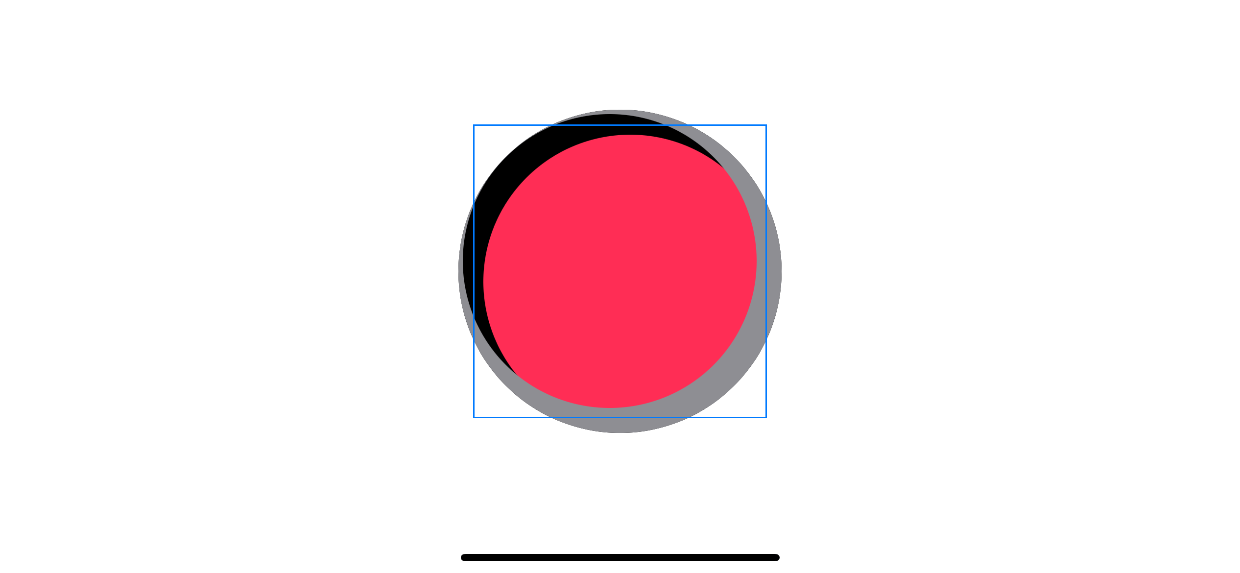
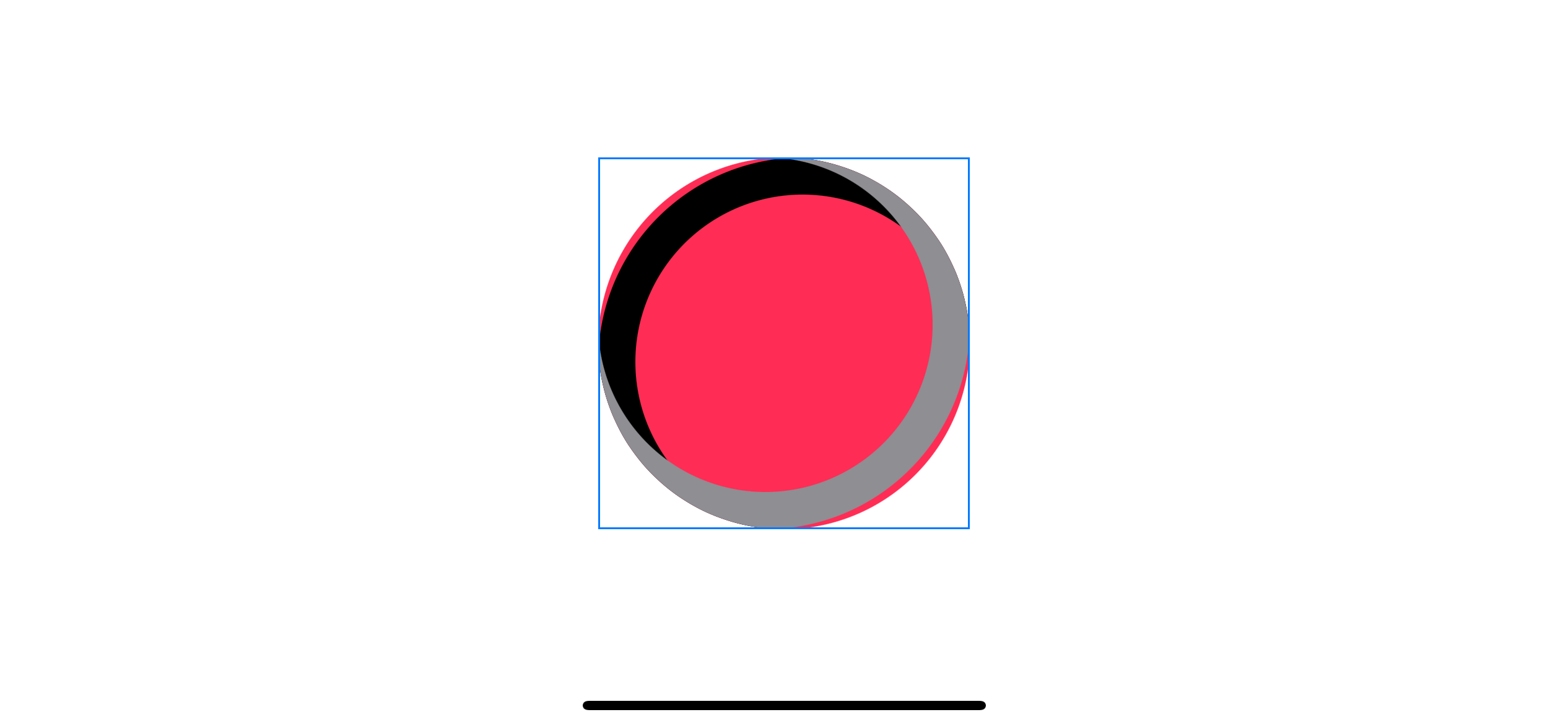
The result looks the same as the last example, but that's because we use the wrong clipping technique. We use .clipShape(Circle()), which clips to our large shadow circle size (size 220).
Since .clipShape accepts Shape as an argument, we can't specify the clipping shape's size.
.clipShape(
    Circle()
        .frame(width: 200, height: 200) // Try to set the size
)
Doing so and you will get the following error.
Instance method 'clipShape(_:style:)' requires that 'some View' conform to 'Shape'
Luckily, we have a working alternative.
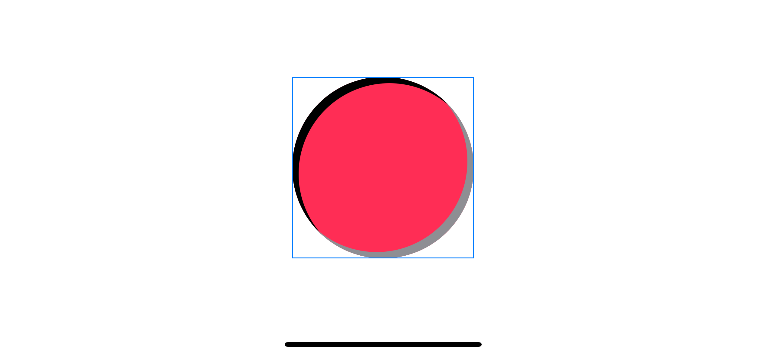
mask
Mask working similar to the .clipShape, but instead of shape, it accepts view as an argument. This makes a perfect fit for our case.
struct ContentView: View {
    var body: some View {
        Circle()
            .fill(Color.pink)
            .frame(width: 200, height: 200)
            .overlay(
                Circle()
                    .stroke(Color.black, lineWidth: 20)
                    .frame(width: 220, height: 220)
                    .offset(x: 7, y: 7)
                    .mask( // 1
                        Circle()
                            .frame(width: 200, height: 200)
                    )
            )
            .overlay(
                Circle()
                    .stroke(Color.gray, lineWidth: 20)
                    .frame(width: 220, height: 220)
                    .offset(x: -7, y: -7)
                    .mask(
                        Circle()
                            .frame(width: 200, height: 200)
                    )
            )
            .border(Color.blue)
    }
}
<1> Mask the shadow with the same size as the parent circle (200).
With this change, we got a better shadow for a circular shape.
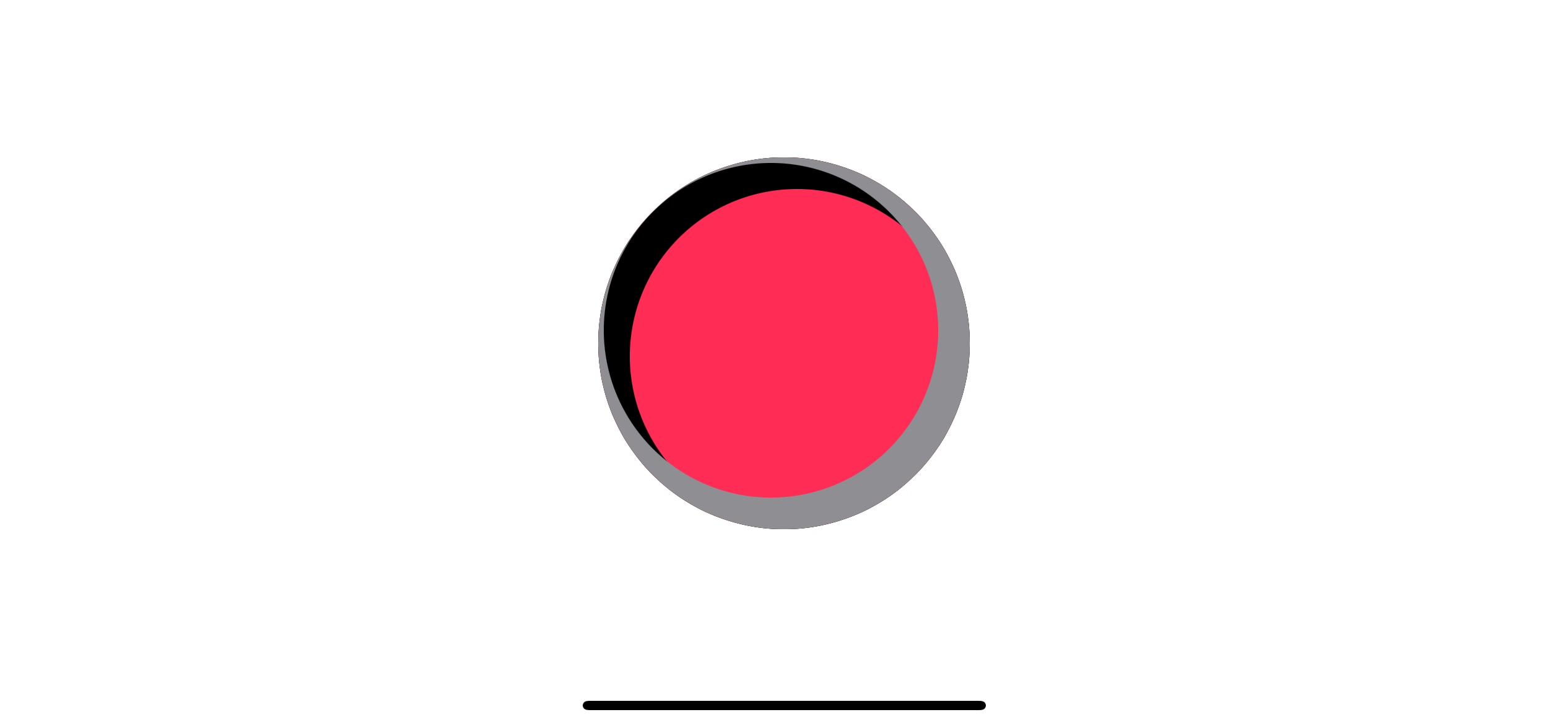
Demo
Again, this might not look like a pleasant shadow, but that because it is on the wrong color combination. Here is an example using the method above.
struct ContentView: View {
    var body: some View {
        ZStack {
            Color("ControllerBackgroundColor") // Red background
                .ignoresSafeArea()
            Circle() // Our button
                .fill(Color("ControllerButtonColor"))
                .frame(width: 200, height: 200)
                .shadow(color: .black.opacity(0.3), radius: 0, x: 0, y: 20)
                .overlay(
                    Circle()
                        .stroke(Color("ControllerHighlightColor"), lineWidth: 20)
                        .frame(width: 220, height: 220)
                        .offset(x: 0, y: 10)
                        .mask(
                            Circle()
                                .frame(width: 200, height: 200)
                        )
                )
                .overlay(
                    Circle()
                        .stroke(Color("ControllerShadowColor"), lineWidth: 20)
                        .frame(width: 220, height: 220)
                        .offset(x: 0, y: -10)
                        .mask(
                            Circle()
                                .frame(width: 200, height: 200)
                        )
                )
            Text("A") // A label
                .font(.system(size: 120, weight: .heavy))
                .foregroundColor(.white)
        }
    }
}
I use a bevel effect to simulate a game controller's button.

You can easily support sarunw.com by checking out this sponsor.
Translate your app In 1 click: Simplifies app localization and helps you reach more users.
Conclusion
In this article, you learn how to create a bevel effect using two inner shadows. We use overlay, stroke, offset, and clip/mask to simulate an inner shadow effect.
I didn't pack a bevel effect into a view modifier or reusable component because the implementation detail might vary based on usage. As you can see, even rectangles shape and circular shapes have different implementation detail. Trying to generalize them might be complicated than necessary for this article.
But with all the basics you learn in this article, I think you can create your own version of a bevel effect and group them as needed into a reusable component based on your use case.
Read more article about SwiftUI or see all available topic
Enjoy the read?
If you enjoy this article, you can subscribe to the weekly newsletter.
Every Friday, you'll get a quick recap of all articles and tips posted on this site. No strings attached. Unsubscribe anytime.
Feel free to follow me on Twitter and ask your questions related to this post. Thanks for reading and see you next time.
If you enjoy my writing, please check out my Patreon https://www.patreon.com/sarunw and become my supporter. Sharing the article is also greatly appreciated.
Become a patron Buy me a coffee Tweet ShareWhat is a Property Wrapper in Swift
As the name implies, a property wrapper is a new type that wraps a property to add additional logic. Let's see what it capable of and the benefit it provided.
How to set up iOS environments: develop, staging, and production
Learn how to create a separate environment for your app with the help of Configuration and Scheme. Create a different app and variables for each environment on the same codebase.