How to use Label in SwiftUI custom view
Table of Contents
Label is a SwiftUI view that provides a simple way to describe any other view. It contains text and an icon. A view that uses a label can choose whether to use it based on available space and environment.
We have learn all of this in SwiftUI Label: A standard way to label user interface items post. At the end of the post, I told you that we should consider using a label when building a custom view. And that is what we will do in this article, learn how to embrace a label into a custom view.
Use a label in a custom view
The label contains two pieces of information, text and an icon. But as we know, by observing built-in views, each view can control which piece of information to use.
Here is an example of the same label that render show different piece of information based on its container view.
struct ContentView: View {
// 1
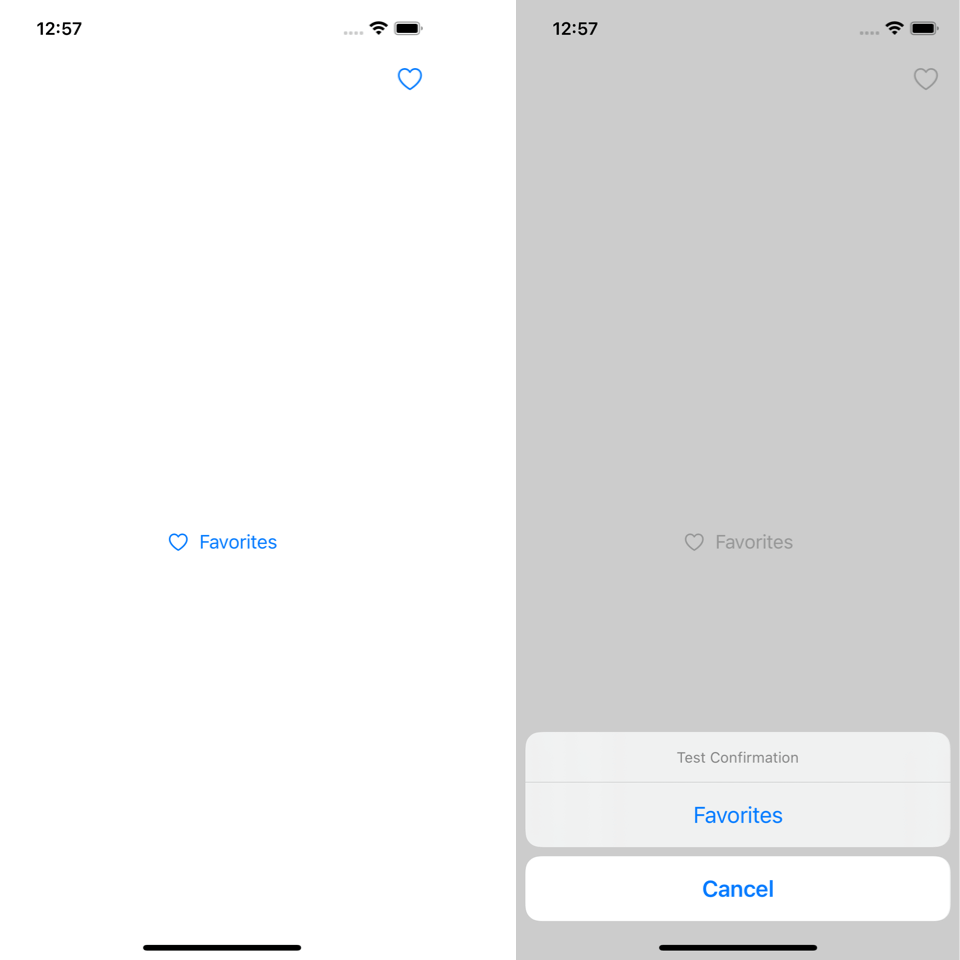
let favoritesLabel = Label("Favorites", systemImage: "heart")
@State private var isPresented = false
var body: some View {
NavigationView {
VStack {
// 2
Button {
isPresented = true
} label: {
favoritesLabel
}
}.toolbar {
// 3
ToolbarItem(placement: .primaryAction) {
Button {
} label: {
favoritesLabel
}
}
}
.confirmationDialog(
"Test Confirmation",
isPresented: $isPresented,
titleVisibility: .visible
) {
// 4
Button {
} label: {
favoritesLabel
}
}
}
}
}1 We create a shared label that will pass as an argument for each view.
2 A button uses an icon and text from label as its content.
3 A tool bar item use only icon as its content.
4 A button inside a confirmation dialog context use only text as its content.
Let's see how to control this in our custom view.
Default label style
To control which information to use, we used what we learn from our previous article, labelStyle(_:).
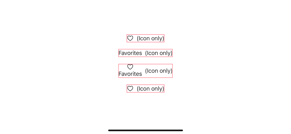
We created IconOnlyView that uses only an icon if a Label is passed as an argument.
// 1
struct IconOnlyView<Label>: View where Label: View {
    let label: Label

    // 2
    init(@ViewBuilder _ label: () -> Label) {
        self.label = label()
    }

    var body: some View {
        HStack {
            // 3
            label
                .labelStyle(.iconOnly)
            Text("(Icon only)")
        }
        .border(.pink) // 4
    }
}
1 We declare a view that accepts any view as a label. I use the same declaration style as a built-in SwiftUI view.
2 An initializer that accepts a view builder used to populate a label for our view.
3 This is where we enforce label style that matches the view, .iconOnly in this case.
4 Our custom view will put a label inside an HStack with a custom text and a pink border.
Users can provide any view as a label to our IconOnlyView. Only a Label view will be effect by .labelStyle.
struct ContentView: View {
    let favoritesLabel = Label("Favorites", systemImage: "heart")

    var body: some View {
        VStack(spacing: 20) {
            // 1
            IconOnlyView {
                Image(systemName: "heart")
            }
            IconOnlyView {
                Text("Favorites")
            }
            IconOnlyView {
                VStack {
                    Image(systemName: "heart")
                    Text("Favorites")
                }
            }
            // 2
            IconOnlyView {
                favoritesLabel
            }
        }
    }
}
1 Non-Label view won't get affect by .labelStyle and show as-is.
2 Only a Label will get an effect. Only an icon will be used as a label.
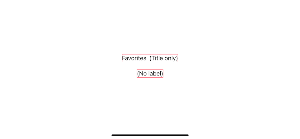
You can choose any style you want that matches your view. Here is an example of TitleOnlyView, which shows only a text, and NoLabelView, which shows nothing.
struct TitleOnlyView<Label>: View where Label: View {
    let label: Label

    init(@ViewBuilder _ label: () -> Label) {
        self.label = label()
    }

    var body: some View {
        HStack {
            label
                .labelStyle(.titleOnly)
            Text("(Title only)")
        }
        .border(.pink)
    }
}

struct NoLabelView<Label>: View where Label: View {
    let label: Label

    init(@ViewBuilder _ label: () -> Label) {
        self.label = label()
    }

    var body: some View {
        HStack {
            // Don't use any label
            Text("(No label)")
        }
        .border(.pink)
    }
}

struct ContentView: View {
    let favoritesLabel = Label("Favorites", systemImage: "heart")

    var body: some View {
        VStack(spacing: 20) {
            TitleOnlyView {
                favoritesLabel
            }
            NoLabelView {
                favoritesLabel
            }
        }
    }
}
Custom label style
The default label style will show an icon and text side-by-side, which might not suit your custom view. If you need to customize a layout of a label or make it adapt to environmental change, you would need to create a custom label style.
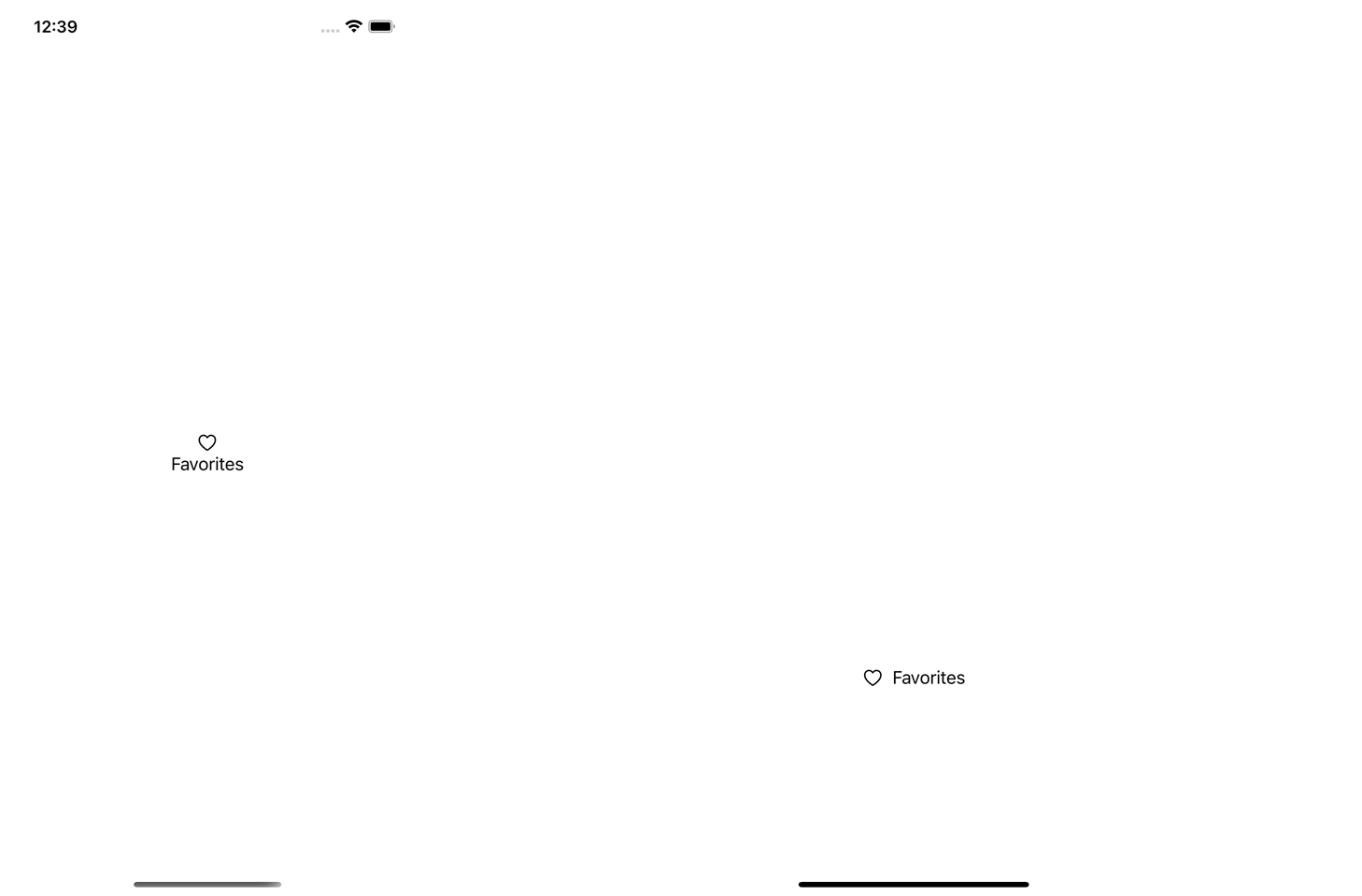
I will create an AdaptiveView view with a companion label style, AdaptiveLabelStyle. The view presents an icon and text label vertically in portrait and shows an icon and text horizontally in a landscape where vertical space is limited (compact vertical size class).
struct AdaptiveView<Label>: View where Label: View {
    let label: Label

    init(@ViewBuilder _ label: () -> Label) {
        self.label = label()
    }

    var body: some View {
        label
            .labelStyle(AdaptiveLabelStyle())
    }
}

struct AdaptiveLabelStyle: LabelStyle {
    @Environment(\.verticalSizeClass) var verticalSizeClass: UserInterfaceSizeClass?

    func makeBody(configuration: Configuration) -> some View {
        if verticalSizeClass == .compact {
            // 1
            HStack {
                configuration.icon
                configuration.title
            }
        } else {
            // 2
            VStack {
                configuration.icon
                configuration.title
            }
        }
    }
}

struct ContentView: View {
    let favoritesLabel = Label("Favorites", systemImage: "heart")

    var body: some View {
        VStack(spacing: 20) {
            AdaptiveView {
                favoritesLabel
            }
        }
    }
}
1 When vertical space is limited (landscape orientation), we show the icon and text horizontally.
2 In portrait mode, we show them vertically.
You can easily support sarunw.com by checking out this sponsor.
Offline Transcription: Fast, privacy-focus way to transcribe audio, video, and podcast files. No data leaves your Mac.
Accessibility
We have learned how to show/hide an icon and text label, customize the layout, and adapt to environmental changes, but one problem remains with our IconOnlyView.
In IconOnlyView, I add an extra text, "Icon only", alongside a label. This extra text is used as a visual clue for demonstration only, and it doesn't mean for VoiceOver to read it out.
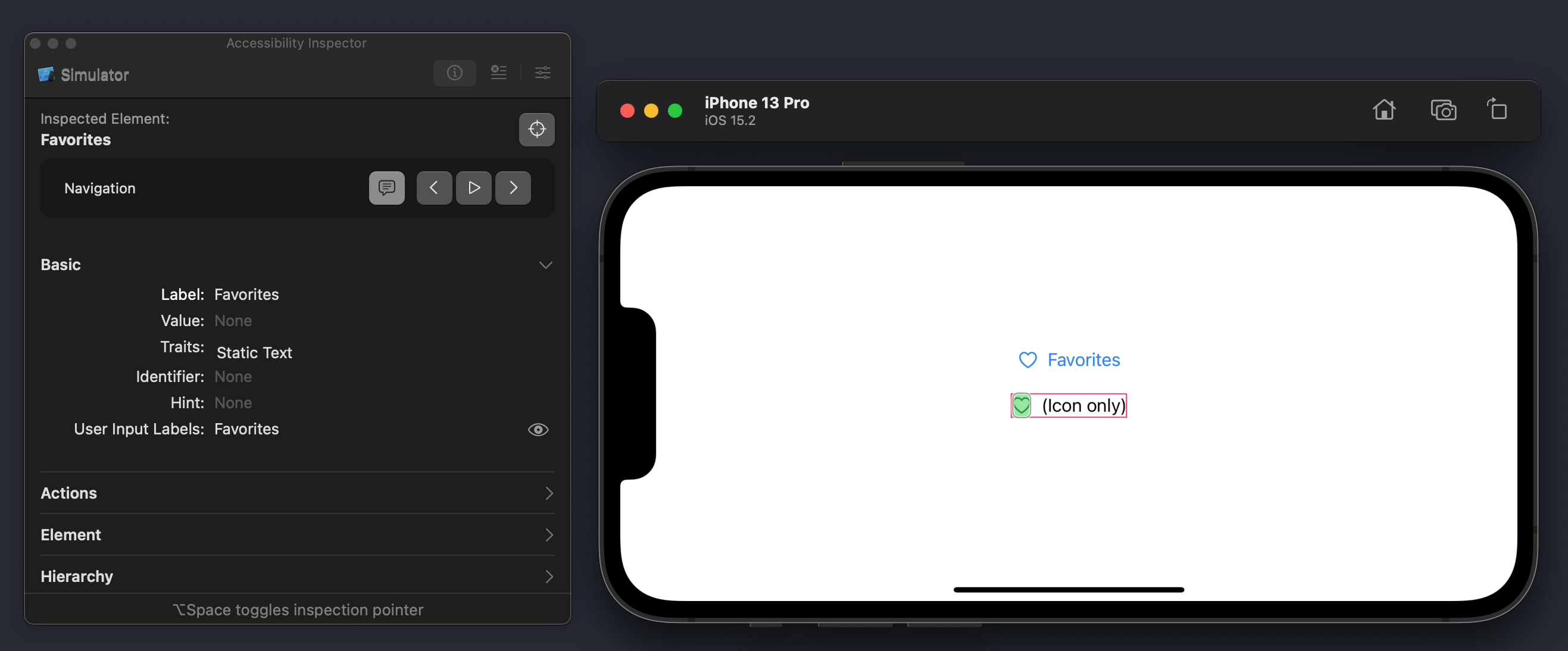
Using VoiceOver right now will read as two separate elements, "Favorites" and "Icon only".
This might not be behavior that users expect when providing a Label to a view. We should use label text as a description.
Custom accessibility data
There is no silver bullet for this custom layout. Each layout required a unique treatment, but I will show you how to fix mine.
Here is our implementation once again.
struct IconOnlyView<Label>: View where Label: View {
    let label: Label

    init(@ViewBuilder _ label: () -> Label) {
        self.label = label()
    }

    var body: some View {
        HStack {
            label
                .labelStyle(.iconOnly)
            Text("(Icon only)")
        }
        .border(.pink)
    }
}
The fix is easy in this case. I need to remove Text("(Icon only)") from system accessibility features. I can do this by applying accessibility(hidden:) to it.
struct IconOnlyView<Label>: View where Label: View {
let label: Label
init(@ViewBuilder _ label: () -> Label) {
self.label = label()
}
var body: some View {
HStack {
label
.labelStyle(.iconOnly)
Text("(Icon only)")
.accessibilityHidden(true)
}
.border(.pink)
}
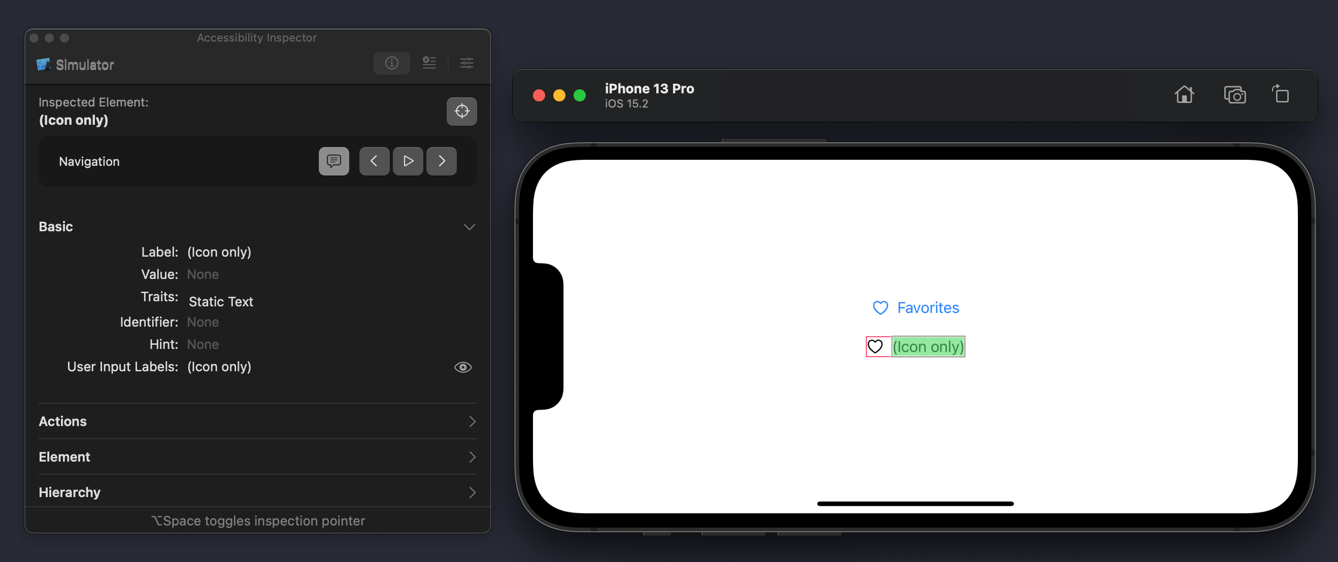
}VoiceOver will read our view as "Favourites" and ignore the text "Icon only" with this simple change.
Depending on your layout, you may or may not need to customize accessibility data. I just want to point out that when you create a custom label style, you opt out from the default behavior and make sure it works the way you want.
You can easily support sarunw.com by checking out this sponsor.
Offline Transcription: Fast, privacy-focus way to transcribe audio, video, and podcast files. No data leaves your Mac.
Conclusion
Here is a recap on how to embrace a label in your custom view.
- Create an initializer that accepts a label. To match built-in views, you should allow any view to use as a label. Only a
Labelview would get special treatment (Get an effect from.labelStyle). - Make sure accessibility data work the way you want if you implement a custom label style.
Read more article about SwiftUI, Label, or see all available topic
Enjoy the read?
If you enjoy this article, you can subscribe to the weekly newsletter.
Every Friday, you'll get a quick recap of all articles and tips posted on this site. No strings attached. Unsubscribe anytime.
Feel free to follow me on Twitter and ask your questions related to this post. Thanks for reading and see you next time.
If you enjoy my writing, please check out my Patreon https://www.patreon.com/sarunw and become my supporter. Sharing the article is also greatly appreciated.
Become a patron Buy me a coffee Tweet ShareHow to draw custom paths and shapes in SwiftUI
Learn how to make hexagon-shaped profile pictures in SwiftUI.
How to reset push notification permission on iOS
Learn how to make notification permission dialog popup again like the first time you run the app.