Set SwiftUI app theme with AccentColor
Table of Contents
An accent color (tint color in UIKit) is a color that applies to most built-in views and controls in your SwiftUI app.
An accent color is a simple and unified way to theming your app. In this article, we will learn how to set a global accent color for your app using Asset Catalog.
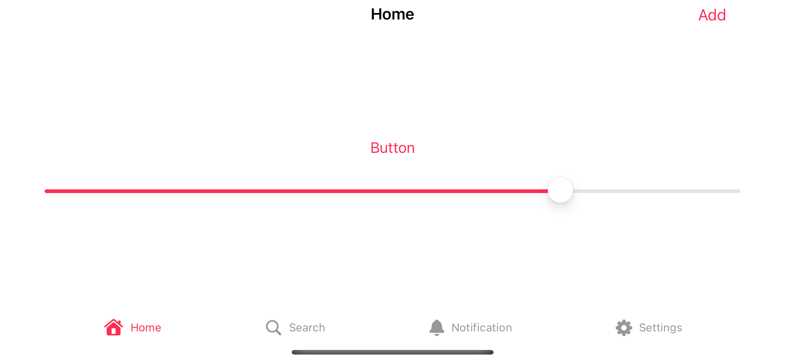
Here is an example of an app that uses pink color as the accent color.
Create an Accent Color Set
If you create a new SwiftUI project, Xcode will automatically include a default Asset Catalog named Assets.xcassets with an AccentColor color set in it. You don't have to do anything in this case.
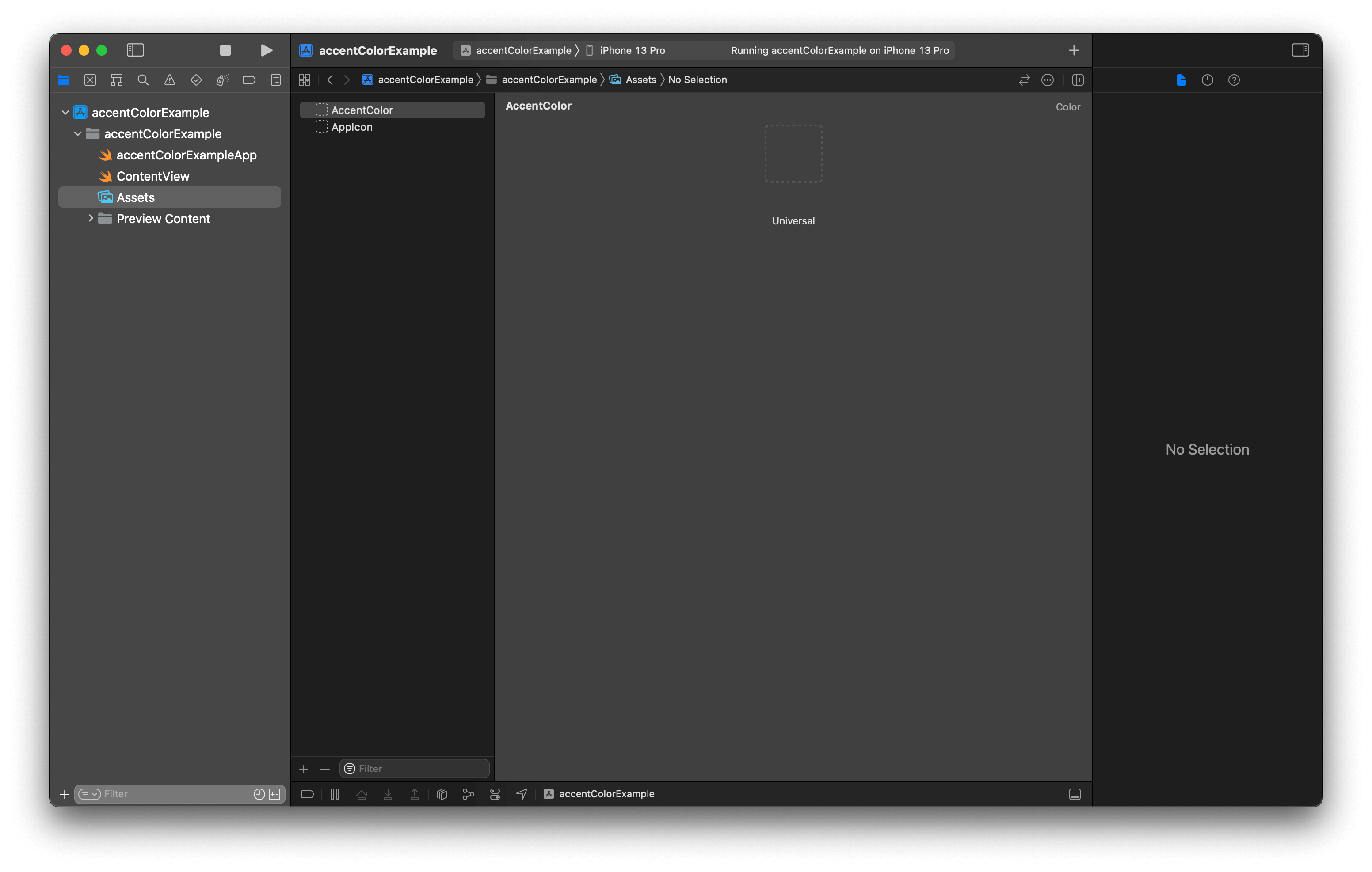
If your app doesn't have an AccentColor color set, your project might create from a different Xcode version. But don't worry; you can manually create it yourselves.
Manually create an Accent Color Set
To manually create an accent color set, you do the following steps.
- Select any asset catalog in your project (It can be any name).
- Click the Add button (+) at the bottom.
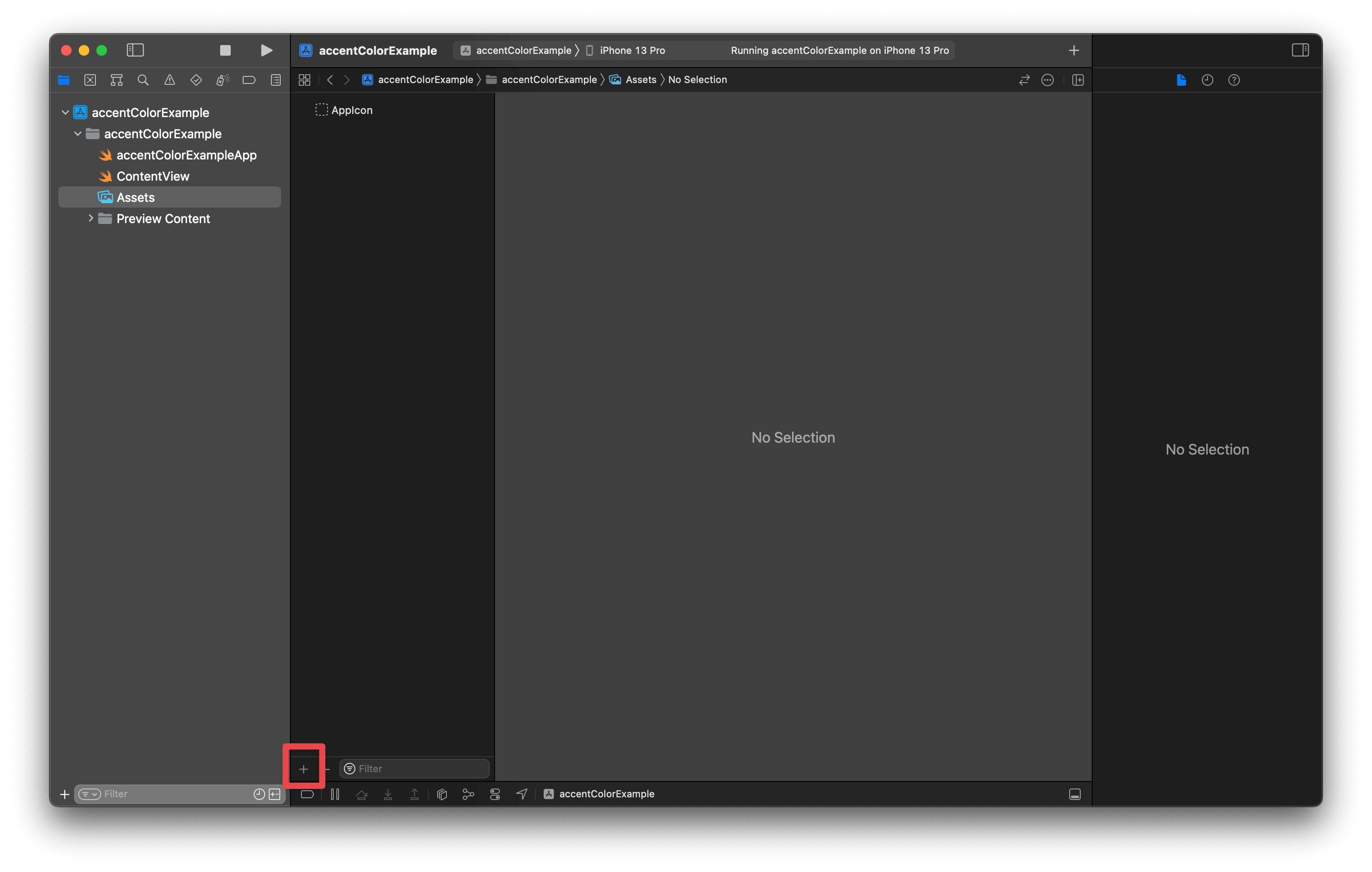
- In the pop-up menu, select "Color Set".
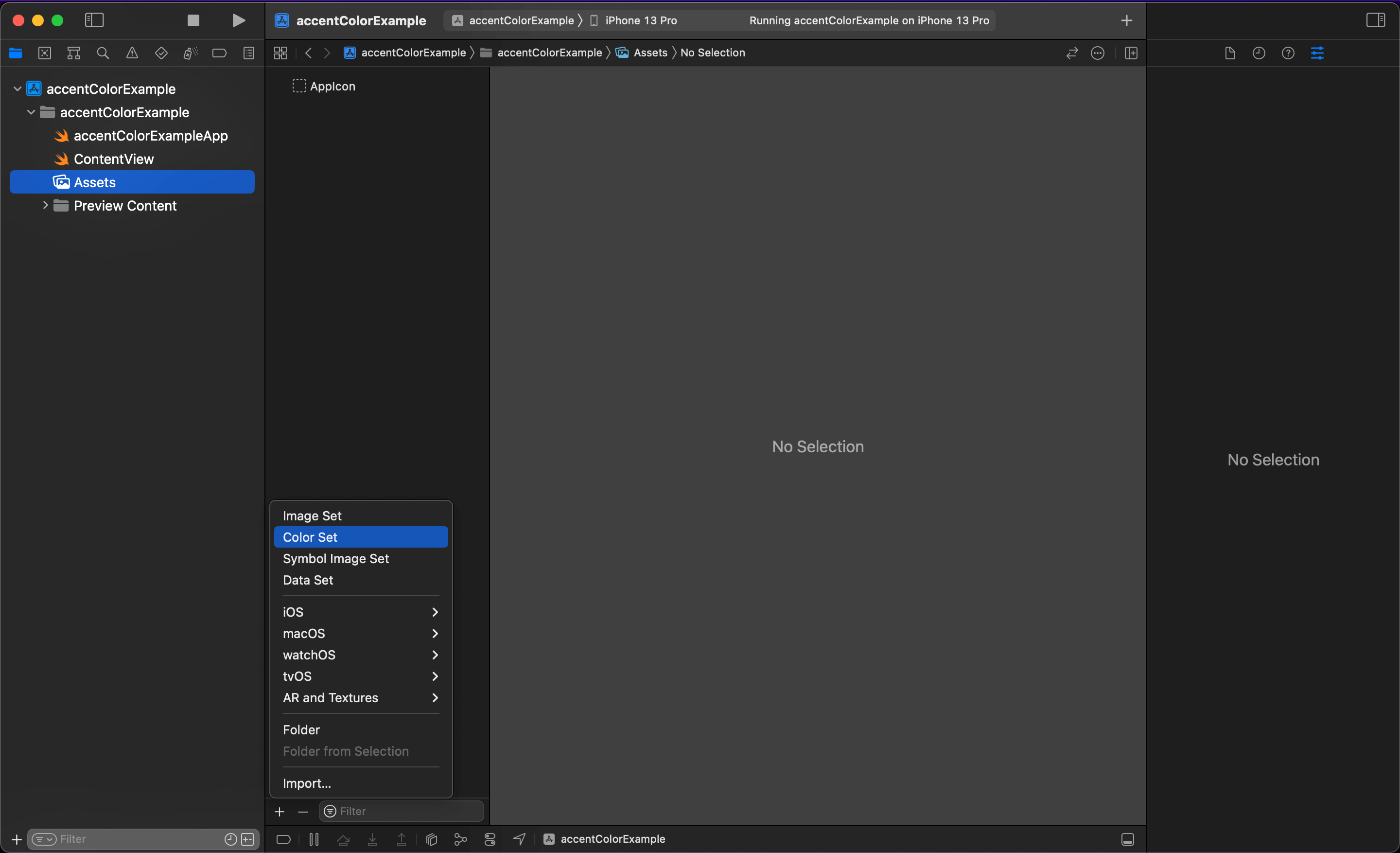
- Double-click on the newly created color set and named it whatever you want. But I suggest you name it AccentColor to align with the default one Xcode created.

- Click on the project root and go to the Build Settings tab. Then, search for the "Global Accent Color Name" build setting.
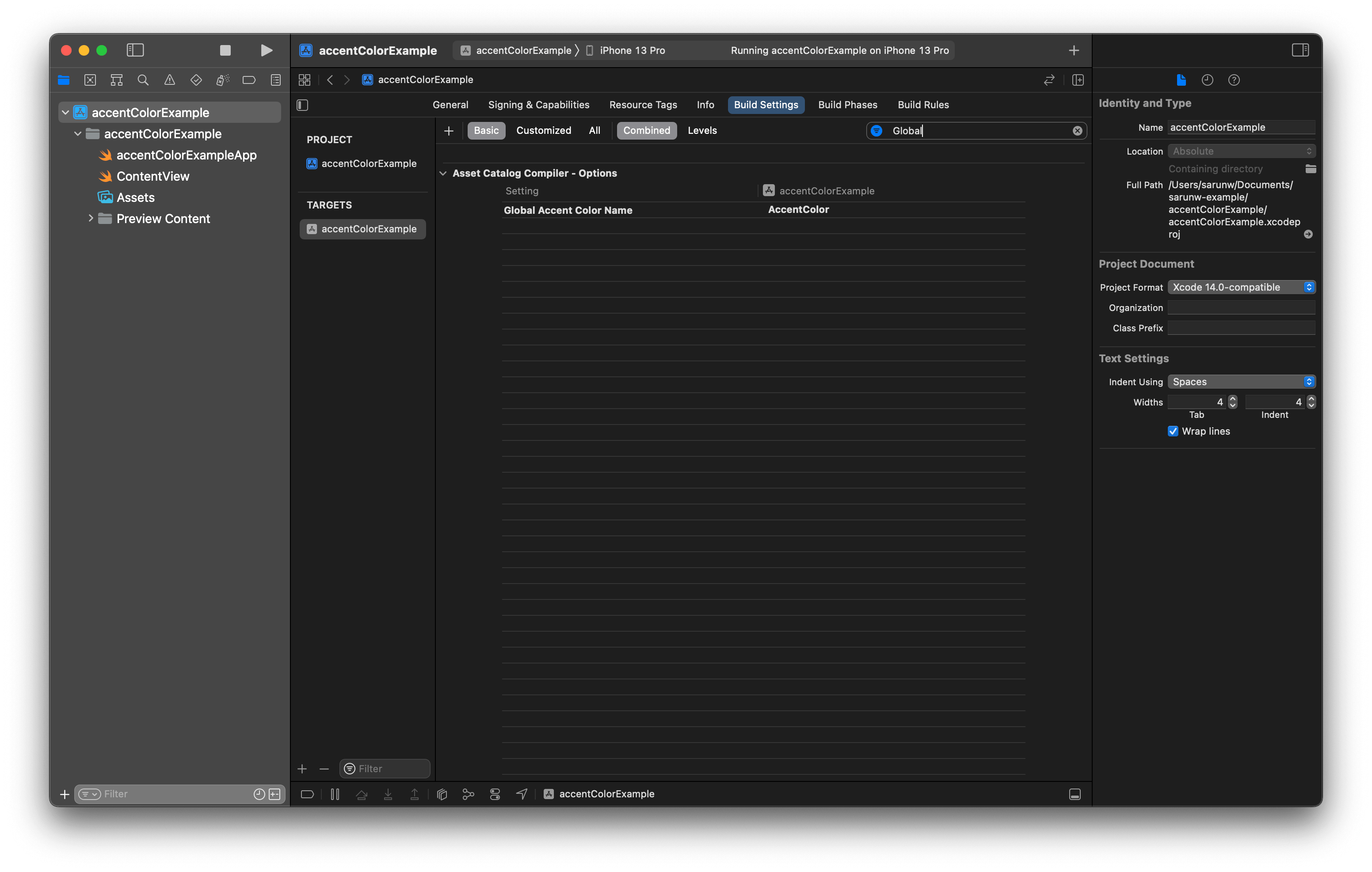
- Double-click the build setting, and type in the name of the accent color set that you created in Step 4.
You can easily support sarunw.com by checking out this sponsor.

Offline Transcription: Fast, privacy-focus way to transcribe audio, video, and podcast files. No data leaves your Mac.
Change Accent Color
Xcode will use the color you specify in the accent color set you created in the previous section as your app's accent color.
To change the accent color of your app, you do the following steps.
- Select an asset catalog where your accent color set is located.
- Select the accent color set.
- In the Appearances field in the Attributes Inspector (The right-most panel), you can set a different accent color for each appearance, e.g., light and dark. As an example, I select "Any, Dark", which will create two placeholders to set colors, one for a dark appearance and one for a non-dark mode.
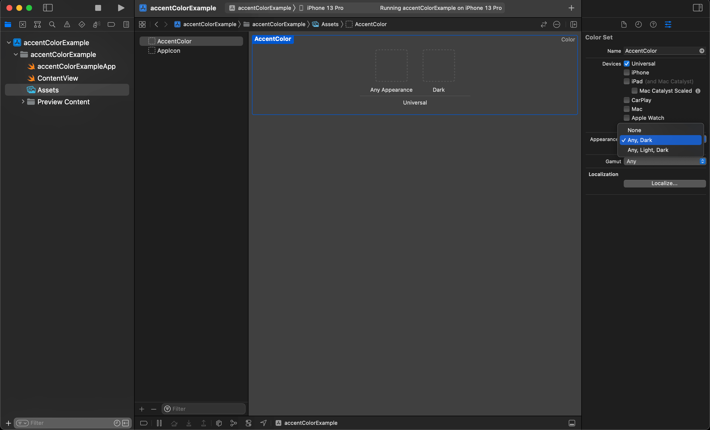
- Select a content field under the Color section to select the color you want. In this case, I set pink for light appearance and green for dark appearance.
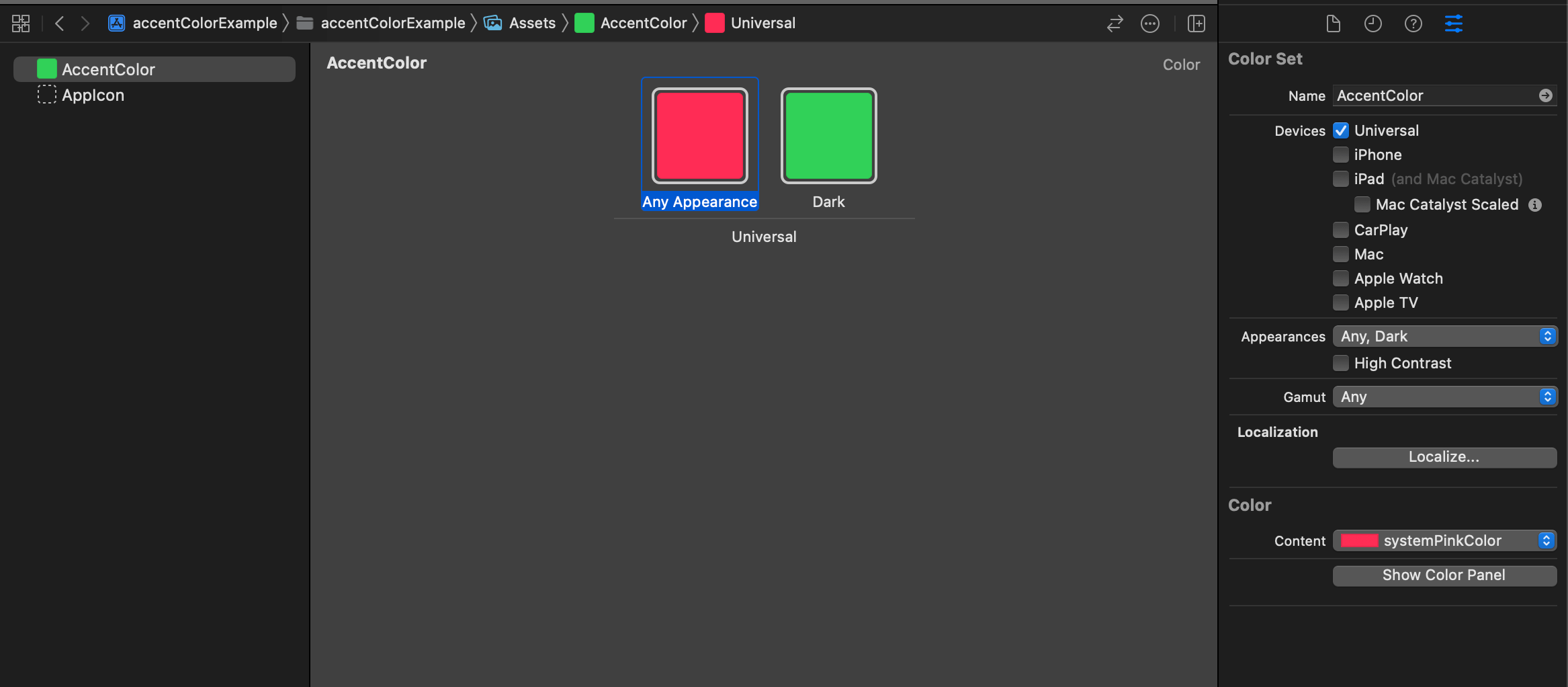
That's all you need to do to change the accent color of your app.
With this setting, our app will use green for a dark appearance and pink otherwise.
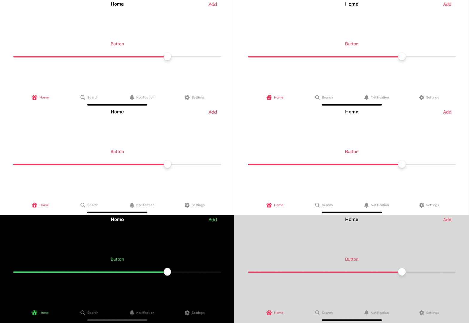
Read more article about SwiftUI, accentColor, tintColor, or see all available topic
Enjoy the read?
If you enjoy this article, you can subscribe to the weekly newsletter.
Every Friday, you'll get a quick recap of all articles and tips posted on this site. No strings attached. Unsubscribe anytime.
Feel free to follow me on Twitter and ask your questions related to this post. Thanks for reading and see you next time.
If you enjoy my writing, please check out my Patreon https://www.patreon.com/sarunw and become my supporter. Sharing the article is also greatly appreciated.
Become a patron Buy me a coffee Tweet ShareHow to scale margin and padding with @ScaledMetric Property Wrapper
Dynamic Type automatically scales a font size according to Accessibility settings. In iOS 14, we also have a way to scale numeric values like padding and margin.
How to Upload dSYM to Firebase using upload_symbols_to_crashlytics and SPM
Learn how to upload a dSYM file to Firebase with Fastlane.