How to change Background Color of Button in SwiftUI
Table of Contents
In this article, I will show you two ways to change the background color of a button based on how you create a button.
Button with Button Style
If you support iOS 15 and use
- Bordered (
.bordered) or - Bordered Prominent (
.borderedProminent) built-in style
You can easily change its background color by applying tint(_:) modifier.
In the following example, we set the tint color to pink.
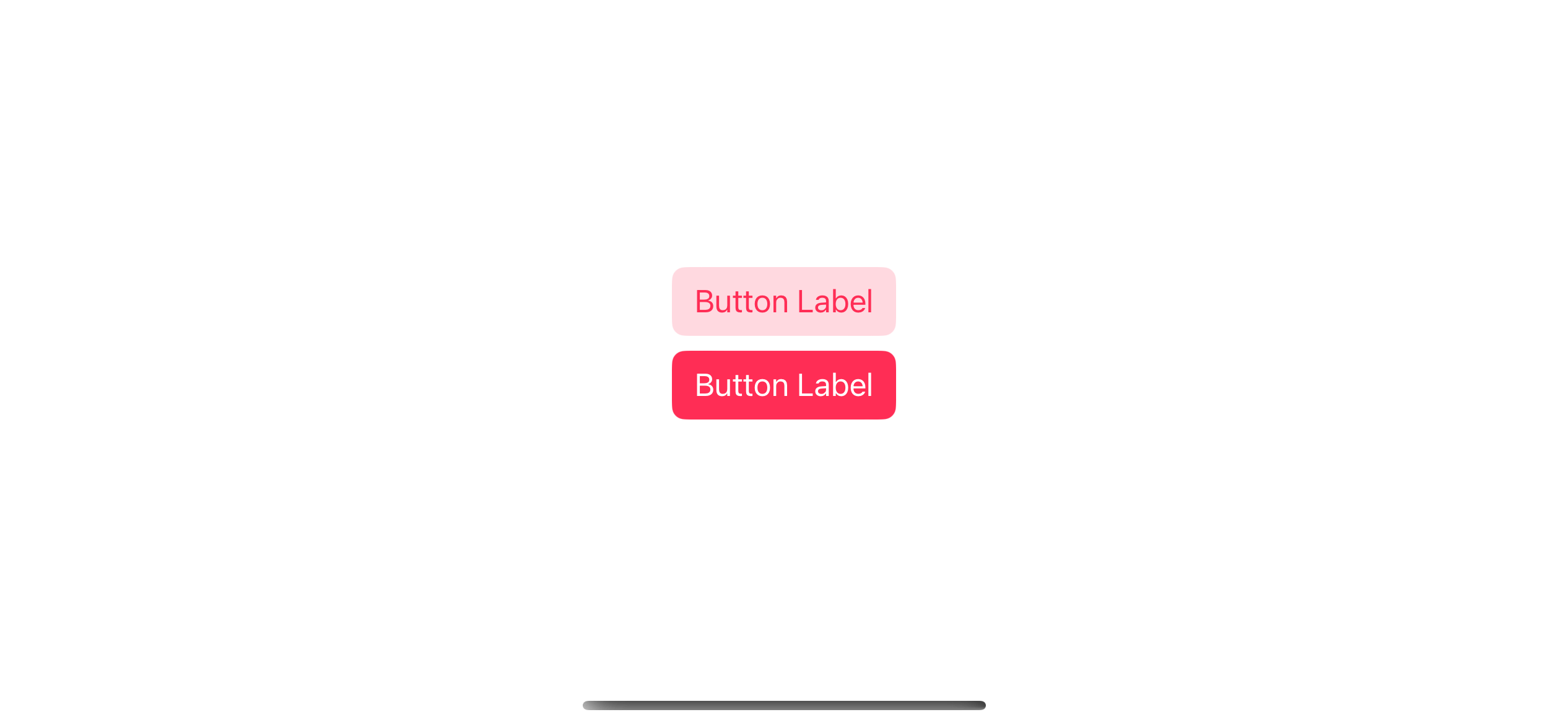
Button("Button Label") {

}
.buttonStyle(.bordered)
.tint(.pink)

Button("Button Label") {

}
.buttonStyle(.borderedProminent)
.tint(.pink)
A Bordered button style uses the tint color for the text and the tint color with opacity for the background.
A Bordered Prominent button style automatically uses a tint color for its background color.
You can easily support sarunw.com by checking out this sponsor.
Screenshot Studio: Create App Store screenshots in seconds not minutes.
Button with Custom Label view
If you have a button with a custom view for your label, you can set the background color using .background modifier.
Here is an example where I tried to replicate a bordered prominent style with my custom label.
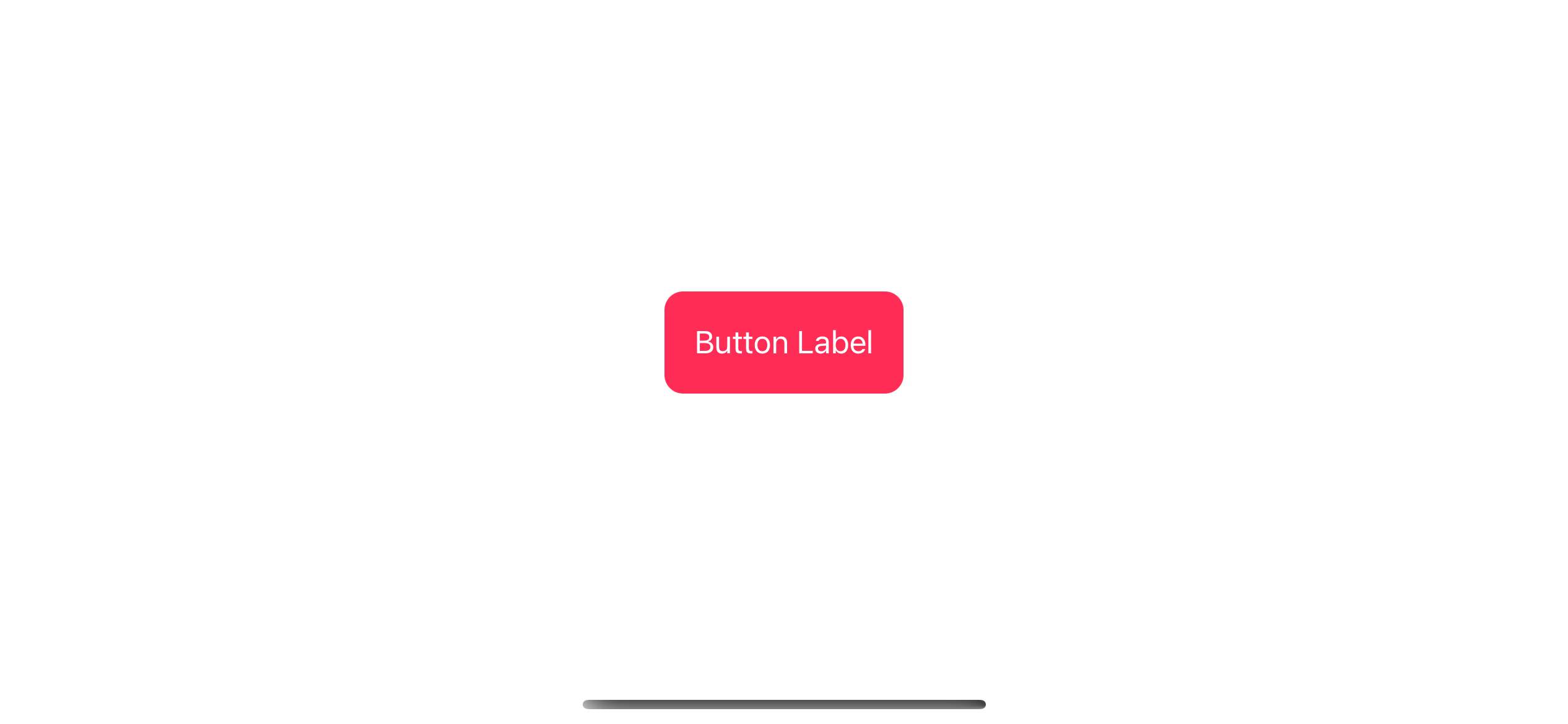
Button(action: { }) {
    // 1
    Text("Button Label")
        .padding()
}
.foregroundColor(.white) // 2
.background(.pink) // 3
.cornerRadius(10) // 4
1 I use a simple text view as a label
2 Set text color to white with .foregroundColor(.white).
3 Set background color to pink with .background(.pink).
4 Set corner radius with .cornerRadius(10).
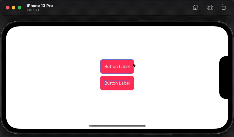
Caveat
The important thing you need to know when creating a custom button is a clickable area is the size of a button content.
In this case, it is Text("Button Label").padding(). So, the clickable area is as wide as the text and padding.
If you move the .padding() modifier outside the button label, your clickable area will be as small as the text.
Here is an example where I compare the two. I also add a blue border to show a clickable area.
VStack {
    Button(action: { }) {
        Text("Button Label")
            .padding()
            .border(.blue)
    }
    .foregroundColor(.white)
    .background(.pink)
    .cornerRadius(10)

    Button(action: { }) {
        Text("Button Label")
            .border(.blue)
    }
    .padding()
    .foregroundColor(.white)
    .background(.pink)
    .cornerRadius(10)
}
As you can see, we can only click the second button when we click on the text.
Read more article about SwiftUI, Button, or see all available topic
Enjoy the read?
If you enjoy this article, you can subscribe to the weekly newsletter.
Every Friday, you'll get a quick recap of all articles and tips posted on this site. No strings attached. Unsubscribe anytime.
Feel free to follow me on Twitter and ask your questions related to this post. Thanks for reading and see you next time.
If you enjoy my writing, please check out my Patreon https://www.patreon.com/sarunw and become my supporter. Sharing the article is also greatly appreciated.
Become a patron Buy me a coffee Tweet ShareHow to join an Array of strings into a Single string in Swift
Learn how to turn ["John", "Alice", "Bob"] into "John, Alice, Bob".
Unwrap Swift optional value in Switch case
Learn how to test for unwrapped optional values in a switch statement.