How to create SwiftUI circular progress bar
Table of Contents
In this tutorial, we will learn how to create a circular progress bar in SwiftUI.
How to create SwiftUI circular progress bar
We need just three SwiftUI views to make a circular progress view.
- Circle view, which acts as a background when there is no progress.
- Another Circle view that sits on top of the first one. This will represent the progress.
- ZStack to layout the second Circle view on top of the first Circle view.
We will start by preparing a static view for our circular progress bar.
Then, we will make it show progress according to progress data.
The final result will look like this.
You can easily support sarunw.com by checking out this sponsor.
AI Grammar: Correct grammar, spell check, check punctuation, and parphrase.
Creating a static circular progress bar view
Let's start by creating a new SwiftUI view for our circular progress bar. I will name it CircularProgressView.
Background
I mentioned earlier that we would use Circle view for our progress, but actually, we want an outline of a circle.
We can get an outline of any SwiftUI shape with stroke(lineWidth:) modifier.
struct CircularProgressView: View {
    var body: some View {
        Circle()
            .stroke( // 1
                Color.pink.opacity(0.5),
                lineWidth: 30
            )
    }
}
1 Draw an outline of a circle shape with a line width of 30 points.
We can use it like this.
struct ContentView: View {
    var body: some View {
        CircularProgressView()
            .frame(width: 200, height: 200)
    }
}
And this is how it looks. We got the first part of our progress bar in place!
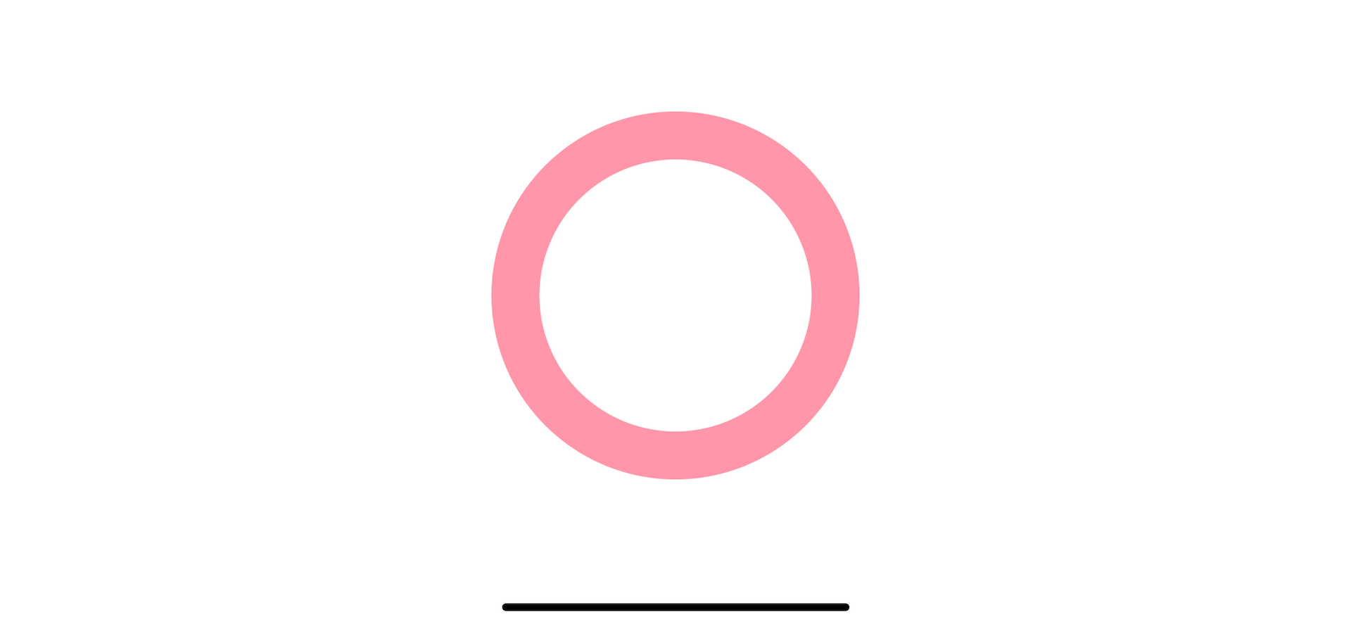
What we see right now is a circular progress bar with zero progress. We need another Circle view to present our progress.
Progress Indicator
To make a progress indicator, I use the same view as the background view. The only difference is the stroke color.
struct CircularProgressView: View {
    var body: some View {
        ZStack { // 1
            Circle()
                .stroke(
                    Color.pink.opacity(0.5),
                    lineWidth: 30
                )
            Circle() // 2
                .stroke(
                    Color.pink,
                    lineWidth: 30
                )
        }
    }
}
1 I use ZStack to put the progress view over the background view.
2 I use the same shape and stroke as a progress indicator. The only difference is the color.
Since our progress indicator sit right on top of the background, everything is the same as our previous implementation.
The only difference is the color which is the one from the second circle.
Here is the result.
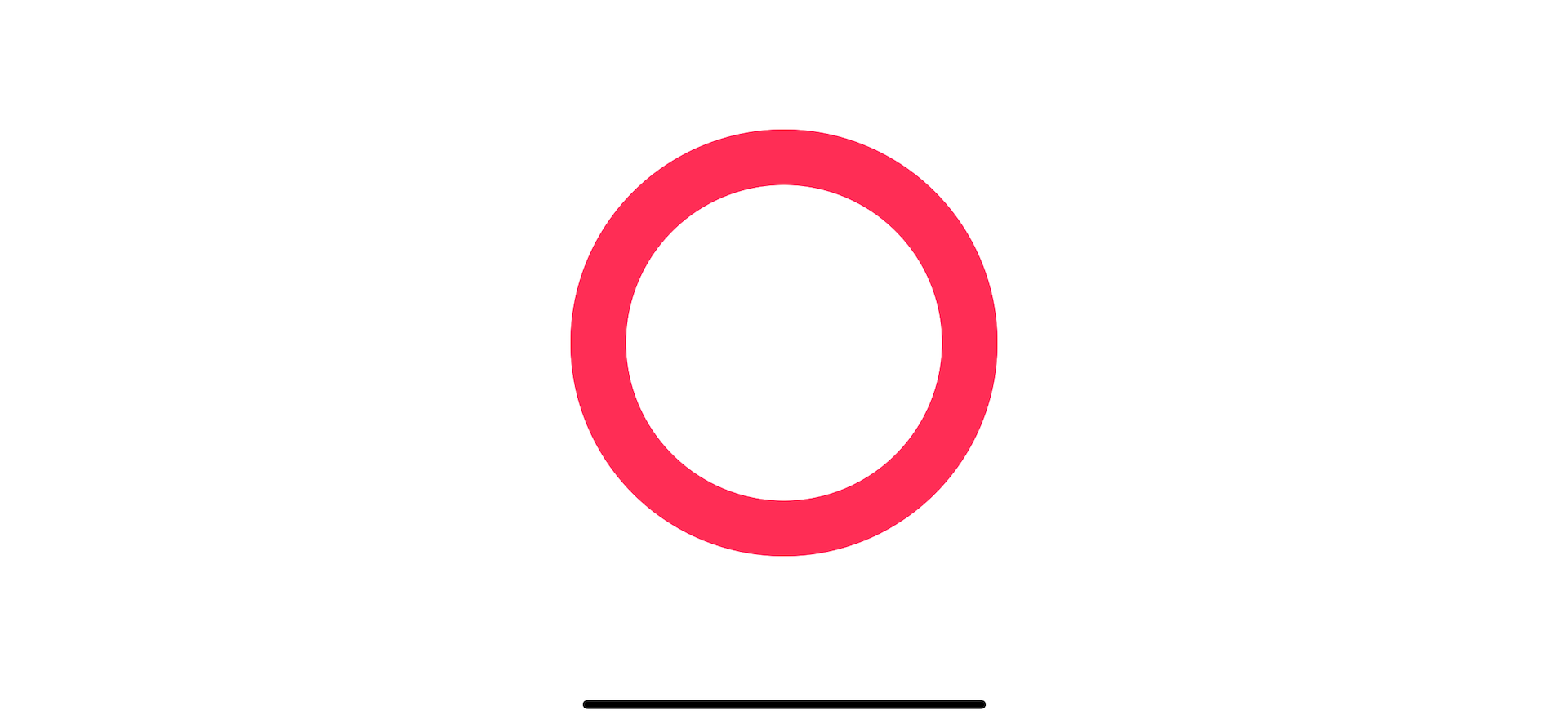
Now we have a view that represents progress, but it always shows 100% progress at the moment. We need a way to show progress between 0 and 100.
Progress
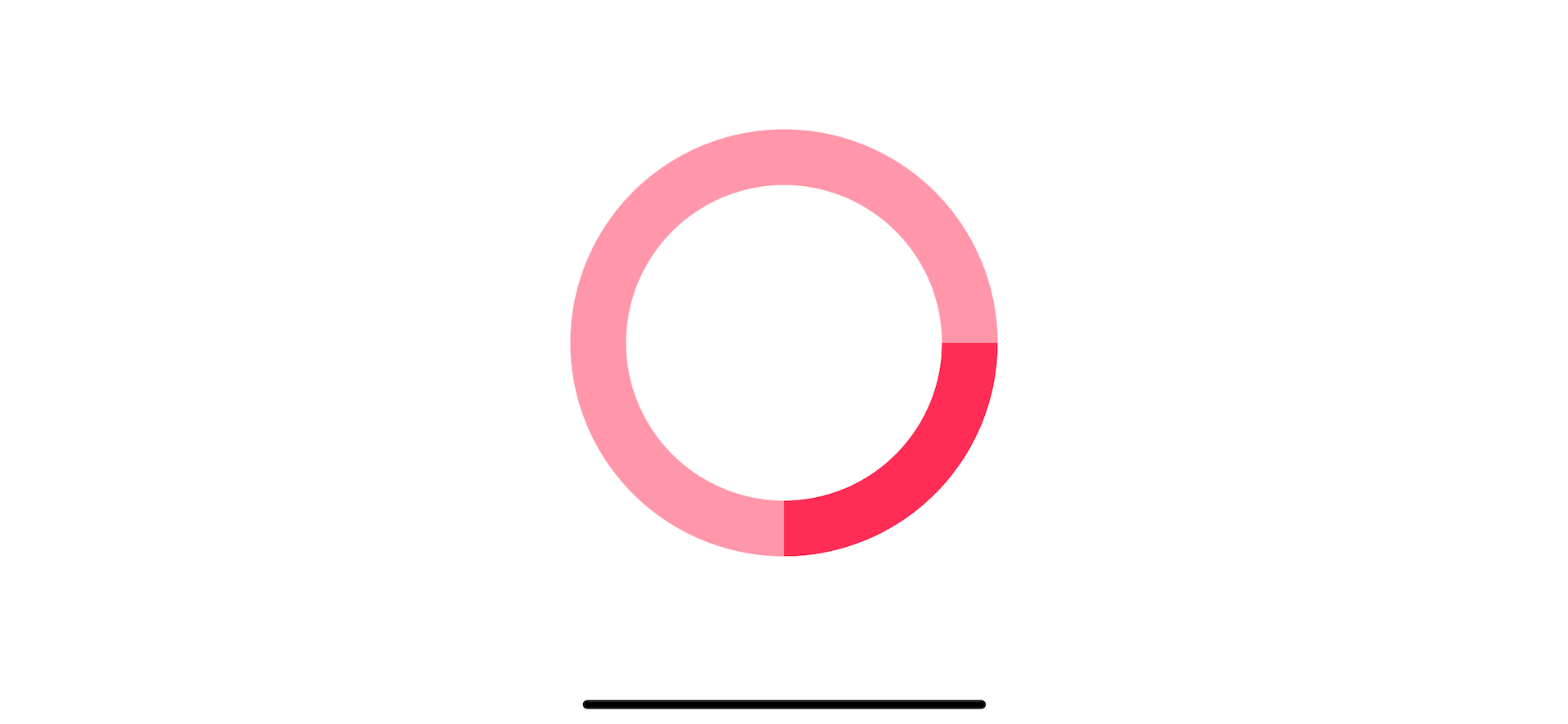
We want a way to draws a fraction of a circle to present a progress. Luckily, we can easily do that with trim(from:to:) modifier.
The Trim modifier will draw a portion of a shape from the specified starting and ending fraction where 0 is the beginning, and 1 is the end.
Here is an example where we set progress to 25% by draw a stroke only 1/4 ways (0.25) of the whole circle.
struct CircularProgressView: View {
    var body: some View {
        ZStack {
            Circle()
                .stroke(
                    Color.pink.opacity(0.5),
                    lineWidth: 30
                )
            Circle()
                .trim(from: 0, to: 0.25) // 1
                .stroke(
                    Color.pink,
                    lineWidth: 30
                )
        }
    }
}
1 By trimming a circle from 0 to 0.25, we draw only a quarter of the whole circle.
Here is the result.
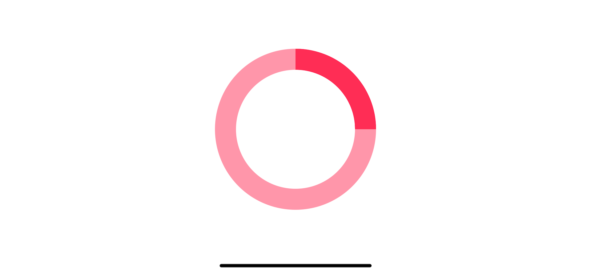
You might notice that the progress starts from the right side of the circle. I want it to start from the top, so we need to modify our progress indicator a bit.
Start progress from the top
We can make our progress indicator start from the top by rotating the view 90 degrees counterclockwise.
To do that, we use rotationEffect(_:anchor:) modifier.
struct CircularProgressView: View {
    var body: some View {
        ZStack {
            Circle()
                .stroke(
                    Color.pink.opacity(0.5),
                    lineWidth: 30
                )
            Circle()
                .trim(from: 0, to: 0.25)
                .stroke(
                    Color.pink,
                    lineWidth: 30
                )
                // 1
                .rotationEffect(.degrees(-90))
        }
    }
}
1 Rotate the second circle view counterclockwise to make progress starting from the top.
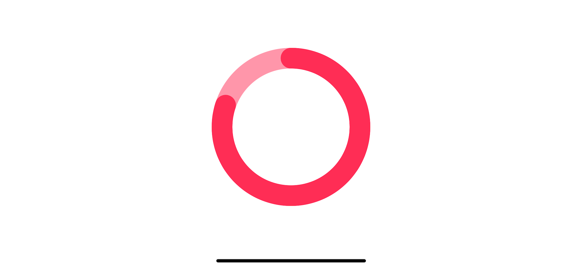
Make the line cap round
We will finish the circular progress view by making its line cap round. This last step is purely for aesthetic reasons.
To control a line cap, we use another variation of stroke modifier, stroke(_:style:), which lets us control stroke style.
struct CircularProgressView: View {
    var body: some View {
        ZStack {
            Circle()
                .stroke(
                    Color.pink.opacity(0.5),
                    lineWidth: 30
                )
            Circle()
                .trim(from: 0, to: 0.25)
                .stroke(
                    Color.pink,
                    // 1
                    style: StrokeStyle(
                        lineWidth: 30,
                        lineCap: .round
                    )
                )
                .rotationEffect(.degrees(-90))
        }
    }
}
1 We use StrokeStyle(lineWidth: 30, lineCap: .round) to make the round line cap.
Here is our final result.

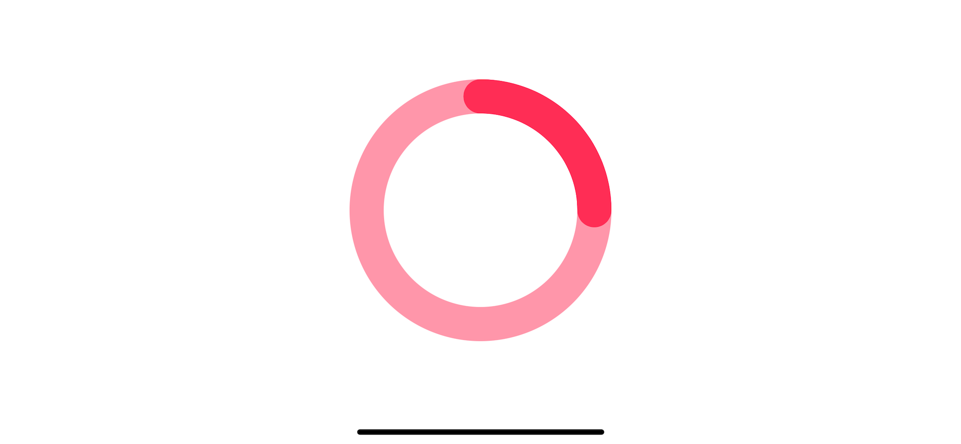
Make the circular progress bar data-driven
We have a circular progress bar ready, but it is still static. The progress is hard-coded to 25% progress.
We will create a new progress property, and make the progress indicator view adapts to this property.
struct CircularProgressView: View {
    // 1
    let progress: Double

    var body: some View {
        ZStack {
            Circle()
                .stroke(
                    Color.pink.opacity(0.5),
                    lineWidth: 30
                )
            Circle()
                // 2
                .trim(from: 0, to: progress)
                .stroke(
                    Color.pink,
                    style: StrokeStyle(
                        lineWidth: 30,
                        lineCap: .round
                    )
                )
                .rotationEffect(.degrees(-90))
        }
    }
}
1 Create a progress property to dictate current progress.
2 Replace our hard-coded number with the new progress property.
Then we can pass progress as an argument when creating CircularProgressView.
struct ContentView: View {
    var body: some View {
        CircularProgressView(progress: 0.8)
            .frame(width: 200, height: 200)
    }
}
Animation
The last thing that I want to improve before wrapping this up is an animation.
Right now, if you change the progress, our circular progress bar would change the progress without any animation.
To make our view animate, we apply animation(_:value:) to our progress view.
struct CircularProgressView: View {
    let progress: Double

    var body: some View {
        ZStack {
            Circle()
                .stroke(
                    Color.pink.opacity(0.5),
                    lineWidth: 30
                )
            Circle()
                .trim(from: 0, to: progress)
                .stroke(
                    Color.pink,
                    style: StrokeStyle(
                        lineWidth: 30,
                        lineCap: .round
                    )
                )
                .rotationEffect(.degrees(-90))
                // 1
                .animation(.easeOut, value: progress)
        }
    }
}
1 .animation(.easeOut, value: progress) will apply ease out animation when the progress value changes.

You can easily support sarunw.com by checking out this sponsor.
AI Grammar: Correct grammar, spell check, check punctuation, and parphrase.
How to use
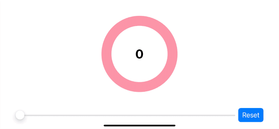
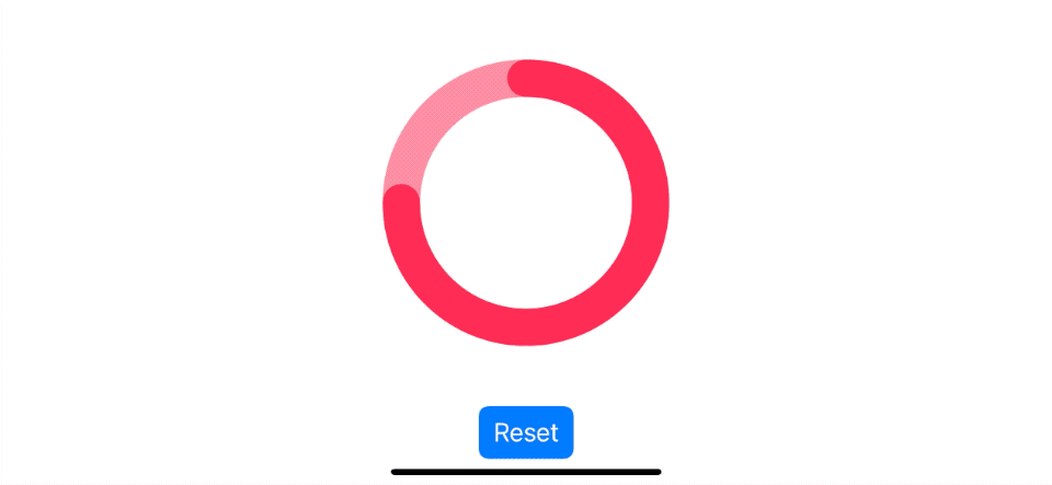
Let's try using CircularProgressView in a sample app so you get an idea of how to use this in a real app.
In this sample, I have a progress value which shared among three views, our progress view, label, and slider.
We will use a slider view to control the progress value. This value will reflect on the label and the progress view. The reset button will set the progress back to zero, which should trigger our circular progress bar animation.
struct ContentView: View {
    // 1
    @State var progress: Double = 0

    var body: some View {
        VStack {
            Spacer()
            ZStack {
                // 2
                CircularProgressView(progress: progress)
                // 3
                Text("\(progress * 100, specifier: "%.0f")")
                    .font(.largeTitle)
                    .bold()
            }.frame(width: 200, height: 200)
            Spacer()
            HStack {
                // 4
                Slider(value: $progress, in: 0...1)
                // 5
                Button("Reset") {
                    resetProgress()
                }.buttonStyle(.borderedProminent)
            }
        }
    }

    func resetProgress() {
        progress = 0
    }
}
1 A data represent current progress.
2 We use progress as our progress view data.
3 We also use the same data to show as text at the center of our progress view.
4 Slider data is binding to the progress, so we can control its value through this slider.
5 Reset button set progress value back to zero. This is used to test the animation.
And here is the result.
Read more article about SwiftUI, ProgressView, or see all available topic
Enjoy the read?
If you enjoy this article, you can subscribe to the weekly newsletter.
Every Friday, you'll get a quick recap of all articles and tips posted on this site. No strings attached. Unsubscribe anytime.
Feel free to follow me on Twitter and ask your questions related to this post. Thanks for reading and see you next time.
If you enjoy my writing, please check out my Patreon https://www.patreon.com/sarunw and become my supporter. Sharing the article is also greatly appreciated.
Become a patron Buy me a coffee Tweet ShareHow to change SwiftUI font size
There are two ways to set a font size for Text view in SwiftUI. Let's see what they are and how to set them.
How to style SwiftUI text Font
Learn how to set font size, design, weight, and color in SwiftUI.