SwiftUI ProgressView
Table of Contents
What is SwiftUI ProgressView
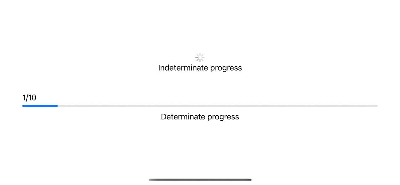
ProgressView is a view that shows the progress of a task.
There are two types of progress that the ProgressView supports.
- Determinate Progress. Progress where we know when the task will be complete.
- Indeterminate Progress. Progress where we don't know when it is going to end.
- For determinate progress, a
ProgressViewwill show in the form of a progress bar. - For indeterminate progress, a
ProgressViewwill show in the form of a spinning wheel.
You can easily support sarunw.com by checking out this sponsor.
Offline Transcription: Fast, privacy-focus way to transcribe audio, video, and podcast files. No data leaves your Mac.
Indeterminate Progress
Indeterminate progress is what we usually show when we perform a task that is impossible to know when it is going to be finished.
For example, loading data from the network.
To create an indeterminate progress view, we initialize ProgressView without any parameter.
ProgressView()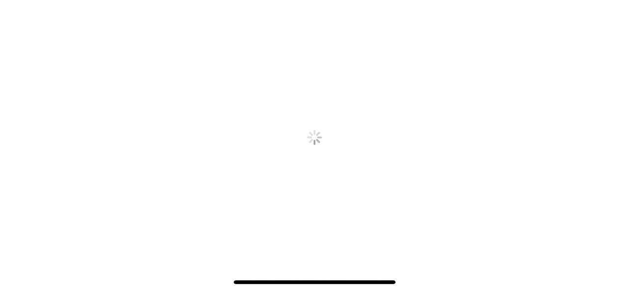
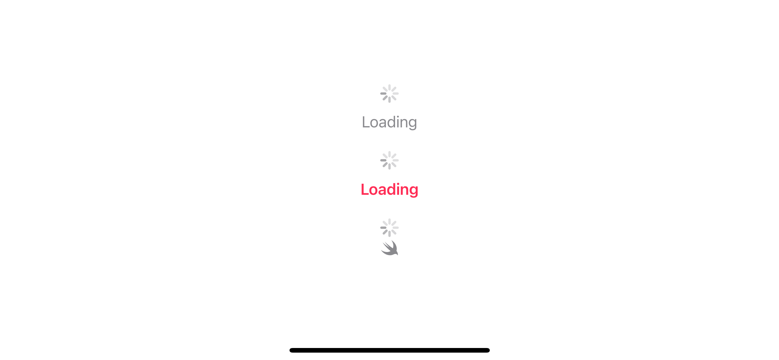
You can specify a string or a view to using as a progress view label.
struct ContentView: View {
    var body: some View {
        VStack(spacing: 20) {
            // 1
            ProgressView("Loading")
            // 2
            ProgressView {
                Text("Loading")
                    .foregroundColor(.pink)
                    .bold()
            }
            // 3
            ProgressView {
                Image(systemName: "swift")
            }
        }
    }
}
1 Use string as a label.
2 Use styled text view as a label.
3 Use an image as a label.
Determinate Progress
Determinate progress is progress in which we can determine how much progress has been made.
In other words, we can calculate percentage complete of a task.
So, to create a determinate progress view, we need to provide data that can turn into a percentage complete.
There are many ways to do so.
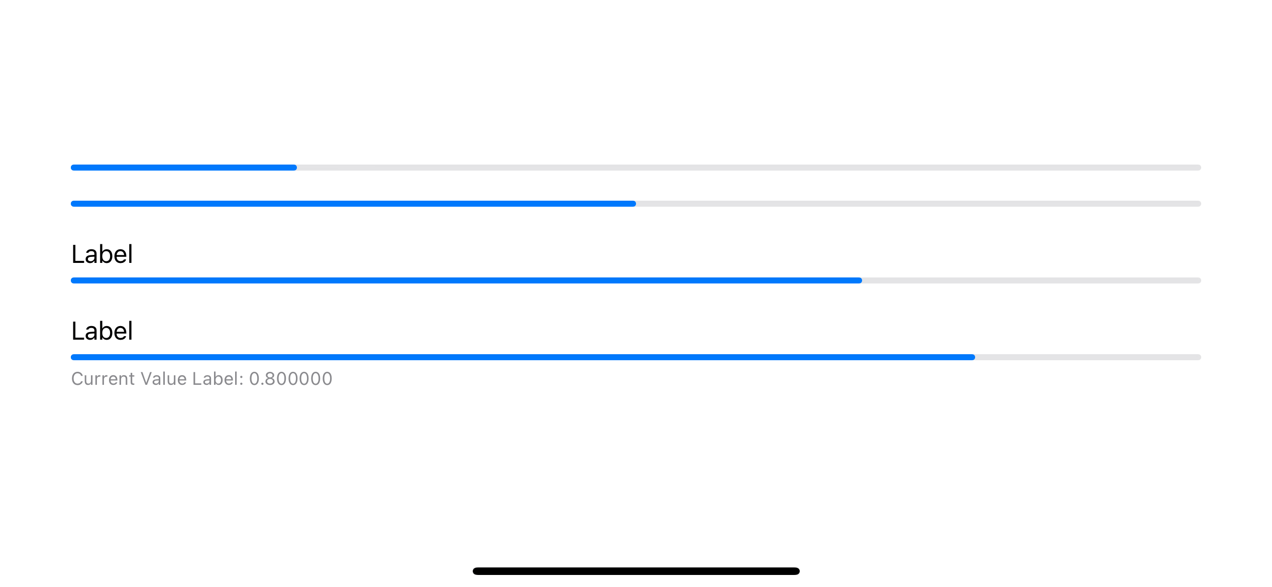
- You can either provide a percentage complete in the form of a fraction, e.g., 0.5, 0.8.
- You can provide current value and total value, e.g., 7 out of 10.
struct ContentView: View {
@State private var progress = 0.8
var body: some View {
VStack(spacing: 20) {
// 1
ProgressView(value: 0.2)
// 2
ProgressView(value: 50, total: 100)
// 3
ProgressView("Label", value: 70, total: 100)
// 4
ProgressView(value: progress) {
Text("Label")
} currentValueLabel: {
Text("Current Value Label: \(progress)")
}
}
}
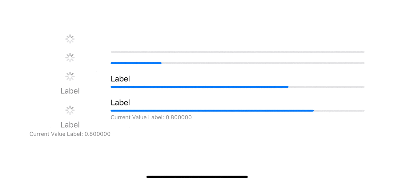
}We can provide a percentage complete in many ways.
1 We can provide a value between 0 to 1 where 1 mean 100% complete.
2 We can provide current value and a total value. ProgressView will automatically calculate the percentage complete for us. In this case 50/100 = 0.5 or 50%
3 We can provide a label which will show at the *top leading edge of the progress bar.
4 We can also provide a current value label, which will show at the bottom leading edge of the progress bar.
Here is the result.
ProgressView Style
ProgressView comes with two built-in styles.
Circular style only supported on macOS. For iOS, it appears as indeterminate progress.
Here is an example of the same ProgressView with different styles.
struct ContentView: View {
    @State private var progress = 0.8

    var body: some View {
        HStack {
            VStack(spacing: 20) {
                ProgressView()

                ProgressView(value: 0.2)

                ProgressView("Label", value: 70, total: 100)

                ProgressView(value: progress) {
                    Text("Label")
                } currentValueLabel: {
                    Text("Current Value Label: \(progress)")
                }

            }
            .progressViewStyle(.circular)
            VStack(spacing: 20) {
                ProgressView()

                ProgressView(value: 0.2)

                ProgressView("Label", value: 70, total: 100)

                ProgressView(value: progress) {
                    Text("Label")
                } currentValueLabel: {
                    Text("Current Value Label: \(progress)")
                }

            }
            .progressViewStyle(.linear)
        }
        .padding()
    }
}
macOS supports both circular and linear styles.
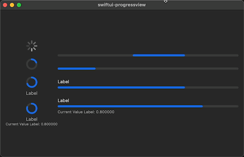
For iOS, a circular style does not support determinate progress and shows as a spinner.
You can easily support sarunw.com by checking out this sponsor.
Offline Transcription: Fast, privacy-focus way to transcribe audio, video, and podcast files. No data leaves your Mac.
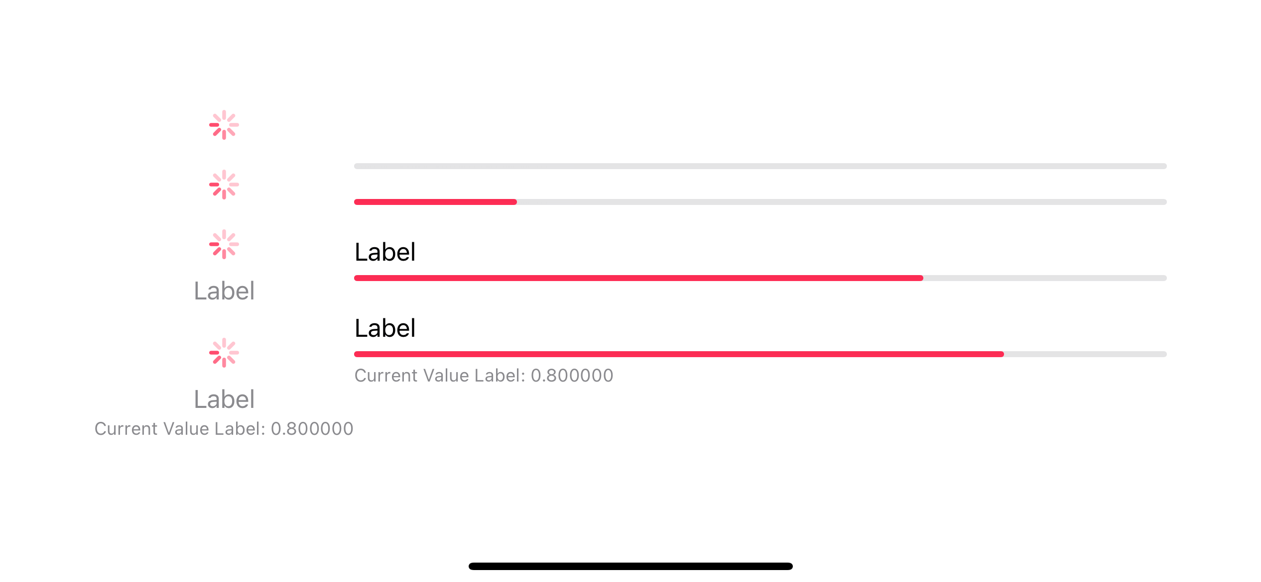
How to change ProgresssView Color
You can change the color of a progress view by applying tint(_:) modifier.
In the following example, I apply the pink color, .tint(.pink).
struct ContentView: View {
    @State private var progress = 0.8

    var body: some View {
        HStack {
            VStack(spacing: 20) {
                ProgressView()

                ProgressView(value: 0.2)

                ProgressView("Label", value: 70, total: 100)

                ProgressView(value: progress) {
                    Text("Label")
                } currentValueLabel: {
                    Text("Current Value Label: \(progress)")
                }

            }
            .progressViewStyle(.circular)

            VStack(spacing: 20) {
                ProgressView()

                ProgressView(value: 0.2)

                ProgressView("Label", value: 70, total: 100)

                ProgressView(value: progress) {
                    Text("Label")
                } currentValueLabel: {
                    Text("Current Value Label: \(progress)")
                }

            }
            .progressViewStyle(.linear)
        }
        .tint(.pink)
        .padding()
    }
}
A tint color will be applied on the progress indicator, not a label.
Read more article about SwiftUI, ProgressView, or see all available topic
Enjoy the read?
If you enjoy this article, you can subscribe to the weekly newsletter.
Every Friday, you'll get a quick recap of all articles and tips posted on this site. No strings attached. Unsubscribe anytime.
Feel free to follow me on Twitter and ask your questions related to this post. Thanks for reading and see you next time.
If you enjoy my writing, please check out my Patreon https://www.patreon.com/sarunw and become my supporter. Sharing the article is also greatly appreciated.
Become a patron Buy me a coffee Tweet ShareComputed property vs Method: Which one to use
A read-only computed property can use interchangeability with a method with no arguments. The question is, which one to use?
What's new in Xcode 14.3 and iOS 16.4
In this article, we will quickly go through some of the new features in Xcode 14.3 and iOS 16.4 that I find interesting.