What is the fixedSize modifier in SwiftUI
Table of Contents
When you read SwiftUI tutorials, you might stumble on the .fixedSize() modifier. Let's see what it is and why we need it.
What is the fixedSize modifier in SwiftUI
The fixedSize modifier fixes the size of modified view at its ideal size.
There are two variations of this modifier: the one that accepts horizontal and vertical arguments and that one which not.
@inlinable public func fixedSize() -> some View
@inlinable public func fixedSize(horizontal: Bool, vertical: Bool) -> some View
And fixedSize() variation is just a convenience method for .fixedSize(horizontal: true, vertical: true).
You can easily support sarunw.com by checking out this sponsor.
AI Grammar: Correct grammar, spell check, check punctuation, and parphrase.
What is an ideal size
As mentioned above, the fixedSize modifier fixes the size of the modified view at its ideal size.
The big question here is what is the ideal size?
Most of the time, ideal size for any view is a size that is large enough to fit the content of that view.
Here is an example of an ideal size from various views.
VStack {
// 1
Circle()
.fixedSize()
.border(.pink)
// 2
Toggle("Toggle", isOn: .constant(true))
.fixedSize()
.border(.pink)
// 3
DatePicker("Calendar",
selection: .constant(.now))
.fixedSize()
.border(.pink)
// 4
Text("Curabitur blandit tempus porttitor. Fusce dapibus, tellus ac cursus commodo, tortor mauris condimentum nibh, ut fermentum massa justo sit amet risus. Praesent commodo cursus magna, vel scelerisque nisl consectetur et.")
.fixedSize()
.border(.pink)
// 5
Slider(value: .constant(0.8))
.fixedSize()
.border(.pink)
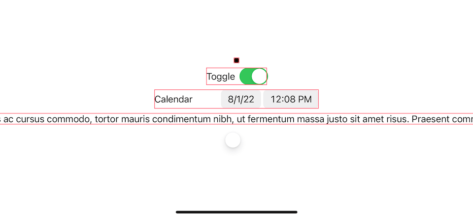
}1 For a Circle shape, it takes the smallest size possible, which is still identifiable as a circle which is 10x10 points in this case.
2 Toggle ideal size is large enough for its label and toggle switch.
3 DatePicker is quite similar to the Toggle. Its ideal size is large enough for label, date, and time view.
4 Text take as much space enough for its content. You can see that it goes beyond the device frame.
5 Slider is quite like a circle shape. It takes the smallest size possible. Too small if you ask me, you can't even slide it.
fixedSize modifier
We learn from last section that fixedSize() force ideal width and height on a view.
But we have another option, fixedSize(horizontal: Bool, vertical: Bool), which can force ideal size on one axis.
In other words, you can have
I think it is easiest to visualize this with a text view.
Let's see how fixedSize() works on a text view again.
// 1
Text("Curabitur blandit tempus porttitor.\nFusce dapibus, tellus ac cursus commodo.\nTortor mauris condimentum nibh.\nUt fermentum massa justo sit amet risus.\nPraesent commodo cursus magna.\nVel scelerisque nisl consectetur et.")
// equivalent to .fixedSize()
.fixedSize(horizontal: true, vertical: true)
.border(.blue)
.frame(width: 200, height: 200)
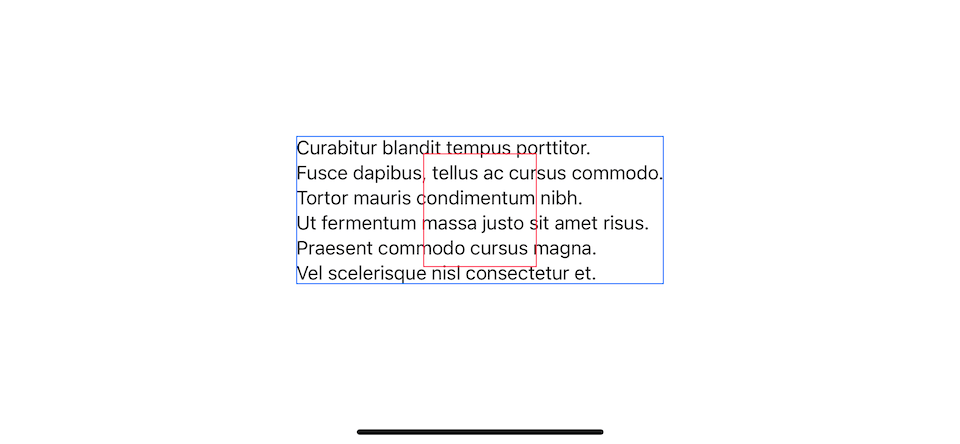
.border(.pink)1 This time, I use newline characters (\n) to make the text expand in both directions.
.fixedSize(horizontal: true, vertical: true) and .fixedSize() make text grow in both axis to fit the content.
ideal width
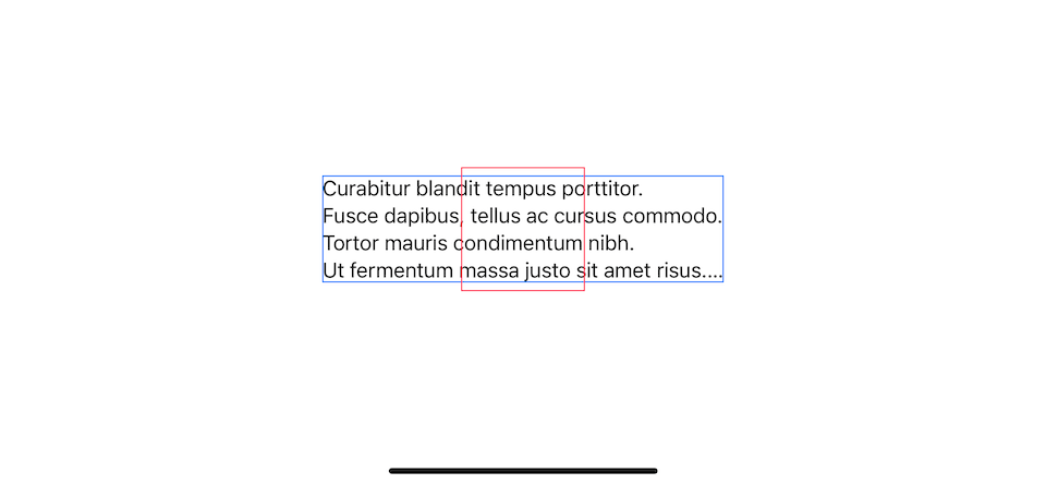
To force a view to have an ideal width, we set horizontal to true, .fixedSize(horizontal: true, vertical: false).
Text("Curabitur blandit tempus porttitor.\nFusce dapibus, tellus ac cursus commodo.\nTortor mauris condimentum nibh.\nUt fermentum massa justo sit amet risus.\nPraesent commodo cursus magna.\nVel scelerisque nisl consectetur et.")
    .fixedSize(horizontal: true, vertical: false)
    .border(.blue)
    .frame(width: 200, height: 200)
    .border(.pink)
This will make a text view occupy its ideal width, which is the largest width of the text. In this case it is the second sentence, "Fusce dapibus, tellus ac cursus commodo."
For the height, it will respect the parent and not go beyond that area.
ideal height
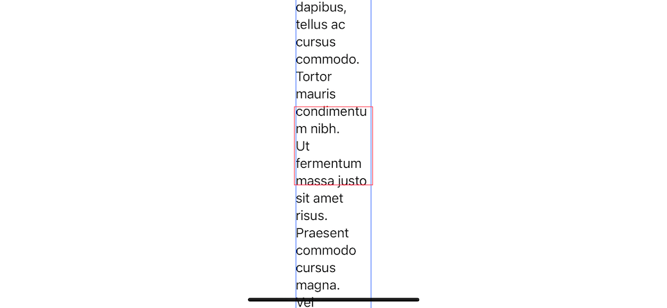
To force a view to have an ideal height, we set vertical to true, .fixedSize(horizontal: false, vertical: true).
Text("Curabitur blandit tempus porttitor.\nFusce dapibus, tellus ac cursus commodo.\nTortor mauris condimentum nibh.\nUt fermentum massa justo sit amet risus.\nPraesent commodo cursus magna.\nVel scelerisque nisl consectetur et.")
    .fixedSize(horizontal: false, vertical: true)
    .border(.blue)
    .frame(width: 200, height: 200)
    .border(.pink)
Width is constrained by its parent, but the height can grow indefinitely to fit its content.
You can easily support sarunw.com by checking out this sponsor.
AI Grammar: Correct grammar, spell check, check punctuation, and parphrase.
Why do we need fixedSize modifier
Most of the time, .fixedSize() will yield the result you might not want, as you can see in the What is ideal size section.
The place where I find people use the most is in container view, e.g., VStack and HStack. When using .fixedSize() on a container view like VStack, it will ask for the ideal size from its children and use that to calculate its size.
We can use this technique to make all children match each other size.
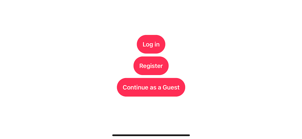
Let's say we have three buttons with different widths.
VStack {
    Button {

    } label: {
        Text("Log in")
            .bold()
            .foregroundColor(.white)
            .padding()
            .background(.pink, in: Capsule())
    }
    Button {

    } label: {
        Text("Register")
            .bold()
            .foregroundColor(.white)
            .padding()
            .background(.pink, in: Capsule())
    }
    Button {

    } label: {
        Text("Continue as a Guest")
            .bold()
            .foregroundColor(.white)
            .padding()
            .background(.pink, in: Capsule())
    }
}
Each button has a different width based on its content.
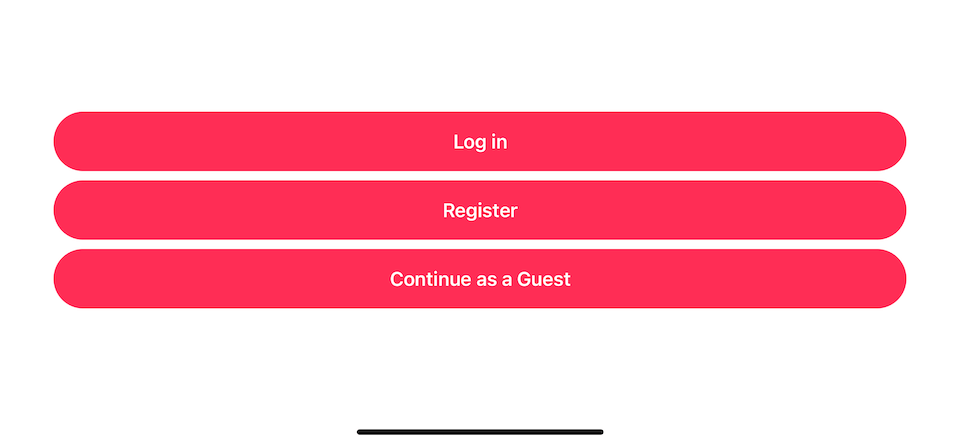
To make each button grow horizontally to match the largest button, you might apply .frame(maxWidth: .infinity) on each button.
But that doesn't work, .frame(maxWidth: .infinity) will make the buttons grow to match available space, which is device width.
VStack {
    Button {

    } label: {
        Text("Log in")
            .bold()
            .foregroundColor(.white)
            .frame(maxWidth: .infinity)
            .padding()
            .background(.pink, in: Capsule())
    }

    Button {

    } label: {
        Text("Register")
            .bold()
            .foregroundColor(.white)
            .frame(maxWidth: .infinity)
            .padding()
            .background(.pink, in: Capsule())
    }

    Button {

    } label: {
        Text("Continue as a Guest")
            .bold()
            .foregroundColor(.white)
            .frame(maxWidth: .infinity)
            .padding()
            .background(.pink, in: Capsule())
    }
}
Using .frame(maxWidth: .infinity) will make the buttons grow to match the device width.
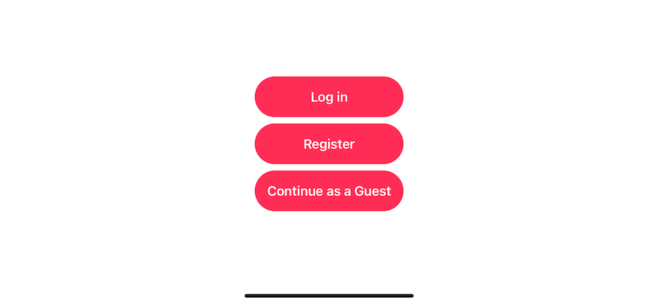
This is where .fixedSize() helps. Apply .fixedSize() on VStack will constrain its size large enough to hold the ideal sizes of each button.
VStack {
    Button {

    } label: {
        Text("Log in")
            .bold()
            .foregroundColor(.white)
            .frame(maxWidth: .infinity)
            .padding()
            .background(.pink, in: Capsule())
    }

    Button {

    } label: {
        Text("Register")
            .bold()
            .foregroundColor(.white)
            .frame(maxWidth: .infinity)
            .padding()
            .background(.pink, in: Capsule())
    }

    Button {

    } label: {
        Text("Continue as a Guest")
            .bold()
            .foregroundColor(.white)
            .frame(maxWidth: .infinity)
            .padding()
            .background(.pink, in: Capsule())
    }
}
.fixedSize()
Using .fixedSize() on VStack will constrain its size large enough to hold the ideal sizes of each button, which is equal to the last button.
Read more article about SwiftUI or see all available topic
Enjoy the read?
If you enjoy this article, you can subscribe to the weekly newsletter.
Every Friday, you'll get a quick recap of all articles and tips posted on this site. No strings attached. Unsubscribe anytime.
Feel free to follow me on Twitter and ask your questions related to this post. Thanks for reading and see you next time.
If you enjoy my writing, please check out my Patreon https://www.patreon.com/sarunw and become my supporter. Sharing the article is also greatly appreciated.
Become a patron Buy me a coffee Tweet ShareHow to change a navigation bar color in SwiftUI on iOS 16
A navigation bar is an essential part of iOS apps. It is a part where we usually apply color to match our branding. In iOS 16, we can customize a navigation bar purely in SwiftUI.
Responsive layout in SwiftUI with ViewThatFit
Making SwiftUI views responsive usually involves a lot of GeometryReaders and if-else. In iOS 16, SwiftUI got a new view that makes it easier. Let's learn how to do it.