SwiftUI Label: A standard way to label user interface items
Table of Contents
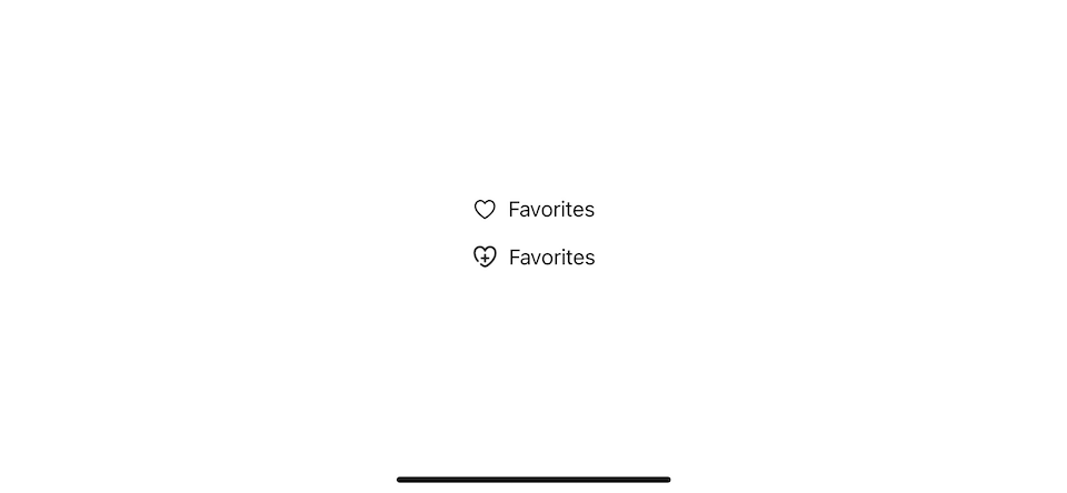
Label in SwiftUI is a view dedicated to labeling other views. A label consist of text and icon.
You can either use SF Symbols or a custom image[1] for an icon.
struct ContentView: View {
    var body: some View {
        VStack {
            // SF Symbols
            Label("Favorites", systemImage: "heart")

            // A custom image
            Label("Favorites", image: "custom-heart")
        }
    }
}
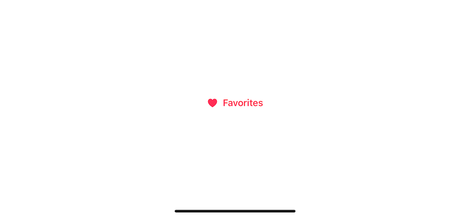
The label also has an initializer that accepts two view builders for text and image if you feel creative.
struct ContentView: View {
    var body: some View {
        Label {
            Text("Favorites")
                .bold()
                .foregroundColor(.pink)
        } icon: {
            Image(systemName: "heart")
                .symbolVariant(.fill)
                .foregroundColor(.pink)

        }

    }
}
Styling
Built-in styles
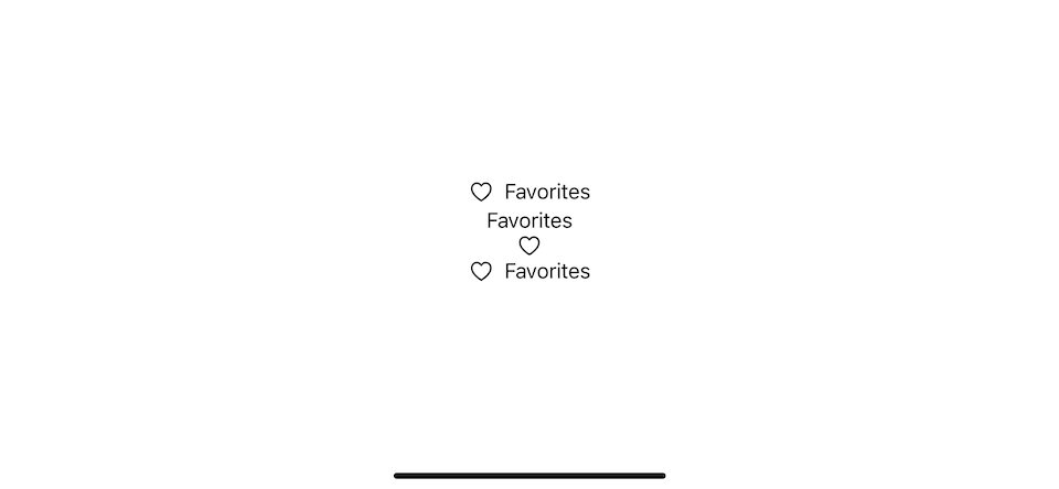
We can control label style by setting it via labelStyle(_:). You have three styles to choose from:
titleOnly: A label style that only displays the title of the label.iconOnly: A label style that only displays the icon of the label.titleAndIcon: A label style that shows both the title and icon of the label using a system-standard layout.
If not specified, the default style, automatic, is applied. The automatic style resolves its appearance automatically based on the current context.
Here is an example of labels in different style.
struct ContentView: View {
    var body: some View {
        VStack {
            Label("Favorites", systemImage: "heart")
                // equals to .labelStyle(.automatic)
            Label("Favorites", systemImage: "heart")
                .labelStyle(.titleOnly)
            Label("Favorites", systemImage: "heart")
                .labelStyle(.iconOnly)
            Label("Favorites", systemImage: "heart")
                .labelStyle(.titleAndIcon)
        }
    }
}
Custom style
Like most SwiftUI views, you can create a custom label style by conforming LabelStyle protocol.
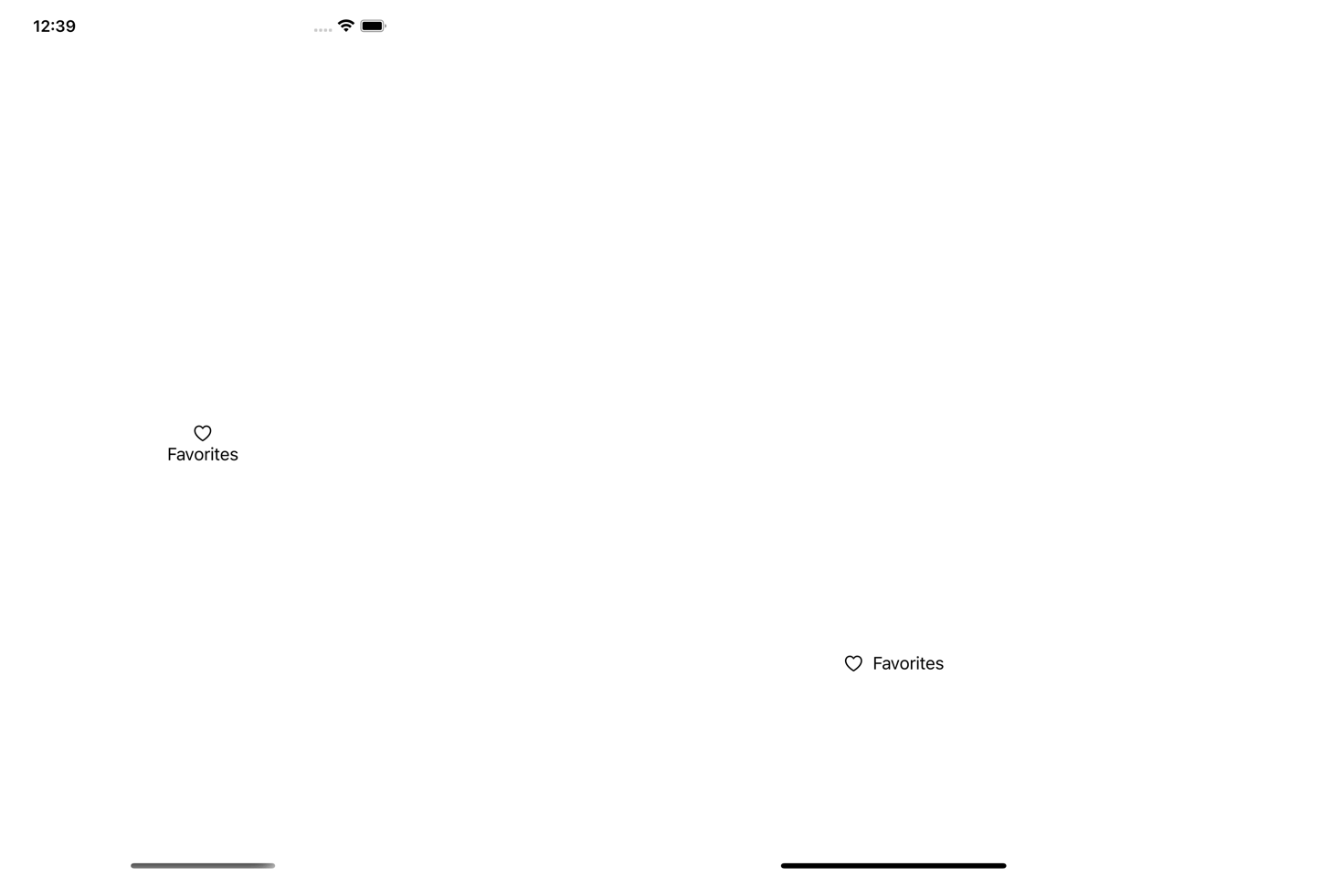
I created AdaptiveLabelStyle, which presents icon and title vertically in portrait and presents icon and title horizontally in a landscape where vertical space is limited (compact vertical size class).
struct AdaptiveLabelStyle: LabelStyle {
    @Environment(\.verticalSizeClass) var verticalSizeClass: UserInterfaceSizeClass?

    func makeBody(configuration: Configuration) -> some View {
        if verticalSizeClass == .compact {
            // 1
            HStack {
                configuration.icon
                configuration.title
            }
        } else {
            // 2
            VStack {
                configuration.icon
                configuration.title
            }
        }
    }
}

struct ContentView: View {
    var body: some View {
        Label("Favorites", systemImage: "heart")
            .labelStyle(AdaptiveLabelStyle())
    }
}
1 When vertical space is limited (landscape orientation), we horizontally show the icon and title.
2 In portrait mode, we show them vertically.
You can easily support sarunw.com by checking out this sponsor.
AI Grammar: Correct grammar, spell check, check punctuation, and parphrase.
Benefits
You won't see much benefit when using a label alone. When you think about a label, it is something that we attached to other objects to give a piece of information about it.
SwiftUI treats Label just like that. You will see many built-in views to an initializer that accept a Label as an argument since it means to describe a particular view.
Even though a view accepts a Label in their initializer, the actual implementation is just a View.
Here is an interface of a Button.
public struct Button<Label> : View where Label : View {
  public init(action: @escaping () -> Void, @ViewBuilder label: () -> Label)
}
As you can see, Label here is just a generic name for the view intended to use as a label (Not a Label view). So, you can use any view as an argument for a label. But if you choose the Label view, it will benefit you in two areas.
Dynamic UI
When I mentioned dynamic UI, I mean a UI that automatically adapt to environmental change such as size or platform.
Label got two pieces of information, text and an icon, which is enough to label any UI element. It's up to the views that use that label to decide whether to use that information or not.
The decision can vary based on many factors such as the size of a view, the platform they are used, device orientation, etc. A view that use in a limited space might choose to show only text or an icon, not both. Using a Label allows a view to adapt to the context it is used.
Here is an example of different view using the same Label.
struct ContentView: View {
    // 1
    let favouritesLabel = Label("Favorites", systemImage: "heart")

    var body: some View {
        TabView {
            NavigationView {
                VStack {
                    // 2
                    favouritesLabel

                    // 3
                    Button {

                    } label: {
                        favouritesLabel

                    }

                    // 4
                    Toggle(isOn: .constant(true)) {
                        favouritesLabel
                    }

                    // 5
                    Slider(value: .constant(5), in: 0...10) {
                        favouritesLabel
                    }
                }.toolbar {
                    // 6
                    ToolbarItem(placement: .primaryAction) {
                        Button {

                        } label: {
                        favouritesLabel

                        }
                    }
                }
            }.tabItem { // 7
                favouritesLabel
            }
        }
    }
}
1 We create a shared label that will pass as an argument for each view.
2 A standalone label renders an icon side by side with text.
3 A button also uses an icon and text to represent itself.
4 Toggle render label alongside with a switch.
5 Slider doesn't render a label at all.
6 A button use only an icon when used as a toolbar item. This is different from a regular button (3).
7 Tab item render both text and image vertically in portrait orientation.
You can see that even all the views use the same label, favouritesLabel, they don't need to render in the same format. They can choose whichever form fit their need.
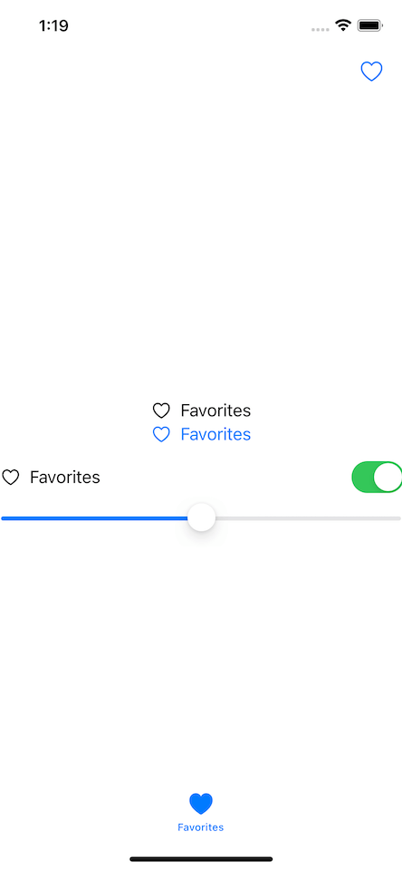
As you can see, the label is used in the best form that fits its container views. It can be icon, title, both, or none!
Interestingly, views might choose not to render anything, like a Slider in the example above that have neither text nor an icon.
Accessibility
Apart from visual clues, a label is also equipped with great accessibility features.
Whichever style a label is rendered, the title is used as a label's description (accessibility label). In our case, even a button chooses to show only the heart icon, it will read as "favorites button", not "heart button".
This is also true when labels are used to label other SwiftUI views. Label's title is used as a voice-over description (accessibility label) for that particular view even without an icon and text. Voice over will describe the Slider in our previous example as "Favorites five adjustable".
You can easily support sarunw.com by checking out this sponsor.
AI Grammar: Correct grammar, spell check, check punctuation, and parphrase.
Conclusion
Today, we learned a small but important view in SwiftUI, Label. It provides a simple way to describe any other view. It contains text and an icon that container views can choose whichever form fits their needs.
I think this simple view greatly improves accessibility across the SwiftUI framework. I hope you consider embracing this when you create your own view.
Icon from https://www.iconfinder.com/Icojam ↩︎
Read more article about SwiftUI, Label, or see all available topic
Enjoy the read?
If you enjoy this article, you can subscribe to the weekly newsletter.
Every Friday, you'll get a quick recap of all articles and tips posted on this site. No strings attached. Unsubscribe anytime.
Feel free to follow me on Twitter and ask your questions related to this post. Thanks for reading and see you next time.
If you enjoy my writing, please check out my Patreon https://www.patreon.com/sarunw and become my supporter. Sharing the article is also greatly appreciated.
Become a patron Buy me a coffee Tweet ShareHow to quickly test apps in other languages with an Xcode scheme
A tip for creating multiple schemes to quickly run your app in different languages.