How to add section header and footer to SwiftUI list
Table of Contents
We can group related data in a SwiftUI list together using Section view. We can also optionally add a header and footer to describe a particular section.
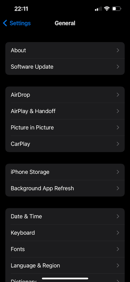
Here is an example from General Settings where related settings are grouped into a smaller section.
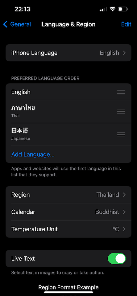
And here is another example where a section header and footer are used to describe a section.
- The header describes what a section is all about, e.g., Preferred language order.
- The footer adds more detail if the header alone is not enough to convey the whole message.
Now that we know what a section, header, and footer look like, it is time to learn how to add it to a list of data.
First, let's learn how to add sections to a SwiftUI list. After that, we will learn how to add a header and footer for those sections.
How to group a SwiftUI list into a section
Adding a section is as easy as adding data to a list. You just need to wrap your data inside a Section view.
struct ContentView: View {
    var body: some View {
        NavigationView {
            List {
                Section {
                    Text("About")
                    Text("Software Update")
                }
                Section {
                    Text("AirDrop")
                    Text("AirPlay & Handoff")
                    Text("Picture in Picture")
                    Text("CarPlay")
                }
                Section {
                    Text("iPhone Storage")
                    Text("Background App Refresh")
                }
                Section {
                    Text("Date & Time")
                    Text("Keyboard")
                    Text("Fonts")
                    Text("Language & Region")
                }
            }
            .navigationTitle("General")
            .navigationBarTitleDisplayMode(.inline)
        }
    }
}
Each section will get a visual separation from the others. How the separation looks is based on the list style.
You will see other variation in the later section.
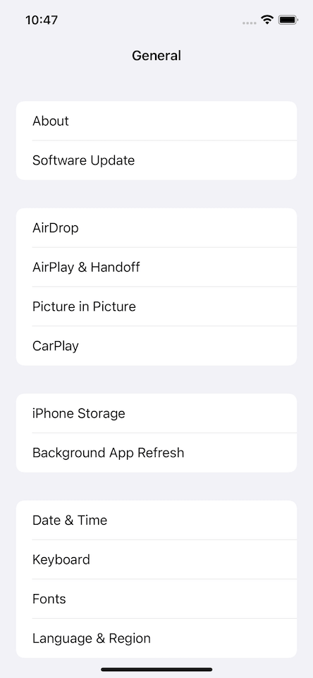
The default list style for a list in iPhone 13 Pro is inset grouped. And here is how it looks.
You can easily support sarunw.com by checking out this sponsor.

AI Grammar: Correct grammar, spell check, check punctuation, and parphrase.
How to add section header/footer in SwiftUI list
After you group your data into a section, you can add a header and footer to a particular section by specifying a header and footer argument to Section.
struct ContentView: View {
    var body: some View {
        NavigationView {
            List {
                Section {
                    Text("iPhone Language")
                }
                Section {
                    Text("English")
                    Text("Thai")
                } header: {
                    Text("Preferred language order")
                } footer: {
                    Text("Apps and websites will use the first language in this list that they support.")
                }
                Section {
                    Text("Region")
                    Text("Calendar")
                    Text("Temperature Unit")
                }
            }
            .navigationTitle("Language & Region")
            .navigationBarTitleDisplayMode(.inline)
        }
    }
}
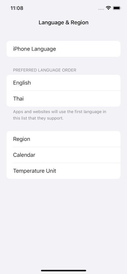
The header will show above the section, and the footer will show below the section.
But the appearance might change according to the list style, as you will see in the next section.
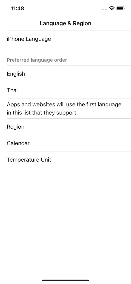
The default list style for a list in iPhone 13 Pro is inset grouped. And here is how the header and footer look.
You can easily support sarunw.com by checking out this sponsor.

AI Grammar: Correct grammar, spell check, check punctuation, and parphrase.
How to customize SwiftUI section header and footer
The section header and footer will change their appearance according to the list style by default.
Here is the same code from the previous section, but this time, we set list style to .inset.
struct ContentView: View {
    var body: some View {
        NavigationView {
            List {
                Section {
                    Text("iPhone Language")
                }
                Section {
                    Text("English")
                    Text("Thai")
                } header: {
                    Text("Preferred language order")
                } footer: {
                    Text("Apps and websites will use the first language in this list that they support.")
                }
                Section {
                    Text("Region")
                    Text("Calendar")
                    Text("Temperature Unit")
                }
            }
            .listStyle(.inset)
            .navigationTitle("Language & Region")
            .navigationBarTitleDisplayMode(.inline)
        }
    }
}
Here is how the section header and footer look for each list style.
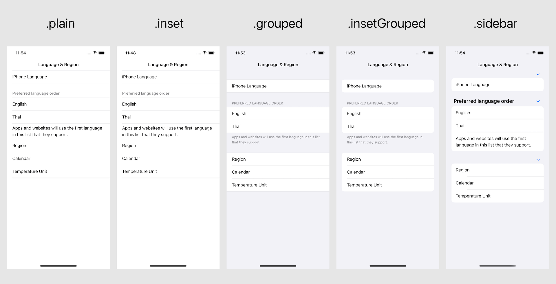
As you can see, the appearance of a header and footer can change according to the list style. It can get bolder, lighter, or become uppercased.
I would suggest you stick with the default style for consistency. But if you have a specific need, there are a few ways to customize the header and footer.
headerProminence modifier
If you want to keep consistency but still want your header to be more outstanding, you can use the .headerProminence() modifier and specify .increased Prominence as an argument.
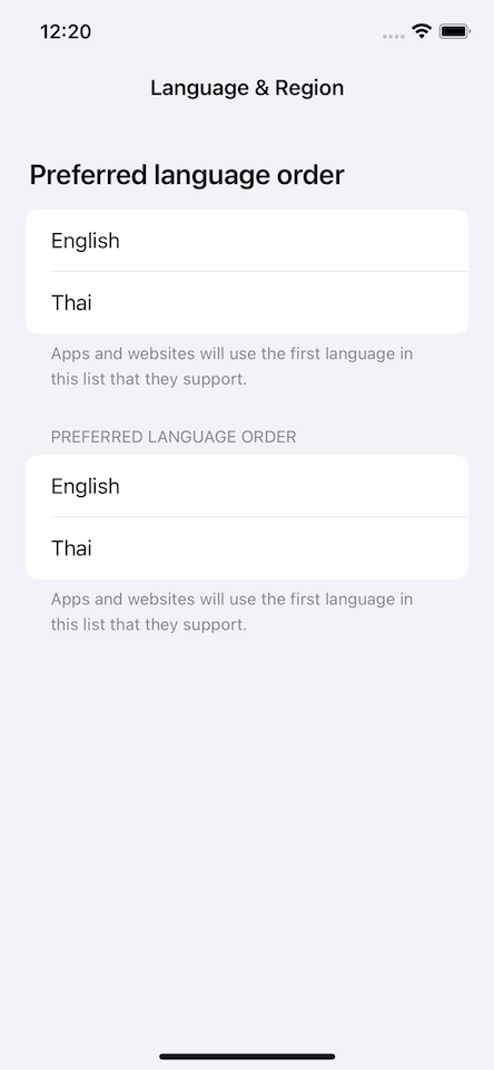
Using .headerProminence(.increased) will request a bigger and bolder style for your header. One thing to note here is the effect is based on the list style.
A list style may or may not support this modifier, so the bigger and bolder header is not guaranteed.
Inset Grouped (.insetGrouped) list style support .headerProminence(.increased), so the header become more prominence.
struct ContentView: View {
    var body: some View {
        NavigationView {
            List {
                Section {
                    Text("English")
                    Text("Thai")
                } header: {
                    Text("Preferred language order")
                } footer: {
                    Text("Apps and websites will use the first language in this list that they support.")
                }
                .headerProminence(.increased)
                Section {
                    Text("English")
                    Text("Thai")
                } header: {
                    Text("Preferred language order")
                } footer: {
                    Text("Apps and websites will use the first language in this list that they support.")
                }

            }
            .listStyle(.insetGrouped)
            .navigationTitle("Language & Region")
            .navigationBarTitleDisplayMode(.inline)
        }
    }
}
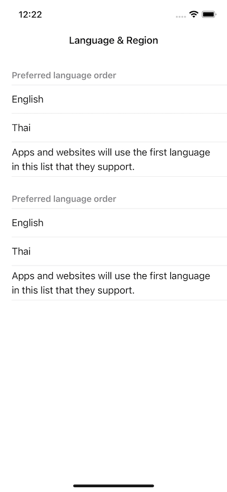
Using .headerProminence(.increased) has no effect on .inset list style.
struct ContentView: View {
    var body: some View {
        NavigationView {
            List {
                Section {
                    Text("English")
                    Text("Thai")
                } header: {
                    Text("Preferred language order")
                } footer: {
                    Text("Apps and websites will use the first language in this list that they support.")
                }
                .headerProminence(.increased)
                Section {
                    Text("English")
                    Text("Thai")
                } header: {
                    Text("Preferred language order")
                } footer: {
                    Text("Apps and websites will use the first language in this list that they support.")
                }

            }
            .listStyle(.inset)
            .navigationTitle("Language & Region")
            .navigationBarTitleDisplayMode(.inline)
        }
    }
}
Custom text
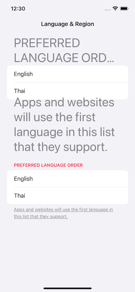
If you don't care about system-wide consistency, you can directly modify the section header and footer.
Section accepts a view builder for header and footer, which isn't limited to a simple text. You can apply any style you want.
struct ContentView: View {
    var body: some View {
        NavigationView {
            List {
                Section {
                    Text("English")
                    Text("Thai")
                } header: {
                    Text("Preferred language order")
                        .font(.system(size: 36))
                } footer: {
                    Text("Apps and websites will use the first language in this list that they support.")
                        .font(.system(size: 36))
                }
                Section {
                    Text("English")
                    Text("Thai")
                } header: {
                    Text("Preferred language order")
                        .bold()
                        .foregroundColor(.pink)
                } footer: {
                    Text("Apps and websites will use the first language in this list that they support.")
                        .underline()
                }

            }
            .navigationTitle("Language & Region")
            .navigationBarTitleDisplayMode(.inline)
        }
    }
}
Even though you can be creative here, some limitations still apply.
As you can see from the first section:
- The header is limited to two-line (and
.lineLimitwon't help). - The footer is too large and starts to overlap the content.
These behaviors vary based on a list-style, so you should be mindful that the result might not match what you expected.
Read more article about SwiftUI, List, or see all available topic
Enjoy the read?
If you enjoy this article, you can subscribe to the weekly newsletter.
Every Friday, you'll get a quick recap of all articles and tips posted on this site. No strings attached. Unsubscribe anytime.
Feel free to follow me on Twitter and ask your questions related to this post. Thanks for reading and see you next time.
If you enjoy my writing, please check out my Patreon https://www.patreon.com/sarunw and become my supporter. Sharing the article is also greatly appreciated.
Become a patron Buy me a coffee Tweet ShareDivider in SwiftUI - Everything you need to know
SwiftUI Divider has some limitations, but you can overcome that with modifiers. Let's explore its limitation and capability.
7 Xcode shortcuts for a large iOS project
This article will share seven Xcode shortcuts that will help you on a large iOS project. The tricks you are about to learn will help you find and navigate to a file/class/symbol in your large and small project.