How to create Rounded Corners Button in UIKit
Table of Contents
A rounded corners button style is one of the popular button styles. It is a matter of time before you need to implement one.

In this article, we will learn how to create one in UIKit using UIButton.
UIButton has a big API improvement in iOS 15, so I will show you how to do it in iOS 15 and prior.
- Rounded corners button before iOS 15.
- Rounded corners button in iOS 15 using
UIButton.Configuration.
Rounded corners button before iOS 15
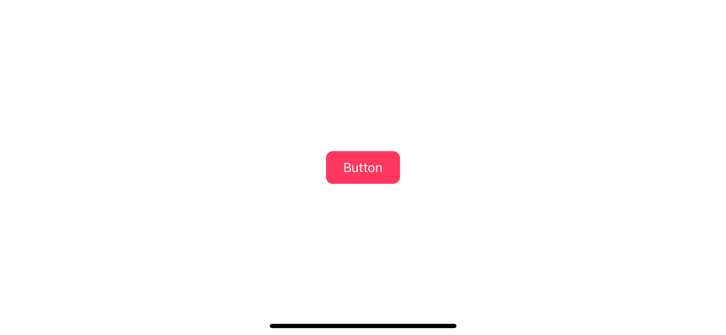
Before iOS 15, you can make a rounded corners button by setting layer.cornerRadius, backgroundColor, and setTitleColor.
The default button style has no background color. To create a rounded button, you need manually set the title and background color. Then make it round by set corner radius.
let button = UIButton(type: .system)
button.setTitle("Button", for: .normal)
button.setTitleColor(.white, for: .normal)
button.backgroundColor = .systemPink
button.layer.cornerRadius = 8
button.contentEdgeInsets = UIEdgeInsets(
  top: 10,
  left: 20,
  bottom: 10,
  right: 20
)setTitle: Set the title of the buttonsetTitleColor: Set the title color of the button.backgroundColor: Set the background color of the button.layer.cornerRadius: Set corner radius for your button.contentEdgeInsets: Set padding around the button and title.
Capsule button
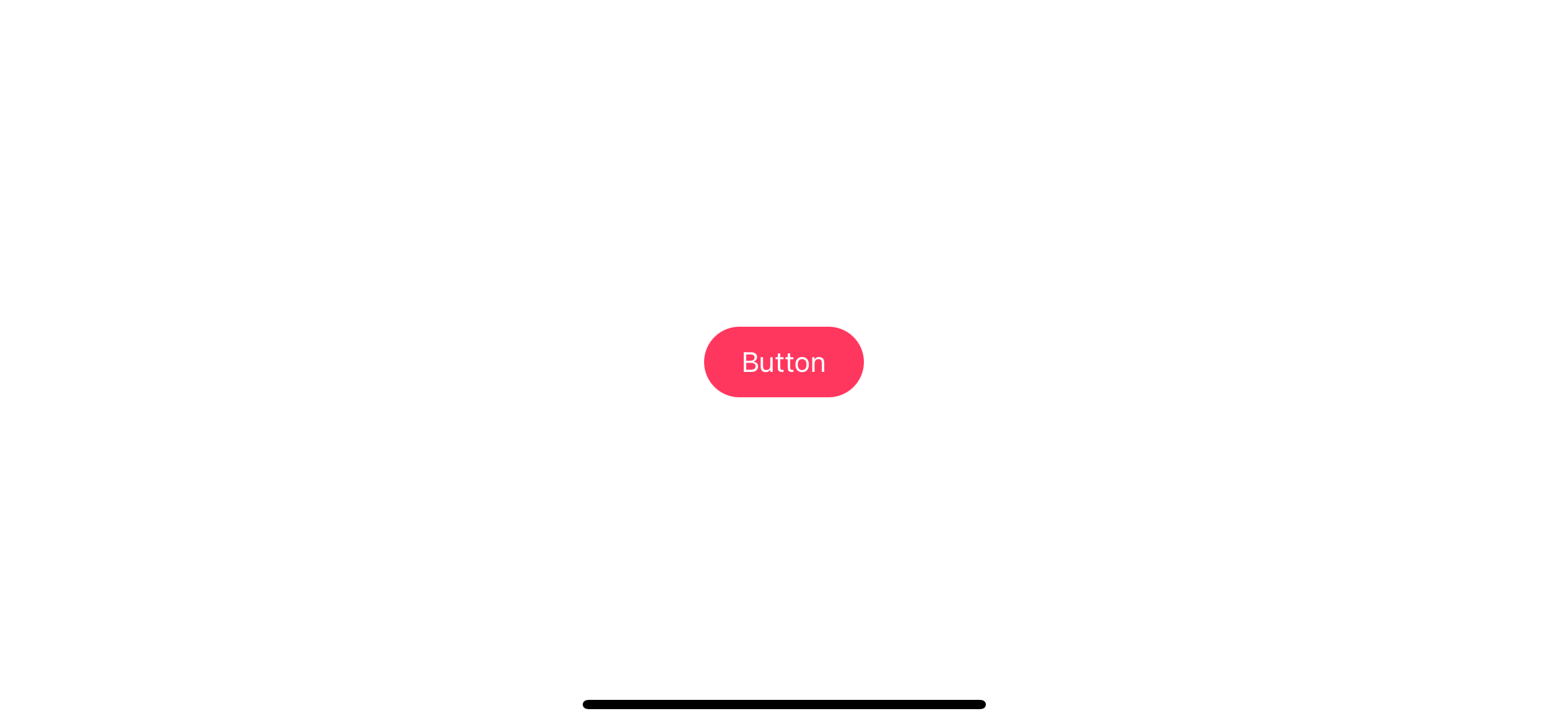
If we increase the corner radius with a large enough value, you can create a capsule-style button.
To create a capsule style button, we set corner radius equals the half of a button height. Since a button height might vary based on title size or layout, I usually create a UIButton subclass for a capsule style.
class CapsuleButton: UIButton {
  override func layoutSubviews() {
    super.layoutSubviews()
    let height = bounds.height
    layer.cornerRadius = height/2
  }
}
layoutSubviews() gets called when the size of a view changes. We use this opportunity to adjust the corner radius to match the new height.
Then we can use it just like a regular button.
let capsule = CapsuleButton(type: .system)
capsule.setTitle("Button", for: .normal)
capsule.setTitleColor(.white, for: .normal)
capsule.backgroundColor = .systemPink
capsule.contentEdgeInsets = UIEdgeInsets(
  top: 10,
  left: 20,
  bottom: 10,
  right: 20
)
Here is the result.
Smooth corners
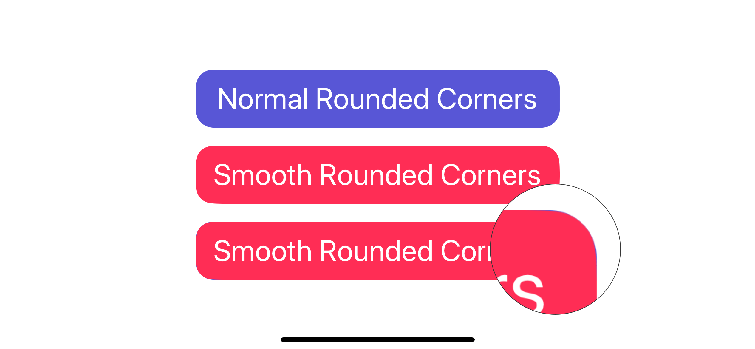
If you want to replicate Apple smooth corners, you can also do that with the cornerCurve property.
To create a continuous smooth corner, you set layer.cornerCurve of a button to .continuous.
let button = UIButton(type: .system)
button.setTitle("Button", for: .normal)
button.setTitleColor(.white, for: .normal)
button.backgroundColor = .systemPink
button.layer.cornerRadius = 8
button.layer.cornerCurve = .continuous
button.contentEdgeInsets = UIEdgeInsets(
  top: 10,
  left: 20,
  bottom: 10,
  right: 20
)
It is very hard to notice with bare eyes, but the smoothness is really there.
You can easily support sarunw.com by checking out this sponsor.

AI Paraphrase:Are you tired of staring at your screen, struggling to rephrase sentences, or trying to find the perfect words for your text?
Rounded corners button in iOS 15 using UIButton.Configuration
In iOS 15, Apple introduces a new way to customize a button via UIButton.Configuration.
UIButton.Configuration has a built-in style with rounded corners. In the following example, we use .filled() button style.
var configuration = UIButton.Configuration.filled()
configuration.title = "Button"
configuration.baseBackgroundColor = UIColor.systemPink
configuration.contentInsets = NSDirectionalEdgeInsets(
  top: 10,
  leading: 20,
  bottom: 10,
  trailing: 20
)

let button = UIButton(configuration: configuration, primaryAction: nil)
The code is quite similar to what we did prior to iOS 15, but instead of setting the value to a button, we set it to UIButton.Configuration.
UIButton.Configuration.filled(): We use built-in filled button style.
title: Set the title of the buttonbaseBackgroundColor: Set the background color of the button.contentInsets: Set padding around the button and title.
As you can see, we don't need to specify any corner radius in this case since the default appearance of the filled style already has the corner rounded.
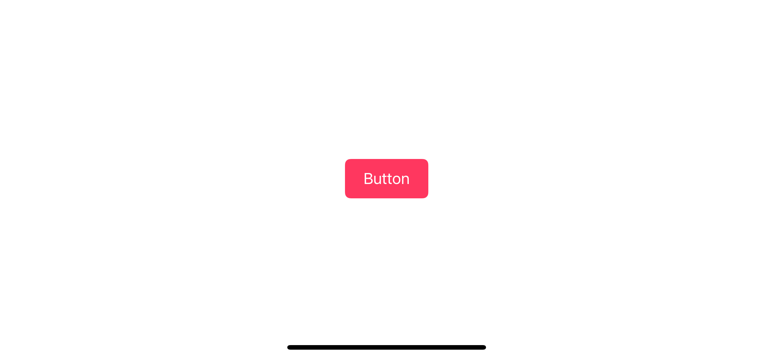
If you aren't satisfied with the default corner radius, you can control it in two ways.
Control corner radius using cornerStyle
UIButton.Configuration has many built-in corner styles for you to choose from. You can set this with the cornerStyle property.
We set corner style by modify cornerStyle property of UIButton.Configuration. It even has a capsule style built-in for us.
configuration.cornerStyle = .small
configuration.cornerStyle = .medium
configuration.cornerStyle = .large
configuration.cornerStyle = .capsule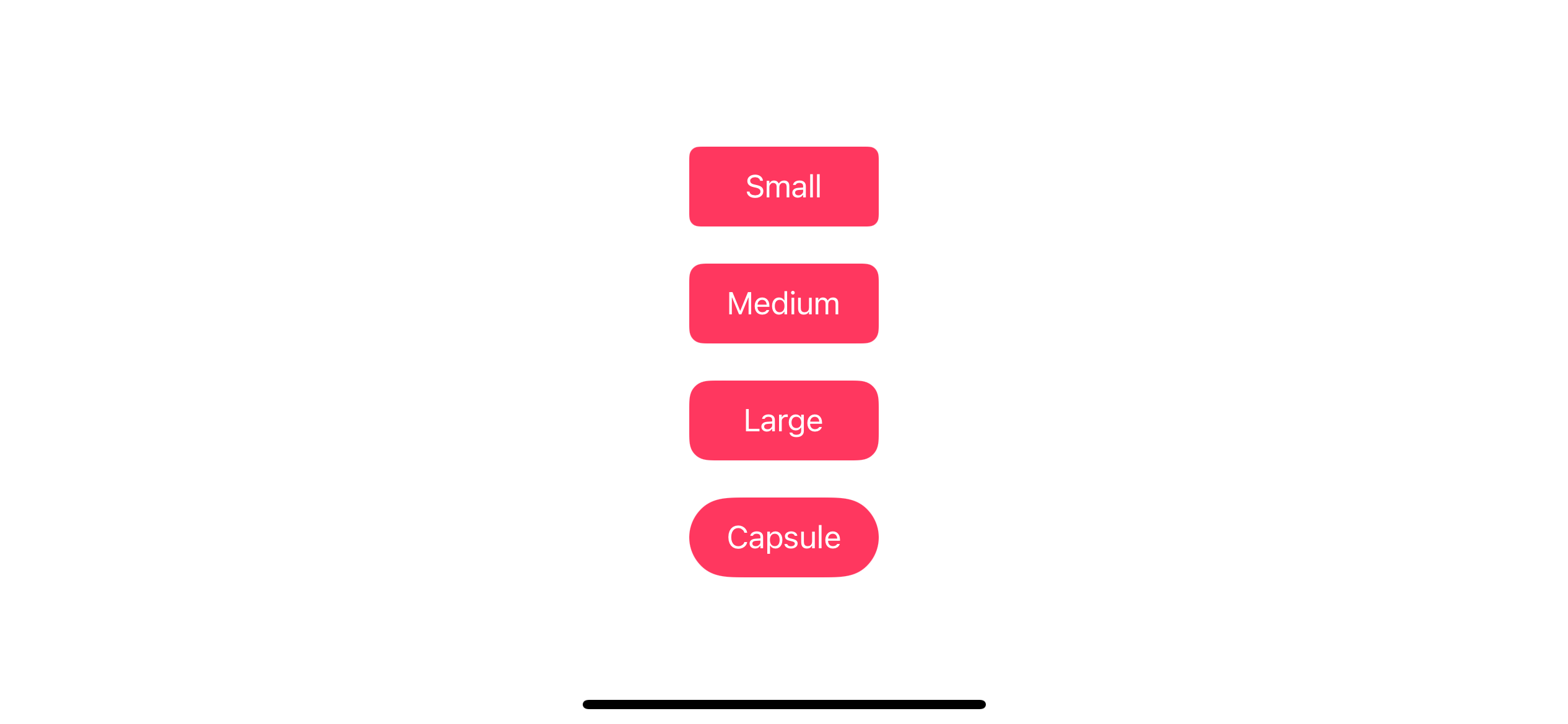
Custom corner radius
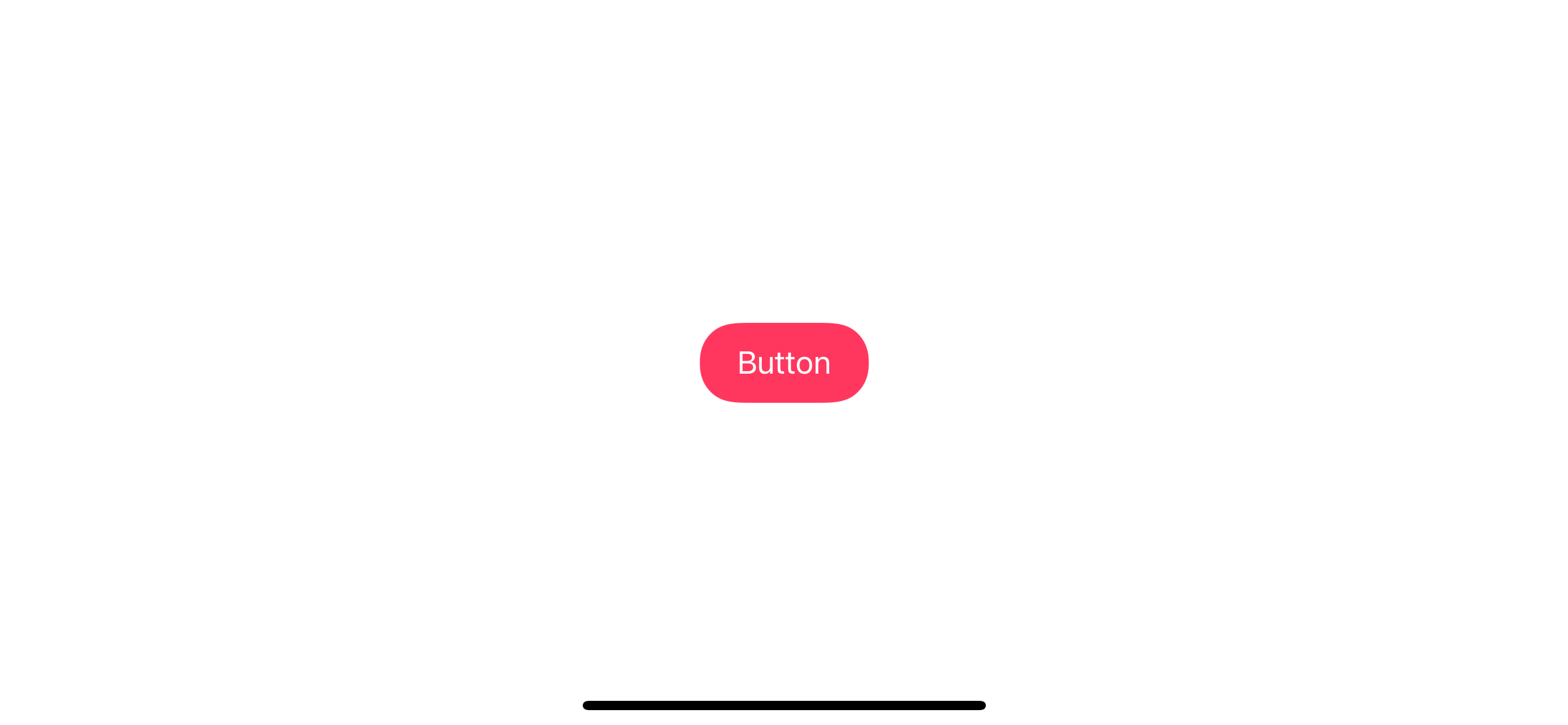
If you want something more unique, you can specify the corner radius via cornerRadius of UIBackgroundConfiguration.
You can access UIBackgroundConfiguration from background property of UIButton.Configuration.
In summary, you need to do two things to set a corner radius.
- Set
configuration.background.cornerRadiusthe value you want - Set
configuration.cornerStyleto.fixed
In this example, we set a corner radius to 20.
var configuration = UIButton.Configuration.filled()
configuration.title = "Button"
configuration.baseBackgroundColor = UIColor.systemPink
configuration.contentInsets = NSDirectionalEdgeInsets(
  top: 10,
  leading: 20,
  bottom: 10,
  trailing: 20
)
configuration.background.cornerRadius = 20
configuration.cornerStyle = .fixed

let button = UIButton(configuration: configuration, primaryAction: nil)
1 Specify your corner radius value with configuration.background.cornerRadius = 20.
2 Then change cornerStyle to fixed. This makes a button use the corner radius we specify in the background style.
Smooth corners
UIButton.Configuration already uses smooth corners everywhere. We don't need to do anything here.
Read more article about UIKit, Button, or see all available topic
Enjoy the read?
If you enjoy this article, you can subscribe to the weekly newsletter.
Every Friday, you'll get a quick recap of all articles and tips posted on this site. No strings attached. Unsubscribe anytime.
Feel free to follow me on Twitter and ask your questions related to this post. Thanks for reading and see you next time.
If you enjoy my writing, please check out my Patreon https://www.patreon.com/sarunw and become my supporter. Sharing the article is also greatly appreciated.
Become a patron Buy me a coffee Tweet ShareHow to check if String is Number in Swift
Learn different ways to check if a string is a number.