What is backIndicatorTransitionMaskImage
Table of Contents
In the last article, How to change a back button image, we learn that to set a custom back button indicator, we have to set an image to both backIndicatorImage and backIndicatorTransitionMaskImage.
From backIndicatorImage documentation:
If you want to customize the back indicator image, you must also set
backIndicatorTransitionMaskImage.
From backIndicatorTransitionMaskImage documentation:
If you want to customize the back indicator image, you must also set
backIndicatorImage.
So, you end up assigning the same image to both properties.
UINavigationBar.appearance().backIndicatorImage = UIImage(named: "custom-back")
UINavigationBar.appearance().backIndicatorTransitionMaskImage = UIImage(named: "custom-back")
These two properties serve a different purpose. For backIndicatorImage, it quite obvious. It serves as an image for the back button. So, what is the purpose of backIndicatorTransitionMaskImage?
backIndicatorTransitionMaskImage
As a name imply, backIndicatorTransitionMaskImage use as masking for content that flowing under the back indicator image during push and pop transitions. It is clearer to see this in action than reading.
Here is the default behavior of the native UINavigationController.

You might not know where to looks at. Here is the snapshot of backIndicatorTransitionMaskImage in action.

As you can see, the text is sliding in and out from the right edge of the arrow shape.
You can easily support sarunw.com by checking out this sponsor.

Localization Buddy: Easiest way to localize and update App Store metadata.
Replication
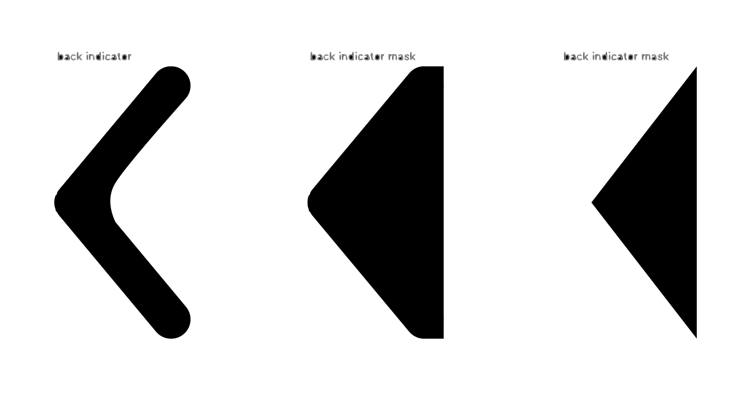
Let's try to set a similar image and see what happens. Here is our custom arrow image.

And here is our transition animation.

As you can see, the text shows up at the end of our image frame, not the edge of the arrow, as the default behavior.
The proper way to mask
First, let's revisit the meaning of the mask image before we jump to the solution.
In the mask image:
- The opaque pixels (alpha = 1, a black area in our case) will be visible for the moving title during navigation transitions.
- The transparent pixels will be covering the moving title during navigation transitions.
So, to provide the same effect as in the native back indicator, you have to use a different image for your mask (backIndicatorTransitionMaskImage).
Here is the image that you should use.

We fill the right part of the arrow with opaque color (black), so the text will be visible during the animation.

Our mask now works the same way as the native one.

Caveat
You might notice that text isn't properly masked as we might be expected. Some text is visible on the left part of the arrow.

To mitigate this, you should offset your mask a bit.

Conclusion
This is such a subtle animation that you can easily get away with since nobody likely to notice it, but if you have a little bit of time and resources, this hassle will definitely please your designers.
You can easily support sarunw.com by checking out this sponsor.

Localization Buddy: Easiest way to localize and update App Store metadata.
Related Resources
Read more article about UIKit, UINavigationBar, Back Button, or see all available topic
Enjoy the read?
If you enjoy this article, you can subscribe to the weekly newsletter.
Every Friday, you'll get a quick recap of all articles and tips posted on this site. No strings attached. Unsubscribe anytime.
Feel free to follow me on Twitter and ask your questions related to this post. Thanks for reading and see you next time.
If you enjoy my writing, please check out my Patreon https://www.patreon.com/sarunw and become my supporter. Sharing the article is also greatly appreciated.
Become a patron Buy me a coffee Tweet ShareHow to change a back button image
Learn how to change a UINavigationBar back button indicator.