Adapting content for iPhone Duo
Table of Contents
Part 3 in the series "Adapting your app for iPhone Duo", based on Apple's Design for iPhone Duo talk.
- Adapting your app for iPhone Duo
- Adapting controls for iPhone Duo
- Adapting content for iPhone Duo
- Sheets and fold avoidance on iPhone Duo
The outer and inner displays give your content different amounts of room. Here are ways to handle an asymmetrical layout, use the extra width, and arrange media around the fold.
Handle an asymmetrical layout
Putting controls along one side creates an asymmetrical layout. The vertical bar takes up space on one edge, so the area available for content is no longer centered within the full display.
How you handle this depends on the content. Much of your content may need to shift to avoid being covered by the controls. Some interfaces, however, work better when their main content stays centered on the full display.
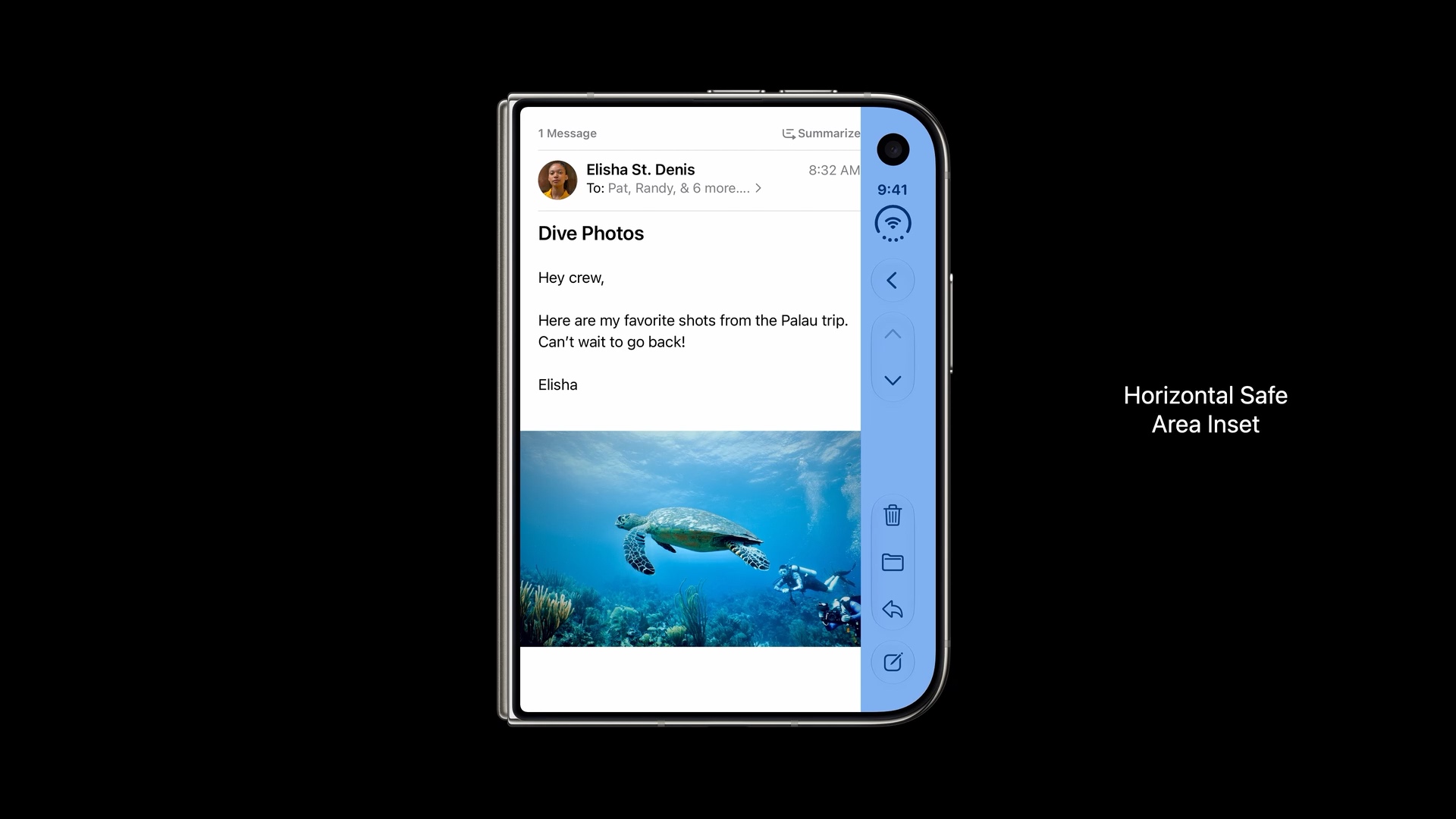
Align content to the horizontal safe area
The first approach is to align content to the horizontal safe area insets. This keeps it clear of the vertical controls.
It is the same idea we have used with the bottom safe area to keep content above a toolbar or tab bar. Here, we account for the space at the side instead.
In the Mail example below, the message and photo stop at the safe area boundary beside the controls. The content fits within the available space, even though that space is asymmetrical.
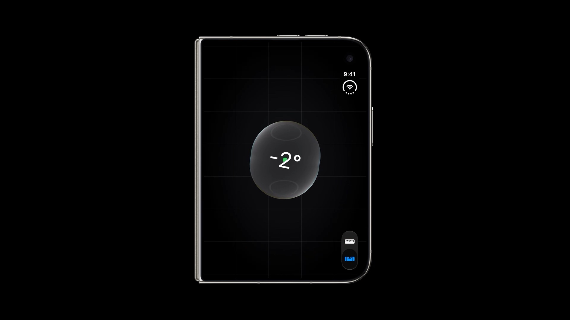
Keep some content centered on the full display
For an interface like the level below, the main visual stays centered on the full display, with no horizontal offset for the vertical bar.
The level remains front and center while the controls sit along the edge. Choose this approach when centering is important to the experience and the controls can stay clear of the main content.
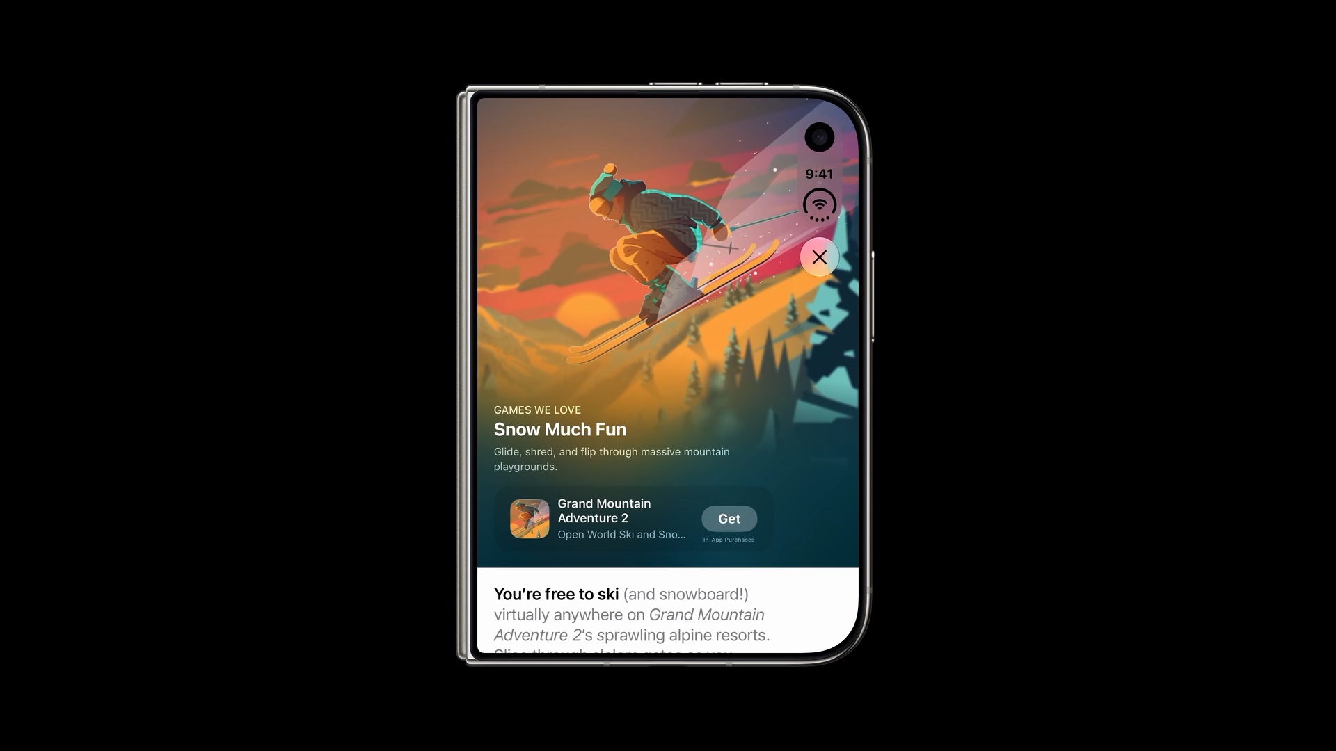
Combine a full-display background with inset content
You can also combine both approaches. Keep the background centered on the full display for an immersive feel, while the scrollable foreground content respects the horizontal safe area insets.
In the App Store example below, the artwork fills the display behind the side controls. The title, app card, and article content are inset to stay clear of those controls.
You can easily support sarunw.com by checking out this sponsor.

AI Grammar: Correct grammar, spell check, check punctuation, and parphrase.
Adapt to the inside and outside displays
Your app needs to work on both the smaller outer display and the larger inner display. Opening the device gives you more room to show related content together.
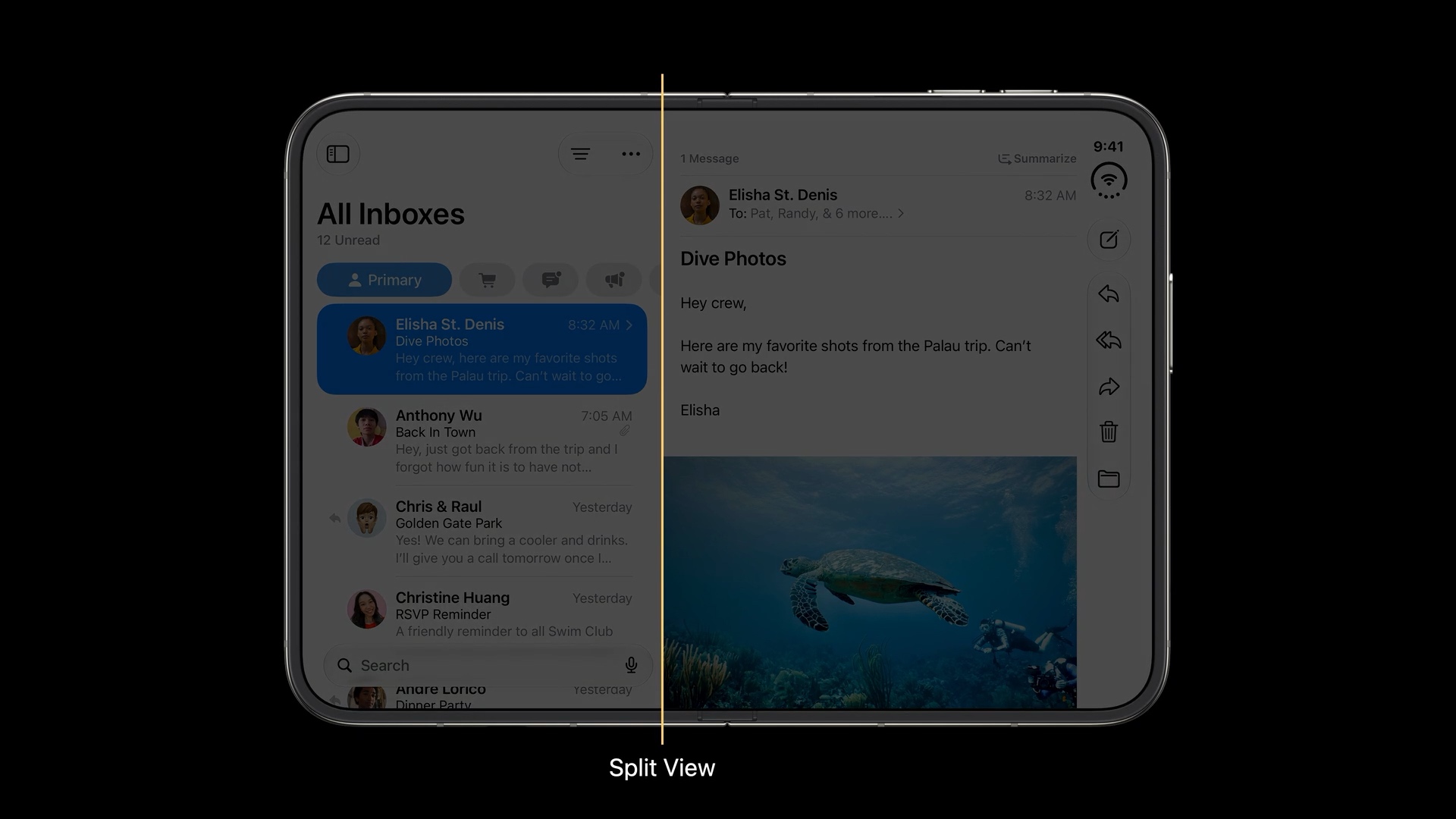
Start with a split view
A split view is a familiar starting point. We have used this approach on iPad for years: show a list and its detail side by side when there is enough width, and show one at a time when space is compact.
Mail is a good example. On the outer display, you can focus on a single message. On the wider inner display, the inbox and selected message sit beside each other, so you can browse messages while keeping their content visible.
Optimize content for a wider screen
Another approach is to rearrange your content to make better use of the extra width.
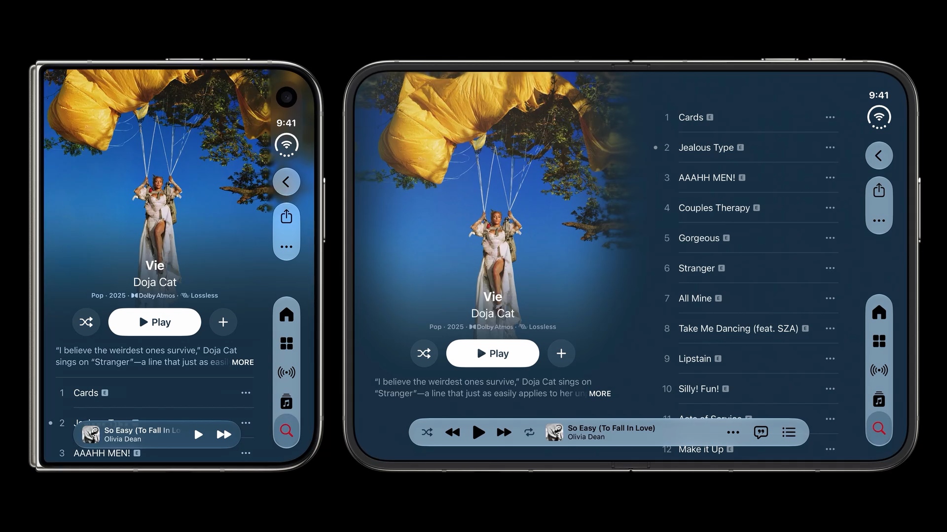
In Music, the compact layout stacks the album artwork, album information, and track list vertically. On the wider display, the artwork and album information sit beside the track list. You can see more songs while keeping the album in view.
This may require checking the horizontal size class and adapting your layout manually. For example, you could stack content in compact width and arrange it in columns in regular width.
Present the tab bar as a sidebar
The third option is for apps with a tab bar. You can present your tab bar as a sidebar on the inner display when there is enough space.
Health shows this approach below. On the outer display, its tabs sit near the bottom of the vertical bar. On the inner display, the sidebar shows those destinations alongside more health categories, while the selected content stays visible beside it.
In SwiftUI, you can opt into this adaptive style by applying .tabViewStyle(.sidebarAdaptable) to your TabView. The style was introduced in iOS 18, as Apple demonstrated in What’s new in SwiftUI at WWDC24.
TabView {
    // Your tabs
}
.tabViewStyle(.sidebarAdaptable)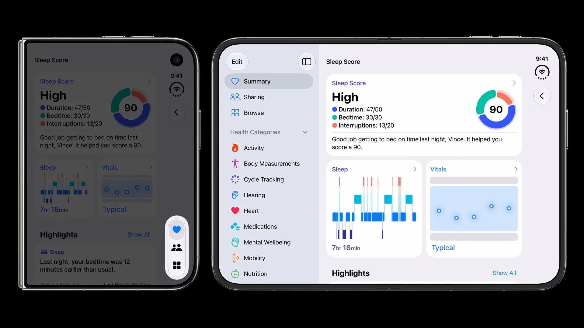
Keep media above the fold and controls below
When the device is partially folded in portrait, place media on the top half and controls on the bottom half.
In the Music example below, the lyrics stay above the fold. Track information, playback controls, and the volume slider sit below it. This keeps the content visible while the controls remain within reach.
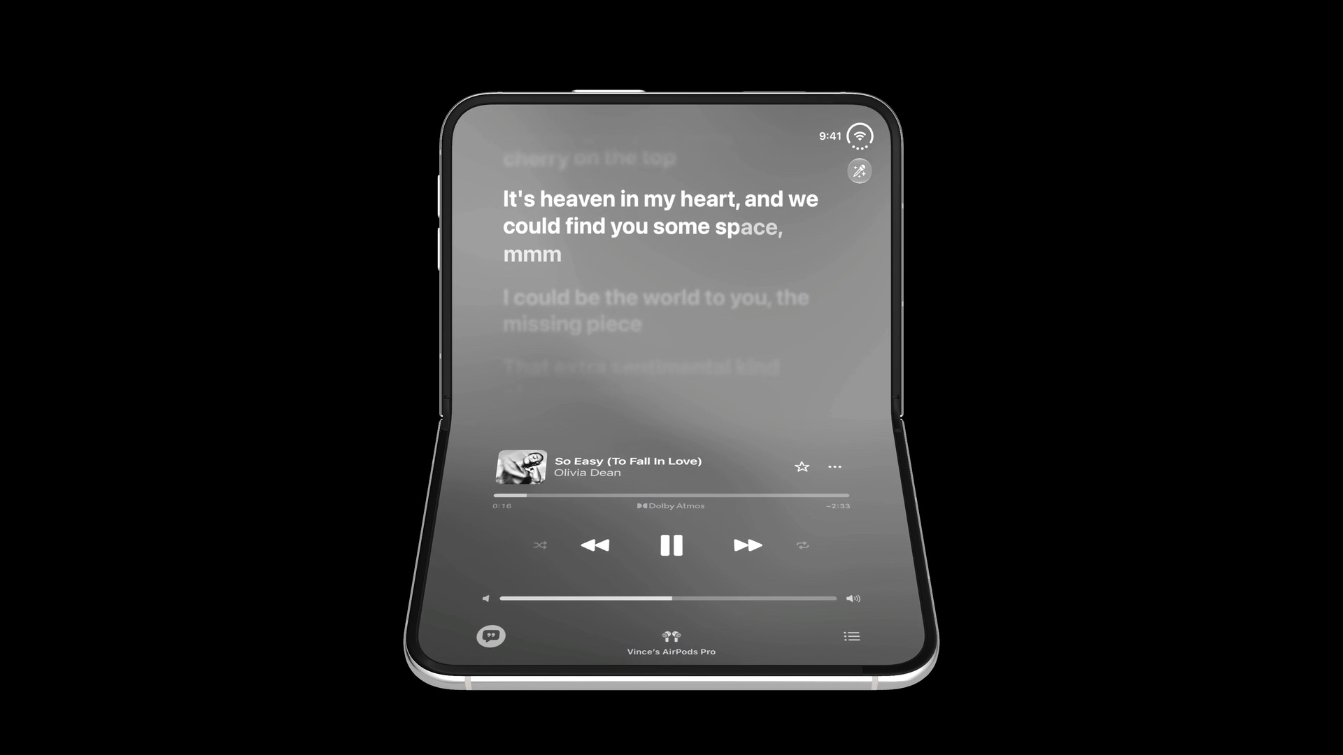
In iOS 27.1, you can use ArrangementView to arrange media and controls in separate regions:
NavigationStack {
    ArrangementView {
        MediaView()
    } secondary: {
        PlaybackControlsView()
    }
    .arrangementViewStyle(.split)
}
MediaView and PlaybackControlsView are your own views. The split arrangement adapts to the available space and fold, placing the views vertically or horizontally.
Apple demonstrates this API in Strike a pose with adaptive layouts on iPhone Duo at 12:00.
You can easily support sarunw.com by checking out this sponsor.
AI Grammar: Correct grammar, spell check, check punctuation, and parphrase.
Summary
We learned how to adjust content for landscape and portrait on iPhone Duo, from working around side controls to using the wider display and separating media from controls around the fold.
I see these refinements as nice-to-have touches on top of the size classes, layout margins, and safe areas we covered in Adapting your app for iPhone Duo. Start with those essentials, then add the adaptations that make sense for your content.
In the next article, we will look at how sheets adapt across the six poses and how system components keep controls away from the fold.
Read more article about iOS, Design, or see all available topic
Enjoy the read?
If you enjoy this article, you can subscribe to the weekly newsletter.
Every Friday, you'll get a quick recap of all articles and tips posted on this site. No strings attached. Unsubscribe anytime.
Feel free to follow me on Twitter and ask your questions related to this post. Thanks for reading and see you next time.
I also make short videos and visual guides on Patreon. Some things are easier to see than to read, like how an API looks and moves on a real screen. If you like to learn that way, come and watch. Sharing the article is also greatly appreciated.
Become a patron Tweet ShareAdapting controls for iPhone Duo
How navigation controls, toolbars, and tab bars adapt to iPhone Duo.
Sheets and fold avoidance on iPhone Duo
How sheets and system components adapt to the poses and fold of iPhone Duo.