iPhone Duo design principles
Table of Contents
iPhone Duo can be used in several different positions. Someone can use it closed, open it fully, or keep it partially folded.
Each position changes the space available to your app and how someone holds and interacts with it.
In this article, we will look at the design principles from Apple's Design for iPhone Duo talk: the different positions, where controls belong, and how layouts change around the fold and in Split View.
The different positions of iPhone Duo
Before looking at the design changes, let's get familiar with the different ways people can use the device.
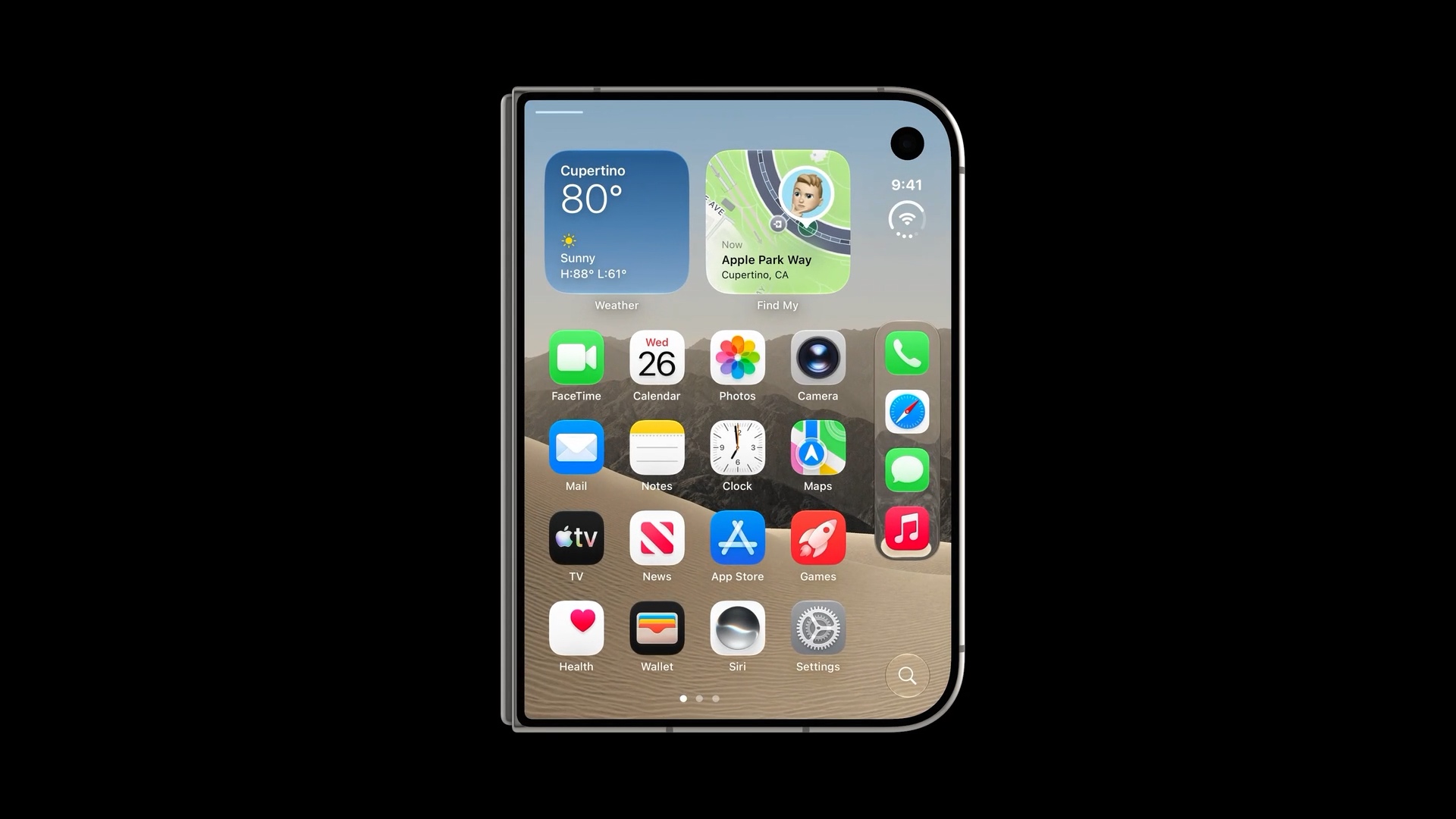
Closed
When iPhone Duo is closed, you use the outer display.
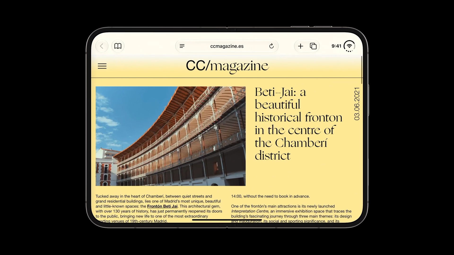
Fully open
Opening the device gives you access to the larger inner display. Your app has more room to show content, such as a list and its selected item side by side.
Partially folded
People can also use iPhone Duo partially folded. There are several ways to use it in this position.
In this position, the fold affects how easy it is to see and reach content near the middle of the inner display. Your layout needs to take this into account.
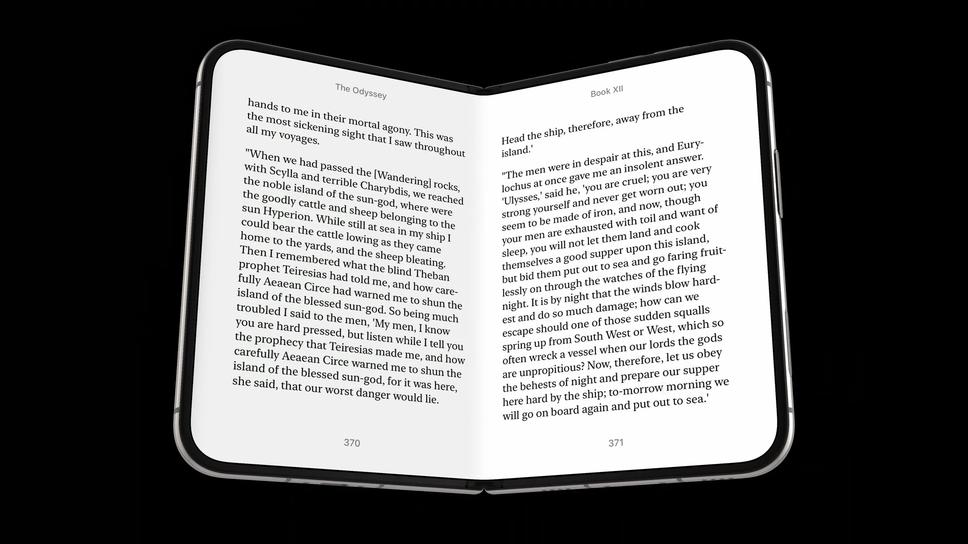
Holding it like a book. A reading app can show a page on each side of the fold, similar to an open book.
Resting it on a table. The device can sit with one half resting on the surface and the other half raised. The user can view it without holding it in their hands.

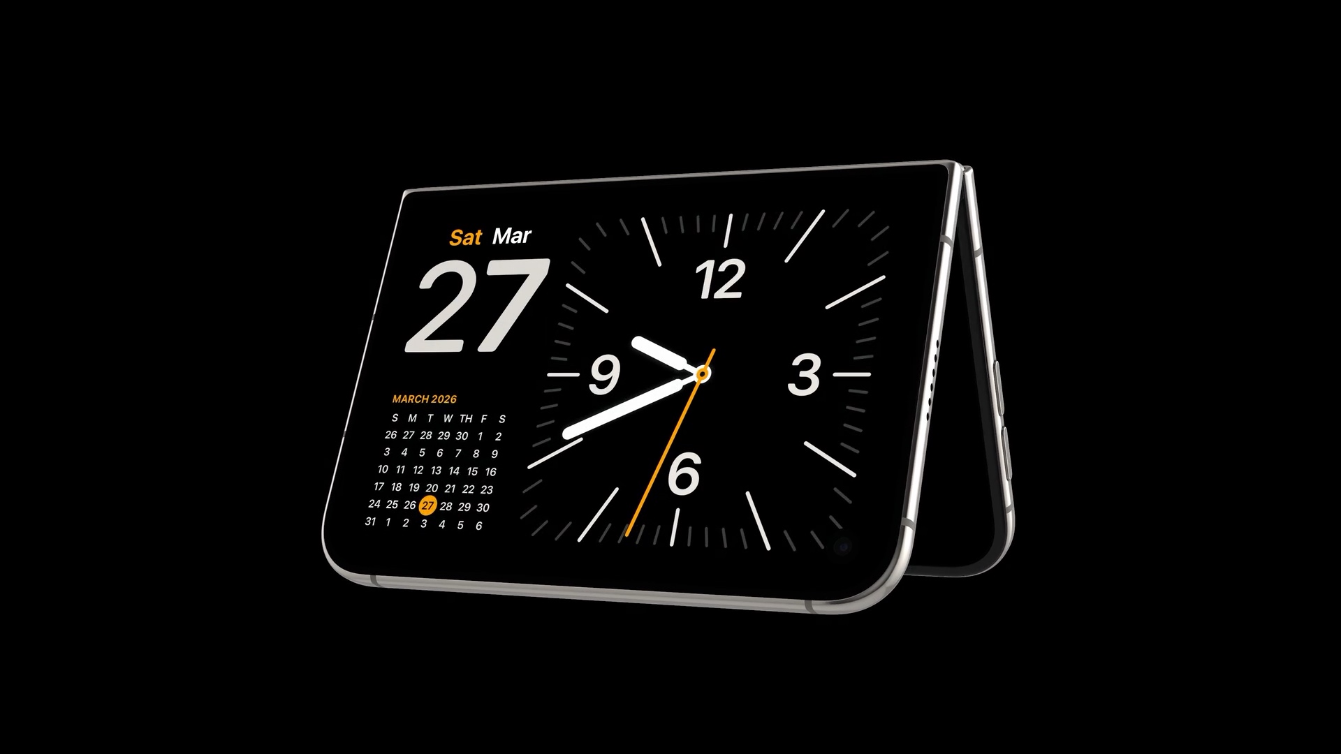
Standing it on its edges. The device can also stand in a tent-like position, with the outer display facing the user. The example below shows a clock and calendar in this position.
You can easily support sarunw.com by checking out this sponsor.

AI Grammar: Correct grammar, spell check, check punctuation, and parphrase.
Controls move to the side
When closed, iPhone Duo has a wider but shorter display than a traditional iPhone.
Putting navigation and toolbars at the top and bottom would take up some of that limited vertical space. To leave more room for content, controls move to the side of the display.
You can see this in Mail. The back button, message navigation, and actions such as delete and reply sit along the right edge. This leaves more vertical space for the message and its photos.
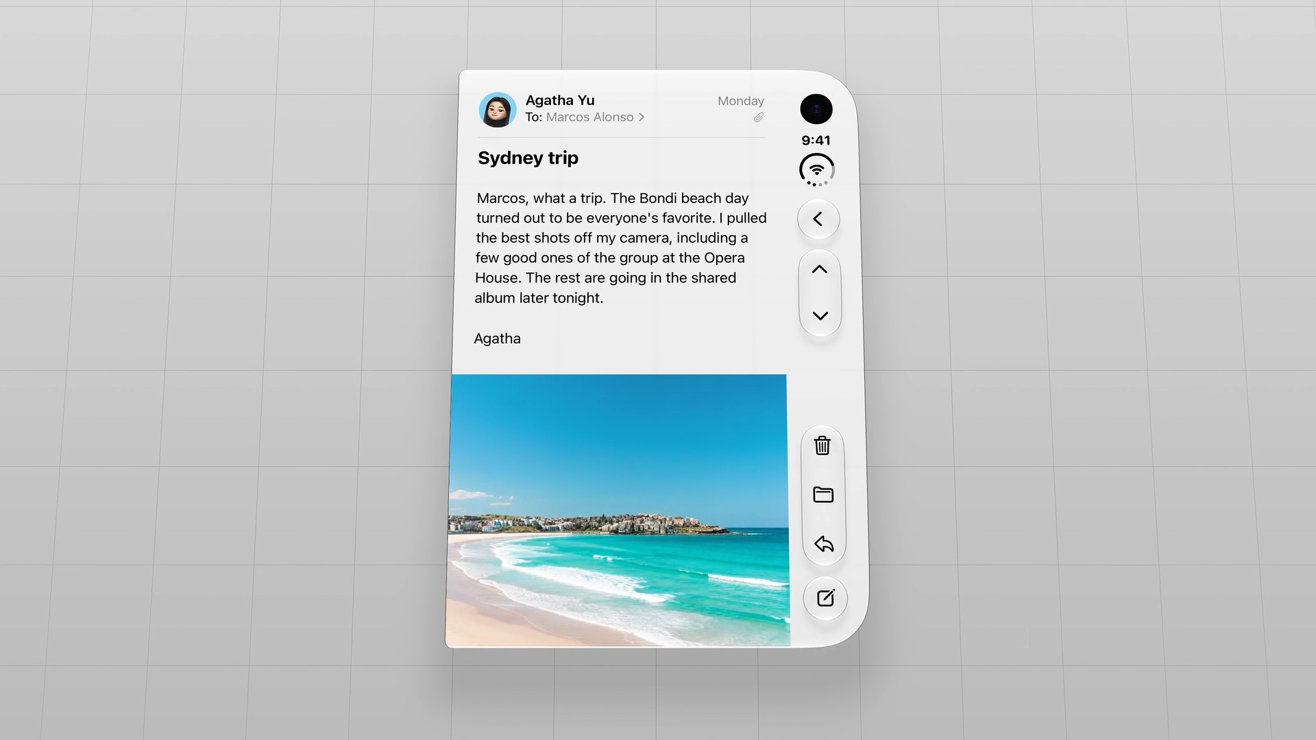
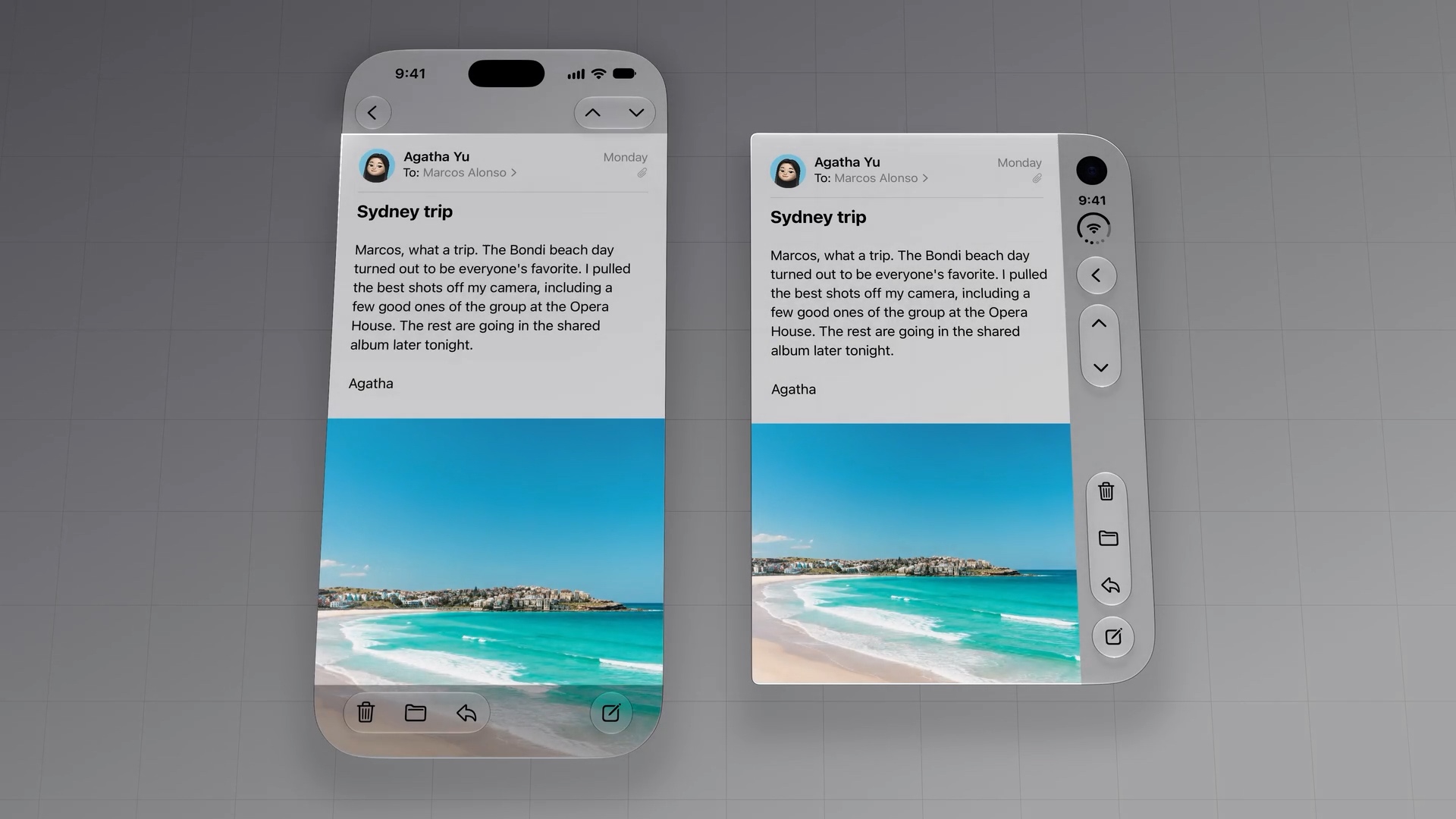
The comparison below shows why this works. Even though iPhone Duo is shorter, moving the controls to the side gives the message roughly the same amount of space as on a traditional iPhone.
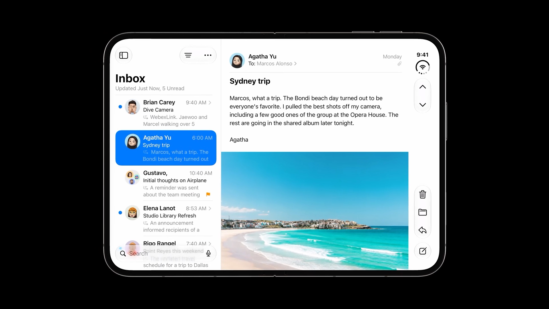
The same approach applies when iPhone Duo is fully open in landscape. In Mail, the message controls stay along the right edge, while the extra width makes room for the inbox beside the selected message.
Content moves away from the fold
When iPhone Duo is partially folded, the center of the inner display curves around the hinge. Content in this region can be harder to read or interact with.
To keep it accessible, the layout moves content away from the center region.
In the Reminders example below, the lists sit on the left and the selected list sits on the right. The content stays on either side of the fold, with space around the center.
The curve becomes a natural divider in the app's layout, separating the list navigation from the selected list's content.
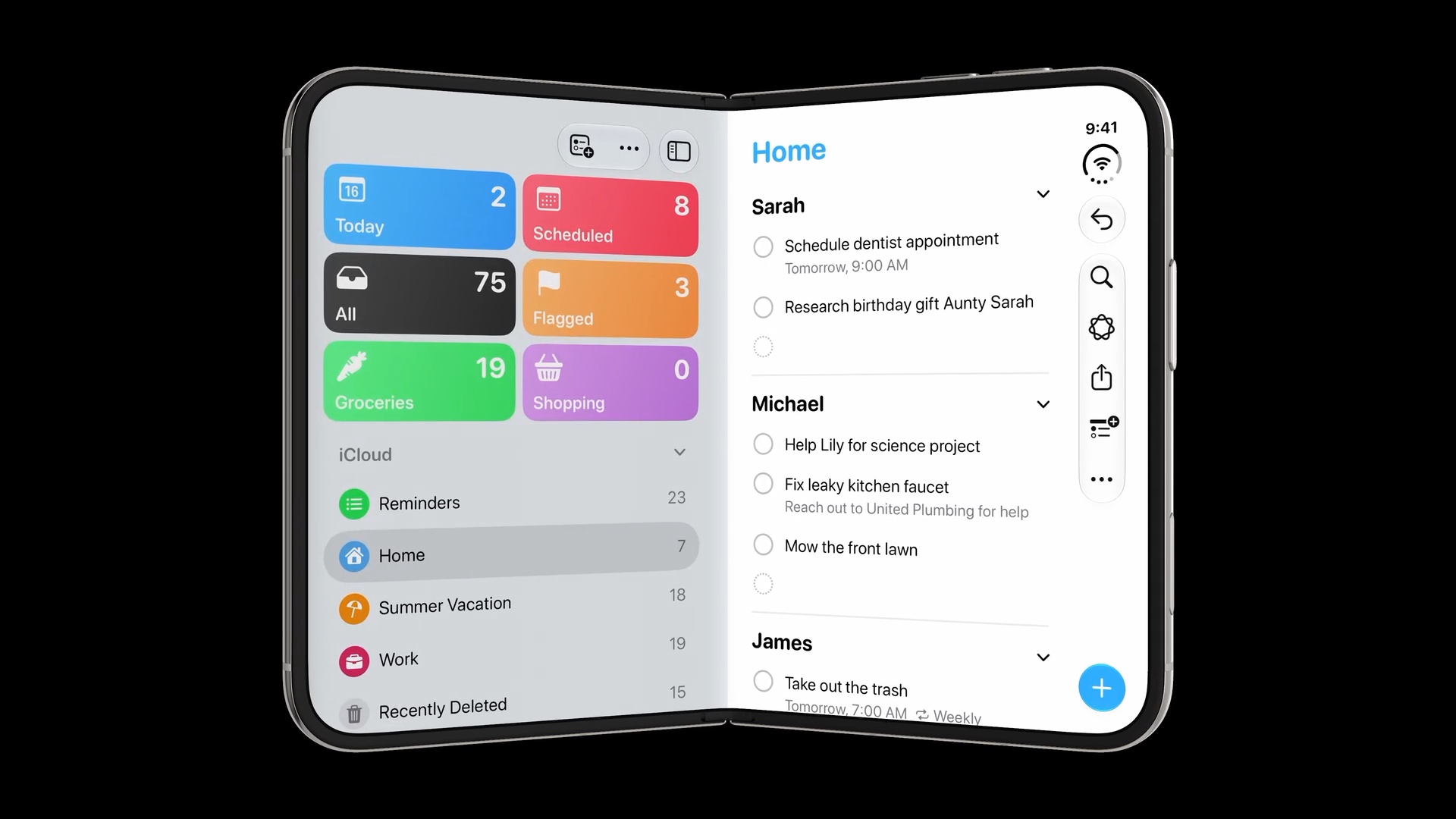
Interactive elements move away from the fold too. In the example below, the dialog appears on the right side. This keeps its buttons clear of the curved center region and easier to tap.
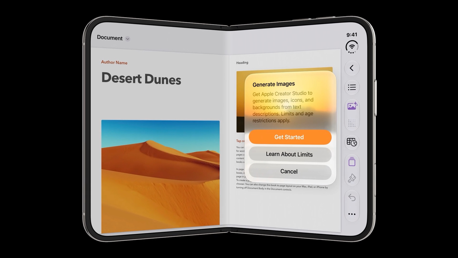
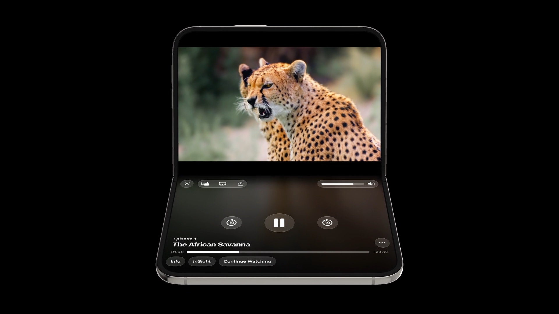
The same idea applies when the device is partially folded in portrait orientation. The fold separates the layout into a top half and a bottom half.
In the video player below, the video stays on the top half while the playback controls move to the bottom half. This keeps the controls within reach without covering the video.
Split View
The larger inner display also makes room for two apps side by side in Split View.
In the example below, Maps is on the left and Messages is on the right. You can look up a place while keeping a conversation visible, without switching between the two apps.
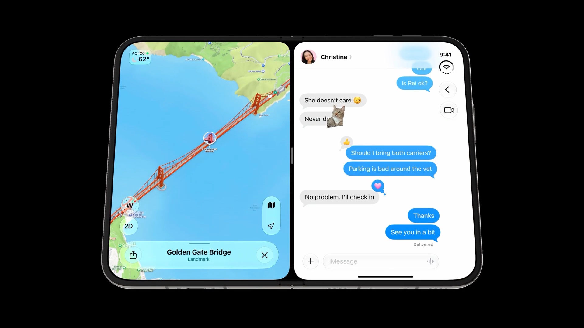
For our apps, this means the layout needs to work in a narrower space too. Content and controls should remain usable when another app shares the display.
Controls follow the outer edge
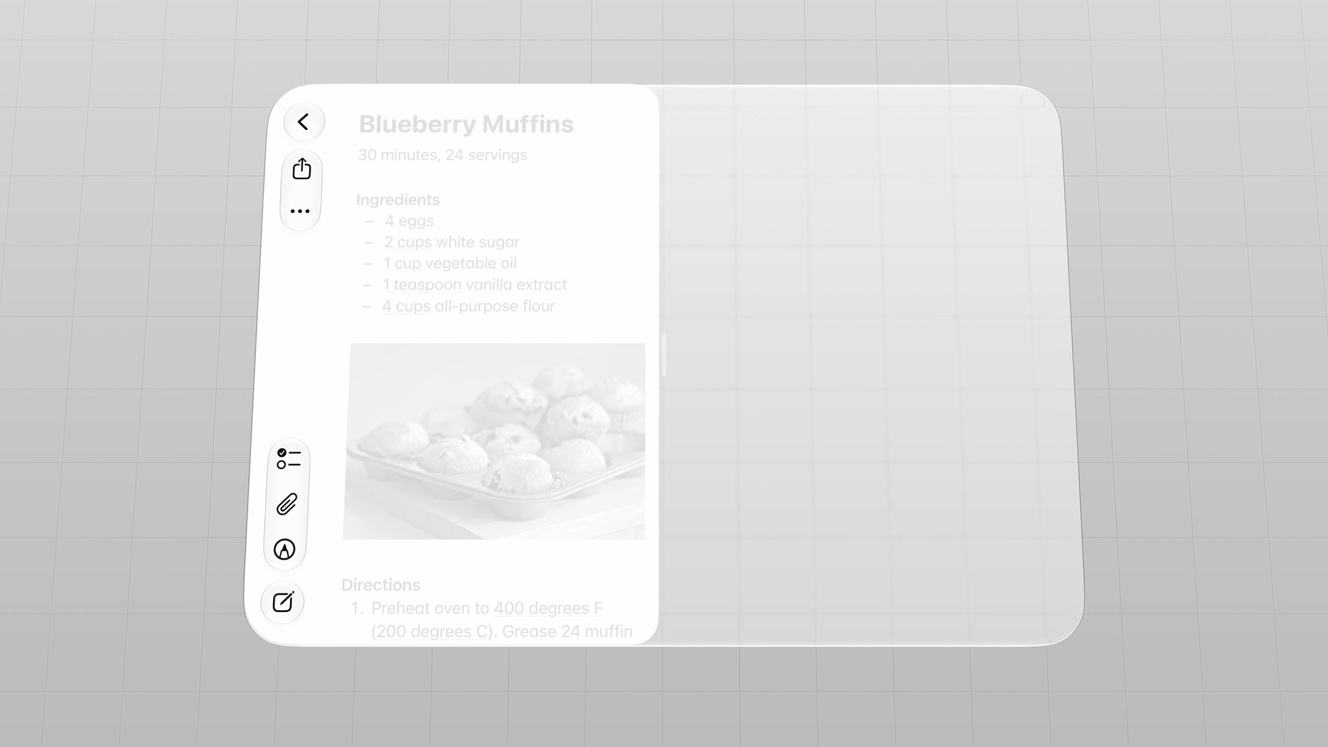
In Split View, controls move to a different edge depending on where the app sits.
When Notes is on the right, its navigation and toolbar controls sit along the right edge.
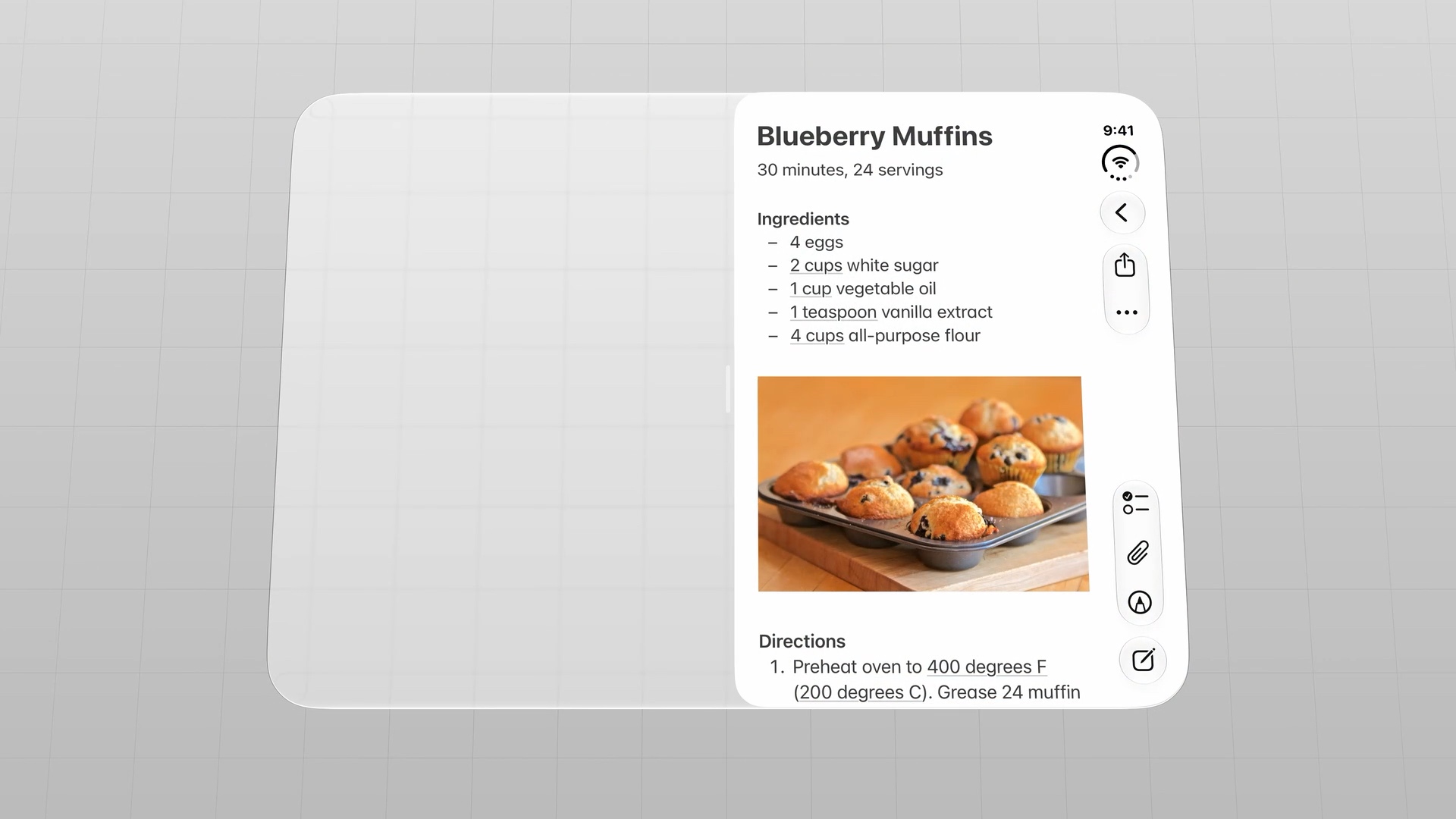
When the app moves to the left, the controls move to the left edge too. This keeps them near the outside of the device and within reach.
You can easily support sarunw.com by checking out this sponsor.
AI Grammar: Correct grammar, spell check, check punctuation, and parphrase.
Conclusion
These examples show how content and controls can follow the way someone uses iPhone Duo. Keep controls within reach, give content space around the fold, and account for the app's position in Split View.
Read more article about iOS, Design, or see all available topic
Enjoy the read?
If you enjoy this article, you can subscribe to the weekly newsletter.
Every Friday, you'll get a quick recap of all articles and tips posted on this site. No strings attached. Unsubscribe anytime.
Feel free to follow me on Twitter and ask your questions related to this post. Thanks for reading and see you next time.
I also make short videos and visual guides on Patreon. Some things are easier to see than to read, like how an API looks and moves on a real screen. If you like to learn that way, come and watch. Sharing the article is also greatly appreciated.
Become a patron Tweet ShareBackward compatibility on iPhone Duo
See how existing apps look on iPhone Duo when built before iOS 27, with the iOS 27 SDK, and with the iOS 27.1 SDK.
Adapting your app for iPhone Duo
The essentials of adapting your app with size classes, layout margins, and safe area insets.