Sheets and fold avoidance on iPhone Duo
Table of Contents
Part 4 in the series "Adapting your app for iPhone Duo", based on Apple's Design for iPhone Duo talk.
- Adapting your app for iPhone Duo
- Adapting controls for iPhone Duo
- Adapting content for iPhone Duo
- Sheets and fold avoidance on iPhone Duo
Sheets change their size and placement as iPhone Duo opens, closes, and folds. Here is how they adapt, when to disable vertical controls, and how system components avoid the fold.
How sheets adapt
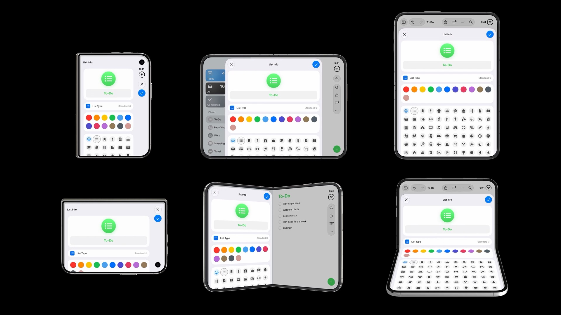
Sheets also adapt to the available space and the device’s pose. The Reminders example below shows the same List Info sheet across all six poses.
Here is how the List Info sheet appears in each pose:
| Pose | Sheet behavior |
|---|---|
| Closed portrait | Fills the outer display, with close and confirm controls arranged vertically along the side. |
| Closed landscape | Fills the shorter, wider outer display. Close and confirm remain near the right edge, leaving less content visible vertically. |
| Open landscape | Appears as a centered sheet with the app visible on either side. Its controls use a horizontal bar across the top. |
| Open portrait | Appears as a tall sheet below the app’s top bar, with close and confirm at opposite ends of the sheet’s horizontal bar. |
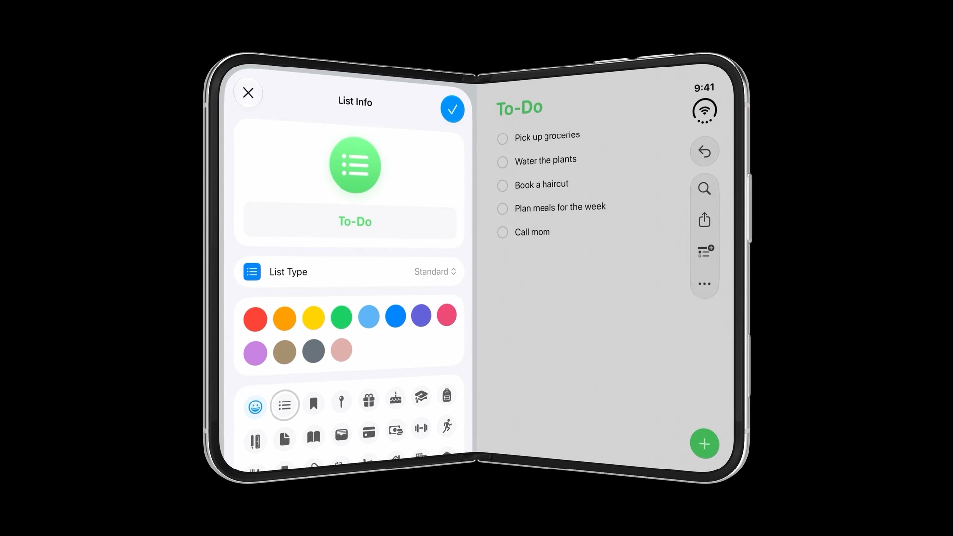
| Partially folded landscape | Moves to one side of the fold, with horizontal controls at the top. In this example, the sheet sits on the left. |
| Partially folded portrait | Remains a tall sheet spanning both halves. Its horizontal controls stay at the top, while the scrollable form continues below the fold. |
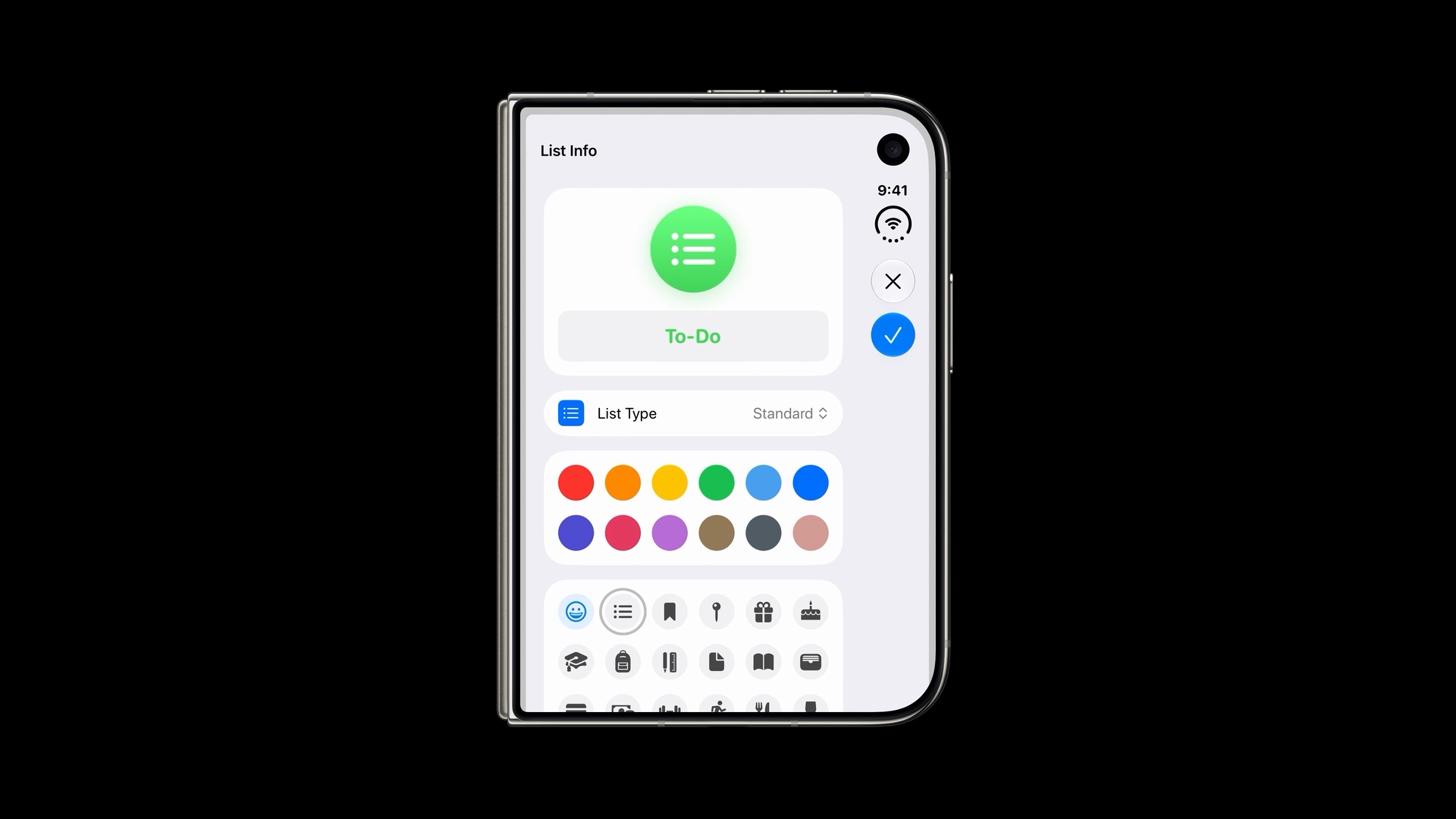
Closed portrait: controls at the side
The closed portrait example shows the change most clearly. Close and confirm move into the vertical bar, and the form uses the space beside them.
Keep a single toolbar button in the sheet
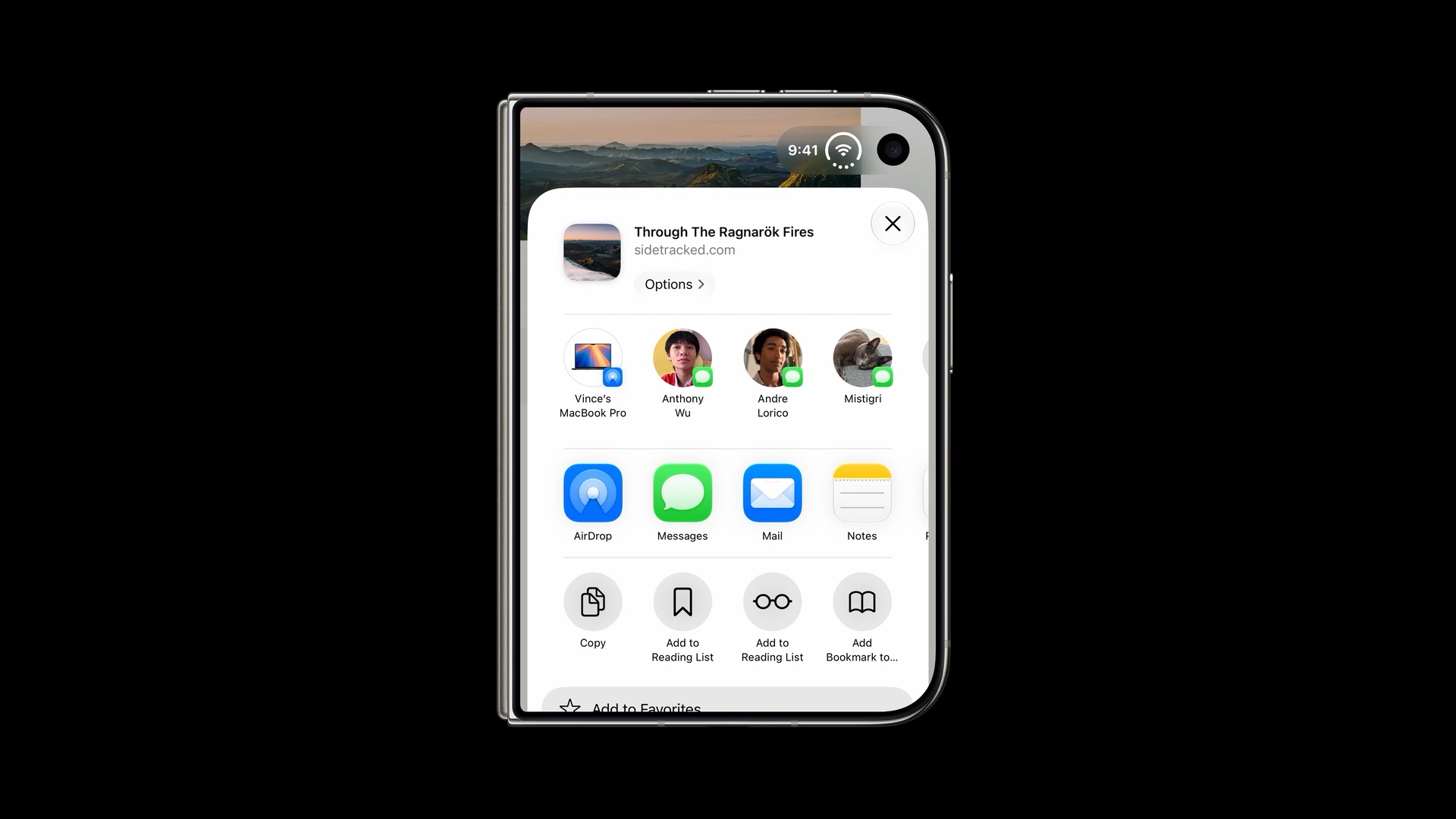
You can also disable the vertical bar for a sheet. This works well when its toolbar only needs one button, such as Close.
In the share sheet below, the Close button stays in the top-right corner of the sheet. The content can use the width without reserving a vertical strip for that one control.
In SwiftUI, apply .toolbarVerticalBehavior(.disabled) to the content inside the sheet’s NavigationStack:
.sheet(isPresented: $showSheet) {
    NavigationStack {
        SheetContent()
            .toolbarVerticalBehavior(.disabled)
    }
}
Apple demonstrates this in Raise the bar with iPhone Duo at 14:47.
Fully open: familiar sheet controls
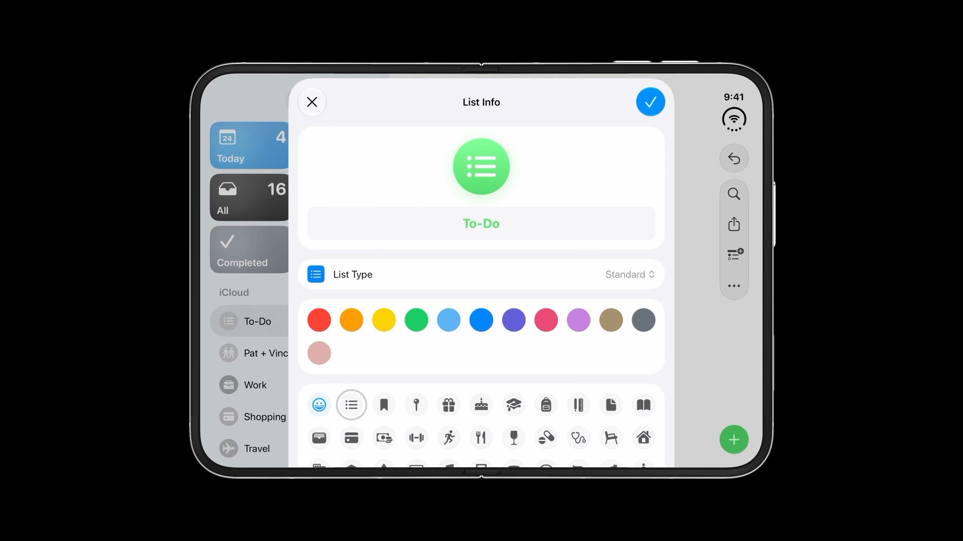
In both open portrait and open landscape, there is enough horizontal room for sheets to keep their familiar layout. Close and confirm stay in a horizontal bar across the top of the sheet.
In the landscape example below, the sheet’s controls remain at the top even though the underlying app uses a vertical bar.
Partially folded: slide away from the fold
When the device is partially folded in landscape, the sheet slides to one side to avoid resting across the curved center of the display.
In Reminders, the List Info sheet moves to the left half, with its controls still arranged horizontally at the top. The underlying list remains visible on the right.
You can easily support sarunw.com by checking out this sponsor.

Screenshot Studio: Create App Store screenshots in seconds not minutes.
Fold avoidance in system components
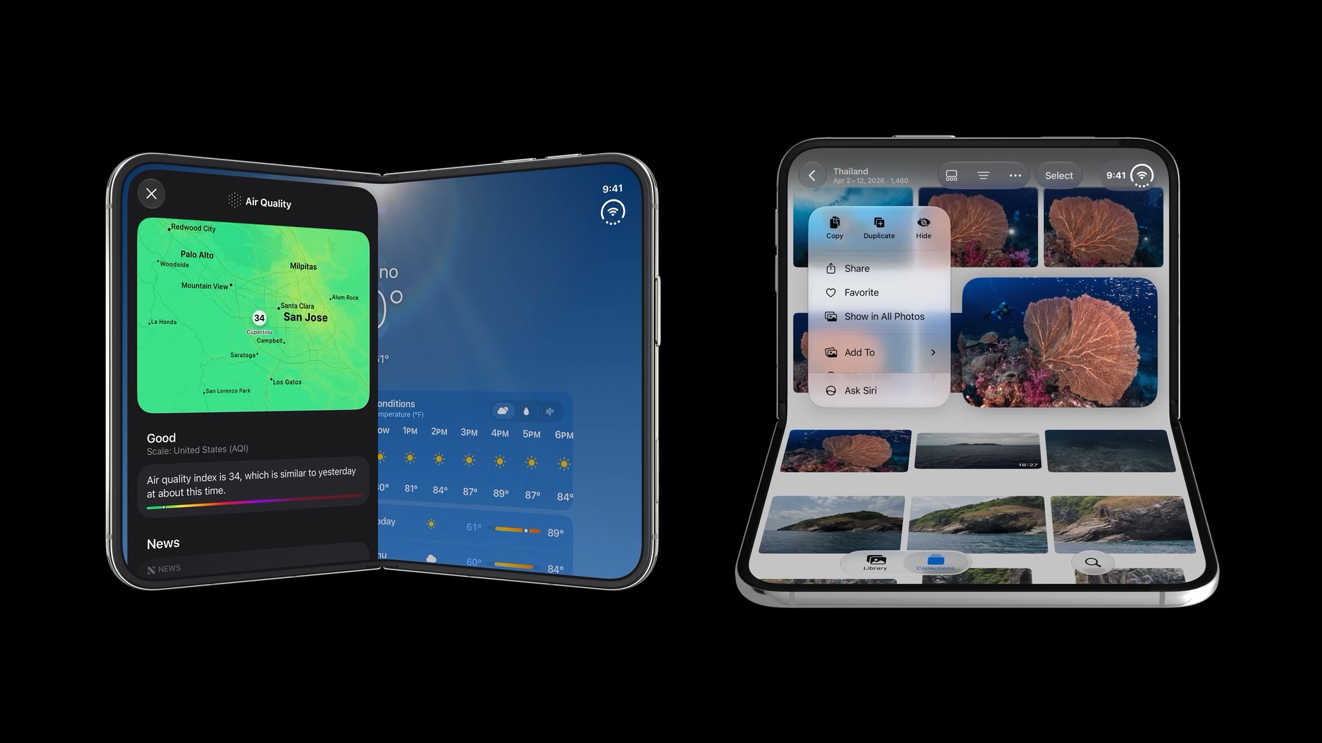
Many system UI components already have fold avoidance built in, including sheets, alerts, and menus. When the device is partially folded, they adjust their placement to keep interactive elements away from the curved center.
In Weather, the Air Quality sheet sits on one side of the fold. In Photos, the context menu appears above the fold in portrait, keeping its actions together on the upper half.
You can easily support sarunw.com by checking out this sponsor.
Screenshot Studio: Create App Store screenshots in seconds not minutes.
Summary
This series should give you a basic understanding of what to prepare for iPhone Duo, from your app’s layout and controls to sheets and fold avoidance.
There is no need to feel overwhelmed by the new poses. The foundation is still the same concepts we have used for years: size classes, layout margins, safe areas, and adaptive system components. Start there, check how your app behaves across the poses, and refine where needed.
Read more article about iOS, Design, or see all available topic
Enjoy the read?
If you enjoy this article, you can subscribe to the weekly newsletter.
Every Friday, you'll get a quick recap of all articles and tips posted on this site. No strings attached. Unsubscribe anytime.
Feel free to follow me on Twitter and ask your questions related to this post. Thanks for reading and see you next time.
I also make short videos and visual guides on Patreon. Some things are easier to see than to read, like how an API looks and moves on a real screen. If you like to learn that way, come and watch. Sharing the article is also greatly appreciated.
Become a patron Tweet ShareAdapting content for iPhone Duo
How to arrange content across the outer and inner displays of iPhone Duo.