Floating Action Button in SwiftUI
Table of Contents
Floating Action Button (FAB) is a UI element that use in Android and Material Design. It refers to a button that triggers the primary action for a particular screen.
Even though it is coming from Android, you can see this pattern in some iOS apps.
Here is an example of a Floating Action Button in the Twitter app. They use Floating Action Button for the most important action, tweet.
You can easily support sarunw.com by checking out this sponsor.
AI Paraphrase:Are you tired of staring at your screen, struggling to rephrase sentences, or trying to find the perfect words for your text?
How to create a Floating Action Button in SwiftUI
There might be many ways to implement a Floating Action Button, but here is my anatomy for my button.
- The FAB appears in front of the main content on a screen.
- It sits at the bottom right of the screen.
- It has a rounded shape and an icon in the center.
- It has a subtle shadow.
That's all the behavior that I will implement for my FAB. Let's implement them step by step.
Before we do that, let's set up an initial screen.
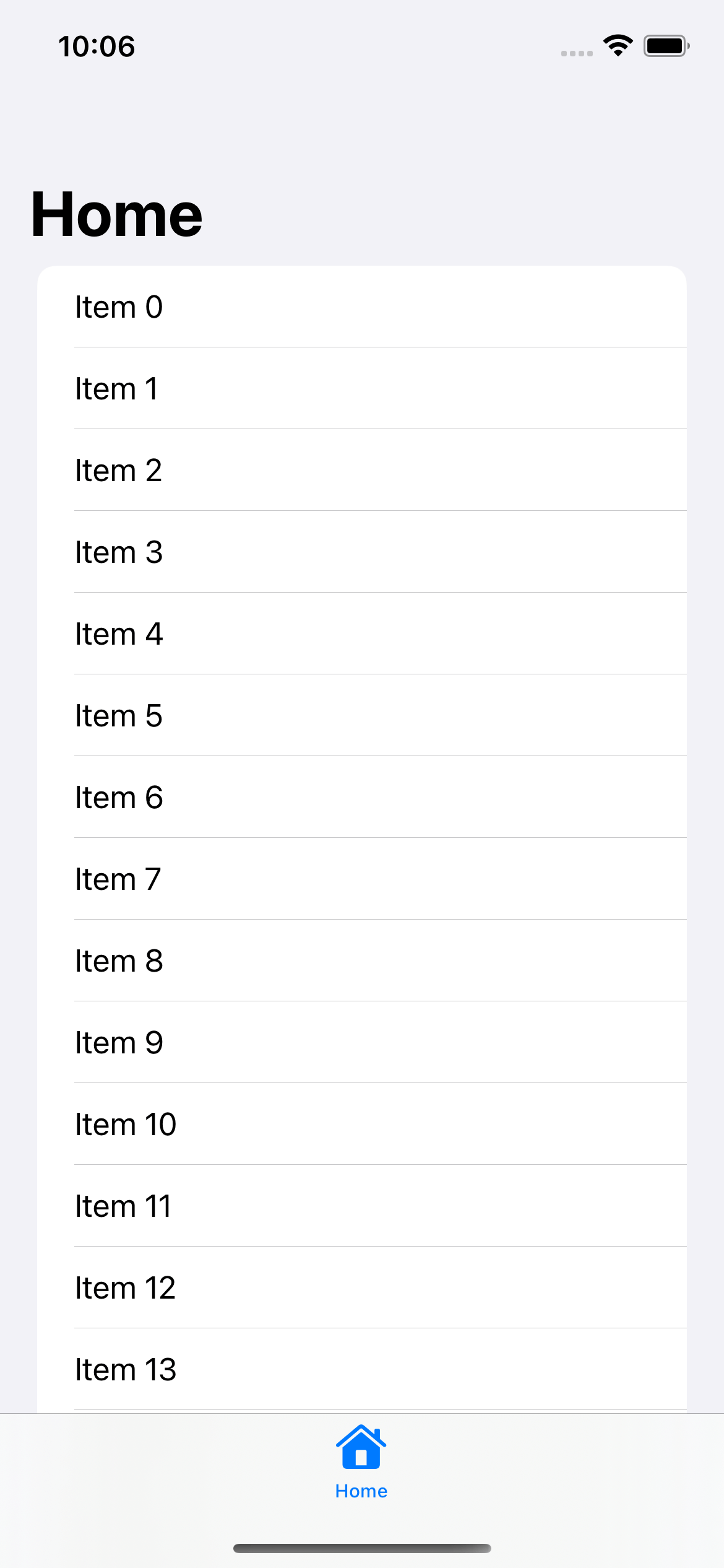
Here is a simple List view that embeds in a navigation view and a tab view.
struct ContentView: View {
    var body: some View {
        TabView {
            NavigationStack {
                List(0..<100) { i in
                    Text("Item \(i)")
                }
                .navigationTitle("Home")
            }
            .tabItem {
                Label("Home", systemImage: "house")
            }
        }
    }
}
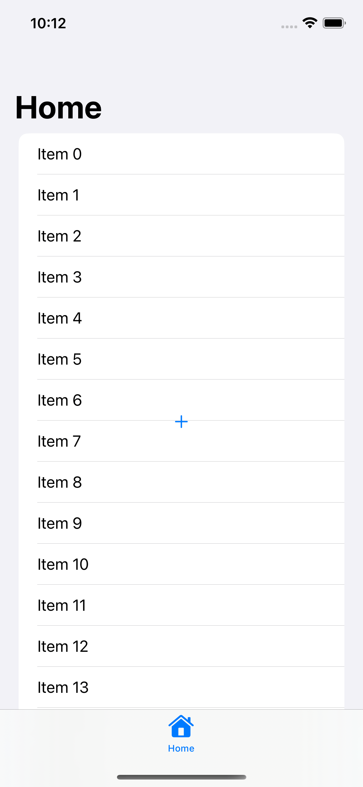
The FAB appears in front of the main content on the screen
To make a view appear in front of another view, you can use either a ZStack or overlay modifier.
I will use ZStack in this case.
struct ContentView: View {
    var body: some View {
        TabView {
            NavigationStack {
                // 1
                ZStack {
                    List(0..<100) { i in
                        Text("Item \(i)")
                    }
                    .navigationTitle("Home")
                    // 2
                    Button {
                        // Action
                    } label: {
                        Image(systemName: "plus")
                    }
                }
            }
            .tabItem {
                Label("Home", systemImage: "house")
            }
        }
    }
}
1 We wrap a content view (List) inside a ZStack.
2 And we put a button over that content.
This will add a plus image button over the list view.
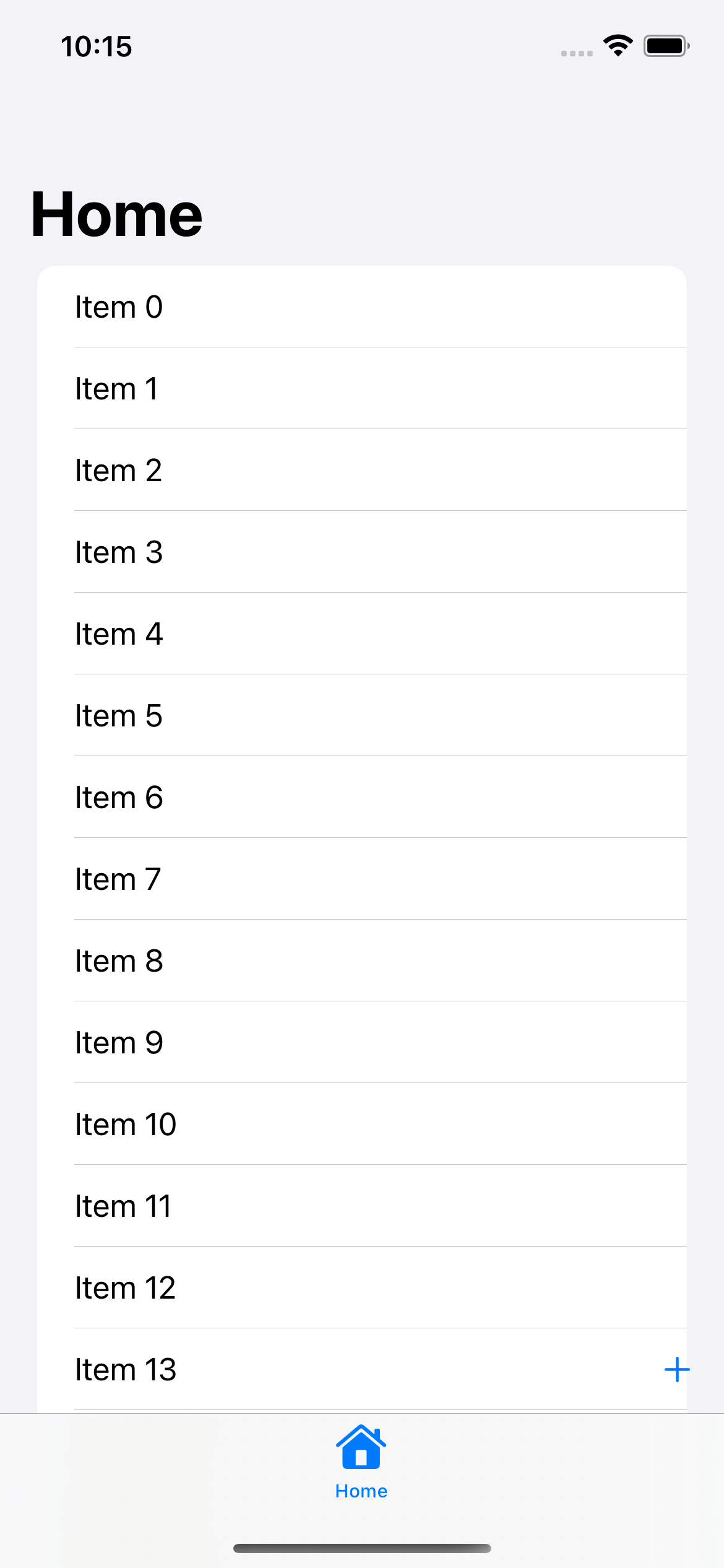
Align it to the bottom right
We can align the button to the bottom right with the alignment parameter of the ZStack.
struct ContentView: View {
    var body: some View {
        TabView {
            NavigationStack {
                // 1
                ZStack(alignment: .bottomTrailing) {
                    List(0..<100) { i in
                        Text("Item \(i)")
                    }
                    .navigationTitle("Home")

                    Button {
                        // Action
                    } label: {
                        Image(systemName: "plus")
                    }
                    // 2
                    .padding()
                }
            }
            .tabItem {
                Label("Home", systemImage: "house")
            }
        }
    }
}
1 ZStack(alignment: .bottomTrailing) make a smaller view (Button) align to the bottom trailing of the bigger view (List).
2 We also add padding around the button to make it not too close to the edges.
Make it round
The position is right, but the appearance isn't yet matched.
We can make it rounded and bold with a combination of modifiers.
struct ContentView: View {
    var body: some View {
        TabView {
            NavigationStack {
                ZStack(alignment: .bottomTrailing) {
                    List(0..<100) { i in
                        Text("Item \(i)")
                    }
                    .navigationTitle("Home")

                    Button {
                        // Action
                    } label: {
                        // 1
                        Image(systemName: "plus")
                            .font(.title.weight(.semibold))
                            .padding()
                            .background(Color.pink)
                            .foregroundColor(.white)
                            .clipShape(Circle())
                    }
                    .padding()
                }
            }
            .tabItem {
                Label("Home", systemImage: "house")
            }
        }
    }
}
1 We change the font style, add padding, background, and foreground color, and clip it to a circle shape.
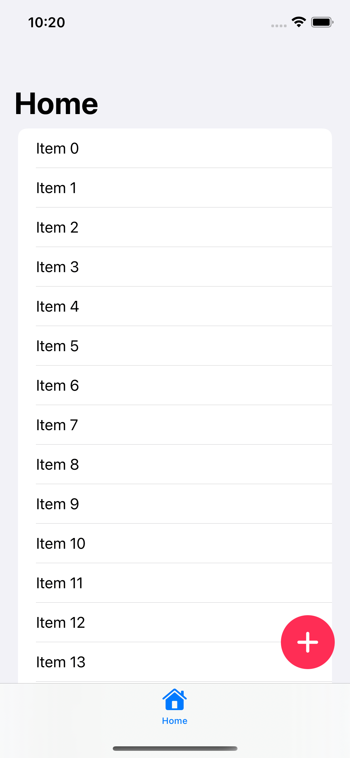
Add a shadow
We add the final touch by adding a shadow to make it look like it is floating.
SwiftUI has a built-in way to add a shadow via shadow modifier.
struct ContentView: View {
    var body: some View {
        TabView {
            NavigationStack {
                ZStack(alignment: .bottomTrailing) {
                    List(0..<100) { i in
                        Text("Item \(i)")
                    }
                    .navigationTitle("Home")

                    Button {
                        // Action
                    } label: {
                        Image(systemName: "plus")
                            .font(.title.weight(.semibold))
                            .padding()
                            .background(Color.pink)
                            .foregroundColor(.white)
                            .clipShape(Circle())
                            .shadow(radius: 4, x: 0, y: 4)
                    }
                    .padding()
                }
            }
            .tabItem {
                Label("Home", systemImage: "house")
            }
        }
    }
}
That's all you need to do to create a Floating Action Button in SwiftUI.
Read more article about SwiftUI, Button, or see all available topic
Enjoy the read?
If you enjoy this article, you can subscribe to the weekly newsletter.
Every Friday, you'll get a quick recap of all articles and tips posted on this site. No strings attached. Unsubscribe anytime.
Feel free to follow me on Twitter and ask your questions related to this post. Thanks for reading and see you next time.
If you enjoy my writing, please check out my Patreon https://www.patreon.com/sarunw and become my supporter. Sharing the article is also greatly appreciated.
Become a patron Buy me a coffee Tweet ShareHow to Filter an Array in Swift
Swift Array has an instance method, filter(_:), that removes unwanted elements from the resulting array.
Observation Framework in iOS 17
In iOS 17, Apple introduced a new and simpler way to make a view response to data changes.