Bottom Sheet in SwiftUI on iOS 16 with presentationDetents modifier
Table of Contents
A bottom sheet is a UI component that slides up from the bottom of the screen with content that supplements the primary screen.
Apple also uses this in their apps, e.g., Map, Find My, and Photos.

Last year (2021), Apple introduced the new UISheetPresentationController, a bottom sheet for UIKit framrework. But no sign of SwiftUI counter part 😢.
In iOS 16, we finally got a way to present a bottom sheet in SwiftUI with the new presentationDetents modifier.
Basic Usage
A bottom sheet is just a sheet presentation with different heights.
There are two steps to use a bottom sheet in SwiftUI.
- Set up sheet presentation like usual.
- Specified supported detents (
PresentationDetent) to sheet's content viapresentationDetentsmodifier.
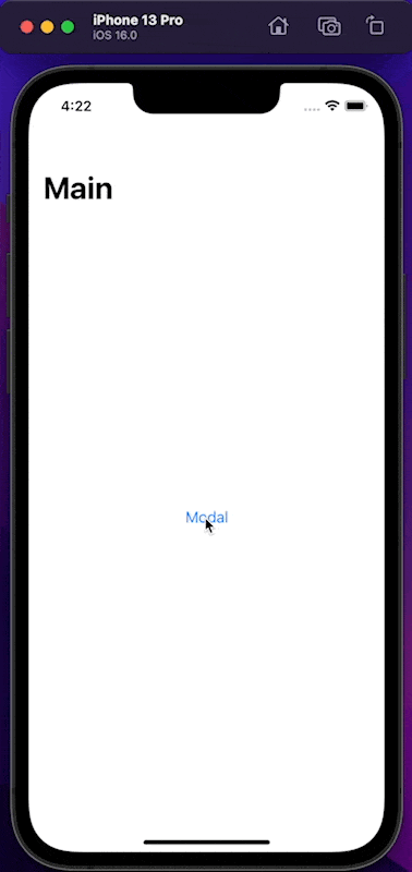
struct ContentView: View {
    @State var presentSheet = false

    var body: some View {
        NavigationView {
            Button("Modal") {
                presentSheet = true
            }
            .navigationTitle("Main")
        }.sheet(isPresented: $presentSheet) {
            Text("Detail")
                .presentationDetents([.medium, .large])
        }
    }
}
All the code you see here is the one we use to present a sheet.
To turn a normal sheet into a bottom sheet, we only need to define supported detents with .presentationDetents([.medium, .large]).
In this example, we support two sizes, medium and large. So users can drag the sheet to change between these two sizes.
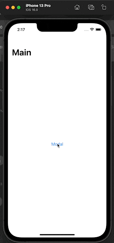
As you can see, we need to set supported sizes for our sheet's content to turn a normal sheet presentation into a bottom sheet presentation.
You can easily support sarunw.com by checking out this sponsor.
Localization Buddy: Easiest way to localize and update App Store metadata.
How to control bottom sheet size
We declare all support sizes by specifying them in the presentationDetents modifier.
There are many kinds of sizes that we can use.
Built-in sizes
SwiftUI come with two built-in detents.
- Medium (
.medium), detent for a sheet that occupied half the height of the screen. This detent is inactive in compact height like iPhone landscape orientation. - Large (
.large), detent for a sheet at full height (This is the same as a normal sheet).
Custom sizes
We have three ways to make a custom size detent.
Fixed height
Fixed height (.height) is a detent that lets you specify a fixed height of your choice.
In this example, we declare a detent with a height of 250 points.
Text("Detail")
.presentationDetents([.height(250)])![.presentationDetents([.height(250)])](/images/swiftui-bottom-sheet-height.png)
Fraction
Fraction (.fraction) is a detent with a height as a fractional of the available height.
In this example we declare an detent with 0.1 percent of available height.
Text("Detail")
.presentationDetents([.fraction(0.1)])![.presentationDetents([.fraction(0.1)])](/images/swiftui-bottom-sheet-fraction.png)
Custom
Custom (.custom) detent lets you define your own logic for the height.
To use this, we need to declare a new detent that conforms to the CustomPresentationDetent protocol.
struct MyDetent: CustomPresentationDetent {
    // 1
    static func height(in context: Context) -> CGFloat? {
        // 2
        return max(50, context.maxDetentValue * 0.1)
    }
}
1 CustomPresentationDetent protocol got only one method to conform, height(in:). You will get a PresentationDetent.Context which provide a maximum height available for your detent (maxDetentValue).
2 We use maxDetentValue to calculate and return desired height for our detent. In this case, I want my detent to occupy 0.1 of the available height with a minimum height of 50 points.
Then, we use it like this.
Text("Detail")
    .presentationDetents([.custom(MyDetent.self)])
Here is the result.
![.presentationDetents([.custom(MyDetent.self)])](/images/swiftui-bottom-sheet-custom.png)
Programmatically changing the size
You can control the sheet position programmatically by using other forms of presentationDetents(_:selection:) that accept selection detent binding.
struct ContentView: View {
    @State var presentSheet = false
    // 1
    @State var selectedDetent: PresentationDetent = .medium
    private let availableDetents: [PresentationDetent] = [.medium, .large]

    var body: some View {
        NavigationView {
            Button("Modal") {
                presentSheet = true
            }
            .navigationTitle("Main")
        }.sheet(isPresented: $presentSheet) {
            // 3
            Picker("Selected Detent", selection: $selectedDetent) {
                ForEach(availableDetents, id: \.self) {
                    Text($0.description.capitalized)
                }
            }
            .pickerStyle(.segmented)
            .padding()
            // 2
            .presentationDetents([.medium, .large], selection: $selectedDetent)
            .presentationDragIndicator(.hidden)
        }
    }
}

// For presenting in a picker
extension PresentationDetent: CustomStringConvertible {
    public var description: String {
        switch self {
        case .medium:
            return "Medium"
        case .large:
            return "Large"
        default:
            return "n/a"
        }
    }
}
1 We declare a new variable, selectedDetent, to hold selected detent.
2 We bind that value to selection argument in presentationDetents.
3 Then, we can programmatically control and read selected detent through that binding. In this case, we control it with a picker.
Here is the result.
Show/Hide drag indicator
The drag indicator will automatically show and hide based on a number of supported detents.
- If you have only one detent, the drag indicator will be hidden.
- If you have more than one detent, the drag indicator will appear.
You can override this behavior by set the.presentationDragIndicator modifier.
In this example, we hide drag indicator by set .presentationDragIndicator(.hidden).
Text("Detail")
    .presentationDetents([.medium, .large])
    .presentationDragIndicator(.hidden)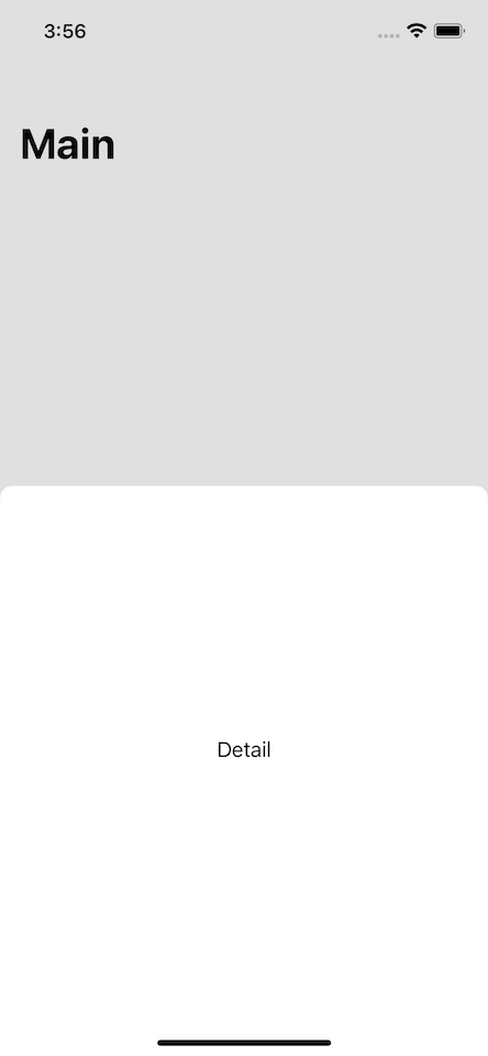
You can easily support sarunw.com by checking out this sponsor.
Localization Buddy: Easiest way to localize and update App Store metadata.
Conclusion
It is nice to see SwiftUI catching up UIKit. Still, if you have read about bottom sheet in UIKit, you know that the SwiftUI version is still missing some important features, e.g., no way to interact with primary content, can't customize corner radius.
iOS 16 is still in beta, so there might be an update before the release 🤞
Read more article about SwiftUI, iOS 16, Sheet, or see all available topic
Enjoy the read?
If you enjoy this article, you can subscribe to the weekly newsletter.
Every Friday, you'll get a quick recap of all articles and tips posted on this site. No strings attached. Unsubscribe anytime.
Feel free to follow me on Twitter and ask your questions related to this post. Thanks for reading and see you next time.
If you enjoy my writing, please check out my Patreon https://www.patreon.com/sarunw and become my supporter. Sharing the article is also greatly appreciated.
Become a patron Buy me a coffee Tweet ShareNew way to control number of lines of SwiftUI Text in iOS 16
In iOS 16, we got a big improvement over lineLimit modifiers. Let's see what we can do with it.
Hide keyboard when scrolling in SwiftUI with scrollDismissesKeyboard
In iOS, we have dedicated built-in ways to dismiss the keyboard in scrollable content. Let's learn how to set that in SwiftUI.