Replicate 12 UIKit's contentMode options in SwiftUI
Table of Contents
There are twelve way[1] to transform image in UIImageView with content mode, but we got only two content mode in SwiftUI. But, we can replicate most of them with a combination of two modifier aspectRatio(_:contentMode:) and frame(width:height:alignment:).
This is the list of UIKit's contentMode. You can visit my previous post to see what these property are.
- scaletofill
- scaleaspectfit
- scaleaspectfill
- center
- top
- bottom
- left
- right
- topleft
- topright
- bottomleft
- bottomright
Throughout this post, I will use two images, a big image with a size of 240x300[2] and a smaller image with a size of 80x100. You will see how each image reacts to the same content mode.


I will put them side-by-side in image views of size 200x200. I also add a pink border for you to visualize the behavior easily. Here is our testing code.
struct ContentView: View {
    var body: some View {
        HStack(spacing: 200) {
            Image("contentmode-large")
                .resizable()
                .frame(width: 200, height: 200)
                .border(Color.pink)
            Image("contentmode-small")
                .resizable()
                .frame(width: 200, height: 200)
                .border(Color.pink)
        }
    }
}
In the examples below, I will only code for the large image for brevity.
Scaling
scaleToFill
scaleToFill scales the content to fill the view's bounds without maintaining the aspect ratio. We can do this in SwiftUI with .resizable() modifier.
Image("contentmode-large")
    .resizable()
    .frame(width: 200, height: 200)
    .border(Color.pink)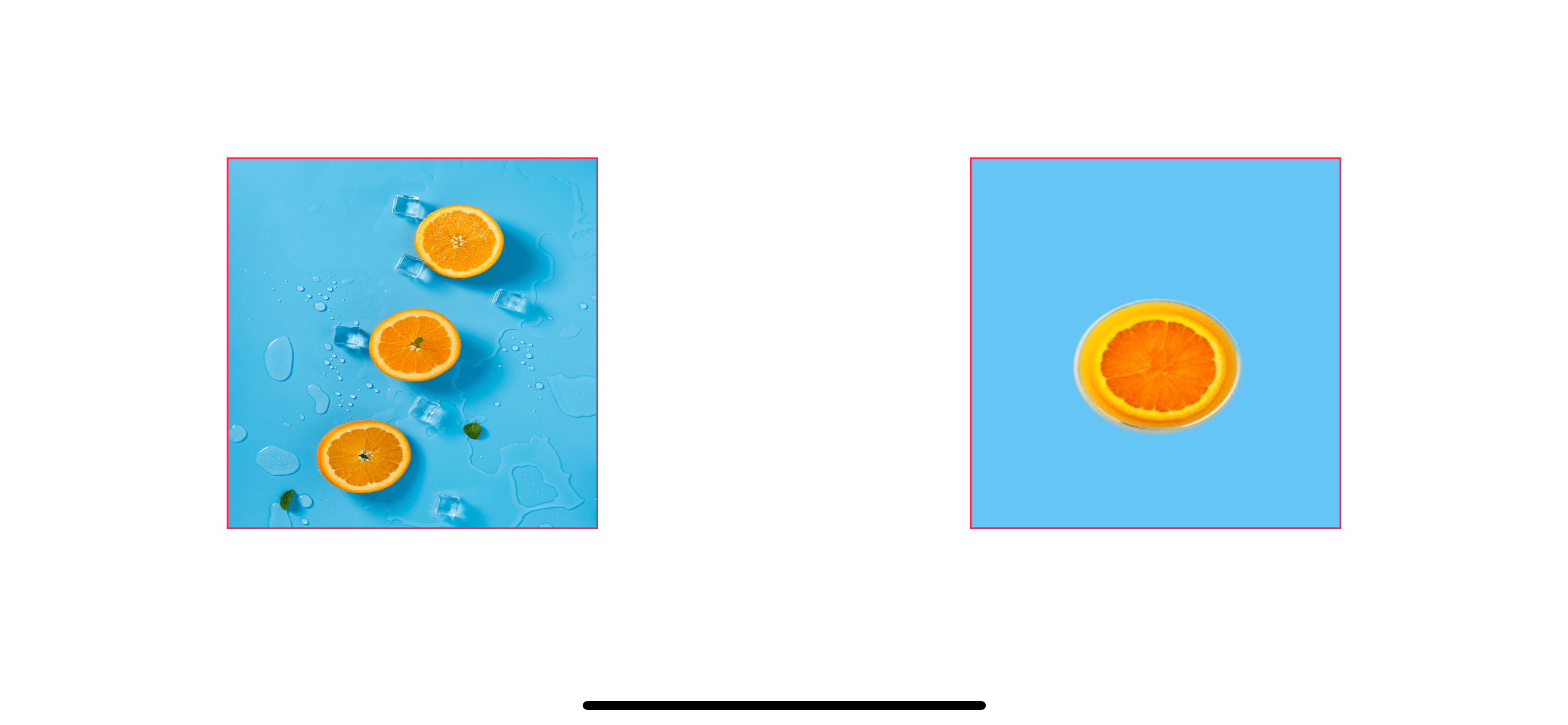
scaleAspectFit
scaleAspectFit scales the content to fit within the view's bounds and maintaining the aspect ratio. This might leave an empty space on one axis. We do this in SwiftUI with resizable() and .aspectRatio(contentMode: .fit) (or .scaledToFit()).
Image("contentmode-large")
    .resizable()
    .aspectRatio(contentMode: .fit) // 1
    .frame(width: 200, height: 200)
    .border(Color.pink)
Image("contentmode-small")
    .resizable()
    .scaledToFit() // 2
    .frame(width: 200, height: 200)
    .border(Color.pink)
You can use .aspectRatio(contentMode: .fit) <1> or shorthand version, .scaledToFit() <2>.
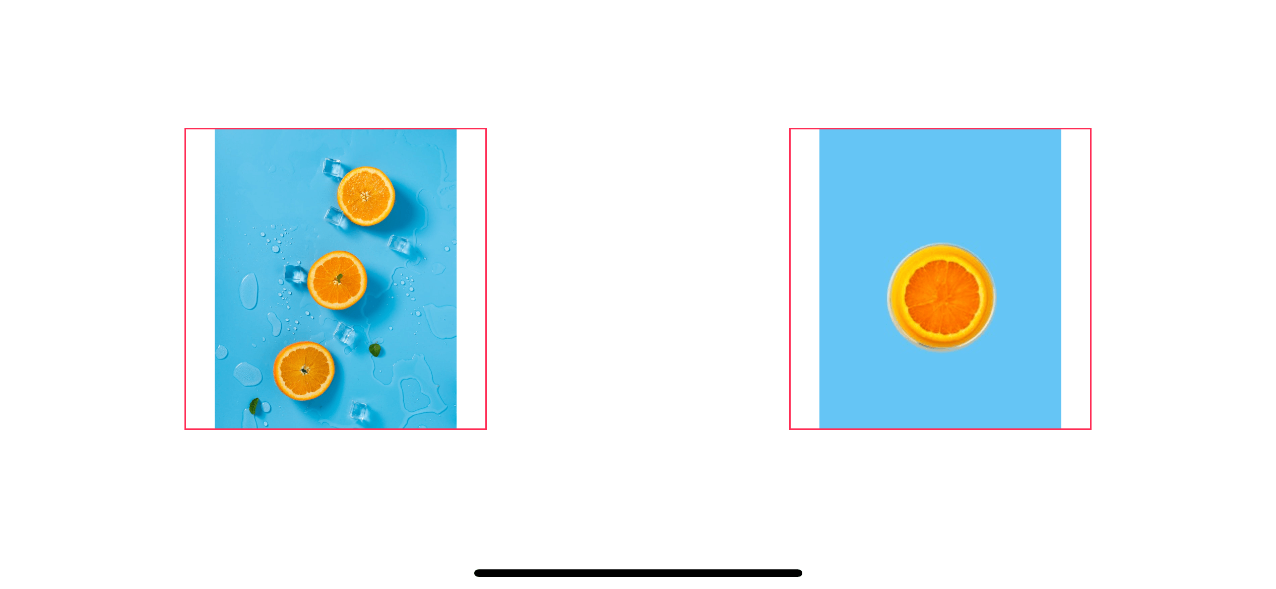
scaleAspectFill
scaleAspectFill scales the content to fill the view's bounds and maintaining the aspect ratio. This might cause some portion of the image to extend beyond the view's bounds. We do this in SwiftUI with resizable() and .aspectRatio(contentMode: .fill) (or .scaledToFill()).
Image("contentmode-large")
    .resizable()
    .aspectRatio(contentMode: .fill)
    .frame(width: 200, height: 200)
    .border(Color.pink)
Image("contentmode-small")
    .resizable()
    .scaledToFill()
    .frame(width: 200, height: 200)
    .border(Color.pink)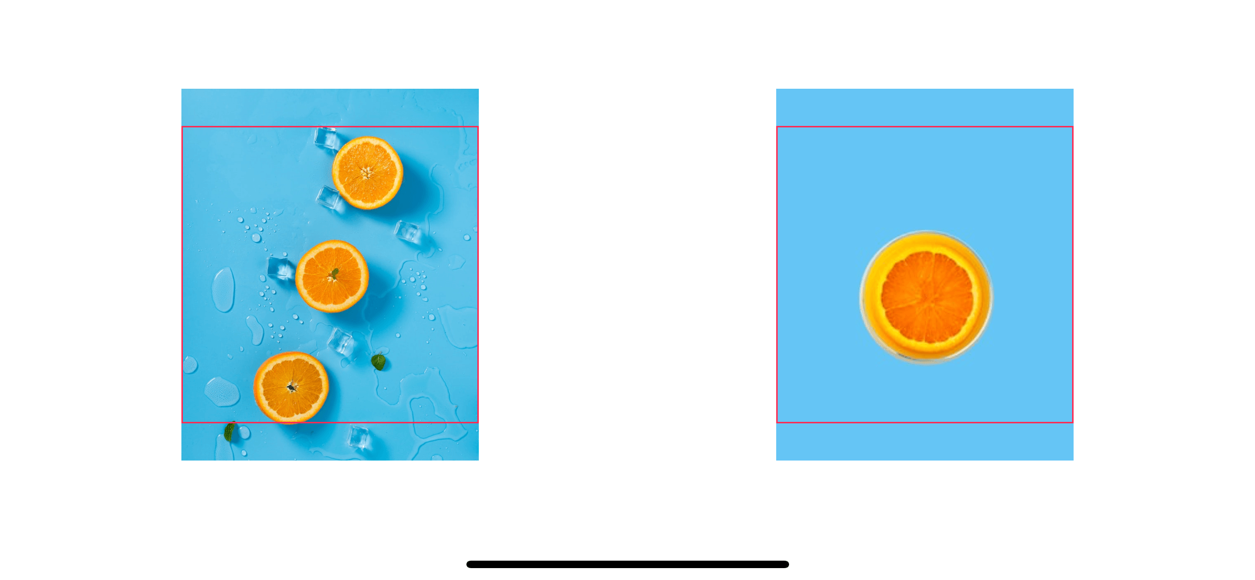
You can easily support sarunw.com by checking out this sponsor.

Localization Buddy: Easiest way to localize and update App Store metadata.
Positioning
We have nine mode to position an image. Each mode will pin the image to the respective position without scaling the image. For example, center will pin the content's center to the view's center, top will pin the content's top to the view's top.
Since we don't need to scale the image, we don't need .resizable() and .aspectRatio() here. We can rely on alignment parameter of .frame(width:height:alignment:).
center
Image("contentmode-large")
    .frame(width: 200, height: 200, alignment: .center)
    .border(Color.pink)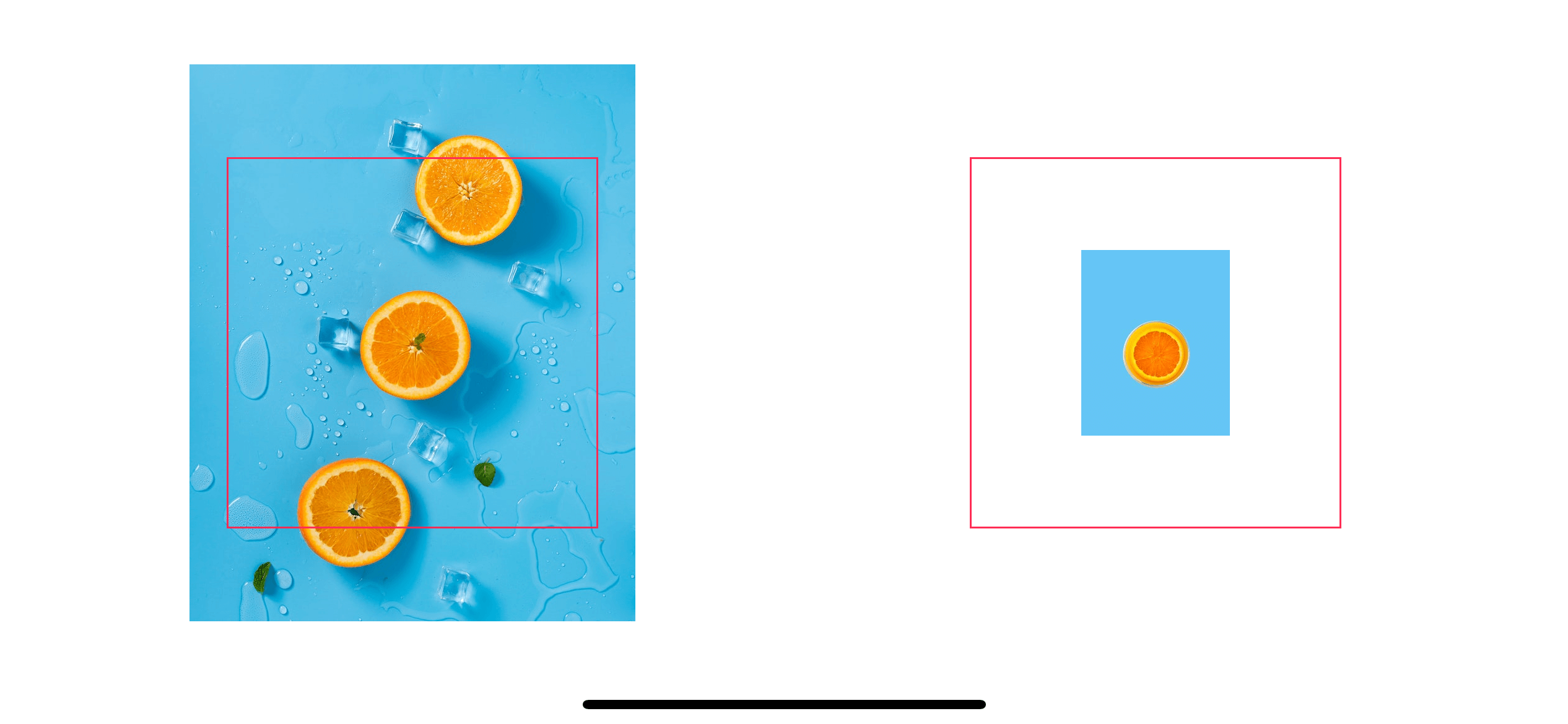
top
Image("contentmode-large")
    .frame(width: 200, height: 200, alignment: .top)
    .border(Color.pink)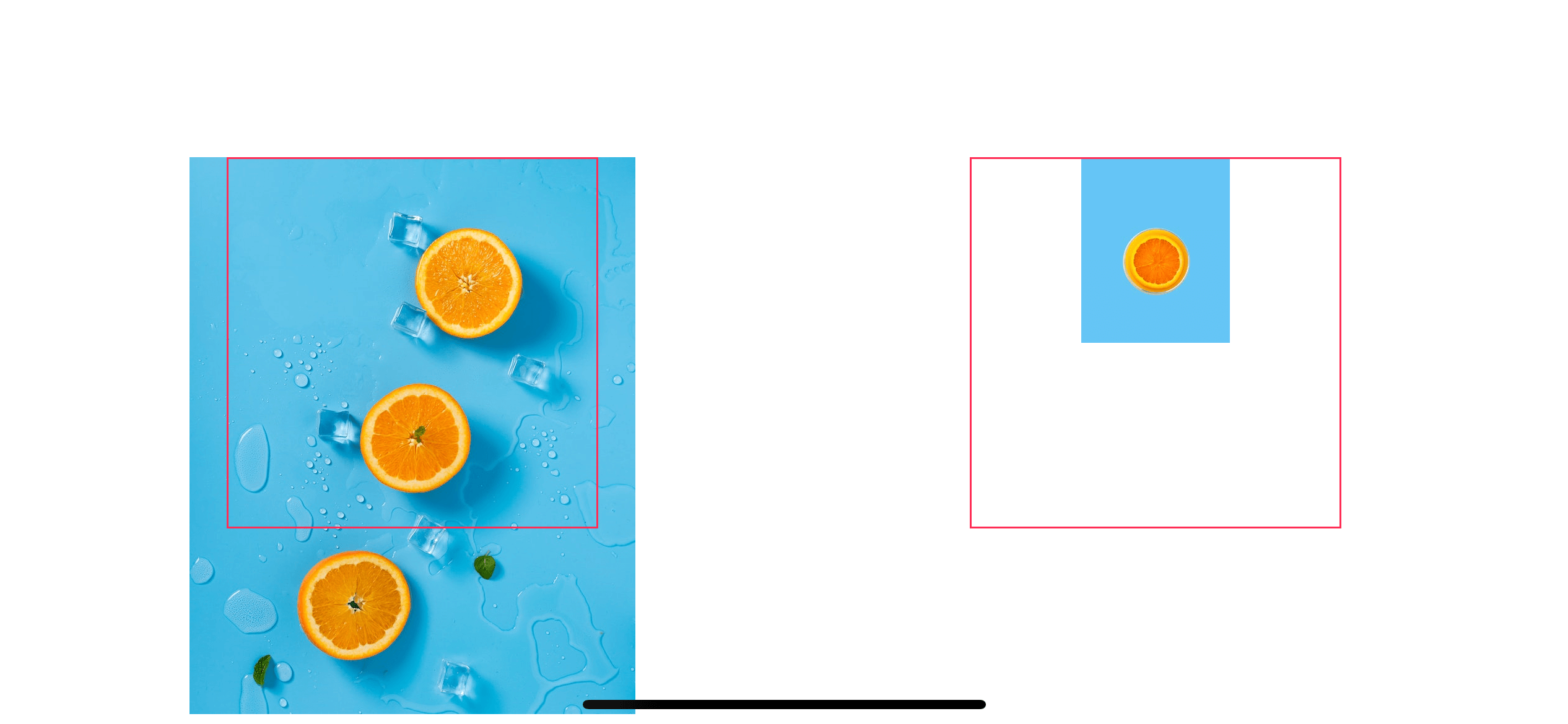
bottom
Image("contentmode-large")
    .frame(width: 200, height: 200, alignment: .bottom)
    .border(Color.pink)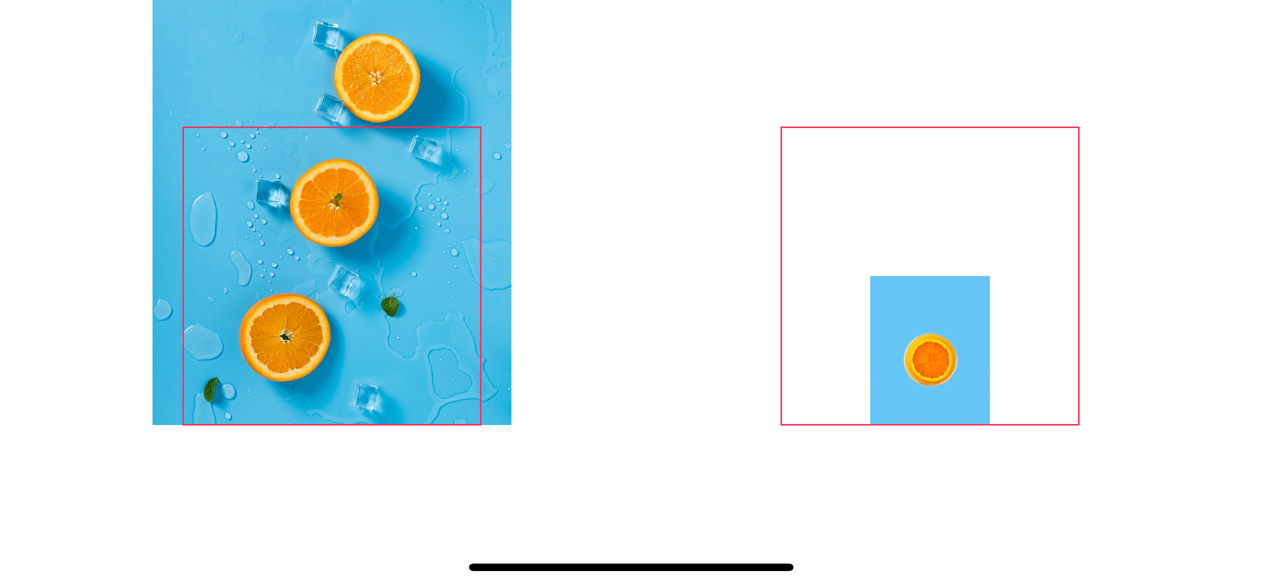
left
Image("contentmode-large")
    .frame(width: 200, height: 200, alignment: .leading)
    .border(Color.pink)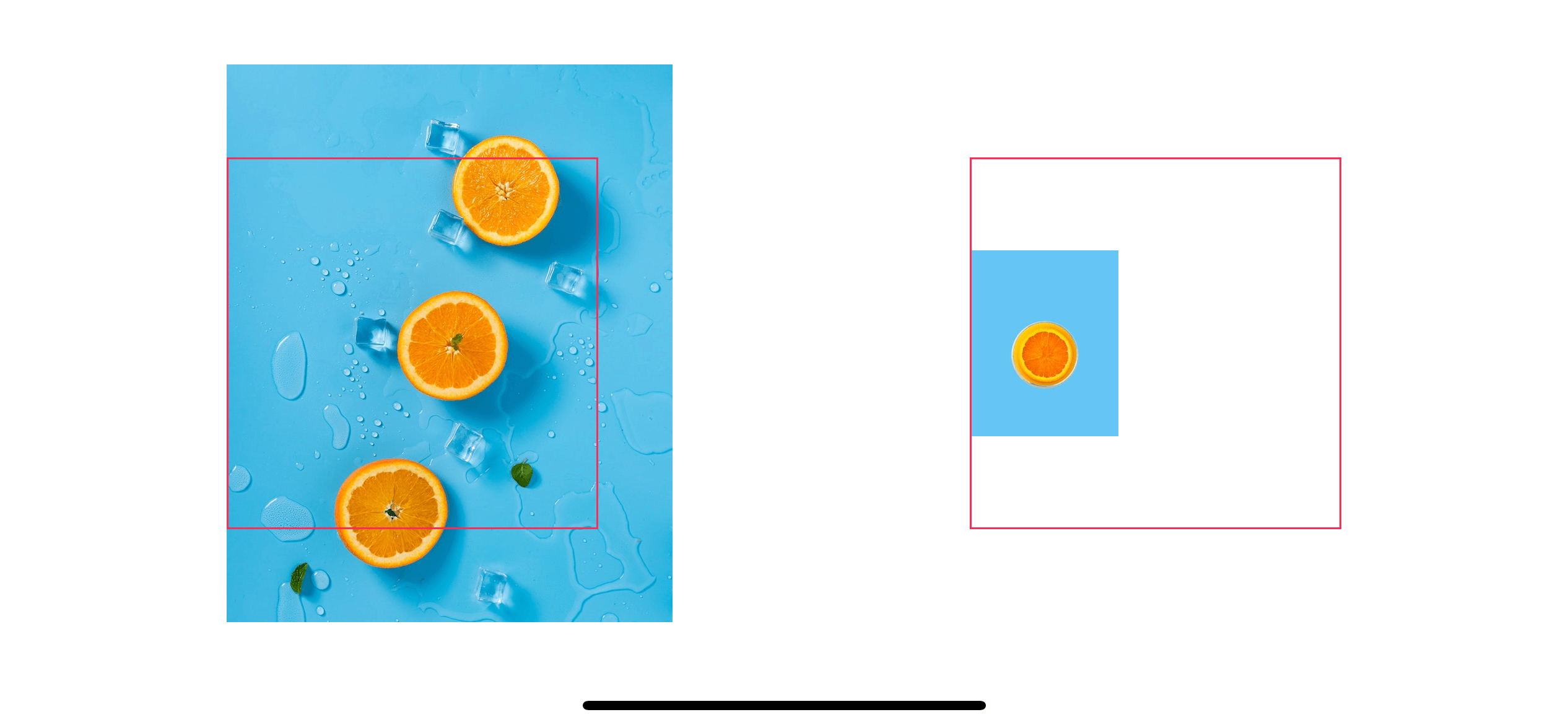
right
Image("contentmode-large")
    .frame(width: 200, height: 200, alignment: .trailing)
    .border(Color.pink)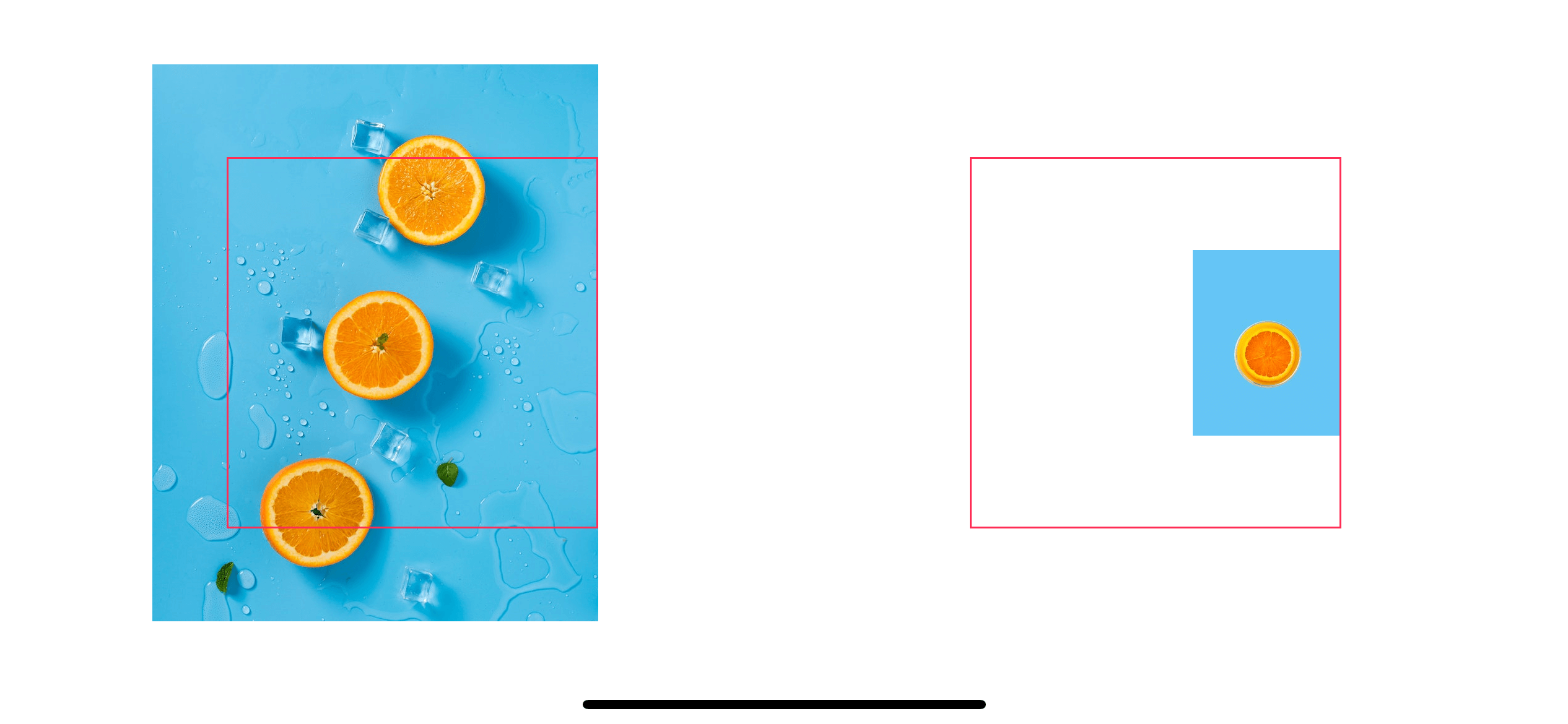
topLeft
Image("contentmode-large")
    .frame(width: 200, height: 200, alignment: .topLeading)
    .border(Color.pink)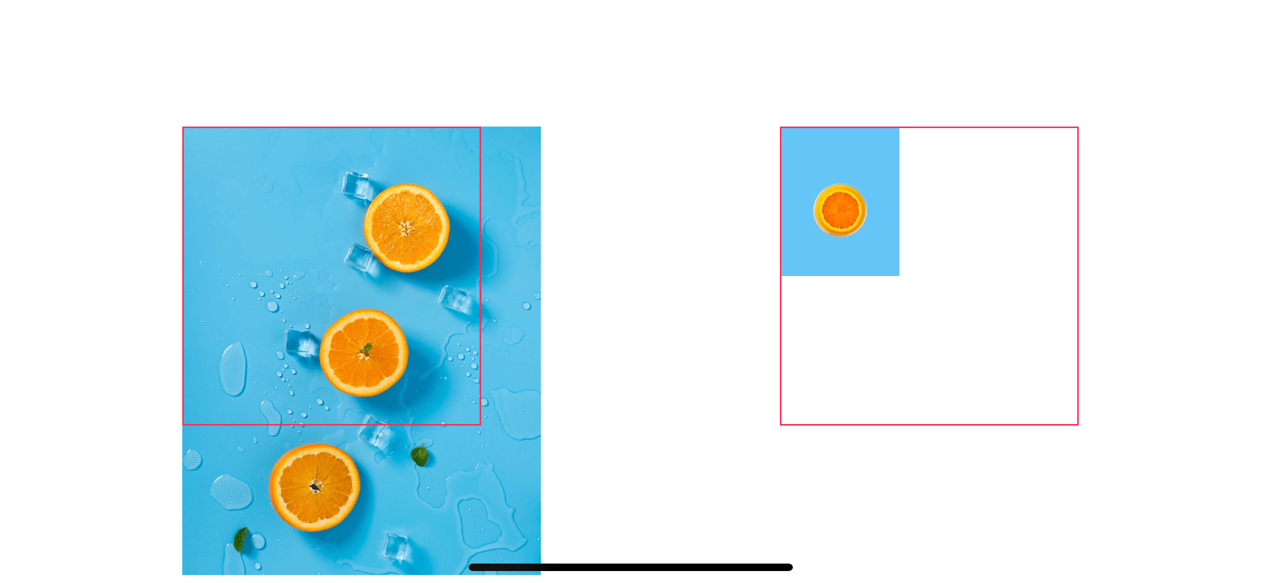
topRight
Image("contentmode-large")
    .frame(width: 200, height: 200, alignment: .topTrailing)
    .border(Color.pink)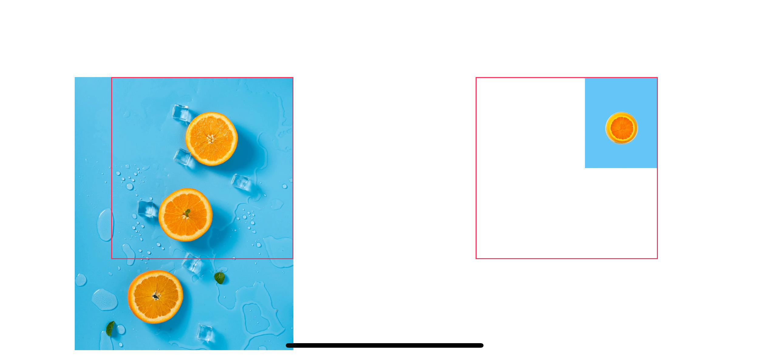
bottomLeft
Image("contentmode-large")
    .frame(width: 200, height: 200, alignment: .bottomLeading)
    .border(Color.pink)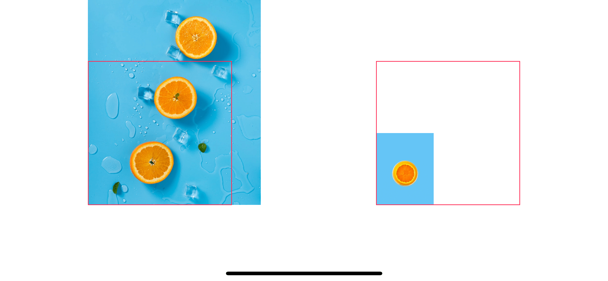
bottomRight
Image("contentmode-large")
    .frame(width: 200, height: 200, alignment: .bottomTrailing)
    .border(Color.pink)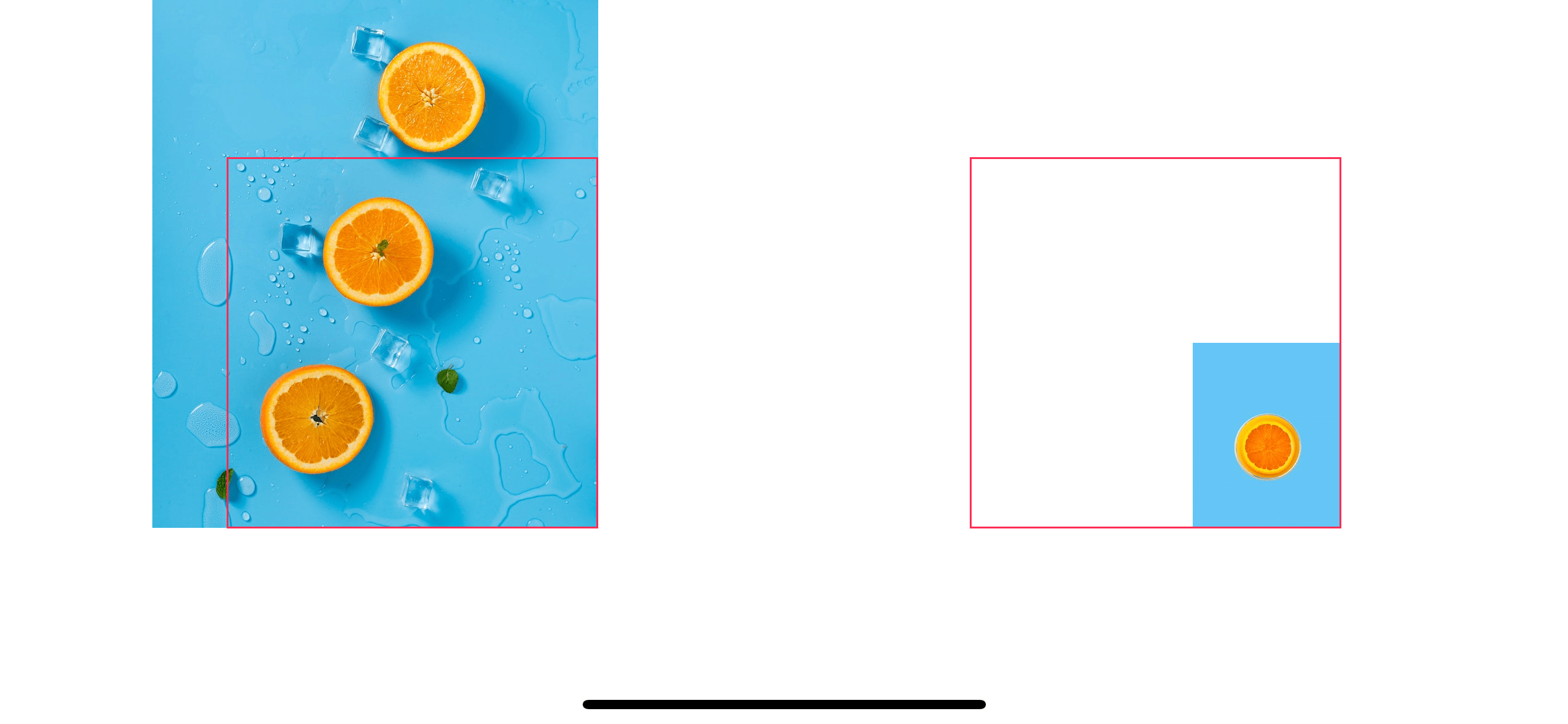
As you can see, the only difference here is we use leading instead of left and trailing instead of right.
Read more article about SwiftUI, Image, Resize, or see all available topic
Enjoy the read?
If you enjoy this article, you can subscribe to the weekly newsletter.
Every Friday, you'll get a quick recap of all articles and tips posted on this site. No strings attached. Unsubscribe anytime.
Feel free to follow me on Twitter and ask your questions related to this post. Thanks for reading and see you next time.
If you enjoy my writing, please check out my Patreon https://www.patreon.com/sarunw and become my supporter. Sharing the article is also greatly appreciated.
Become a patron Buy me a coffee Tweet ShareHow to add background to your view in SwiftUI
Learn how hard or easy it is to add a background view in SwiftUI.
How to resize an image view to fit a container view in SwiftUI
Learn how to fit an image view to any container.