What is a variant in SF Symbols
Table of Contents
What is a variant in SF Symbols
SF Symbols defines several design variants such as fill, slash, circle. The variant isn't a new concept in SF Symbols.
Before iOS 15, we refer to these variants by putting a variant name to the end of the base symbol name, e.g., heart.fill, heart.slash.
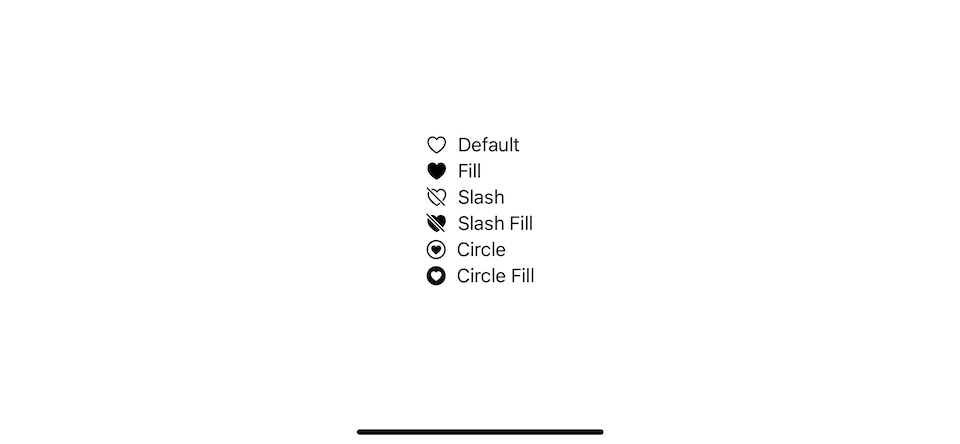
Here are some variations of a heart symbol.
VStack(alignment: .leading) {
    Label("Default", systemImage: "heart")
    Label("Fill", systemImage: "heart.fill")
    Label("Slash", systemImage: "heart.slash")
    Label("Slash Fill", systemImage: "heart.slash.fill")
    Label("Circle", systemImage: "heart.circle")
    Label("Circle Fill", systemImage: "heart.circle.fill")
}
You can see that symbol can have many variants (heart.fill, heart.slash) and even multiple variants simultaneously (heart.slash.fill).
All of these symbols are just a variation of the default symbol, "heart".
You can easily support sarunw.com by checking out this sponsor.
AI Grammar: Correct grammar, spell check, check punctuation, and parphrase.
Improvement in iOS 15
iOS 15, we have a new way to reference symbol variants without changing the name. We can do that with the symbolVariant(_:) modifier.
We have six SymbolVariants to choose from at the moment.
nonecirclesquarerectanglefillslash
Here is how we use symbolVariant(_:) to yeild the same result I show earlier.
VStack(alignment: .leading) {
    Label("Default", systemImage: "heart")
    Label("Fill", systemImage: "heart")
        .symbolVariant(.fill)
    Label("Slash", systemImage: "heart")
        .symbolVariant(.slash)
    Label("Slash Fill", systemImage: "heart")
        .symbolVariant(.slash.fill)
    Label("Circle", systemImage: "heart")
        .symbolVariant(.circle)
    Label("Circle Fill", systemImage: "heart")
        .symbolVariant(.circle.fill)
}
Instead of modifying the symbol name, we control a variant by setting the one you want via symbolVariant(_:) modifier.
You might wonder how this change is considered an improvement. It is even more verbose than the original implementation.
To understand the beauty of these changes, let's step back and learn the functions of variants.
What are usages of symbol variants
The default variant of most SF Symbols is an Outline style because it matches the appearance of a text (SF Pro font). But what about other variants? I think we can categorize variants into two groups by their usages.
- Variants that communicate states and actions.
- Variants which match visual UI elements or design language of platforms.
Variants that communicate states and actions
Variants can be used to communicate states and actions of UI elements. For example, you could use the slash variant to show that an item or action is unavailable.
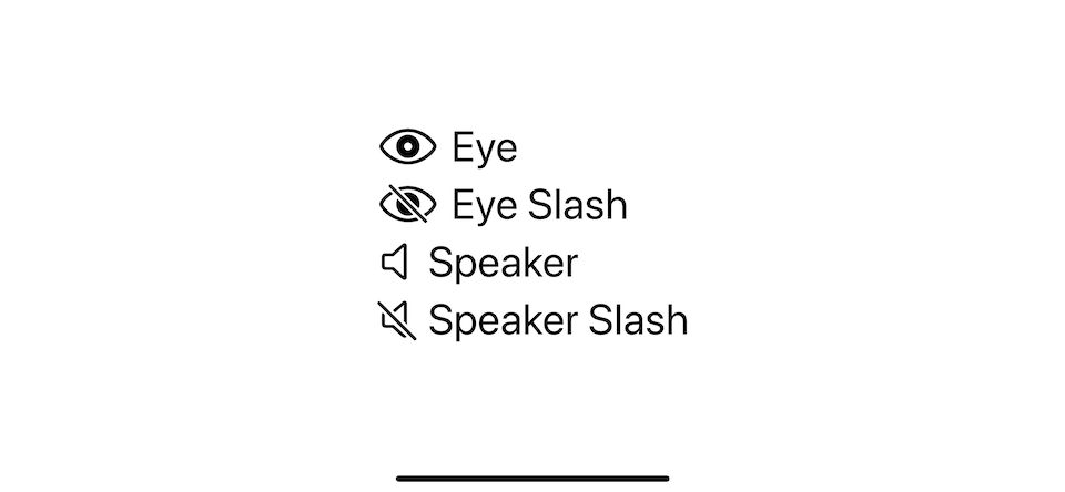
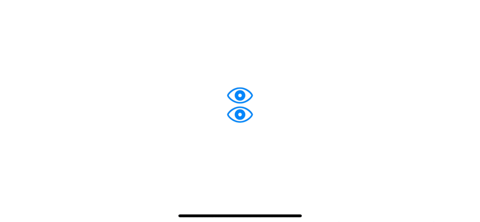
Here is an example where we use a slash to communicate visibility and mute state.
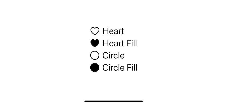
Another example is to use the fill variant to indicate selection.
We can use a fill variant with a heart symbol to show whether users like something. And we use a fill variant with a circle to represent a checkbox.
Variants for platforms and UI elements
Another usage of variant is its appearance. The default outline variant works well in toolbars, navigation bars, and other places displaying a symbol alongside text. On the other hand, the fill variant gives a symbol more visual emphasis, making it a good choice for iOS tab bars.
iOS Tab bar items usually use a fill style because it has a large solid area, which is good for communicating a selection state.
What makes the situation more complicated is that the visual for the same element might not be the same on the different platforms. The macOS tab bars in the preference window are usually present in an outline variant with a highlighted background for the selected state.
Benefits of symbolVariant(_:)
As you can see from the last section, variants are more dynamic than we thought.
It used to represent a state which likely to change back and forth during the lifetime of an app.
It is also possible for the same UI element to present in different variants depending on the platform.
This is where the new API shine. Let's compare how symbol variants can help us improve for each usage.
Changing states
Here is an example of using the .slash variant to show a visible and an invisible state.
struct ContentView: View {
    @State private var isVisible = false

    var body: some View {
        VStack {
            // New API
            Button {
                isVisible.toggle()
            } label: {
                Image(systemName: "eye")
                    .symbolVariant(isVisible ? .slash: .none)
            }
            // Old API
            Button {
                isVisible.toggle()
            } label: {
                Image(systemName: isVisible ? "eye.slash": "eye")
            }
        }
        .font(.largeTitle)
    }
}
Both methods achieve the same result.
The difference between an old and new API might look small, just changing from hard-coded string to view modifier. But it is quite an improvement if you ask me.
Since variant is now extracted from a string to a struct, SymbolVariants, it can be applied to any symbols without touching a symbol name.
Here is a naive implementation of SlashButton, which you can toggle between a slash and non-slash variant symbol.
struct SlashButton: View {
    @Binding var isSlash: Bool
    let systemName: String

    var body: some View {
        Button {
            isSlash.toggle()
        } label: {
            Image(systemName: systemName)
                .symbolVariant(isSlash ? .slash: .none)
        }
    }
}
We can use it like this. You can see that we don't have to worry about the name of the slash variant, "eye.slash".
SlashButton(isSlash: $isVisible, systemName: "eye")Platforms and UI dependent
The benefit of the symbol variant for this case is more prominent. Let's use tab bars as an example. Apple suggests that we should use the fill variant symbol for tab bars. The following are how we implement tab bars with and without a symbolVariant(_:).
Before iOS 15
Before iOS 15, you might need to do something like this.
TabView {
Label("photo.on.rectangle", systemImage: "photo.on.rectangle")
.tabItem {
Label("Library", systemImage: "photo.on.rectangle.fill")
}
Label("heart.text.square", systemImage: "heart.text.square")
.tabItem {
Label("For You", systemImage: "heart.text.square.fill")
}
Label("rectangle.stack", systemImage: "rectangle.stack")
.tabItem {
Label("Albums", systemImage: "rectangle.stack.fill")
}
Label("magnifyingglass", systemImage: "magnifyingglass")
.tabItem {
Label("Search", systemImage: "magnifyingglass.fill")
}
}
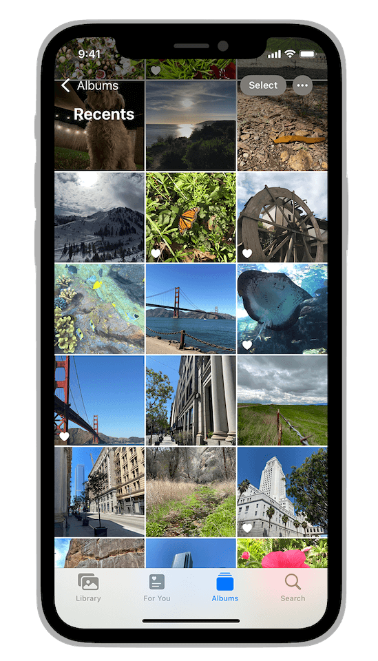
.font(.largeTitle)If you run the app, this is what you will get. The last tab bar has no image since we want to use a fill variant for symbols, but the magnifyingglass symbol doesn't have a fill variant.
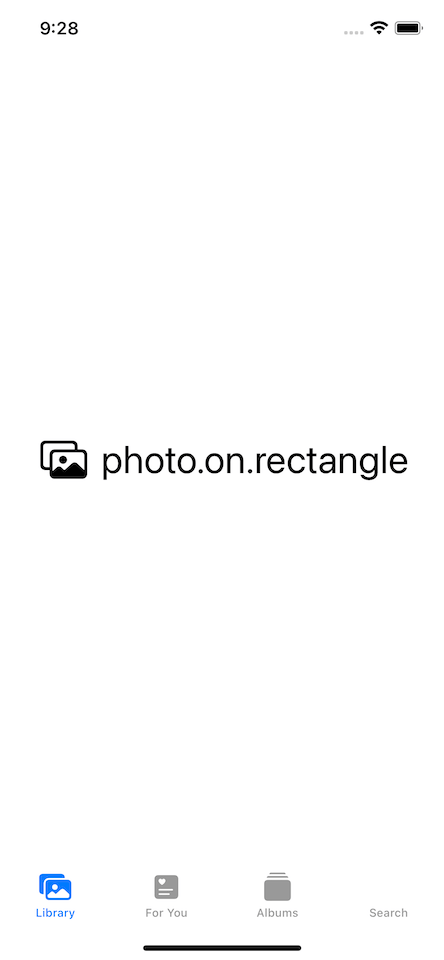
There are two problems right here.
- You need to know that you should use a fill variant for a tab bar in iOS. This might not be obvious for newcomers or those with no time to keep up with all the Apple guidelines.
- You have to figure out whether your symbols got a fill variant or not and if you somehow mistype it like our
magnifyingglass.fill, you will end up with an empty image.
iOS 15
In iOS 15, symbolVariant(_:) can greatly help us on this. You can apply .fill variant for all symbol by apply .symbolVariant(.fill) on a parent view, TabView.
TabView {
    Label("photo.on.rectangle", systemImage: "photo.on.rectangle")
        .tabItem {
            Label("Library", systemImage: "photo.on.rectangle")
        }
    Label("heart.text.square", systemImage: "heart.text.square")
        .tabItem {
            Label("For You", systemImage: "heart.text.square")
        }
    Label("rectangle.stack", systemImage: "rectangle.stack")
        .tabItem {
            Label("Albums", systemImage: "rectangle.stack")
        }
    Label("magnifyingglass", systemImage: "magnifyingglass")
        .tabItem {
            Label("Search", systemImage: "magnifyingglass")
        }
}
.symbolVariant(.fill)
.font(.largeTitle)
For symbols that don't support fill variant, like "magnifyingglass", remains unaffected.
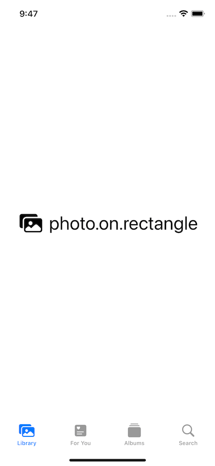
In fact, what I did in the above example is just for demonstration purposes. You don't even need to do that in iOS 15. SwiftUI is very smart. It automatically applies the right variant for UI elements. In this case, the fill variant is applied for items that appear in the content closure of the tab bar items of a TabView. So, you can remove .symbolVariant(.fill), and the result would be the same.
TabView {
    Label("photo.on.rectangle", systemImage: "photo.on.rectangle")
        .tabItem {
            Label("Library", systemImage: "photo.on.rectangle")
        }
    Label("heart.text.square", systemImage: "heart.text.square")
        .tabItem {
            Label("For You", systemImage: "heart.text.square")
        }
    Label("rectangle.stack", systemImage: "rectangle.stack")
        .tabItem {
            Label("Albums", systemImage: "rectangle.stack")
        }
    Label("magnifyingglass", systemImage: "magnifyingglass")
        .tabItem {
            Label("Search", systemImage: "magnifyingglass")
        }
}
.font(.largeTitle)
Content inside .tabItem automatically got a fill variant.

As you can see, the two problems that we mentioned earlier are gone.
We don't have to know which variant is suitable for which UI. We can just put a default version of a symbol, and SwiftUI will handle the rest for us.
And we don't need to care whether a symbol would break if the specified variant does not exist, as you can see from our magnifyingglass symbol. There are a few behaviors that you should know about symbolVariant(_:), which I'm going to go through in the next section.
You can easily support sarunw.com by checking out this sponsor.
AI Grammar: Correct grammar, spell check, check punctuation, and parphrase.
How to use symbolVariant(_:)
We have seen some behaviors of symbolVariant(_:) in previous examples, but let's repeat it for completeness.
Basic
Use symbolVariant(_:) modifier with a SymbolVariants value to make all the SF Symbols in that view hierarchy use the same variant.
We apply .symbolVariant(.fill) to the bottom HStack, so every symbol in that stack use the same variant, .fill.
VStack(spacing: 20) {
    HStack(spacing: 20) {
        Image(systemName: "heart")
        Image(systemName: "folder")
        Image(systemName: "person")
        Image(systemName: "magnifyingglass")
    }

    HStack(spacing: 20) {
        Image(systemName: "heart")
        Image(systemName: "folder")
        Image(systemName: "person")
        Image(systemName: "magnifyingglass")
    }
    .symbolVariant(.fill) // Shows filled variants, when available.
}
.font(.largeTitle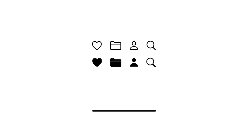
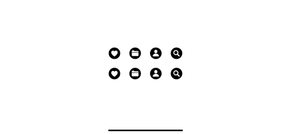
Accumulate effect
If you apply the modifier more than once, its effects accumulate. Alternatively, you can apply multiple variants in one call.
VStack(spacing: 20) {
    HStack(spacing: 20) {
        Image(systemName: "heart")
        Image(systemName: "folder")
        Image(systemName: "person")
        Image(systemName: "magnifyingglass")
    }
    // 1
    .symbolVariant(.circle.fill)

    HStack(spacing: 20) {
        Image(systemName: "heart")
        Image(systemName: "folder")
        Image(systemName: "person")
        Image(systemName: "magnifyingglass")
    }
    // 2
    .symbolVariant(.circle)
    .symbolVariant(.fill)
}
.font(.largeTitle)
1 Apply multiple variants in one call.
2 The effect from two modifiers is added up.
The result from both .symbolVariant(.circle.fill) and .symbolVariant(.circle).symbolVariant(.fill) are the same.
Order
Most of the time, the order of SymbolVariants doesn't matter, and it doesn't need to match the real symbol's name.
For example, the "heart.circle.fill" symbol can be build from both Image(systemName: "heart").symbolVariant(.circle.fill) and Image(systemName: "heart").symbolVariant(.fill.circle).
The only case where the order is matters is when you apply more than one shape variant. The one closest to the symbol takes precedence.
For example, the following images got all three shape variants, but render differently.
 VStack(spacing: 20) {
    VStack(spacing: 20) {
        Image(systemName: "heart")
            .symbolVariant(.square) // This shape takes precedence for the first heart.
        Image(systemName: "heart")
    }
    .symbolVariant(.circle) // This shape takes precedence for the second heart.
    Image(systemName: "heart")
}
.symbolVariant(.rectangle) // This shape takes precedence for the third heart.
.symbolVariant(.square)
.symbolVariant(.circle)
.font(.largeTitle)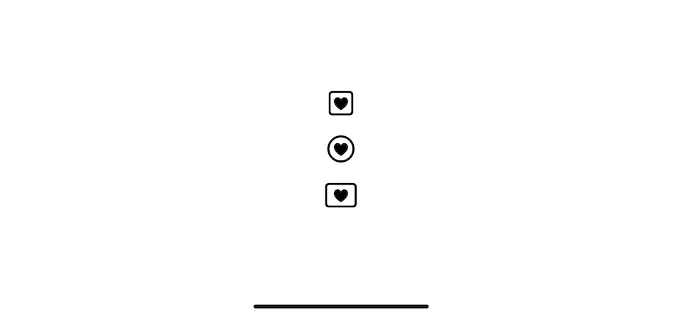
Opt-out
You can clear a variant effect by directly setting the symbolVariants environment value to .none.
In this example all symbols got the .fill variant from the parent. Set .symbolVariant(.none) won't work due to accumulate effect. The only way to clear variants and start fresh is by setting .environment(\.symbolVariants, .none).
HStack {
    Image(systemName: "heart")
    Image(systemName: "heart")
        .symbolVariant(.none) // This won't work
    Image(systemName: "heart")
        .environment(\.symbolVariants, .none)
}
.symbolVariant(.fill)
.font(.largeTitle)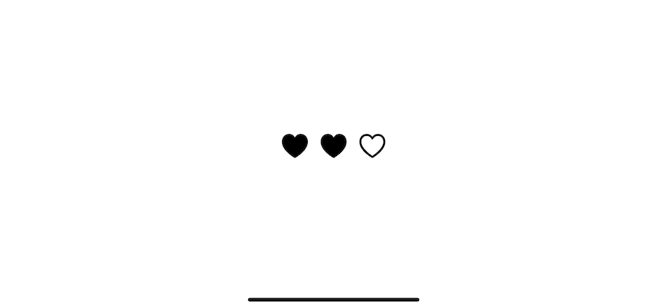
Read more article about SwiftUI, SF Symbols, or see all available topic
Enjoy the read?
If you enjoy this article, you can subscribe to the weekly newsletter.
Every Friday, you'll get a quick recap of all articles and tips posted on this site. No strings attached. Unsubscribe anytime.
Feel free to follow me on Twitter and ask your questions related to this post. Thanks for reading and see you next time.
If you enjoy my writing, please check out my Patreon https://www.patreon.com/sarunw and become my supporter. Sharing the article is also greatly appreciated.
Become a patron Buy me a coffee Tweet ShareHow to decode enums ignoring case in Swift Codable
Learn how to make a case insensitive enum.
What is image rendering mode in iOS
When using an image in iOS, you have an opportunity to control how you want the image to be rendered. Most of the time, you don't need to care about this, but when images do not render the way you want, make sure you know how to customize them.