Gradient in SwiftUI
Table of Contents
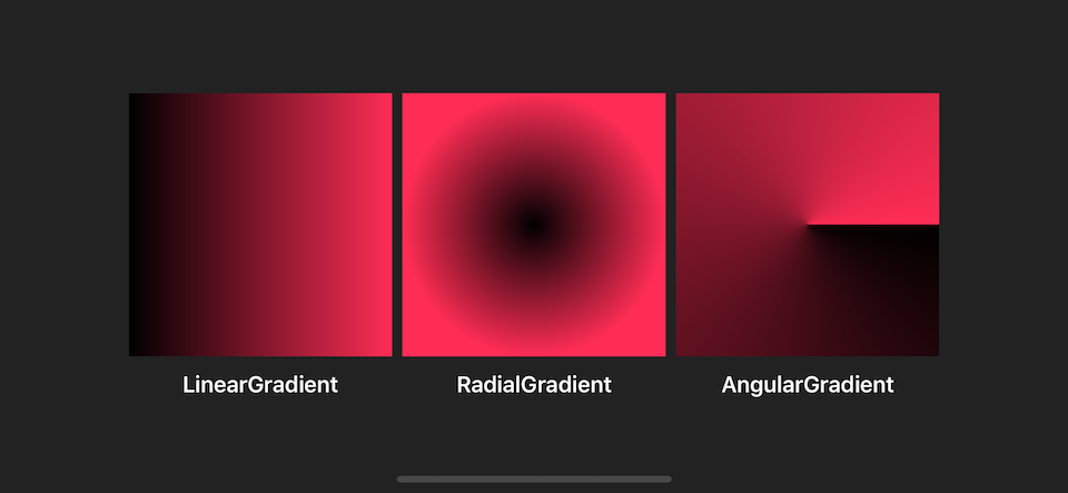
SwiftUI has a built-in way to apply gradient color to its view. There are three types of gradients:
Following is what they look like:
Before we visit each gradient, let's begin with a component that they have in common, Gradient.
Gradient
Gradient is a struct holding information for rendering all types of a gradient represented as an array of color stops. Gradient.Stop is a struct represented each color and location (in range of 0 to 1) in a gradient.
You can initialize it with Gradient.Stop like this:
Gradient(stops: [.init(color: .black, location: 0),
                 .init(color: .pink, location: 0.5)
You can also initialize it with Color if you want all **Gradient.Stop **'s location to be equally distributed.
Gradient(colors: [.black, .pink])
// Which is equavalent to
Gradient(stops: [.init(color: .black, location: 0),
                 .init(color: .pink, location: 1)
It can contain more than two stops.
Gradient(colors: [.black, .pink, .black])The following are examples of different ways to initialize Gradient.
let gradient = Gradient(colors: [.black, .pink])
let gradient2 = Gradient(colors: [.black, .pink, .black])
let gradient3 = Gradient(stops: [.init(color: .black, location: 0),
                                  .init(color: .pink, location: 0.5)
])
Now we know how to define a gradient; let's go through every type of gradient SwiftUI provided.
You can easily support sarunw.com by checking out this sponsor.
Translate your app In 1 click: Simplifies app localization and helps you reach more users.
LinearGradient
This is the most common type of gradient. It is the one I use to render examples above.
The gradient applies the color function along an axis, as defined by its start and end points. The gradient maps the unit-space points into the bounding rectangle of each shape filled with the gradient.
In short, you specify the start and end points of the gradient with UnitPoint, a struct represented x, y coordinate space (range from 0 to 1), and gradient stop will be rendered along that path based on each stop's location.
SwiftUI has predefined UnitPoint, .zero, .center, leading, trailing, top, bottom, topLeading, topTrailing, bottomLeading, and bottomTrailing. You can create your own UnitPoint like a normal struct if you have a special need.
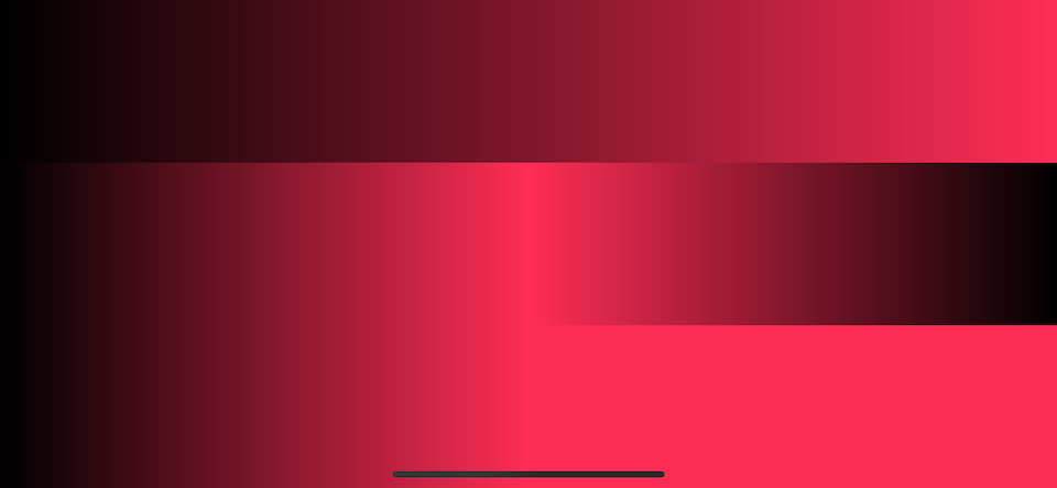
UnitPoint(x: 1, y: 0) // .topTrailingThe following is an example of a different setup of LinearGradient.
let gradient = Gradient(colors: [.black, .pink])

LinearGradient(gradient: gradient, startPoint: .leading, endPoint: .topTrailing)
LinearGradient(gradient: gradient, startPoint: .top, endPoint: .bottom)
LinearGradient(gradient: gradient, startPoint: .bottomTrailing, endPoint: .topLeading)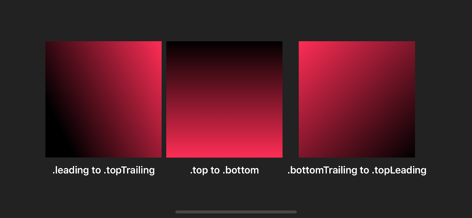
RadialGradient
The gradient applies the color function as the distance from a center point, scaled to fit within the defined start and end radii. The gradient maps the unit-space center point into the bounding rectangle of each shape filled with the gradient.
RadialGradient might looks different from LinearGradient, but the concept is quite the same. The only difference is instead of define starting and ending points, you define start radius, end radius, and the center of the gradient. The gradient will be drawn as circular around the center and move outward to the end radius.
RadialGradient(gradient: gradient, center: .center, startRadius: 1, endRadius: 100)center is UnitPoint like the one we discussed in LinearGradient. startRadius and endRadius are CGFloat represents radius in points.
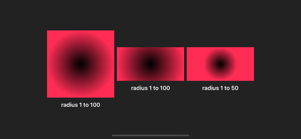
The following is an example of a different setup of RadialGradient.
struct RadialSample: View {
    let gradient = Gradient(colors: [.black, .pink])

    var body: some View {
        HStack {
            VStack {
                Rectangle()
                    .fill(
                        RadialGradient(gradient: gradient, center: .center, startRadius: 1, endRadius: 100)
                )
                    .frame(width: 200, height: 200)
                Text("radius 1 to 100")
                    .fontWeight(.semibold)
                    .foregroundColor(.white)
            }
            VStack {
                Rectangle()
                    .fill(
                        RadialGradient(gradient: gradient, center: .center, startRadius: 1, endRadius: 100)
                )
                    .frame(width: 200, height: 100)
                Text("radius 1 to 100")
                    .fontWeight(.semibold)
                    .foregroundColor(.white)
            }
            VStack {
                Rectangle()
                    .fill(
                        RadialGradient(gradient: gradient, center: .center, startRadius: 1, endRadius: 50)
                )
                    .frame(width: 200, height: 100)
                Text("radius 1 to 50")
                    .fontWeight(.semibold)
                    .foregroundColor(.white)
            }
        }
    }
}
AngularGradient
An angular gradient is also known as a “conic” gradient. This gradient applies the color function as the angle changes, relative to a center point and defined start and end angles. If endAngle - startAngle > 2π, the gradient only draws the last complete turn. If endAngle - startAngle < 2π, the gradient fills the missing area with the colors defined by gradient locations one and zero, transitioning between the two halfway across the missing area. The gradient maps the unit-space center point into the bounding rectangle of each shape filled with the gradient.
AngularGradient applies the color as the angle changes; you define the start and end angle which gradient will be applied to.
There are a few variables you can initialize AngularGradient.
The following is the simplest form. You define a center of the circle, and the gradient will start from 0 degrees (the rightmost), and the remaining colors will be drawn clockwise until it completes the circle.
AngularGradient(gradient: gradient, center: .center)
If you don't want to start from 0 degrees, you can use the second form where you can specify angle (start angle).
AngularGradient(gradient: gradient, center: .center, angle: .degrees(90))
If you want to specify the end angle, you have to use the last form where you define startAngle and endAngle.
AngularGradient(gradient: gradient, center: .center, startAngle: .degrees(90), endAngle: .degrees(180))
It is easier to see it in action.
struct AngularSample: View {
    let gradient = Gradient(colors: [.red, .orange, .yellow, .green, .blue, .purple])

    var body: some View {
        HStack {
            VStack {
                Rectangle()
                    .fill(
                        AngularGradient(gradient: gradient, center: .center)
                )
                .frame(width: 200, height: 200)
            }
            VStack {
                Rectangle()
                    .fill(
                        AngularGradient(gradient: gradient, center: .center, angle: .degrees(90))
                )
                .frame(width: 200, height: 200)
            }
            VStack {
                Rectangle()
                    .fill(
                        AngularGradient(gradient: gradient, center: .center, startAngle: .degrees(90), endAngle: .degrees(180))
                )
                .frame(width: 200, height: 200)
            }
        }
    }
}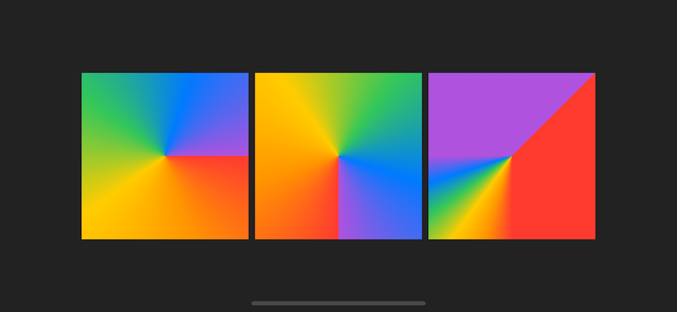
The definition of start and end angle is quite confusing, let's revisit them case by case.
End angle - start angle = 2π
This is a normal case where the start and end angle make a complete circle. Every color will evenly distribute.
AngularGradient(gradient: gradient, center: .center)
AngularGradient(gradient: gradient, center: .center, angle: .degrees(0))
AngularGradient(gradient: gradient, center: .center, startAngle: .degrees(0), endAngle: .degrees(360))
End angle - start angle > 2π
This is a case where the total angle is more than a circle. The extra angle will eat up the first circle portion.
The following are examples of angular gradients.
AngularGradient(gradient: gradient, center: .center, startAngle: .degrees(0), endAngle: .degrees(360))
AngularGradient(gradient: gradient, center: .center, startAngle: .degrees(0), endAngle: .degrees(360 + 45))
AngularGradient(gradient: gradient, center: .center, startAngle: .degrees(0), endAngle: .degrees(360 + 360))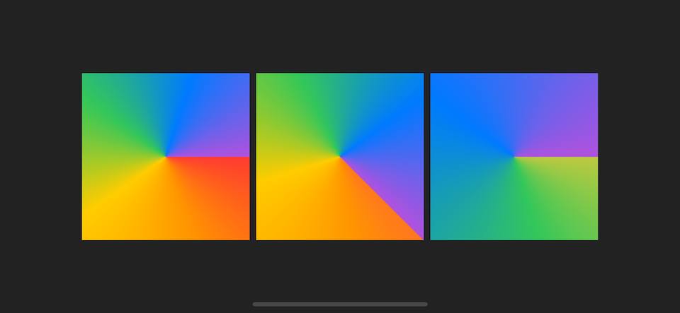
I want you to focus on the last example where the end angle is 360 + 360 degrees, which is two circles. You will only see three colors (green, blue, purple) in this case since six colors gradient are render in a total angle of 2 circles, so the first three colors (red, orange, yellow) will be painted on the first circle which will be covered by the second circle. That's why you only see three final colors (green, blue, purple) with a little bit of yellow (last color of the first circle) at the very beginning.
End angle - start angle < 2π
The last case is where the start and end angle does not make a complete circle. The missing area (between start and end) will be evenly painted with the first and the last color of the gradient.
AngularGradient(gradient: gradient, center: .center, startAngle: .degrees(-90), endAngle: .degrees(180))
AngularGradient(gradient: gradient, center: .center, startAngle: .degrees(0), endAngle: .degrees(90))
AngularGradient(gradient: gradient, center: .center, startAngle: .degrees(90), endAngle: .degrees(270))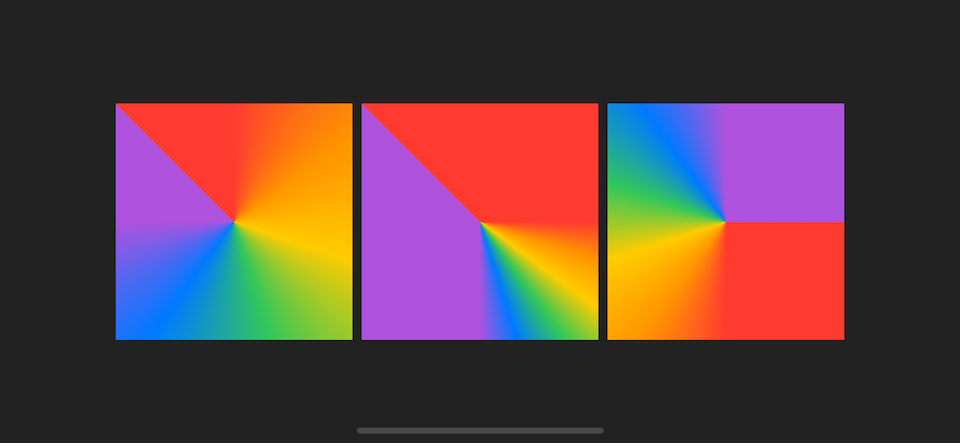
How to use these gradients?
All of these gradients are ShapeStyle and View protocol, so you can use them where ever expected those two protocols.
Common places I can think of right now are a standalone View, argument for .background, argument for .fill and .stroke of a Shape.
You can easily support sarunw.com by checking out this sponsor.
Translate your app In 1 click: Simplifies app localization and helps you reach more users.
Related Resources
Read more article about SwiftUI, Gradient, or see all available topic
Enjoy the read?
If you enjoy this article, you can subscribe to the weekly newsletter.
Every Friday, you'll get a quick recap of all articles and tips posted on this site. No strings attached. Unsubscribe anytime.
Feel free to follow me on Twitter and ask your questions related to this post. Thanks for reading and see you next time.
If you enjoy my writing, please check out my Patreon https://www.patreon.com/sarunw and become my supporter. Sharing the article is also greatly appreciated.
Become a patron Buy me a coffee Tweet ShareSwiftUI basic Shape operations
Most complex custom views can be made by composing many basic shapes together. Today we will learn basic operations that we can do with them. It may seem trivial, but knowing these basics will benefit you in the future.
Testing Remote Push Notification in iOS simulator
A new and easier way to test Apple push notification on iOS simulator.