Size classes on iPhone Duo
Table of Contents
iPhone Duo has two displays: a small outer display you use folded, and a large inner display you use half-open or open.
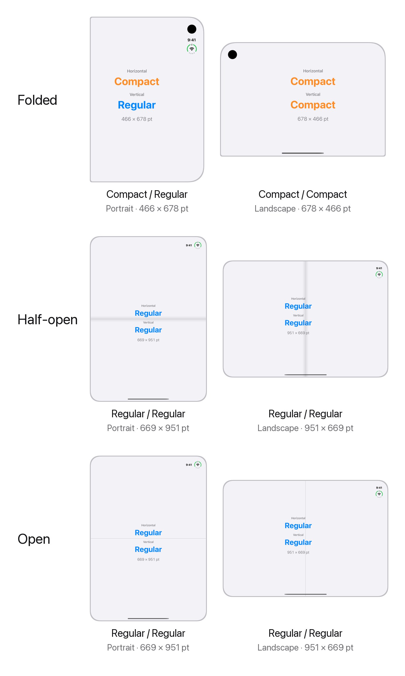
This is a quick reference for the size classes you get in each pose and orientation.
Size classes in each pose
| Pose | Orientation | Horizontal | Vertical | Size (points) |
|---|---|---|---|---|
| Folded | Portrait | Compact | Regular | 466 × 678 |
| Folded | Landscape | Compact | Compact | 678 × 466 |
| Half-open | Portrait | Regular | Regular | 669 × 951 |
| Half-open | Landscape | Regular | Regular | 951 × 669 |
| Open | Portrait | Regular | Regular | 669 × 951 |
| Open | Landscape | Regular | Regular | 951 × 669 |
You can easily support sarunw.com by checking out this sponsor.

AI Grammar: Correct grammar, spell check, check punctuation, and parphrase.
What to take from it
- Folded, it's an iPhone. The outer display gives the same size classes as most iPhones: compact width in portrait, and compact in both directions in landscape.
- Unfolded, it's an iPad. The inner display is regular in both directions, in either orientation.
- The hinge angle doesn't matter. Half-open and open give the same size classes and the same size. If you need to know about the fold, size classes won't tell you.
So if your layout already switches on size class, iPhone Duo gets your iPhone layout on the outer display and your iPad layout on the inner display.
Read them
In SwiftUI, read both from the environment:
struct ContentView: View {
    @Environment(\.horizontalSizeClass) private var horizontalSizeClass
    @Environment(\.verticalSizeClass) private var verticalSizeClass

    var body: some View {
        if horizontalSizeClass == .compact && verticalSizeClass == .compact {
            // Folded, landscape.
        }
    }
}
In UIKit, use traitCollection.horizontalSizeClass and traitCollection.verticalSizeClass.
You can easily support sarunw.com by checking out this sponsor.
AI Grammar: Correct grammar, spell check, check punctuation, and parphrase.
Inside ArrangementView
The table is for the whole window. Inside an ArrangementView, each pane gets its own size classes based on its own size.
For example, folded in portrait, ArrangementView stacks two views. The bottom view reads compact in both directions, even though the display is compact and regular.
If you need the display's size classes, read them outside the ArrangementView.
Read more article about iOS, SwiftUI, UIKit, or see all available topic
Enjoy the read?
If you enjoy this article, you can subscribe to the weekly newsletter.
Every Friday, you'll get a quick recap of all articles and tips posted on this site. No strings attached. Unsubscribe anytime.
Feel free to follow me on Twitter and ask your questions related to this post. Thanks for reading and see you next time.
I also make short videos and visual guides on Patreon. Some things are easier to see than to read, like how an API looks and moves on a real screen. If you like to learn that way, come and watch. Sharing the article is also greatly appreciated.
Become a patron Tweet SharePlace a sheet on one side with presentationPlacement on iPhone Duo
iOS 27 lets you put a sheet on the leading or trailing side of the screen. See what each placement does on iPhone Duo when it is open, half-open, and closed.