Place a sheet on one side with presentationPlacement on iPhone Duo
Table of Contents
On a regular iPhone, a sheet fills the width of the screen, so there is nothing to place. On an open iPhone Duo, the screen is wide, and a sheet only takes part of it.
iOS 27 lets you choose which side that sheet sits on:
- SwiftUI:
presentationPlacement(_:) - UIKit:
UISheetPresentationController.preferredPlacement
How to use presentationPlacement
Like the other presentation modifiers, it goes on the content of the sheet, not on the view that presents it.
.sheet(isPresented: $showNewList) {
    NewListView()
        .presentationPlacement(.trailing)
}
There are four placements:
| Placement | What it asks for |
|---|---|
.automatic |
The system decides. This is the default. |
.leading |
The leading edge of the screen. |
.center |
The middle of the screen. |
.trailing |
The trailing edge of the screen. |
.leading, .center, and .trailing are iOS only. On macOS, tvOS, watchOS, and visionOS, you only get .automatic.
You can easily support sarunw.com by checking out this sponsor.

AI Paraphrase:Are you tired of staring at your screen, struggling to rephrase sentences, or trying to find the perfect words for your text?
Fully open
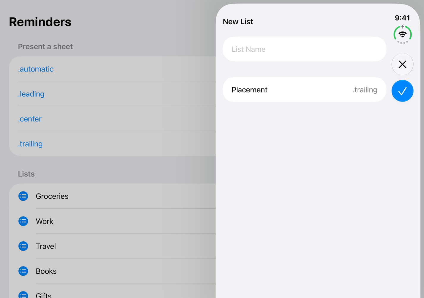
This is where the placement shows the most.
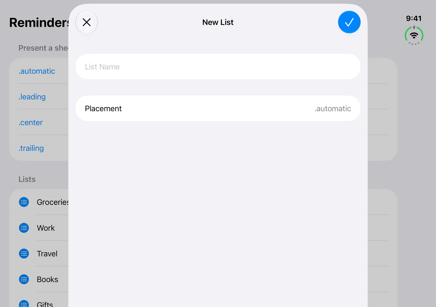
With .automatic, the sheet sits in the middle, with the app visible on both sides. .center looks the same.
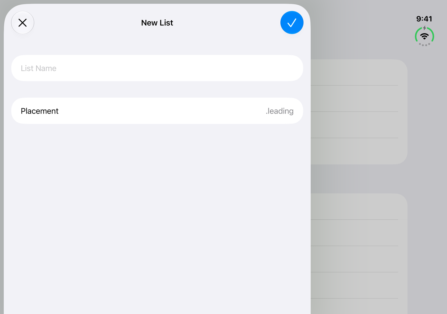
.leading moves the sheet to the leading edge, the left edge in a left-to-right language.
.trailing moves it to the trailing edge, on the right. That edge is where iPhone Duo puts its vertical bar, so the sheet's Close and Done buttons move into the vertical bar too.
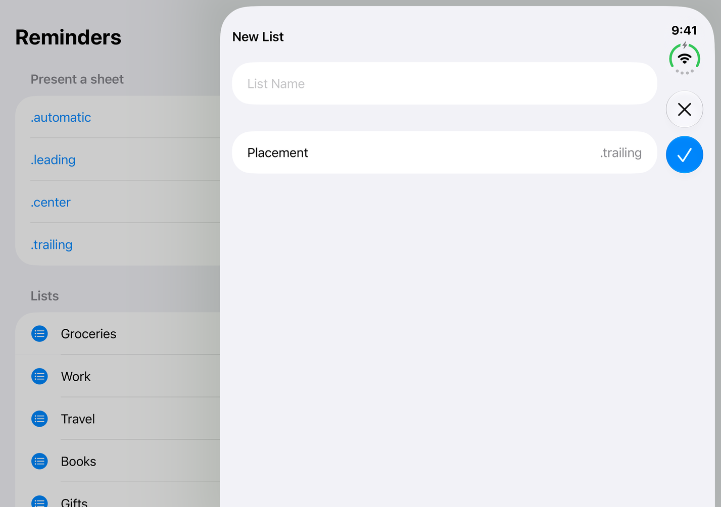
So the placement also decides how the toolbar looks. A sheet on the left keeps a horizontal toolbar at the top. A sheet on the right gets vertical controls. I covered that rule in Opt in to vertical bars on iPhone Duo.
Half-open
When iPhone Duo is partially folded, a sheet doesn't sit across the fold. That is the fold avoidance Apple describes for system components. So the sheet takes one half of the screen.
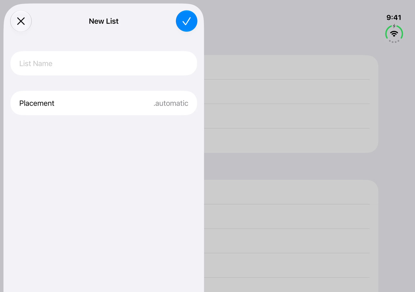
With .automatic, it goes to the left half.
.trailing puts it on the right half, with the controls in the vertical bar.
.center can't stay in the middle, because the middle is the fold. The sheet goes to the left half, the same as .automatic and .leading.
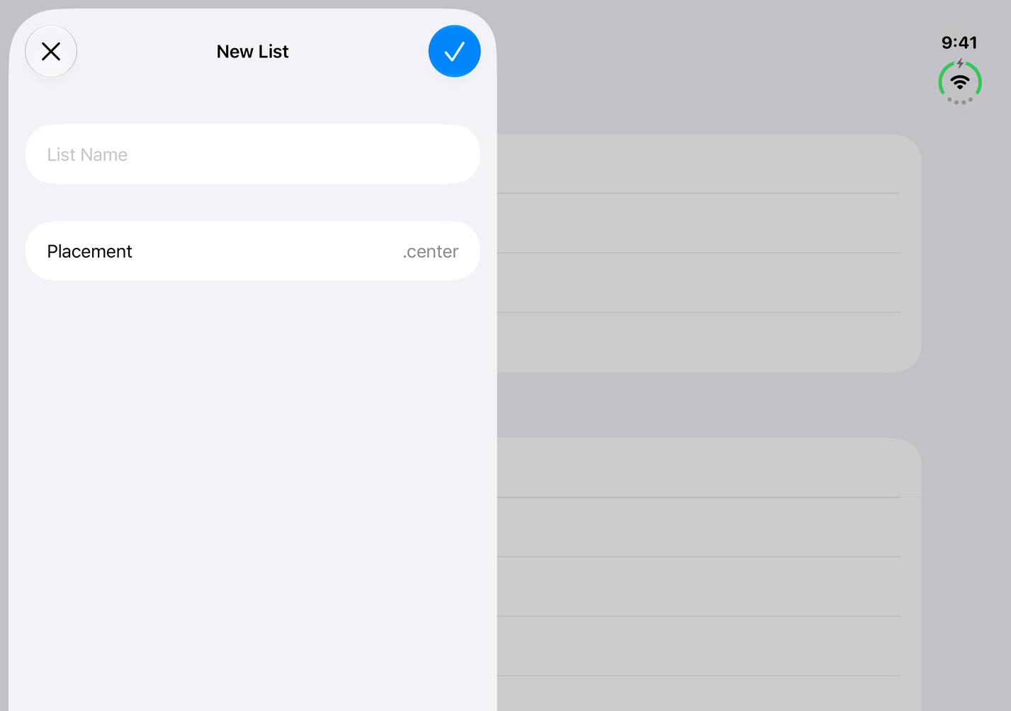
The placement is a preference, not a promise. The system still keeps the sheet off the fold.
Closed, and on other iPhones
On the outer display, the sheet fills the screen. The placement makes no difference. .leading and .trailing look the same. The controls go into the vertical bar, as they do for any sheet with a toolbar on the outer display.
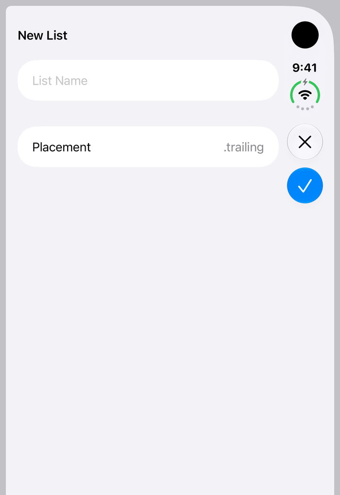
It is the same on a regular iPhone. The sheet fills the width in both portrait and landscape, whatever the placement. You can add the modifier without checking which device you are on.
UIKit
In UIKit, set preferredPlacement on the sheet presentation controller before you present.
let newList = UINavigationController(rootViewController: NewListViewController())
if let sheet = newList.sheetPresentationController {
    sheet.preferredPlacement = .trailing
}
present(newList, animated: true)
The values are the same four: .automatic, .leading, .center, and .trailing.
According to the UIKit header, preferredPlacement is ignored when sourceView is set. A sheet with a source view centers itself over that view instead.
When to use it
The default is a good choice for most sheets. Reach for a placement when the side matters, for example:
.trailing, when the sheet's actions should sit in the vertical bar, like the rest of your app's controls on the open device..leading, when the sheet should keep a regular horizontal toolbar..leadingor.trailing, to keep one side of your layout visible next to the sheet.
You can easily support sarunw.com by checking out this sponsor.
AI Paraphrase:Are you tired of staring at your screen, struggling to rephrase sentences, or trying to find the perfect words for your text?
Summary
presentationPlacement(_:)in SwiftUI andpreferredPlacementin UIKit choose the side of a sheet. They are new in iOS 27.- They make a difference on an open iPhone Duo, where the sheet doesn't fill the screen.
.trailingputs the sheet next to the vertical bar, so its controls become vertical..leadingkeeps them horizontal.- When half-open, the sheet takes one half.
.centercan't sit over the fold and goes to the left half. - Closed, and on a regular iPhone, the sheet fills the width, so the placement has no effect.
Read more article about iOS, SwiftUI, UIKit, or see all available topic
Enjoy the read?
If you enjoy this article, you can subscribe to the weekly newsletter.
Every Friday, you'll get a quick recap of all articles and tips posted on this site. No strings attached. Unsubscribe anytime.
Feel free to follow me on Twitter and ask your questions related to this post. Thanks for reading and see you next time.
I also make short videos and visual guides on Patreon. Some things are easier to see than to read, like how an API looks and moves on a real screen. If you like to learn that way, come and watch. Sharing the article is also greatly appreciated.
Become a patron Tweet ShareWhen toolbar items share a glass background in iOS 26
In iOS 26, toolbar items next to each other merge into one Liquid Glass capsule. Learn which items merge, which ones stand alone, and how to split them with ToolbarSpacer.