Adapt custom toolbar views for iPhone Duo
Table of Contents
Part 3 in the series "Vertical bars on iPhone Duo", based on Apple's Raise the bar with iPhone Duo talk.
- Opt in to vertical bars on iPhone Duo
- Prepare toolbar items for a vertical bar
- Adapt custom toolbar views for iPhone Duo
- Toolbar overflow and visibility priority on iPhone Duo
In the previous article, we learned how to control system items in the bar.
In this article, we'll have a quick look at what we can do for a custom item.
Custom means the content, not the bar. The view still has to live in a system toolbar: .toolbar on a NavigationStack, or items on a UINavigationController. A homemade UIToolbar or a panel you overlay on the screen stays where you put it. Duo only moves bars it owns.
That's the same rule as the first article. Nothing here changes it.
How to make a custom toolbar view adopt vertical
A custom view needs two things to work in a vertical bar:
.axisBehavior(.verticalPreferred), so the system is allowed to place it on the vertical axis.- A different layout, so the view actually fits that axis.
You can easily support sarunw.com by checking out this sponsor.

Translate your app In 1 click: Simplifies app localization and helps you reach more users.
Set axis behavior
The system doesn't know whether your view is ready to adapt to vertical or not. By default, it keeps the custom view horizontal.
The way to tell that you're ready is to set .axisBehavior(.verticalPreferred):
// SwiftUI
.toolbar {
    ToolbarItem(placement: .bottomBar) {
        CustomPanel()
    }
    .axisBehavior(.verticalPreferred)
}
// UIKit
let item = UIBarButtonItem(customView: CustomPanel())
item.axisBehavior = .verticalPreferredFailing to set this flag, your item stays horizontal even if your view already adapts to vertical.
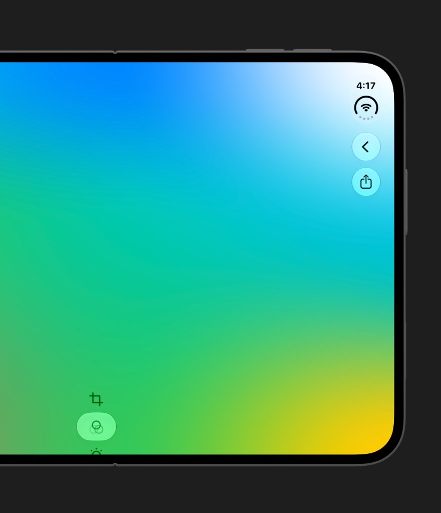
.axisBehavior(.verticalPreferred), the custom panel stays horizontal.Fit the fixed width, or change your layout
A vertical bar has a fixed width and flexible height, the opposite of a horizontal bar.
Once you opt in, the custom view has to do one of two things:
- Fit within the bar's fixed width.
- Lay itself out differently when it's vertical.
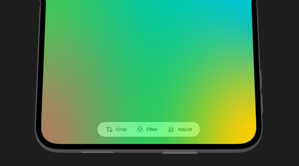
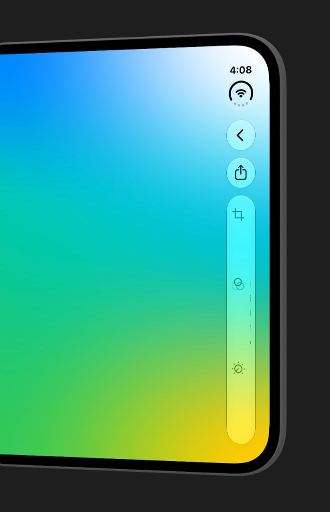
Here is an example of a custom panel with a horizontal icon and title. When it goes vertical it can hide its titles and become slightly shorter, which leaves more room in the bar for other content. Same view, different proportions, chosen for the axis it's on.
Failing to adapt the layout might cause a weird result like this.
Read the vertical bar edge
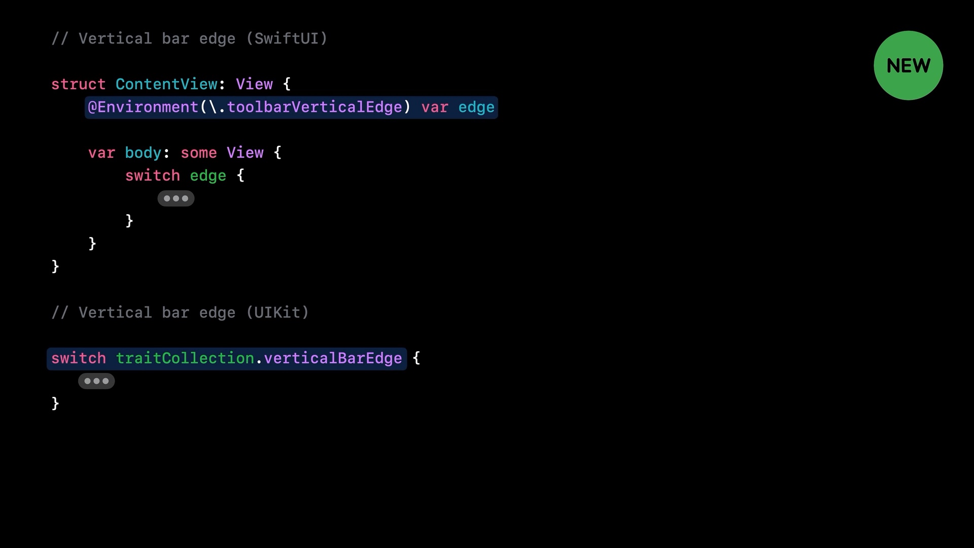
To read whether our control is on the vertical edge or not, we read it from the .toolbarVerticalEdge environment property in SwiftUI, or the trait in UIKit.
// SwiftUI
struct ContentView: View {
    @Environment(\.toolbarVerticalEdge) var edge

    var body: some View {
        switch edge {
        // ...
        }
    }
}
// UIKit
switch traitCollection.verticalBarEdge {
// ...
}
Backgrounds and legibility
By default, a vertical bar has no scroll edge effect, the same as a horizontal bar. Your view sits over whatever content is behind it.
There is one case where that changes: when Reduce Transparency is turned on, the bar gets a background.
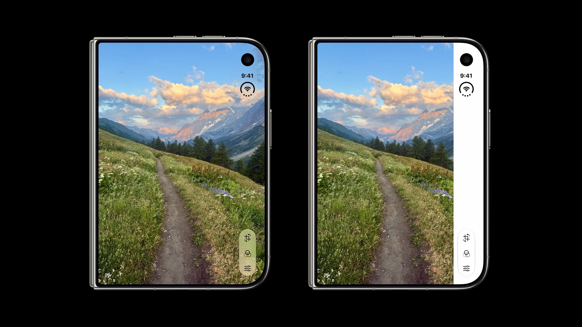
Make sure your custom view's content stays readable either way. It's easy to design against the transparent case only and find the view disappears into the background when someone turns the accessibility setting on.
You can easily support sarunw.com by checking out this sponsor.
Translate your app In 1 click: Simplifies app localization and helps you reach more users.
Summary
A custom view still has to live in a system toolbar. Opting it into the vertical bar is the easy part. The view needs to fit a fixed width or change its layout, and it may want different metrics when vertical. Read toolbarVerticalEdge in SwiftUI or verticalBarEdge in UIKit to know which case you're in, and keep your content legible when Reduce Transparency adds a background.
In the last article, we deal with the case where everything no longer fits: overflow, visibility priority, and when to turn vertical bars off.
Read more article about iOS, SwiftUI, UIKit, or see all available topic
Enjoy the read?
If you enjoy this article, you can subscribe to the weekly newsletter.
Every Friday, you'll get a quick recap of all articles and tips posted on this site. No strings attached. Unsubscribe anytime.
Feel free to follow me on Twitter and ask your questions related to this post. Thanks for reading and see you next time.
I also make short videos and visual guides on Patreon. Some things are easier to see than to read, like how an API looks and moves on a real screen. If you like to learn that way, come and watch. Sharing the article is also greatly appreciated.
Become a patron Tweet ShareHow to change line height in SwiftUI
iOS 26 adds a lineHeight modifier to SwiftUI. See what each of its seven options does, where the extra space goes, and the cases where lines overlap.
Toolbar overflow and visibility priority on iPhone Duo
Choosing between the toolbar and tab bar, consolidating overflow, setting visibility priority, and when to turn vertical bars off.