How native SwiftUI controls look different in iOS 26
Table of Contents
When you build an app with the iOS 26 SDK and run it on iOS 26, native SwiftUI controls automatically get a new appearance.
You don't need to add glassEffect() or change the existing code to see the difference.
In this article, I will compare buttons, toggles, pickers, sliders, toolbars, tab bars, and sheets on iOS 17 and iOS 26.
How I made the comparison
To make the comparison fair, both sides use the same app binary. I built it with Xcode 26.6 and the iOS 26.5 SDK with an iOS 17 deployment target.
I ran the app on two iPhone 15 Pro simulators:
- Left: iOS 17.5, showing the design before Liquid Glass.
- Right: iOS 26.3, showing the iOS 26 design.
Both simulators use Light Mode, the same text size, blue tint, and the same initial values.
The older runtime is iOS 17.5 because that was the pre-iOS-26 runtime available for this comparison.
Building with the new SDK is important. Standard components adopt the new appearance when an app is built with the iOS 26 SDK and runs on iOS 26. A lower deployment target still allows the same app to run on older iOS versions. See Adopting Liquid Glass.
You can easily support sarunw.com by checking out this sponsor.

AI Grammar: Correct grammar, spell check, check punctuation, and parphrase.
Buttons, toggles, pickers, and sliders
Let's start with buttons, toggles, pickers, and sliders.
iOS 17.5
iOS 26.3
Bordered buttons have a different default shape
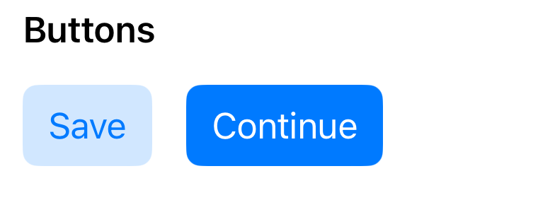
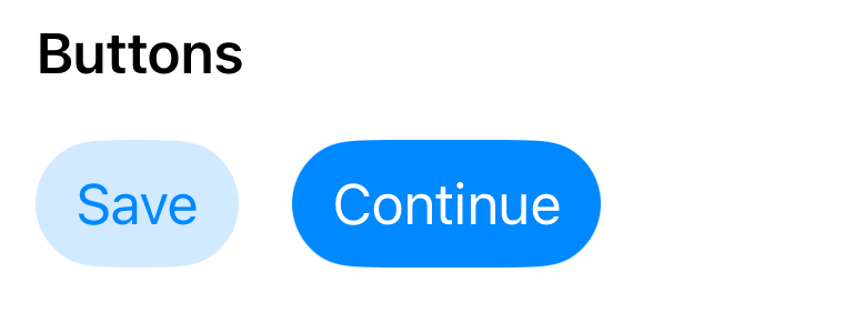
This example uses .bordered and .borderedProminent button styles.
iOS 17.5
iOS 26.3
HStack(spacing: 16) {
    Button("Save") { }
        .buttonStyle(.bordered)

    Button("Continue") { }
        .buttonStyle(.borderedProminent)
}
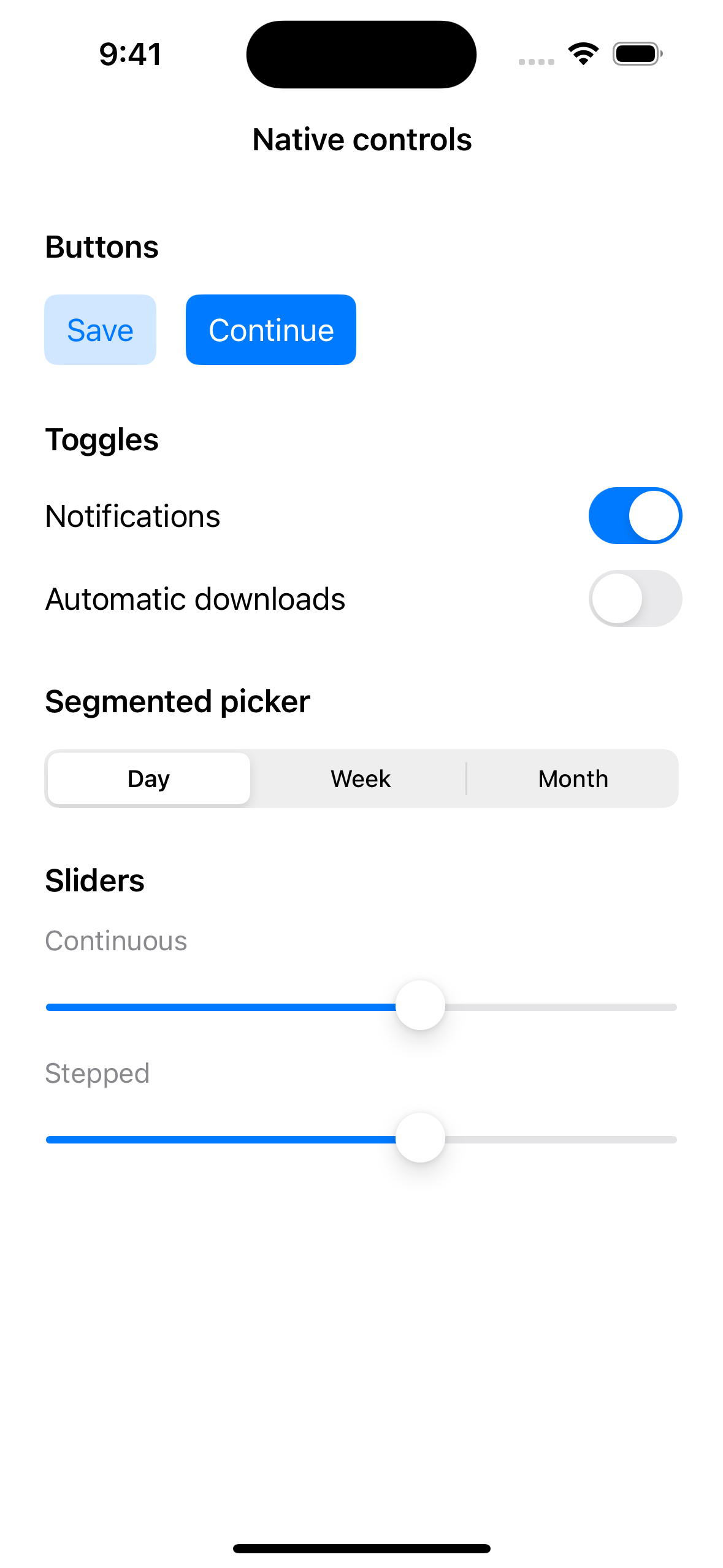
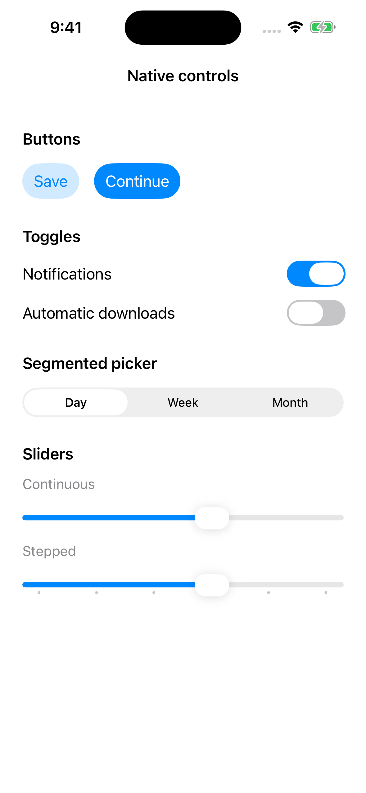
On iOS 17.5, both buttons have rounded rectangle backgrounds. On iOS 26.3, they become capsule-shaped.
The code doesn't specify this shape anywhere. SwiftUI changes the appearance of the existing button styles automatically.
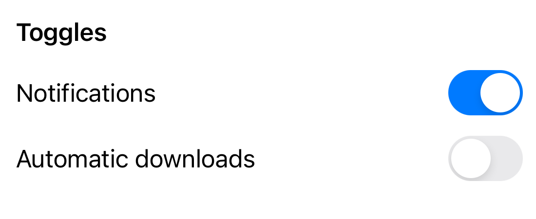
Toggle thumbs become wider
This example creates two toggles using Boolean states.
@State private var notifications = true
@State private var downloads = false

// Inside body:
Toggle("Notifications", isOn: $notifications)
Toggle("Automatic downloads", isOn: $downloads)
iOS 17.5
iOS 26.3
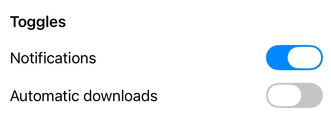
On iOS 17.5, the thumb is a circle. On iOS 26.3, it is a wider oval.
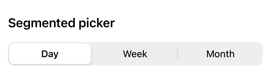
Segmented picker selections become rounder
The Day, Week, and Month control is a Picker with a segmented style.
@State private var selection = "Day"

// Inside body:
Picker("Period", selection: $selection) {
    Text("Day").tag("Day")
    Text("Week").tag("Week")
    Text("Month").tag("Month")
}
.pickerStyle(.segmented)
iOS 17.5
iOS 26.3
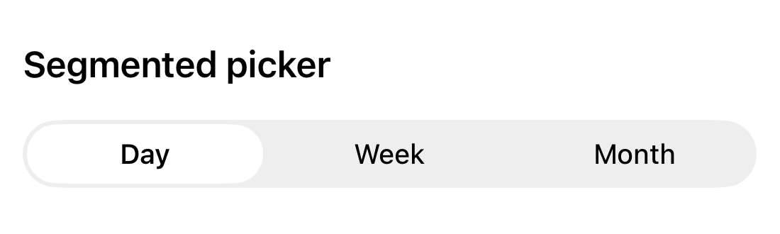
On iOS 26, the selected segment has a rounder shape, and the separators between segments disappear.
The screenshots only show the controls at rest. Toggles, segmented pickers, and sliders also have new Liquid Glass effects when you interact with them. You can see these effects in Build a SwiftUI app with the new design.
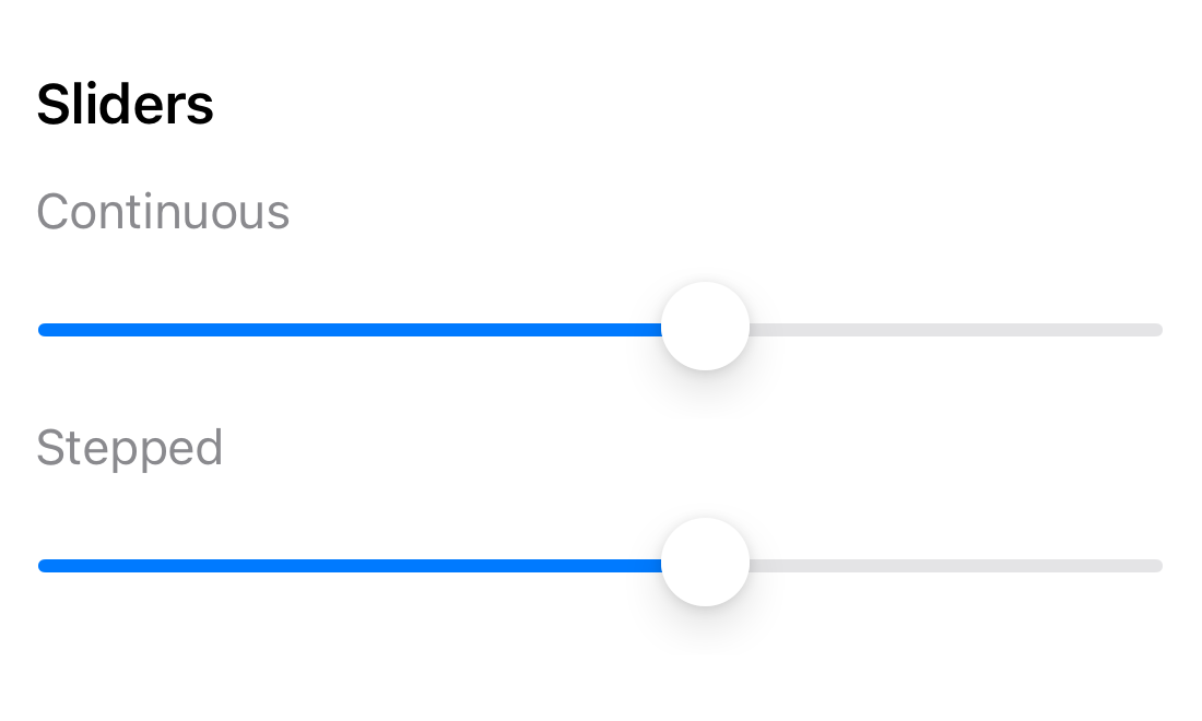
Stepped sliders make their steps visible
The lower slider has a step value of one.
@State private var level = 3.0

// Inside body:
Slider(value: $level, in: 0...5, step: 1)
iOS 17.5
iOS 26.3
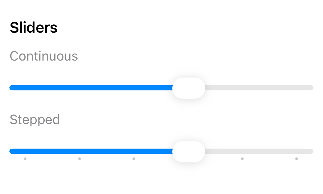
On iOS 17.5, the track looks continuous even though the value changes in steps. On iOS 26.3, SwiftUI adds tick marks to show each possible value.
You don't need to add custom labels or draw the marks yourself.
Toolbar buttons and tab bars float above the content
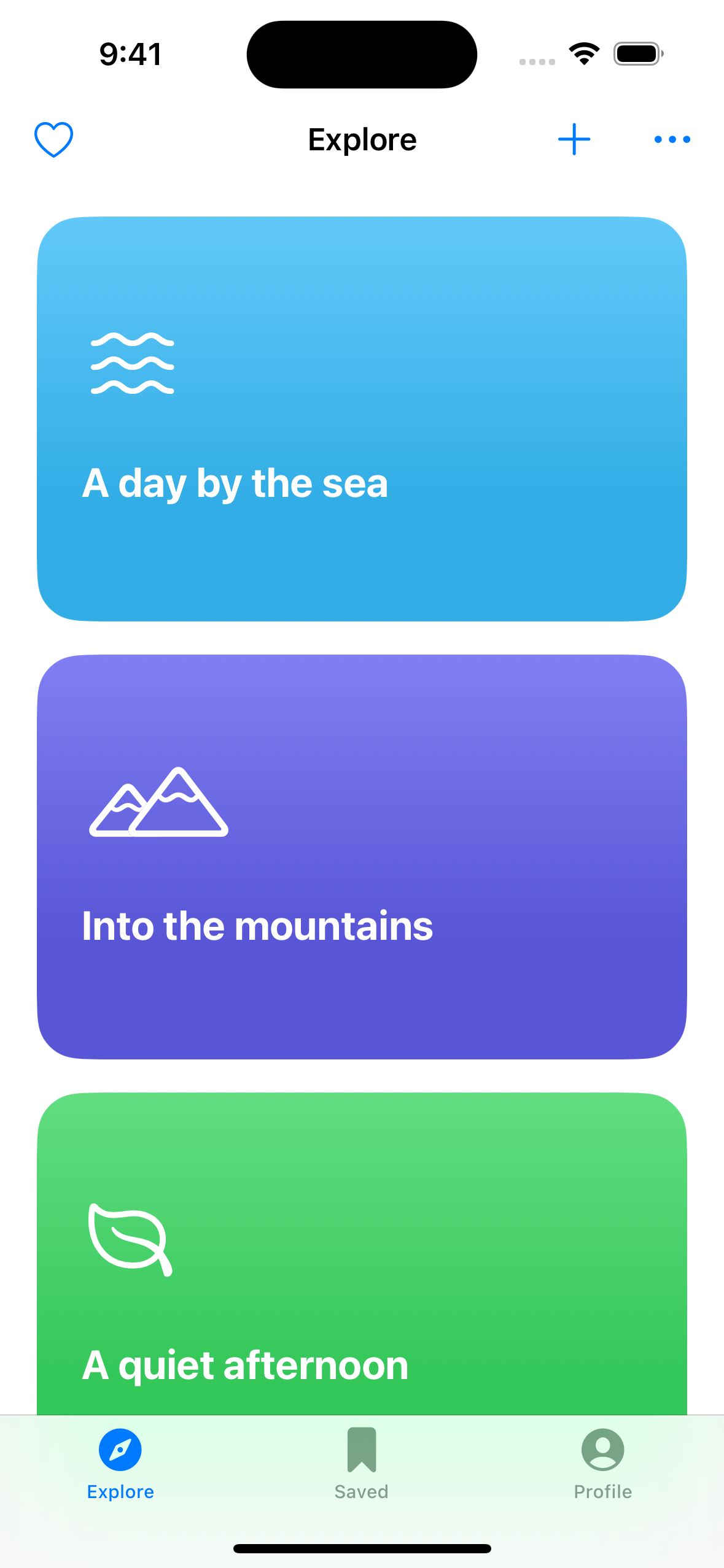
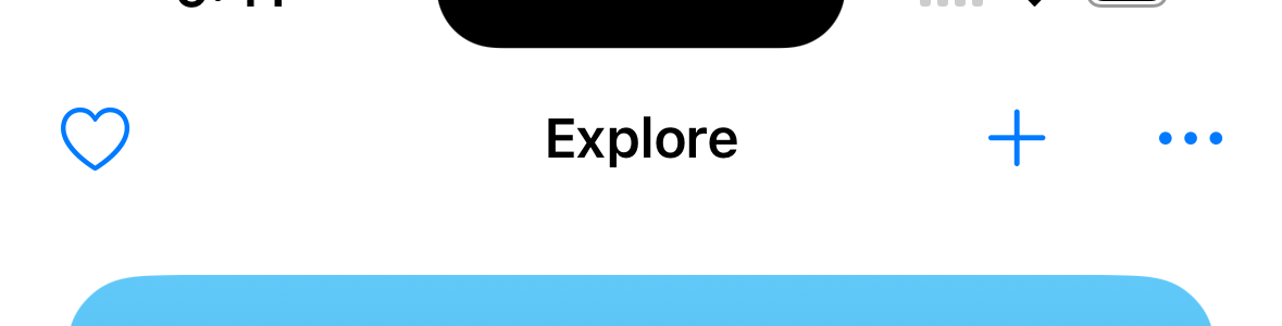
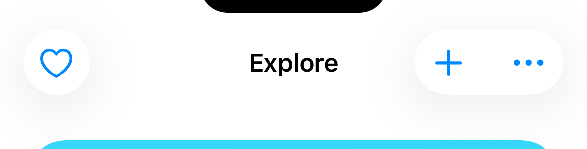
The next screen contains a NavigationStack, three toolbar actions, and a TabView.
iOS 17.5
iOS 26.3
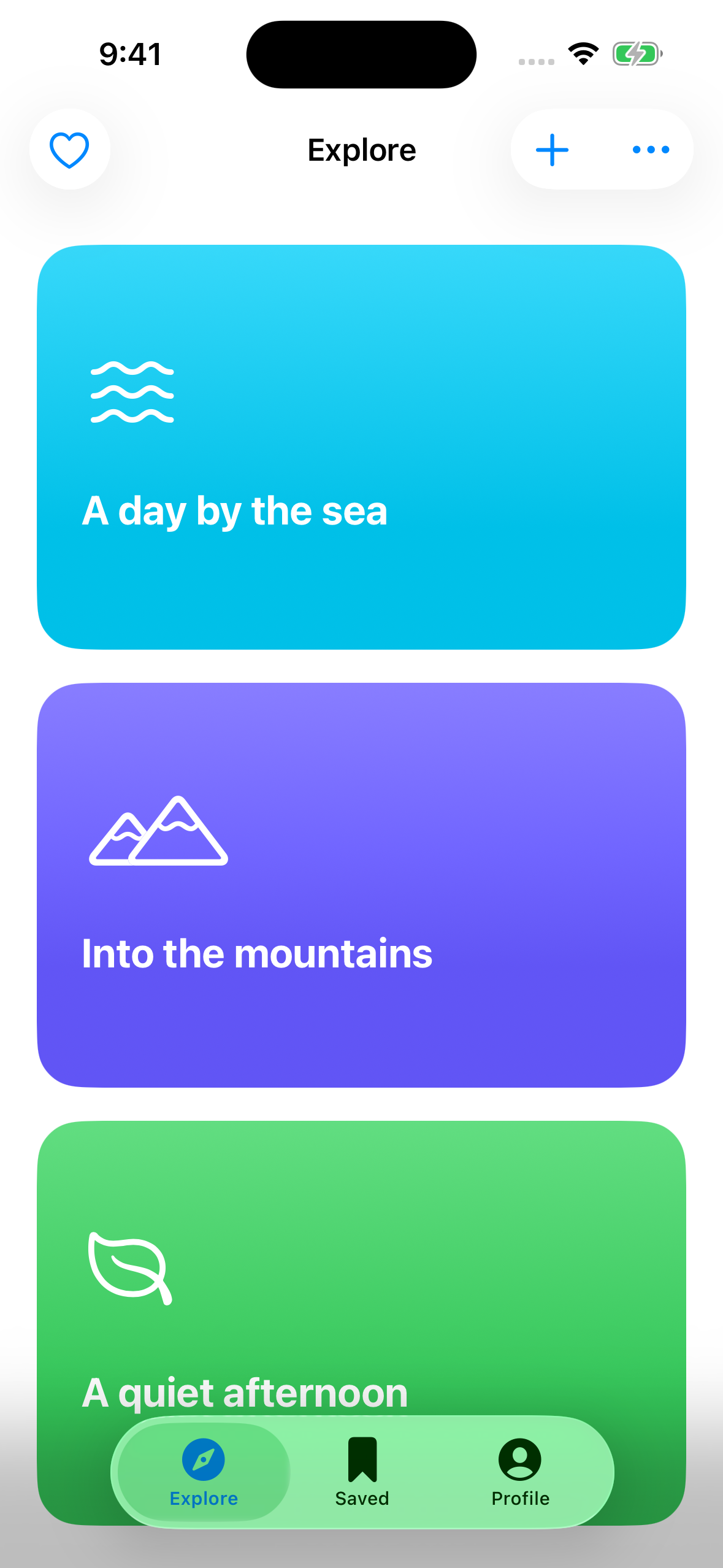
On iOS 17.5, toolbar buttons don't have a background. On iOS 26.3, SwiftUI places them on Liquid Glass surfaces.
The Add button uses a standard ToolbarItem.
iOS 17.5
iOS 26.3
.toolbar {
    ToolbarItem(placement: .topBarTrailing) {
        Button("Add", systemImage: "plus") {
            showsSheet = true
        }
    }
}
There is no custom background or material. SwiftUI provides this appearance automatically.
The tab bar becomes a floating surface
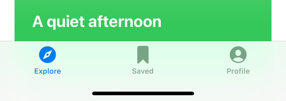
The TabView code is also unchanged.
TabView {
    ExploreView()
        .tabItem { Label("Explore", systemImage: "safari") }

    SavedView()
        .tabItem { Label("Saved", systemImage: "bookmark") }
}
iOS 17.5
iOS 26.3
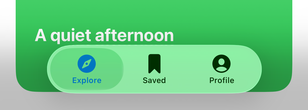
On iOS 17.5, the tab bar touches the left, right, and bottom edges of the screen. On iOS 26.3, it becomes a floating capsule with content visible around it.
This is the default appearance. To make the tab bar minimize when the user scrolls down, add .tabBarMinimizeBehavior(.onScrollDown) to TabView.
TabView {
    // Tabs
}
.tabBarMinimizeBehavior(.onScrollDown)
Before scrolling
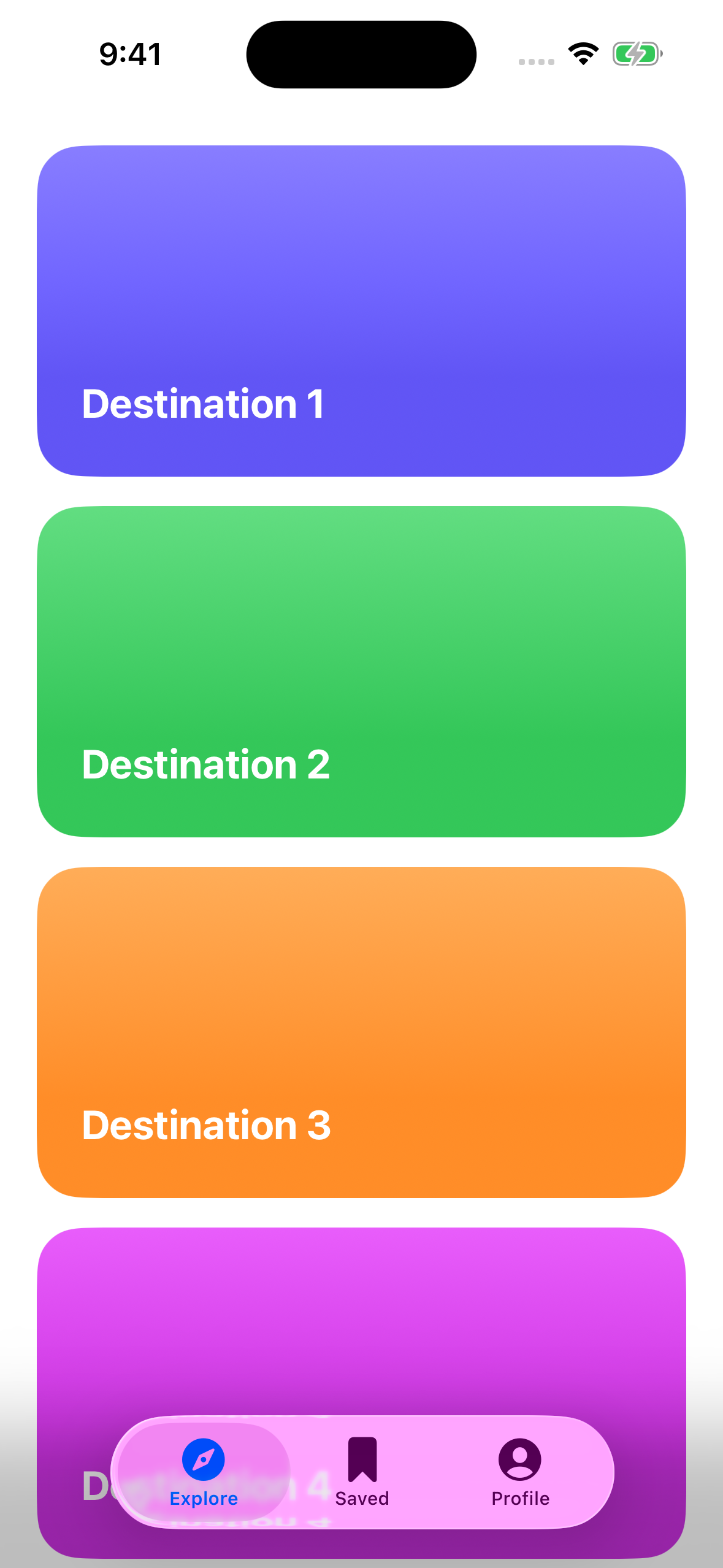
After scrolling down
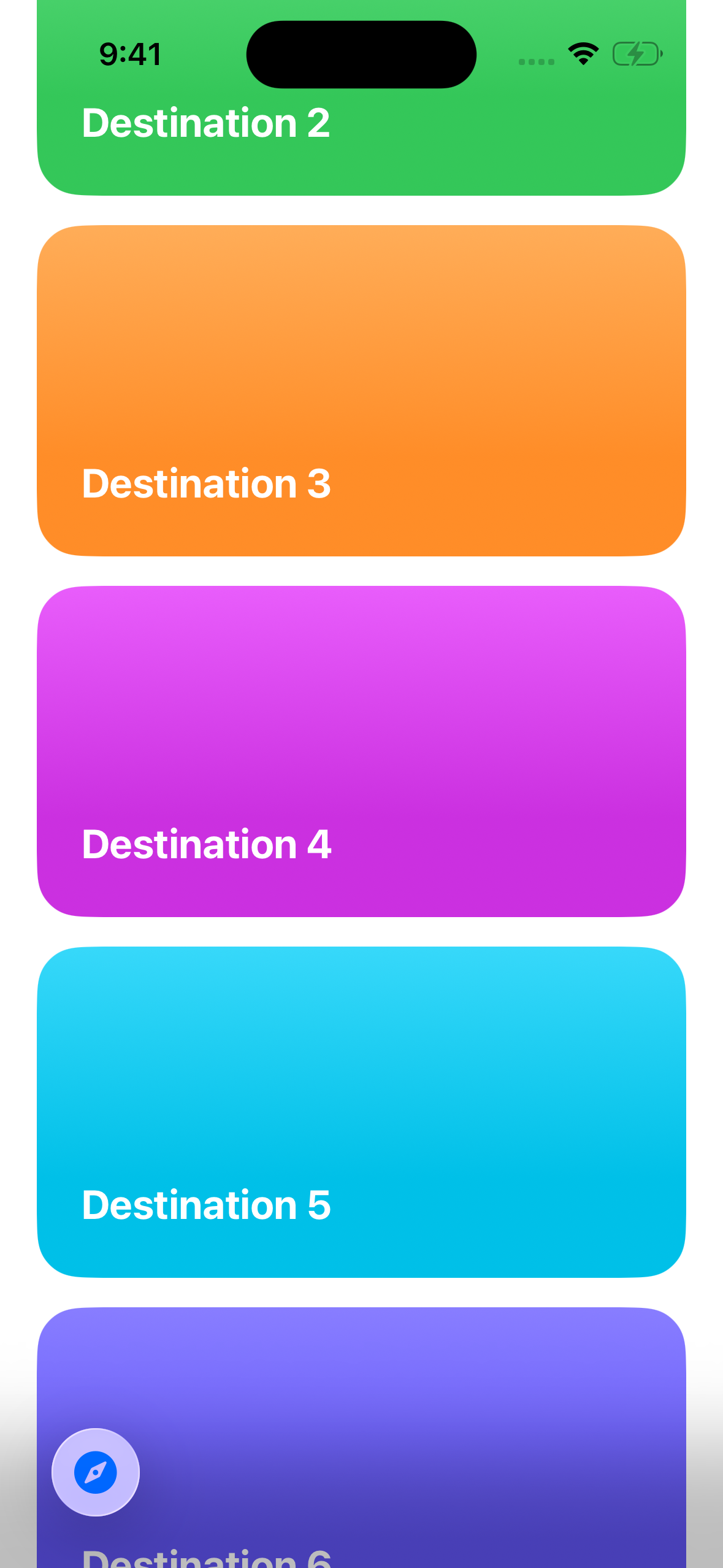
Tab bar minimization is available on iPhone.
Partial-height sheets have inset edges
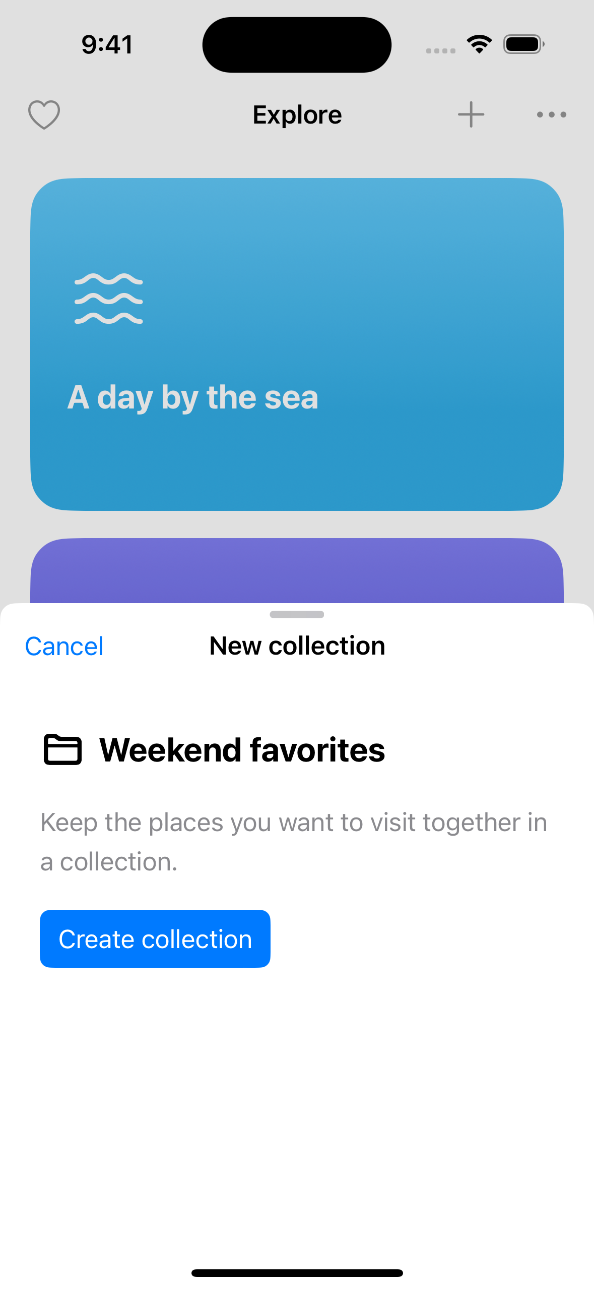
The Add button presents a sheet with medium and large detents.
.sheet(isPresented: $showsSheet) {
    CollectionSheet()
        .presentationDetents([.medium, .large])
        .presentationDragIndicator(.visible)
}
CollectionSheet is the content view of the sheet. This example doesn't set presentationBackground or add a custom shape.
iOS 17.5
iOS 26.3
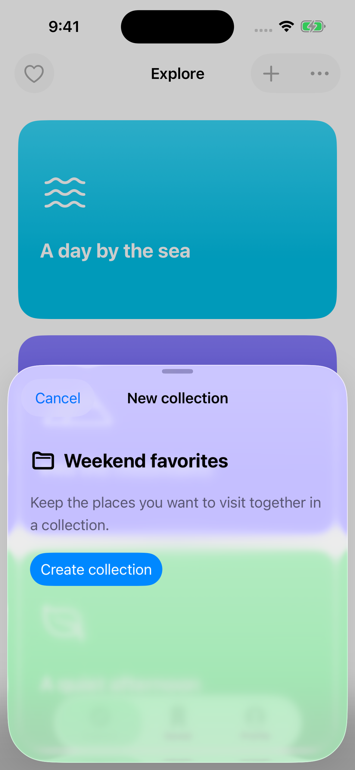
On iOS 17.5, the sheet touches the screen edges. On iOS 26.3, it is inset from the sides and bottom and has rounded corners.
The Liquid Glass background becomes opaque as the sheet expands to full height. Setting a custom presentation background can hide this behavior. See the sheet demonstration.
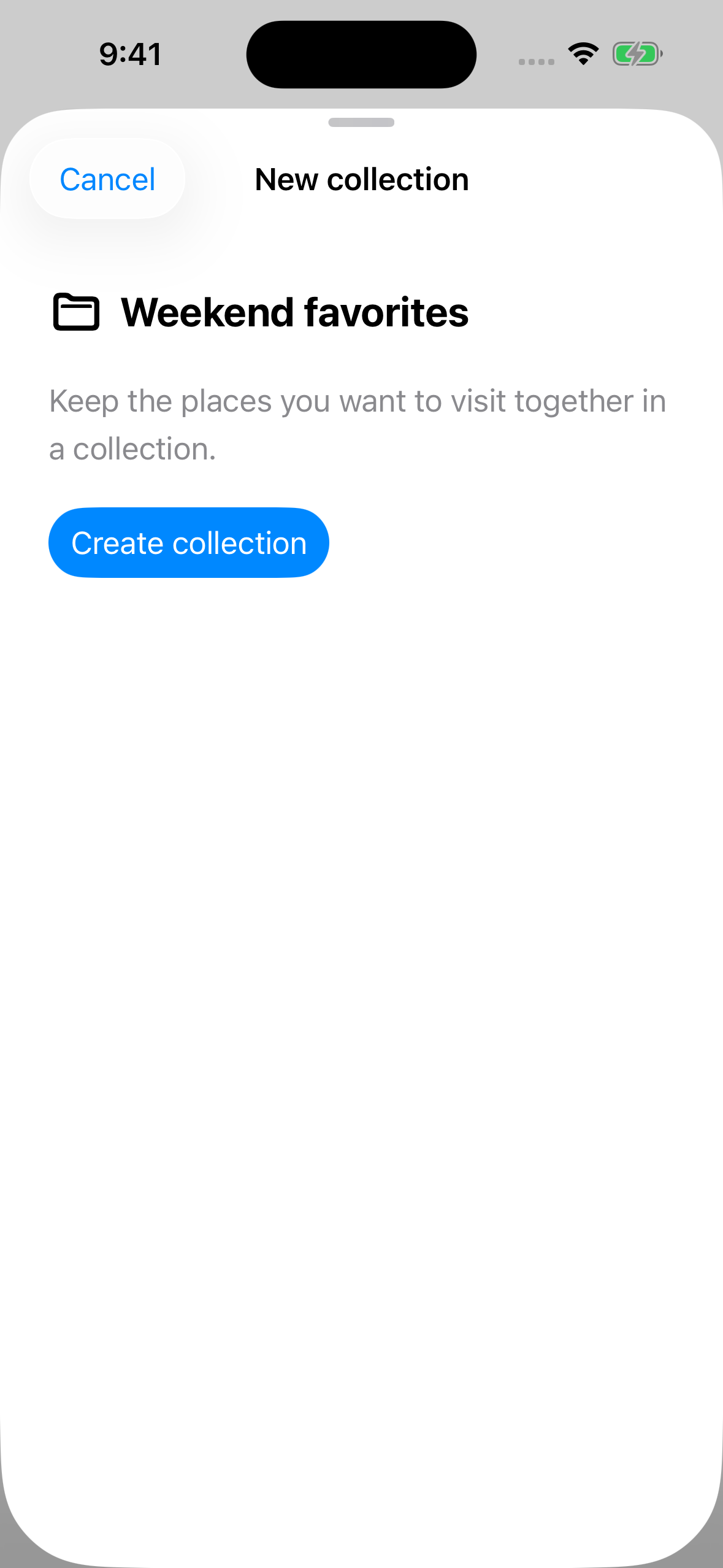
When testing a sheet, drag it between detents to see how the background changes.
You can easily support sarunw.com by checking out this sponsor.
AI Grammar: Correct grammar, spell check, check punctuation, and parphrase.
What changes automatically?
Here is a summary of the changes in this example.
| Existing code in this demo | What to look for on iOS 26 |
|---|---|
.bordered and .borderedProminent |
Rounder button backgrounds |
Toggle and segmented Picker |
Updated shapes and interaction effects |
Slider(..., step: 1) |
Visible tick marks |
ToolbarItem |
Glass backgrounds around actions |
TabView |
A floating tab bar |
.sheet with partial-height detents |
Inset presentation edges |
These changes come automatically from system components. Features such as glass button styles, tab bar minimization, and custom glass effects require additional APIs.
Before adding a custom glass effect, build your existing app with Xcode 26 and run it on iOS 26. Many native controls may already have the new appearance you want.
Read more article about SwiftUI, iOS 26, Liquid Glass, or see all available topic
Enjoy the read?
If you enjoy this article, you can subscribe to the weekly newsletter.
Every Friday, you'll get a quick recap of all articles and tips posted on this site. No strings attached. Unsubscribe anytime.
Feel free to follow me on Twitter and ask your questions related to this post. Thanks for reading and see you next time.
I also make short videos and visual guides on Patreon. Some things are easier to see than to read, like how an API looks and moves on a real screen. If you like to learn that way, come and watch. Sharing the article is also greatly appreciated.
Become a patron Tweet ShareSwiftUI Liquid Glass - Regular vs Clear
Learn the difference between regular and clear Liquid Glass in SwiftUI, how each affects foreground colors, and when to use them.
Build Siri experiences across apps, Part 1: Onscreen Awareness
Connect your views to App Entities so Siri can resolve "this" to the content on screen, using NSUserActivity annotations or view annotations.