When toolbar items share a glass background in iOS 26
Table of Contents
In iOS 26, toolbar items no longer float on a flat bar. They sit on Liquid Glass, and items that are next to each other on the same edge share one glass capsule.
We don't write any code for that. It is the default. But it raises three questions:
- When do items merge?
- When do they get their own capsule?
- How do we split them when the default is not what we want?
Items on the same edge merge
Here are three buttons, each in its own ToolbarItem.
.toolbar {
    ToolbarItem(placement: .topBarTrailing) {
        Button("Share", systemImage: "square.and.arrow.up") { }
    }
    ToolbarItem(placement: .topBarTrailing) {
        Button("Favorite", systemImage: "heart") { }
    }
    ToolbarItem(placement: .topBarTrailing) {
        Button("More", systemImage: "ellipsis") { }
    }
}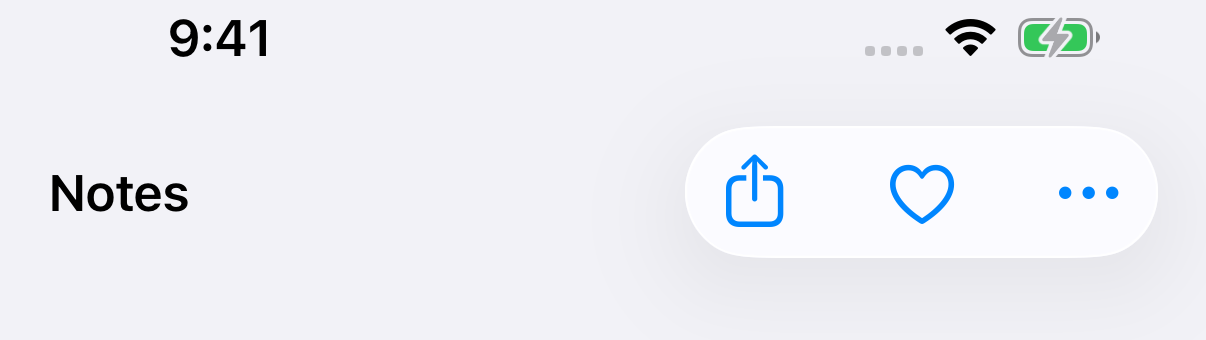
Separate ToolbarItems do not mean separate capsules. Wrapping them in a ToolbarItemGroup gives the same result. So does splitting them across two groups.
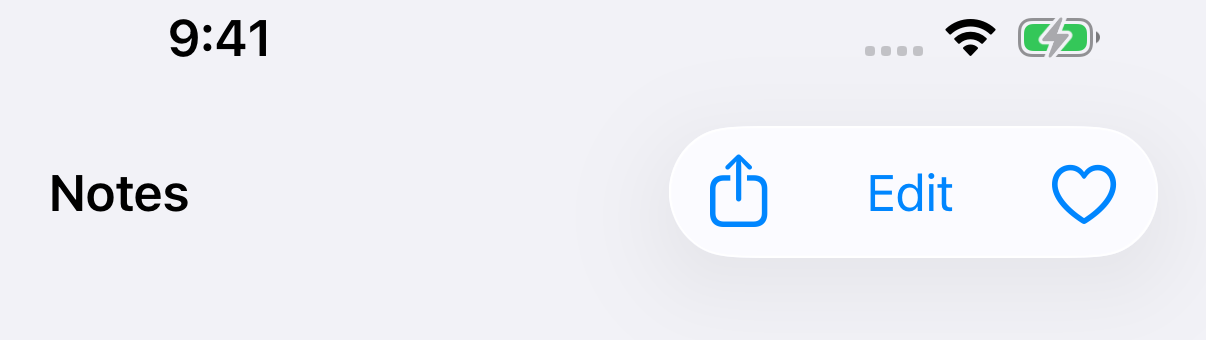
The kind of item doesn't matter much either. Text buttons merge with icon buttons.
.toolbar {
    ToolbarItem(placement: .topBarTrailing) {
        Button("Share", systemImage: "square.and.arrow.up") { }
    }
    ToolbarItem(placement: .topBarTrailing) {
        Button("Edit") { }
    }
    ToolbarItem(placement: .topBarTrailing) {
        Button("Favorite", systemImage: "heart") { }
    }
}
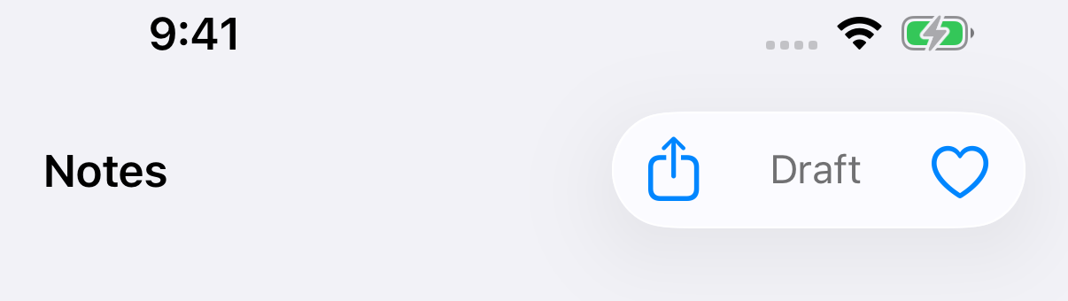
A custom view joins the capsule too, even one that isn't a button.
.toolbar {
    ToolbarItem(placement: .topBarTrailing) {
        Button("Share", systemImage: "square.and.arrow.up") { }
    }
    ToolbarItem(placement: .topBarTrailing) {
        Text("Draft")
            .font(.subheadline)
            .foregroundStyle(.secondary)
    }
    ToolbarItem(placement: .topBarTrailing) {
        Button("Favorite", systemImage: "heart") { }
    }
}
You can easily support sarunw.com by checking out this sponsor.

Offline Transcription: Fast, privacy-focus way to transcribe audio, video, and podcast files. No data leaves your Mac.
When items get their own capsule
There are three cases where an item doesn't join its neighbors.
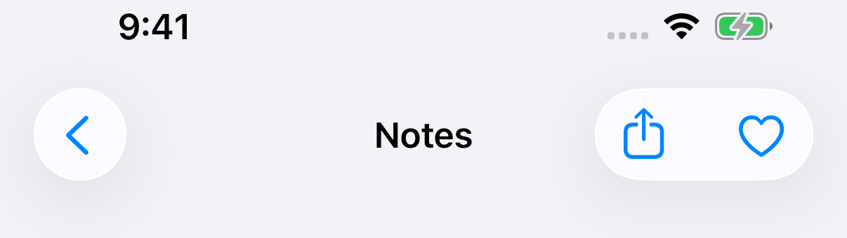
Different edges
The leading edge, the title, and the trailing edge are separate areas. Items in different areas never share a capsule.
.toolbar {
    ToolbarItem(placement: .topBarLeading) {
        Button("Back", systemImage: "chevron.left") { }
    }
    ToolbarItem(placement: .topBarTrailing) {
        Button("Share", systemImage: "square.and.arrow.up") { }
    }
    ToolbarItem(placement: .topBarTrailing) {
        Button("Favorite", systemImage: "heart") { }
    }
}
Prominent buttons
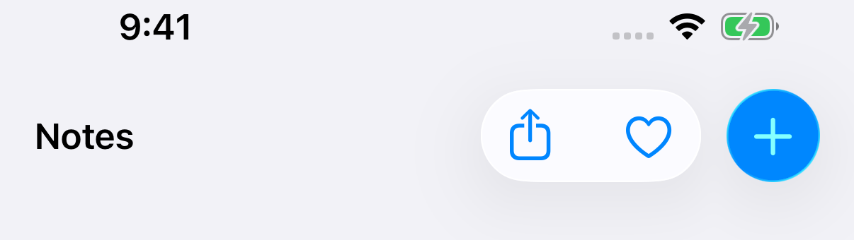
A prominent button is the main action on the screen, drawn with a filled, tinted background. It always gets its own capsule.
.toolbar {
    ToolbarItem(placement: .topBarTrailing) {
        Button("Share", systemImage: "square.and.arrow.up") { }
    }
    ToolbarItem(placement: .topBarTrailing) {
        Button("Favorite", systemImage: "heart") { }
    }
    ToolbarItem(placement: .topBarTrailing) {
        Button("Add", systemImage: "plus") { }
            .buttonStyle(.glassProminent)
    }
}
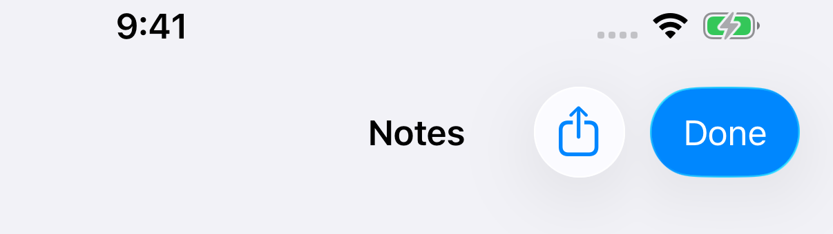
We don't have to set .glassProminent ourselves. A button with role: .confirm is prominent in the toolbar.
.toolbar {
    ToolbarItem(placement: .topBarTrailing) {
        Button("Share", systemImage: "square.and.arrow.up") { }
    }
    ToolbarItem(placement: .topBarTrailing) {
        Button("Done", role: .confirm) { }
    }
}
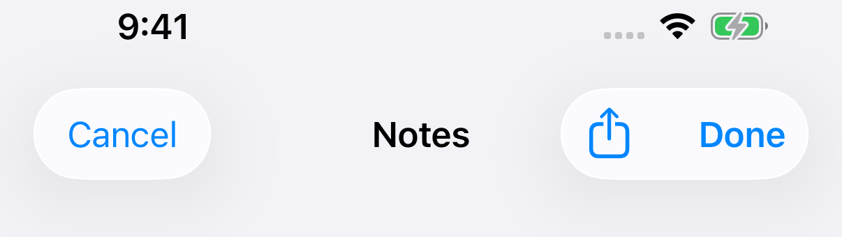
The .confirmationAction placement is not enough on its own. It makes Done bold, but Done still merges with Share.
.toolbar {
    ToolbarItem(placement: .cancellationAction) {
        Button("Cancel", role: .cancel) { }
    }
    ToolbarItem(placement: .topBarTrailing) {
        Button("Share", systemImage: "square.and.arrow.up") { }
    }
    ToolbarItem(placement: .confirmationAction) {
        Button("Done") { }
    }
}
If a sheet's Done button should stand out, give it role: .confirm.
Items with the background turned off
.sharedBackgroundVisibility(.hidden) removes the glass from one item. With no glass, it has nothing to share, so it sits on its own.
This is useful for something that already has its own shape, like a profile picture.
.toolbar {
    ToolbarItem(placement: .topBarTrailing) {
        Button("Share", systemImage: "square.and.arrow.up") { }
    }
    ToolbarItem(placement: .topBarTrailing) {
        Button("Favorite", systemImage: "heart") { }
    }
    ToolbarItem(placement: .topBarTrailing) {
        Image(systemName: "person.crop.circle.fill")
            .font(.title)
            .foregroundStyle(.orange)
    }
    .sharedBackgroundVisibility(.hidden)
}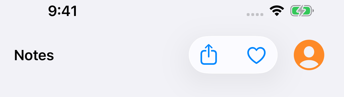
The modifier goes on the ToolbarItem, not on the view inside it.
How to split items explicitly
When the items should be in two capsules, put a ToolbarSpacer between them. Everything before the spacer is one capsule, and everything after it is another.
.toolbar {
    ToolbarItem(placement: .topBarTrailing) {
        Button("Share", systemImage: "square.and.arrow.up") { }
    }
    ToolbarItem(placement: .topBarTrailing) {
        Button("Favorite", systemImage: "heart") { }
    }

    ToolbarSpacer(.fixed, placement: .topBarTrailing)

    ToolbarItem(placement: .topBarTrailing) {
        Button("More", systemImage: "ellipsis") { }
    }
}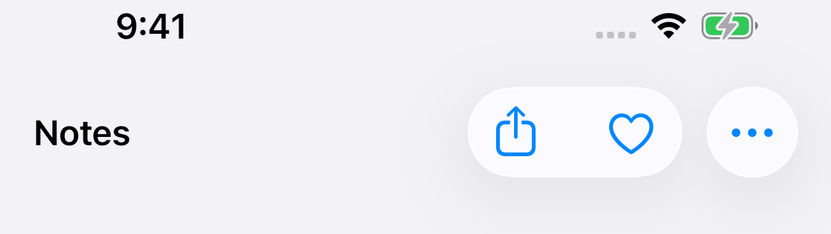
Use this to keep related actions together. Here, Share and Favorite act on the note, and More opens everything else.
ToolbarSpacer comes in two sizes:
.fixedadds a small, fixed gap..flexibletakes all the space it can get.
Flexible spacer in the navigation bar
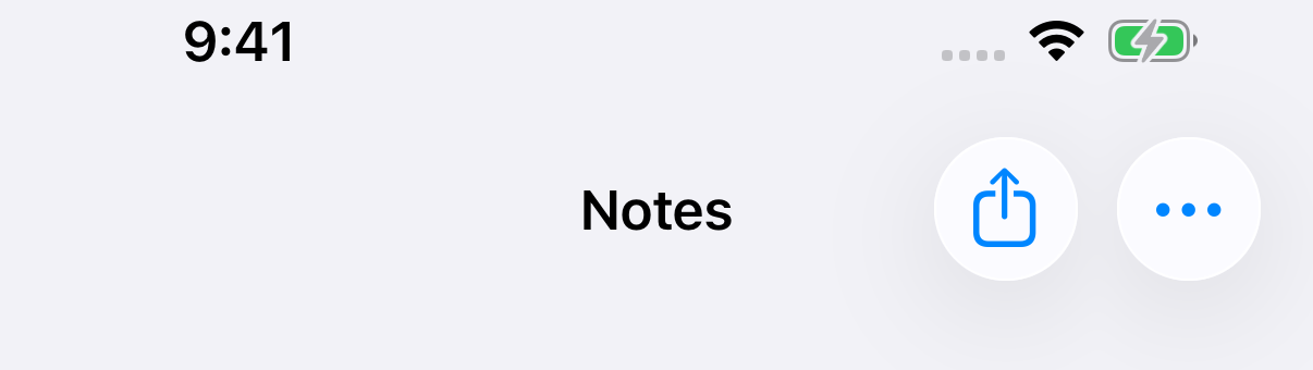
In the navigation bar, a trailing item can't grow into the title's space. So a .flexible spacer there gives the same small gap as .fixed.
.toolbar {
    ToolbarItem(placement: .topBarTrailing) {
        Button("Share", systemImage: "square.and.arrow.up") { }
    }
    ToolbarSpacer(.flexible, placement: .topBarTrailing)
    ToolbarItem(placement: .topBarTrailing) {
        Button("More", systemImage: "ellipsis") { }
    }
}
Flexible spacer in the bottom bar
The bottom bar is where .flexible matters. Without a spacer, all bottom bar items merge into one capsule in the middle.
.toolbar {
    ToolbarItem(placement: .bottomBar) {
        Button("Filter", systemImage: "line.3.horizontal.decrease") { }
    }
    ToolbarItem(placement: .bottomBar) {
        Button("Folder", systemImage: "folder") { }
    }
    ToolbarItem(placement: .bottomBar) {
        Button("Compose", systemImage: "square.and.pencil") { }
    }
}
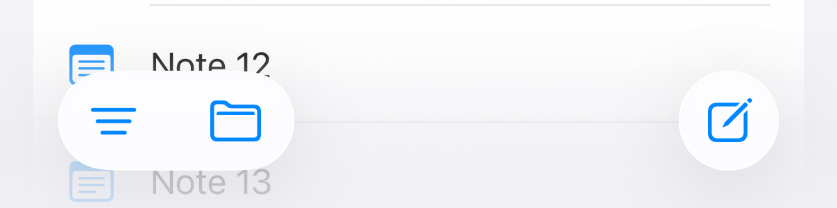
Add a .flexible spacer, and it splits the capsule and pushes the two halves to the edges.
.toolbar {
    ToolbarItem(placement: .bottomBar) {
        Button("Filter", systemImage: "line.3.horizontal.decrease") { }
    }
    ToolbarItem(placement: .bottomBar) {
        Button("Folder", systemImage: "folder") { }
    }

    ToolbarSpacer(.flexible, placement: .bottomBar)

    ToolbarItem(placement: .bottomBar) {
        Button("Compose", systemImage: "square.and.pencil") { }
    }
}
The search field merges too
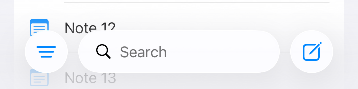
The search field from searchable can be placed in the bottom bar with DefaultToolbarItem(kind: .search, placement: .bottomBar). It is a toolbar item like any other, so it merges with its neighbors.
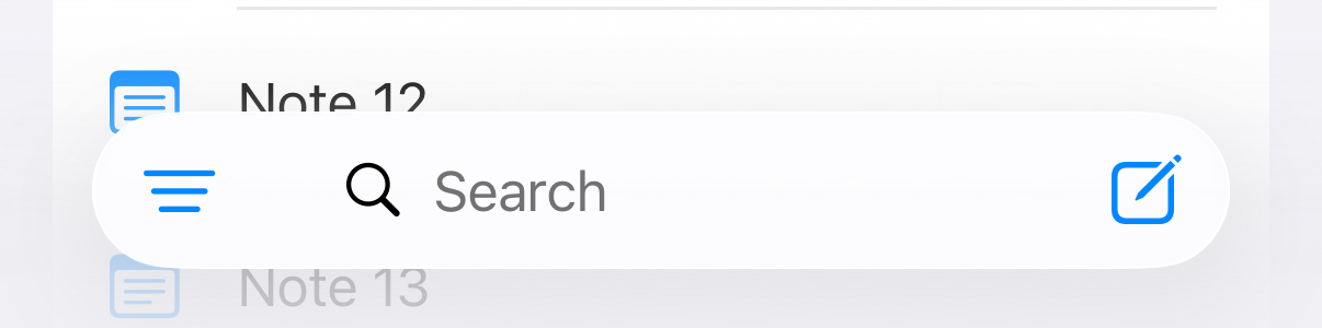
Put a fixed spacer on each side to give the field its own capsule.
.toolbar {
    ToolbarItem(placement: .bottomBar) {
        Button("Filter", systemImage: "line.3.horizontal.decrease") { }
    }
    ToolbarSpacer(.fixed, placement: .bottomBar)
    DefaultToolbarItem(kind: .search, placement: .bottomBar)
    ToolbarSpacer(.fixed, placement: .bottomBar)
    ToolbarItem(placement: .bottomBar) {
        Button("Compose", systemImage: "square.and.pencil") { }
    }
}
You can easily support sarunw.com by checking out this sponsor.
Offline Transcription: Fast, privacy-focus way to transcribe audio, video, and podcast files. No data leaves your Mac.
Summary
Items merge when they are next to each other on the same edge. It doesn't matter if they are separate ToolbarItems or a ToolbarItemGroup, or if they are text, icons, menus, or custom views.
An item gets its own capsule when:
- It is on a different edge.
- It is prominent:
.buttonStyle(.glassProminent)orrole: .confirm. The.confirmationActionplacement alone doesn't count. - Its glass is turned off with
.sharedBackgroundVisibility(.hidden).
To split items yourself, put a ToolbarSpacer between them. Use .fixed for a small gap and .flexible to push items apart in the bottom bar.
Read more article about SwiftUI, Toolbar, iOS 26, or see all available topic
Enjoy the read?
If you enjoy this article, you can subscribe to the weekly newsletter.
Every Friday, you'll get a quick recap of all articles and tips posted on this site. No strings attached. Unsubscribe anytime.
Feel free to follow me on Twitter and ask your questions related to this post. Thanks for reading and see you next time.
I also make short videos and visual guides on Patreon. Some things are easier to see than to read, like how an API looks and moves on a real screen. If you like to learn that way, come and watch. Sharing the article is also greatly appreciated.
Become a patron Tweet ShareGet concentric corner radii from GeometryReader in iOS 27
iOS 27 adds concentricCornerRadii to GeometryProxy. It tells you the corner radii a view needs to match the corners of its container or the screen.