What is GlassEffectContainer in SwiftUI and how to use it
Table of Contents
In iOS 26, SwiftUI got a new modifier, glassEffect(), that turns any view into Liquid Glass.
By default, each glass view is on its own. It doesn't know about the other glass views around it. If you want glass views to interact with each other, like blending into one shape or morphing from one to another, GlassEffectContainer is what you are looking for.
In this article, we will learn what GlassEffectContainer is, why we need it, and how to use it to blend, merge, and animate glass shapes.
What is GlassEffectContainer
GlassEffectContainer is a view that groups Liquid Glass shapes so they can react to each other.
Liquid Glass bends the content behind it. But glass can't pick up other glass. Without a container, each glass view is drawn on its own and doesn't know the others exist.
Inside a container, the system draws all the glass shapes together. This gives you three things.
- Blending: shapes that get close to each other melt together like drops of water.
- Animation: shapes can grow out of and shrink into each other when views appear and disappear.
- Better performance: Apple says drawing the shapes together is faster than drawing them one by one.
You can easily support sarunw.com by checking out this sponsor.
Screenshot Studio: Create App Store screenshots in seconds not minutes.
How to use GlassEffectContainer
To use it, you wrap your glass views in a GlassEffectContainer. You still apply glassEffect() to each view as usual.
GlassEffectContainer {
    HStack(spacing: -16) {
        Image(systemName: "pencil")
            .frame(width: 64, height: 64)
            .glassEffect()

        Image(systemName: "eraser")
            .frame(width: 64, height: 64)
            .glassEffect()
    }
}
The container only groups the glass. You still arrange the views yourself with an HStack, VStack, or any other layout inside it.
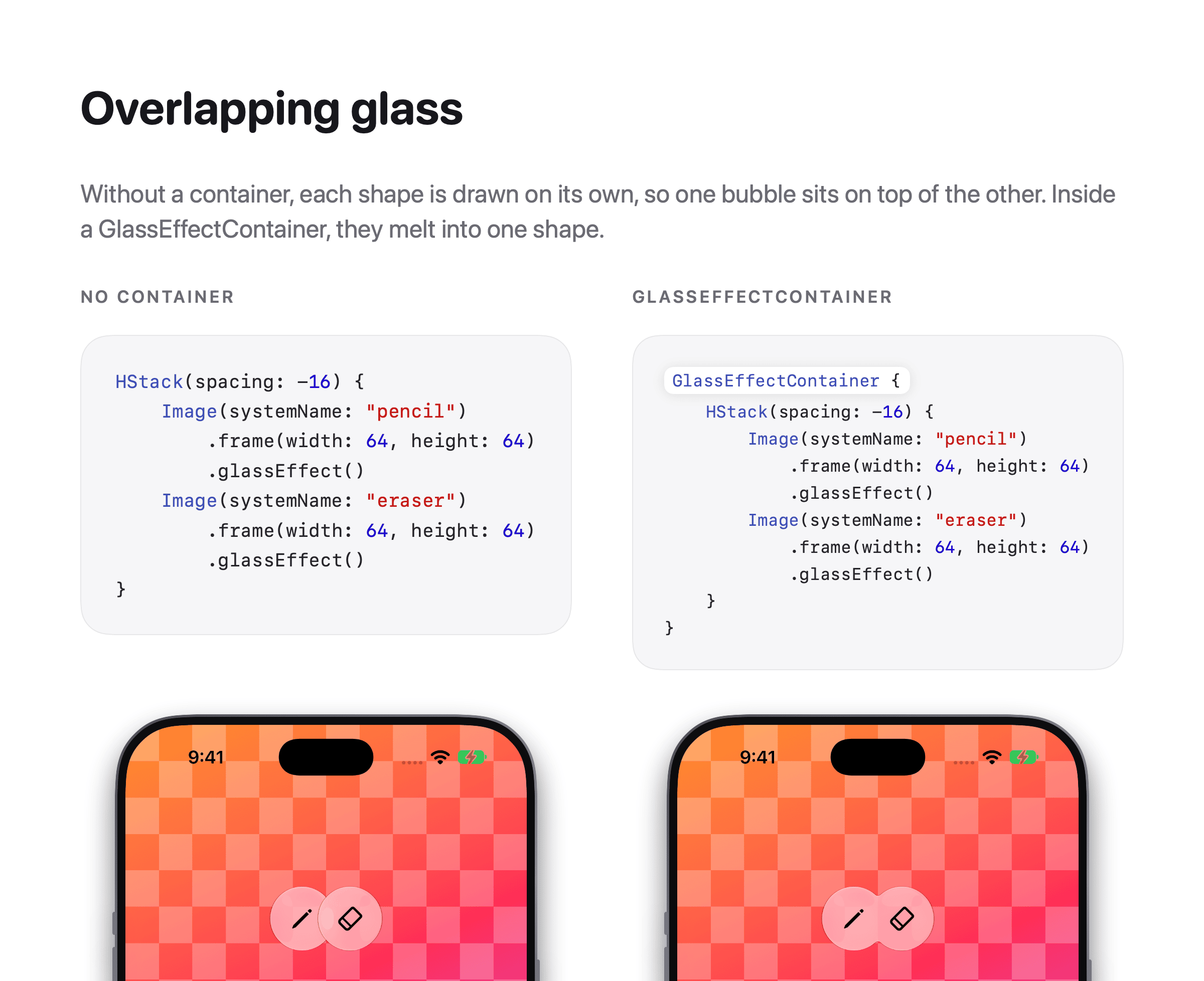
In this example, I make the two buttons overlap by 16 points, so you can see the difference clearly.
- Without a container, you get two bubbles, one on top of the other.
- With a container, they melt into one shape.
Control blending with spacing
GlassEffectContainer takes an optional spacing parameter.
GlassEffectContainer(spacing: 40) {
    ...
}
spacing controls how far apart shapes can be and still blend. The larger the value, the more the shapes pull toward each other.
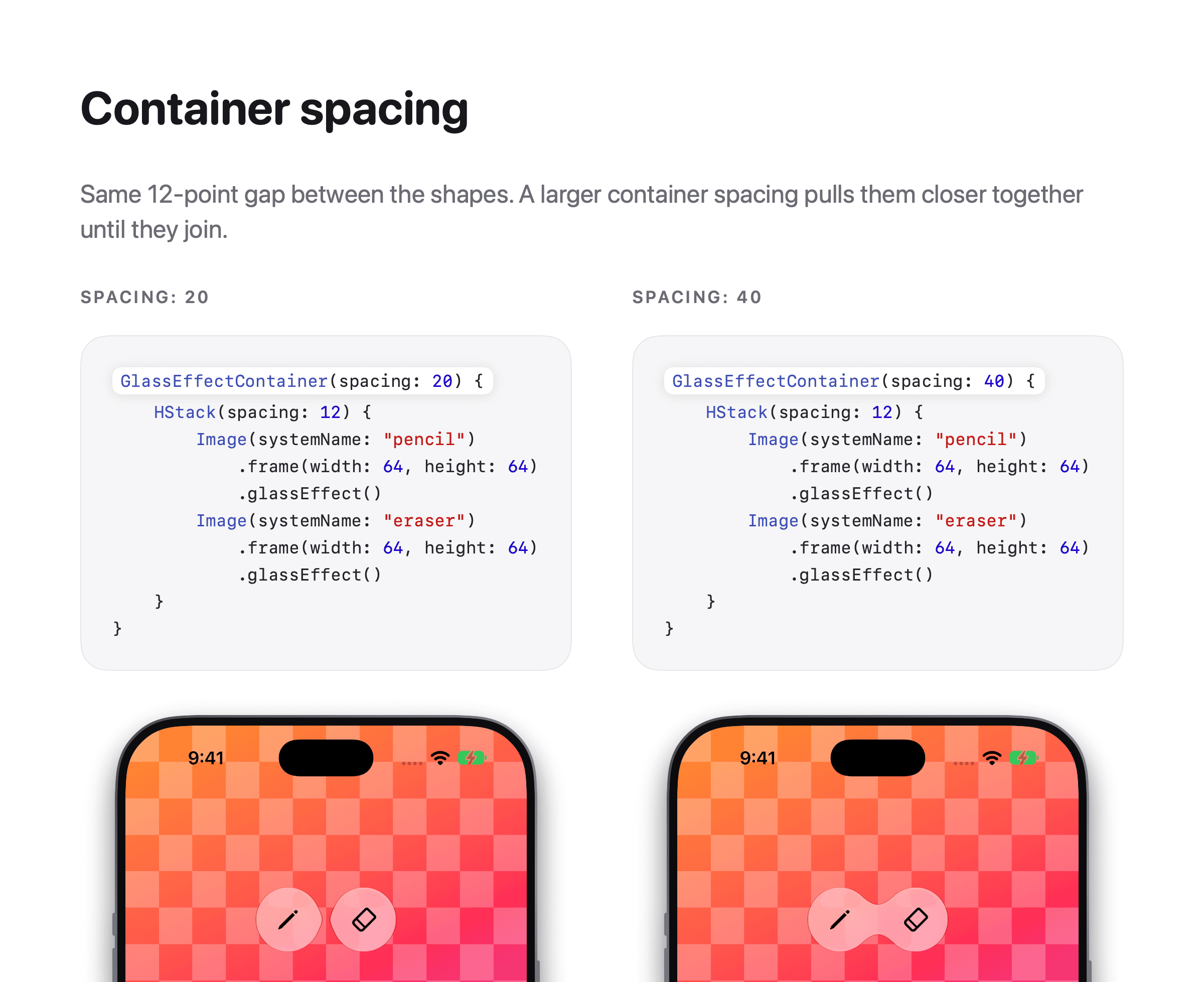
Here are two buttons with the same 12-point gap between them. The only thing I change is the container spacing.
- With
spacing: 20, the shapes reach toward each other but stay apart. - With
spacing: 40, they join into one piece of glass.
If you don't pass spacing, the system uses a default value. With the default, my two buttons stay apart at a 12-point gap.
Merge glass shapes with glassEffectUnion
Sometimes, you want shapes to become one piece of glass even when they are far apart. You can do that with glassEffectUnion(id:namespace:).
Views that use the same ID and namespace become a single glass shape.
struct FormatBar: View {
    @Namespace private var namespace

    var body: some View {
        GlassEffectContainer {
            HStack(spacing: 40) {
                Image(systemName: "bold")
                    .frame(width: 64, height: 64)
                    .glassEffect()
                    .glassEffectUnion(id: "format", namespace: namespace)

                Image(systemName: "italic")
                    .frame(width: 64, height: 64)
                    .glassEffect()
                    .glassEffectUnion(id: "format", namespace: namespace)

                Image(systemName: "trash")
                    .frame(width: 64, height: 64)
                    .glassEffect()
            }
        }
    }
}
Bold and italic share one glass shape, even with 40 points between them. The trash button keeps its own glass.
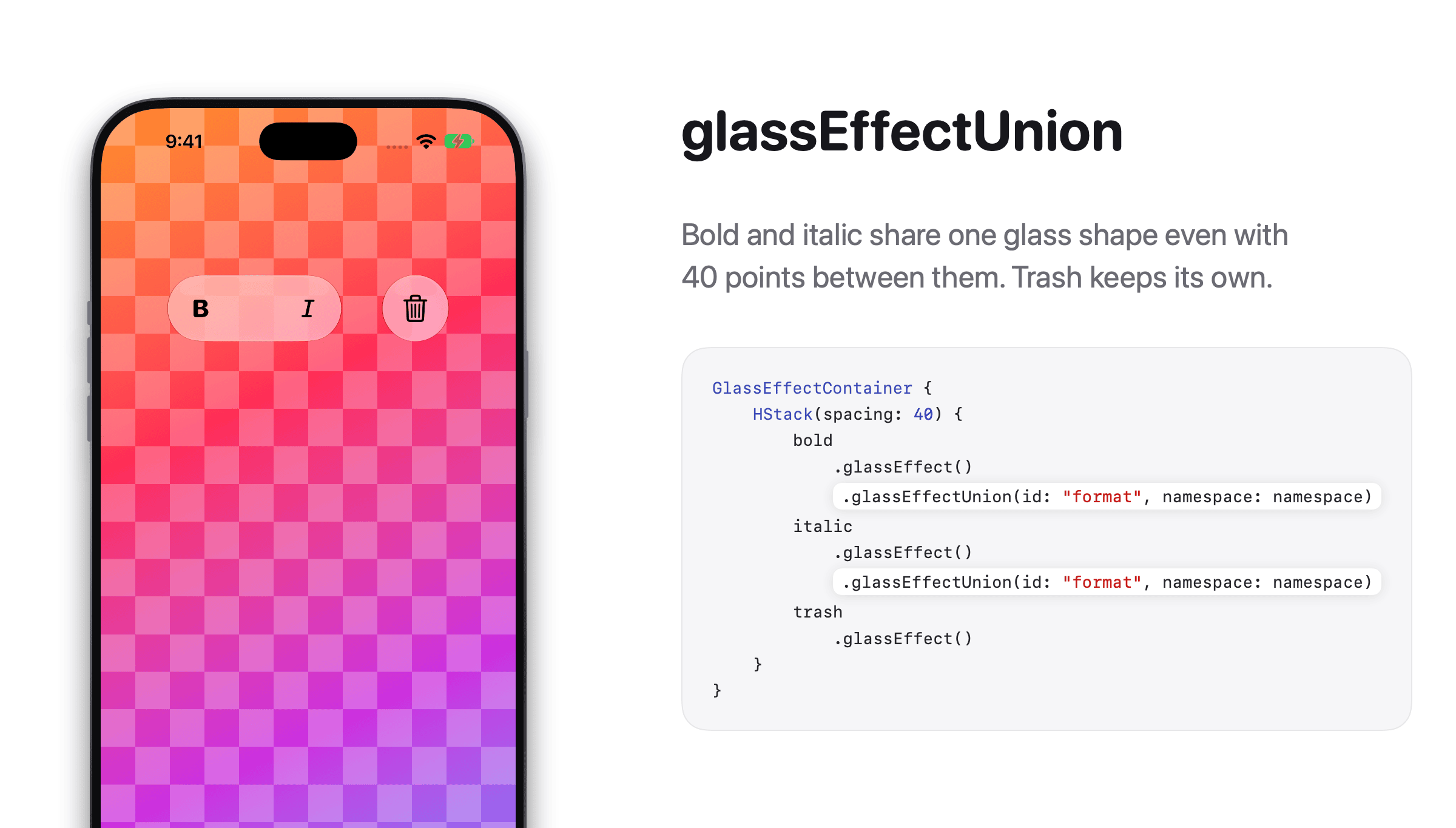
This is useful when the shapes come from a ForEach or another dynamic layout, and you can't control how close they are.
Animate glass shapes
For me, the best part of a container is animation. When a glass view appears or disappears, it can grow out of, or shrink into, a nearby glass shape.
There are two things you can play with.
Morph with glassEffectID
Apple's documentation morphs glass shapes with three things.
- A
@Namespace. - A unique
glassEffectID(_:in:)for each glass view. - A change wrapped in
withAnimation.
Here is a tool picker that shows more tools when you tap the pencil button.
struct ToolPicker: View {
    @State private var isExpanded = false
    @Namespace private var namespace

    var body: some View {
        GlassEffectContainer {
            HStack {
                Button {
                    withAnimation {
                        isExpanded.toggle()
                    }
                } label: {
                    Image(systemName: isExpanded ? "xmark" : "pencil")
                        .frame(width: 64, height: 64)
                }
                .glassEffect(.regular.interactive())
                .glassEffectID("toggle", in: namespace)

                if isExpanded {
                    Image(systemName: "eraser")
                        .frame(width: 64, height: 64)
                        .glassEffect()
                        .glassEffectID("eraser", in: namespace)

                    Image(systemName: "lasso")
                        .frame(width: 64, height: 64)
                        .glassEffect()
                        .glassEffectID("lasso", in: namespace)
                }
            }
        }
    }
}
When you tap the button, the eraser and lasso grow out of the button's glass. When you tap again, they shrink back into it.
Change the transition with glassEffectTransition
The morph you just saw is the default transition. You can change it with glassEffectTransition(_:).
There are three options.
.matchedGeometry: the default. The glass grows out of and shrinks into nearby shapes in the container..materialize: the glass fades in and out where it is, without coming out of a nearby shape..identity: no glass transition.
Image(systemName: "eraser")
    .frame(width: 64, height: 64)
    .glassEffect()
    .glassEffectID("eraser", in: namespace)
    .glassEffectTransition(.materialize)
Here is the same tool picker with both transitions. With the default, the eraser and lasso grow out of the button. With .materialize, they fade in where they are.
Use .materialize when a glass view should stand on its own and not look like it comes out of the shape next to it.
When to use GlassEffectContainer
- Use a container when you want glass views to interact: blend when they get close, merge into one shape, or grow out of each other.
- Skip it when each glass view should stay on its own. Having more than one glass view on screen doesn't mean you need a container.
- Standard controls like toolbars and tab bars already do this for you. You only need a container for your own glass views.
You can easily support sarunw.com by checking out this sponsor.
Screenshot Studio: Create App Store screenshots in seconds not minutes.
Conclusion
GlassEffectContainer is what makes Liquid Glass feel like liquid. Without it, glass views are just separate bubbles. With it, they can blend, merge, and grow out of each other.
spacingsets how far apart shapes can be and still blend.glassEffectUnion(id:namespace:)merges shapes into one, no matter the distance.withAnimationmakes shapes morph when views appear and disappear. Apple also addsglassEffectID(_:in:), but it made no difference in my testing.glassEffectTransition(_:)changes how a glass view appears and disappears.
If you want your custom glass views to blend and morph into each other, try wrapping them in a container. It is a one-line change, and you get the blending and animation for free.
Read more article about SwiftUI, iOS 26, Liquid Glass, or see all available topic
Enjoy the read?
If you enjoy this article, you can subscribe to the weekly newsletter.
Every Friday, you'll get a quick recap of all articles and tips posted on this site. No strings attached. Unsubscribe anytime.
Feel free to follow me on Twitter and ask your questions related to this post. Thanks for reading and see you next time.
I also make short videos and visual guides on Patreon. Some things are easier to see than to read, like how an API looks and moves on a real screen. If you like to learn that way, come and watch. Sharing the article is also greatly appreciated.
Become a patron Tweet ShareSize classes inside ArrangementView
Views inside an ArrangementView get different size classes than the window. Here's the rule on iPhone Duo and iPad, and an iOS 27.1 quirk with the top view of each pane.